
The 2D Gaming Boom: How These 3 Video Games Created Their Striking Hand-Made Look
Animation and gaming, kindred worlds from the start, have converged in various ways over the decades.
The industries have shared writers, designers, characters, franchises. Technology, too: recently, game engines have become central to big-budget vfx and animation, playing a growing role in pre-visualization and other stages of production.
Meanwhile, another trend is playing out on a more intimate scale. Recent years have seen a boom in games that use boldly stylized 2d animation, whether in gameplay, cut scenes, or both. These tend to be created by animators or artists in collaboration with indie developers. Sometimes, they are simultaneously produced as a film; more often, they are released just as a game, albeit one with an emphasis on design.
Cartoon Brew picked three games from this movement, and spoke to their creators about the visual development of their project. Their comments are taken from longer Q&As conducted by email.
Later Alligator
Cartoon Brew first previewed Later Alligator last year, when we were taken by the hand-drawn aesthetic and mock-noir environments in the trailer. The family-friendly game features 30 mini-games and challenges, over 100 alligators to investigate, and multiple endings, as well as a fully-animated finale. The project is a collaboration between Lindsay and Alex Small-Butera’s Smallbu Animation (Baman Piderman, Adventure Time) and Jo Fu and Conrad Kreyling of indie developer Pillow Fight (Heaven will be Mine, Rose of Winter).
Lindsay Small-Butera: Back in 2017, Pillowfight floated casually to us that if we had an idea for a game, they’d like to work with us. We’d never worked on a video game and it seemed like a fun new way to use animation to make jokes and tell stories.
Jo Fu: This was a chance to challenge ourselves, and to work with people who were ready to make something fun and new.
Small-Butera: I follow a blog that specializes in interesting interiors and exteriors. One post that had come up was some random, overwrought interiors ranging from the 1960s to the 1980s. I became enamored by the terribleness of them. The game ended up embodying a lot of my feelings around them. They also reminded me of old story games on the PC, which were cluttered in a way that created a mysterious environment, like Myst.
Another reason to have these heavily detailed backgrounds was the other drawing style in the game: flat, ridiculous drawings of alligators. I’d been drawing this one silly alligator since college. Alex and I developed this stupid drawing style based on my alligator doodles, and we came up with a concrete visual language for the characters. One of Smallbu’s specialties is taking very flat art and moving it around in a robust manner unexpectedly, so that was something we wanted to play with in the game.
The game is done in a mostly grayscale, “noir” style. [This was partly done humorously], but also out of necessity for our workflow on the assets. Backgrounds aren’t our specialty, Alex and I. I wasn’t confident in our ability to do full-color backgrounds in the timeframe we had, so it was a band-aid as well as part of the joy of the game!
Fu: We’ve developed four visual novels, and our language of movement in those games is mostly tweens and getting clever with crossfades. The Smallbu team have a huge vocabulary for animated movement, and that gave us access to more perspective changes, more movement, more ways for each character to express themselves.
Small-Butera: The visual assets were created and animated in Toon Boom Harmony. We did almost everything in Harmony, on our end, only using Photoshop to paint the parodies of fine art in the game.
Fu: Later Alligator was built in Unity 2018.4, but we were gawping at the features that Unity is testing in their new beta. There’s a hand-drawn animation renaissance happening in games, and the tech is really keeping pace! For some of the novel stuff, we made do with some clever hacks, and our programmer wrote a lot of custom compression tasks so we could load all those animations quickly.
Later Alligator is available on Steam (PC/Mac/Linux).
Knights and Bikes
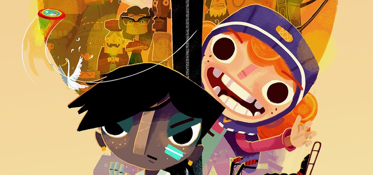
Having grown up in the U.K.’s remote Cornwall, Rex Crowle, a designer and animation director, returned to the region’s legends and geography when developing this narrative adventure game. Set on a fictional British island, Knights and Bikes renders 3d assets in a hand-painted, pastel-colored 2d style. Crowle and game programmer Moo Yu (Ratchet and Clank) form the core team at Foam Sword, which developed the game.
Rex Crowle: Having teamed up with my friend and former colleague Moo Yu, we started to flesh out the island setting, bringing in a lot of influences from my childhood growing up in a similar region. We combined that with an underlying legend of the island and the knights that once ruled it.
We wanted a 2d look for two main reasons. Firstly, to make the ambitious project more achievable! Building a world out of 2d art that’s then layered up in a 3d scene meant I could just paint the concept art, split it into individual elements, then export everything as PNG images directly into the 3d engine. We then repeated the process thousands of times to build up the scenes, playing with depth, lighting, tinting, and composition.
In our early prototypes we found that a purely 2d world wasn’t interesting enough to explore, because [relatively little] was revealed by the players’ movement through the world. Once we’d switched to a 3d camera it meant that you could walk into the screen and behind objects. [This] captured the feeling of exploration we wanted to achieve.
The second reason for the 2d look was to allow more expressiveness. It’s a style that attempts to show the world through the eyes of our two protagonists. In other words: it’s a child’s-eye view of the adult world. So I painted everything in similar materials to what children would use: chalk, pastels, and paint. Much of that was then animated with line-boil so it’s all shifting around slightly. This suggests movement from the stormy weather of the island, but also that there is no set way to look at things.
The bikes were hard to get right. They became a combination of many overlaid animations: a hand-painted frame-by-frame 3d rotation of the bike frame, another similar animation for the front handlebars, extra ones for the wheels, and then all the character animations created separately without the bike.
That was tricky to visualize while working on it, as I come from a Flash animation background, and I’m used to seeing the end result right there in the timeline, rather than as a lot of isolated pieces.
[The painter] Alfred Wallis was a large influence. He was a fisherman who lived close to where I grew up. He didn’t have any formal art-college training, and painted in a naive “outsider” style. His work lacks any traditional perspective, with scenes looking halfway between maps and landscapes. Studying those really freed me up to not worry too much about the faking of 3d environments with 2d artwork.
[Other big influences include] the poem “Under Milk Wood” by Dylan Thomas, The Goonies, the wild work of animator Bob Godfrey, and the wonderfully exaggerated production design from Laika’s Paranorman.
Everything is painted in Photoshop, using some of Kyle T. Webster’s digital brushes. It’s then combined in Unity where I build out the scenes and design the levels. The animation is created using a combination of Unity’s own system for animation, Spine 2D for the characters and creatures, and Photoshop for the stop-frame elements.
Knights and Bikes is available on Playstation 4, and Steam (PC, Mac, and Linux).
River City Girls
Launched in the early days of console gaming, the Kunio-kun franchise has stayed popular over the decades, its rpg-inflected fighting games garnering fans far beyond its native Japan. River City Girls is the latest installment. The beat-’em-up pays homage to the original Kunio-kun games by aping their 16-bit graphics, while incorporating hi-res anime-style cut scenes and illustrations inspired by manga. Conceived by veteran Californian developers Wayforward, the game was co-directed by Adam Tierney and Bannon Rudis, with Kay Yu serving as lead animator.
Kay Yu: I was contacted by Adam through Twitter. He mentioned that he was interested in me as an animator candidate because of a tweet of mine that he came across, where I showed a pixel animation with a style close to how he imagined River City Girls to look. As a fan of the franchise since I was a child, I jumped onto the project without a second thought.
Adam Tierney: [The look] was always imagined as pixel art, partly because that would help keep the production costs down, but even more so because Kunio-kun games are still, 30 years later, using the original sprites from River City Ransom [a 1989 game from the franchise].
Yu: Before RCG, I generally used black outlines even for pixel art as if it was traditional animation! When I looked at the style they had already developed for RCG, I had to reshape my methodology for drawing pixel art.
With the line-drawing approach, you draw out the object as correct as possible and fill in colors afterwards. When it comes to pixel blocks, it almost becomes like sculpting from a blob. You first draw out some vague shape with some color with lines and fill it in. [You then] erase some pixels or add in new pixels to mold it until it’s the shape you want.
There’s one major advantage in this approach. Because pixel art at this size is pretty small, any line takes up a significant area of the sprite. When a sprite is only in lines, your eyes will understand the image based on the lines. Once you fill in the color, your eyes will start to understand the image based on the colors. With pixel color blocks from the start, the sprite will always look how you intend it to be from start to finish. I used Aseprite, a great software designed for pixel art.
One of the biggest challenges was recreating Priscilla Hamby’s beautiful character designs in sprite form. It’s not just a matter of keeping good looks either! Sprite model designs had to be “animation-friendly.” If you retain too many details on a sprite, it can make animating those characters exponentially more difficult.
There are two major differences animating for gameplay versus cinematics. The first is readability: having too many details can also make a small sprite harder to read, especially on a smaller screen. When you have too many pixels and too many colors on a small canvas, things start to blur.
[Secondly,] it’s important to make sure animation works for the gameplay. If a player has a weak, light attack, then that attack should be quick. A heavy attack would require more frames to emphasize the force. However, you don’t want too many frames in any attack, [or] it becomes too sluggish to use. Additionally, [unlike in film], attacks from enemies should always give players enough time to react, [otherwise] the game becomes unfair.
Tierney: The manga scenes were influenced by the manga sequence in [anime series] FLCL. We used those sequences to convey specific story beats that wouldn’t play clearly in pixel art. We also more sparingly created full-animation sequences in an anime style, which were used for the game intro and boss intro sequences.
Yu: All of the traditionally animated cutscenes in RCG were storyboarded by Eric Huang. He also created the visual style for the anime cinematics with his unique art style.
River City Girls is available on Playstation 4, Xbox One, Nintendo Switch, and Steam (PC).
(Image at top: “Knights and Bikes.”)

.png)


