How The Creators Of Hulu’s ‘Animaniacs’ Reboot Subtly Updated The Look Of The Series
One of the most hotly anticipated reboots of 2020 is Warner Bros. Animation’s Animaniacs, which is set to launch November 20th on Hulu.
The new series, which has received a two-season order totalling 26 episodes, has generated loads of online discussion as fans of the original Nineties series have wondered how closely it will emulate the iconic original that is a classic of early 1990s tv animation. The general public got its first extended look at the updated version last Friday during a panel presented by Warner Bros. Animation at the virtual edition of the Ottawa Int’l Animation Festival. And the answer is: Fans of the classic series are likely to be very pleased.
While no footage was shown and there was scant discussion of the stories in the new series, executive producer Wellesley Wild made it clear that they’ve strived to recreate a similar tone to the original series.
The panel, which also included co-executive producer Gabe Swarr (El Tigre: The Adventures of Manny Rivera, The Penguins of Madagascar, Kung Fu Panda: Legends of Awesomeness ), who is leading the artistic side of the show, along with character designer Genevieve Tsai and art director Roman Laney, revealed plenty about the visual direction of the series. Swarr and the others discussed how they approached the design of the new series, which was a balancing act between maintaining the original look and updating it to remove the rough edges of the Nineties production to create something even more visually appealing and consistent.
The information and images below explain the approach they’ve taken with the design of the upcoming show.
Visual development
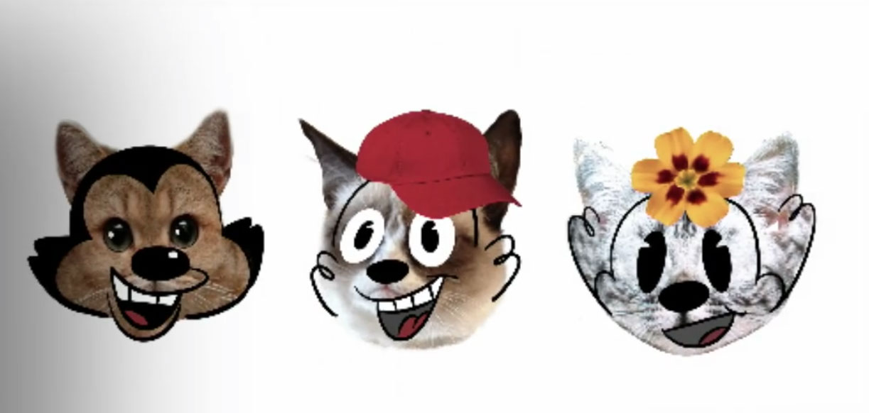
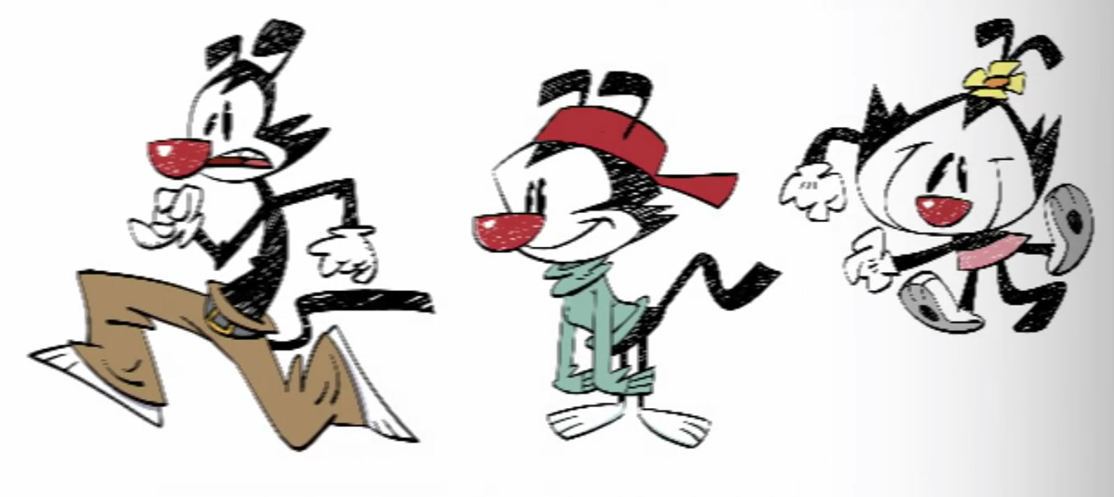
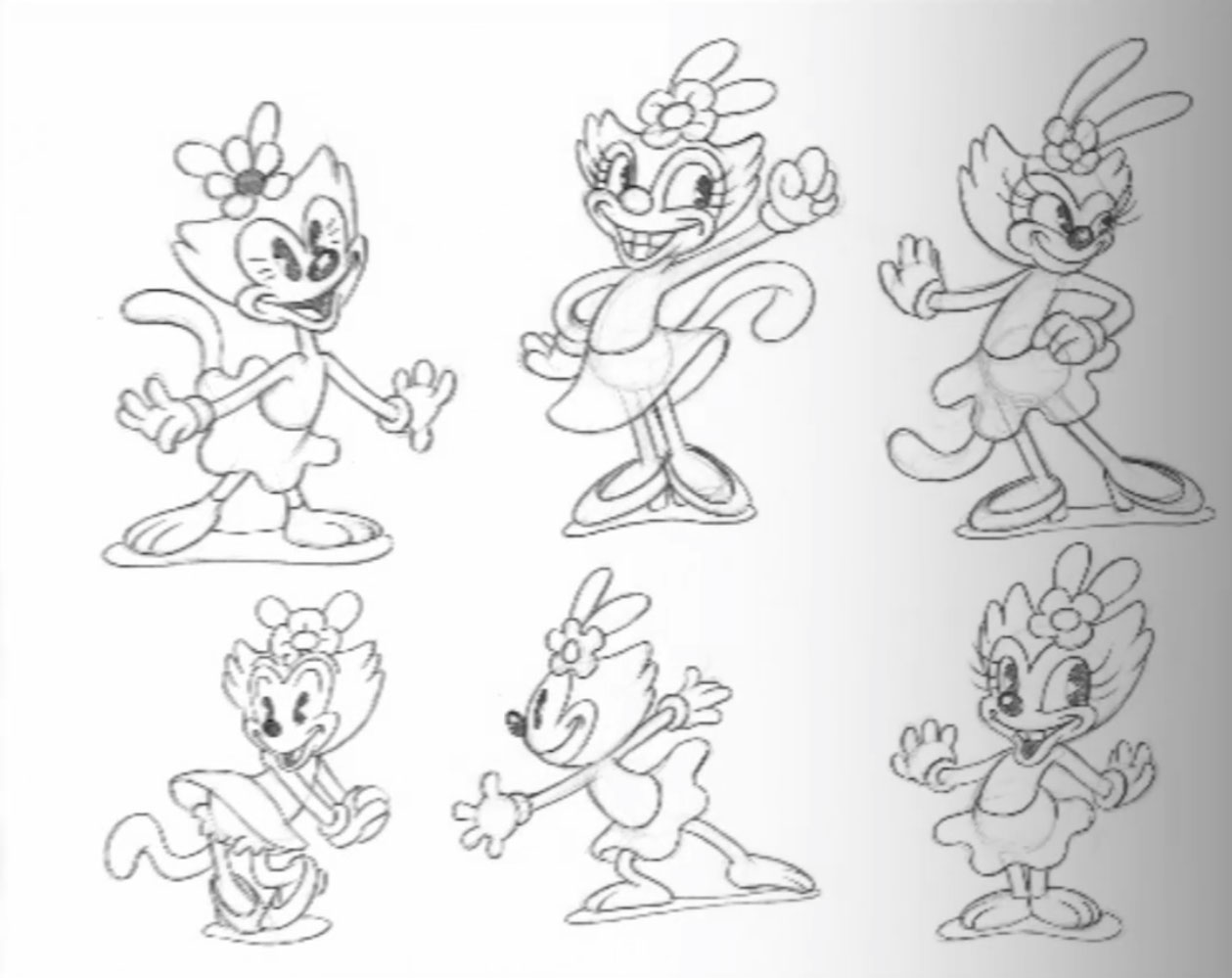
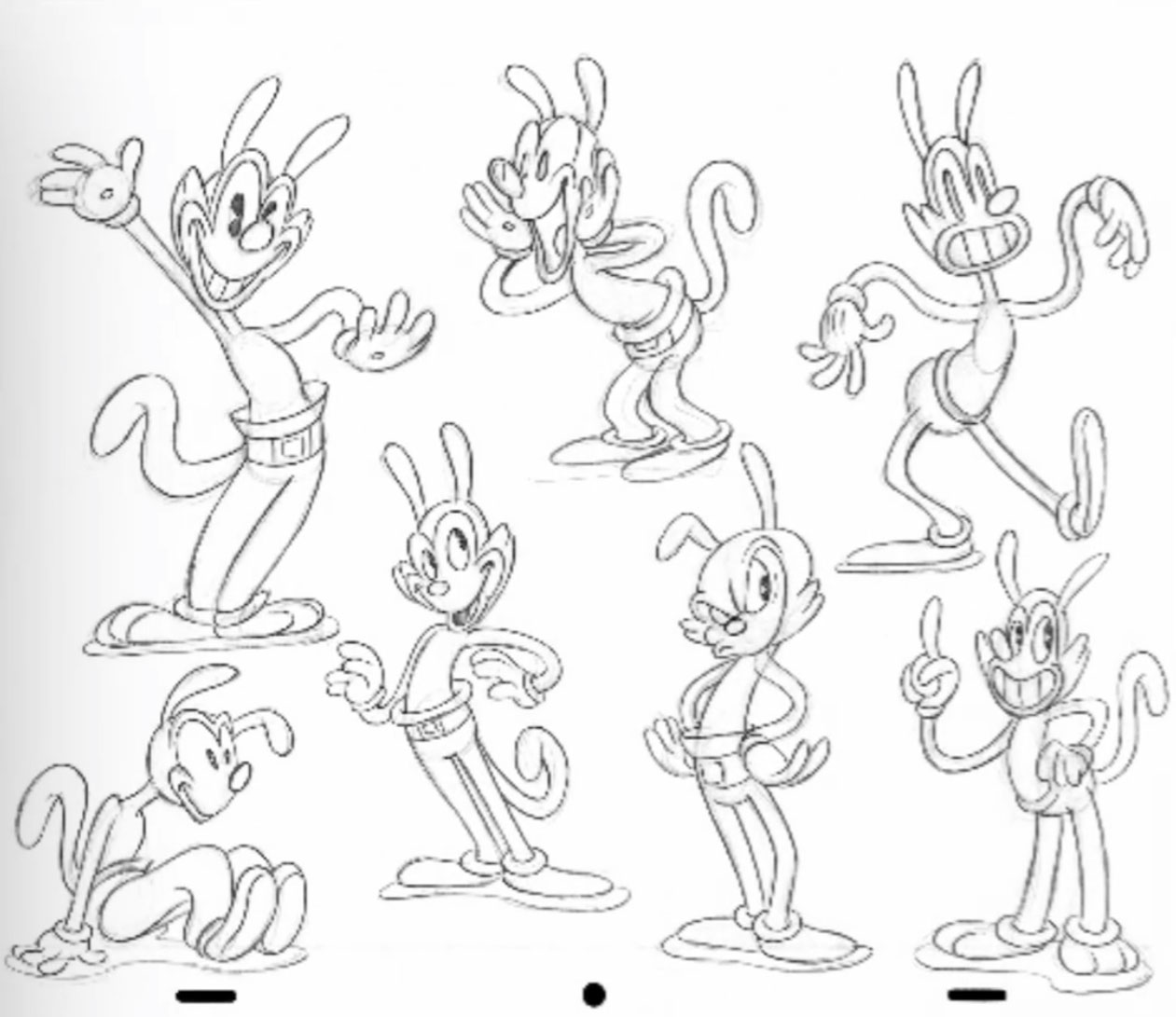
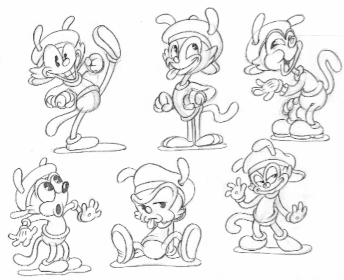
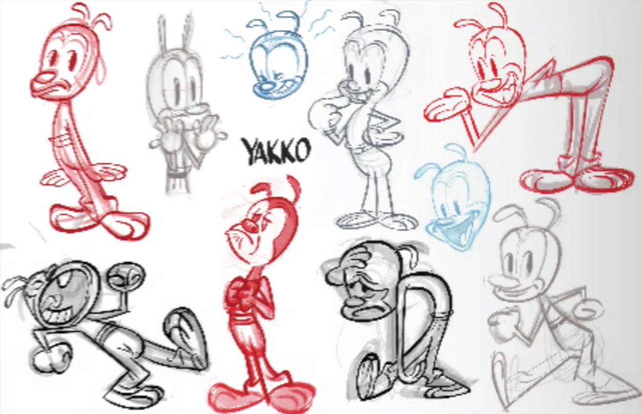
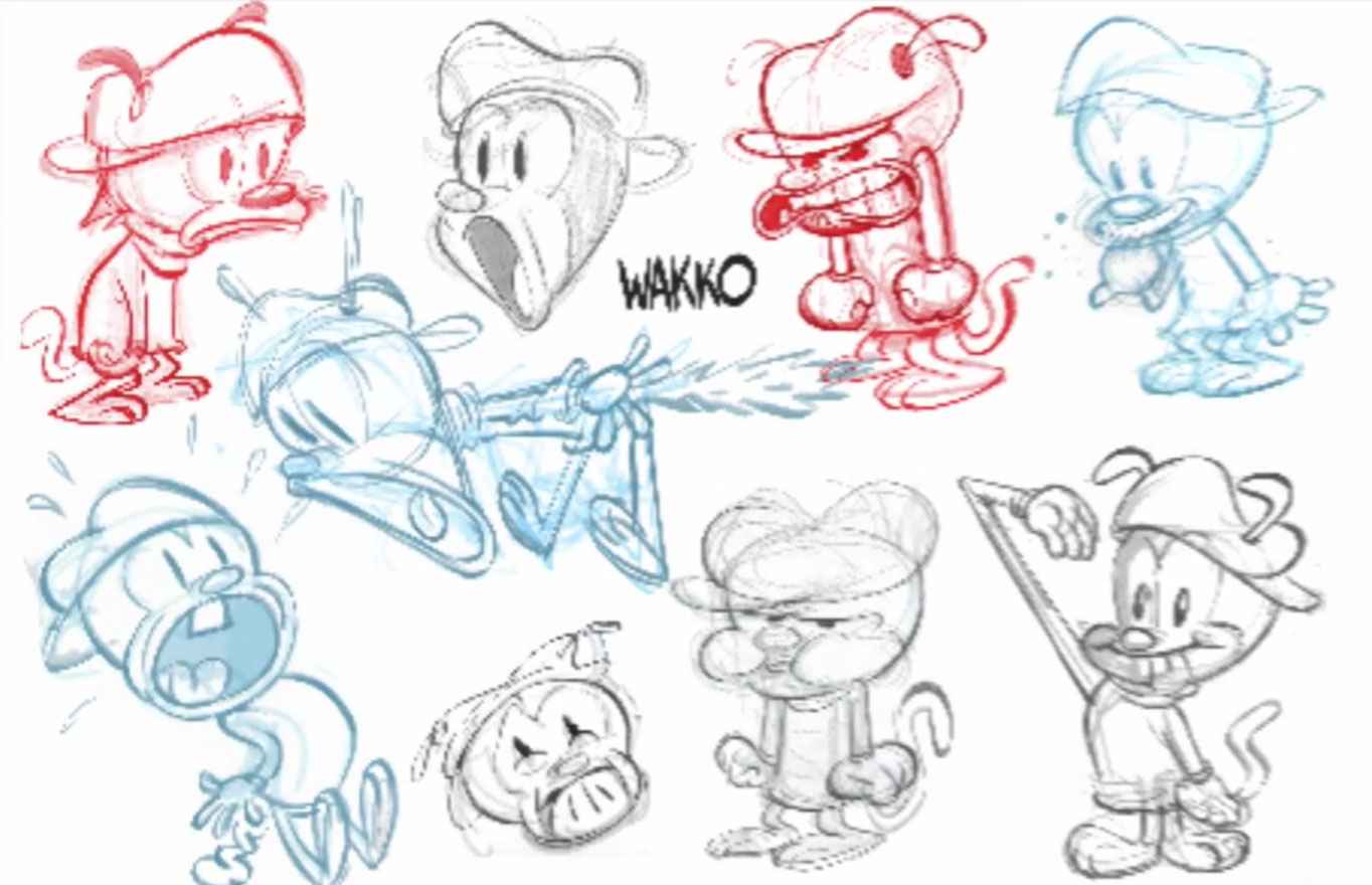
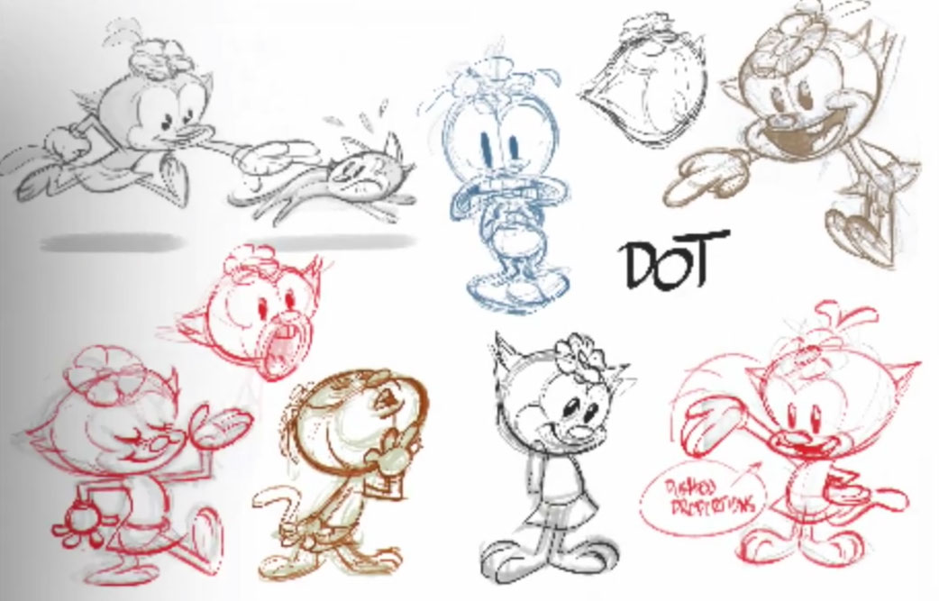
Before they settled on their final visual approach, Swarr said that the executive in charge Audrey Diehl tasked him with “just coming up with a bunch of different looks.” Swarr reached out to a variety of artists and they ended up with a wide variety of concepts from a rubber-hose animation look developed by Cuphead creators Studio MDHR to a “French comic” style by Jennifer Wood. Some of the looks they explored are below:


An appreciation for TMS
The idea of the design exploration phase was to see whether there was a style that would be more appropriate for the characters than their existing form, but ultimately the decision was made to stick with the original designs.
But one thing that Swarr noticed is that the original Animaniacs series didn’t really have a single look. There was tremendous variation between the animation that was created by the different service studios that worked on the Nineties series. “We saw a lot of weird, kind of out of control animation that was really blobby,” he said.
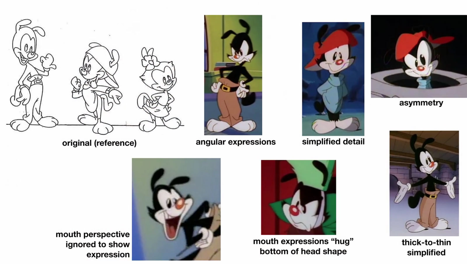
After closely studying the original episodes, the team singled out the episodes made by Japan’s TMS Entertainment Co. (Tokyo Movie Shinsha) as the gold standard. Unlike some of the studios that drew the characters with entirely rounded forms, “[TMS] figured out that that there’s angles,” Swarr said. “The construction is so good; they have so much control. What are they doing to do that? One of them was definitely how they were really being very obvious the way that all the pieces are fitting together and that’s where the angles are coming from.”
This led the crew to take a deep dive into the TMS episodes. Said Swarr: “[We] literally broke down what they were doing. They would do a lot of really angular expressions; they would simplify the details, like a lot of wrinkles were simplified; they made sure a lot of the expressions were asymmetrical; they would kind of ignore the facial perspective to really help with the expression. They would do this great thing when the characters would smile or frown, they would hug the outside shape so they get this nice cool little [shape] at the bottom.” Another thing that TMS would do is to take out a lot of the anatomy in the original designs and simplify shapes. TMS’s approach had the benefit of making the characters easier to inbetween. This breakdown shows what the new crew liked about the old TMS approach of drawing the characters:
Developing the look of the series
The updated look of the new episodes really fell into place when Swarr was introduced to Genevieve Tsai, a Warner Bros. Animation artist who was working on the same floor on another series, Netflix’s Green Eggs and Ham. Tsai, who was a childhood fan of the original series, understood the careful balancing act of keeping the designs familiar while also contemporizing them for a modern production.
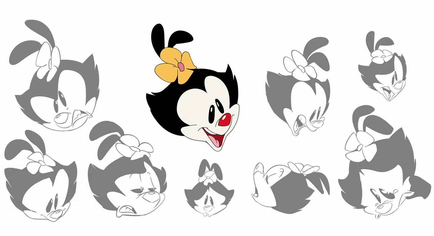
“My style just has an angular feel to it, so I put that onto the characters,” Tsai said. “I kinda kept what I really liked about the TMS stuff, but just streamlined them, pushed the expressions because I really love pushed facial expressions and dynamic poses. My aesthetic, I just put a little bit into it. But I think what was already there, with the TMS stuff, and just like combining all the cool stuff that Chuck Jones already established in his original style, it all just came together like that.” (One of the keys of the production was to not just study Animaniacs, but to also study the work that the original Animaniacs crew was inspired by, like the Looney Tunes theatrical shorts directed by Chuck Jones.)
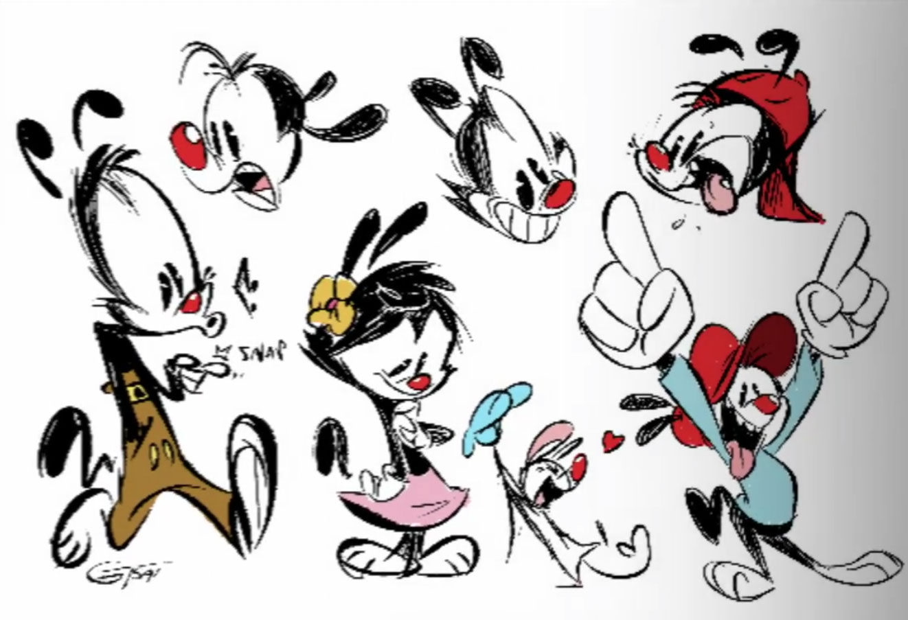
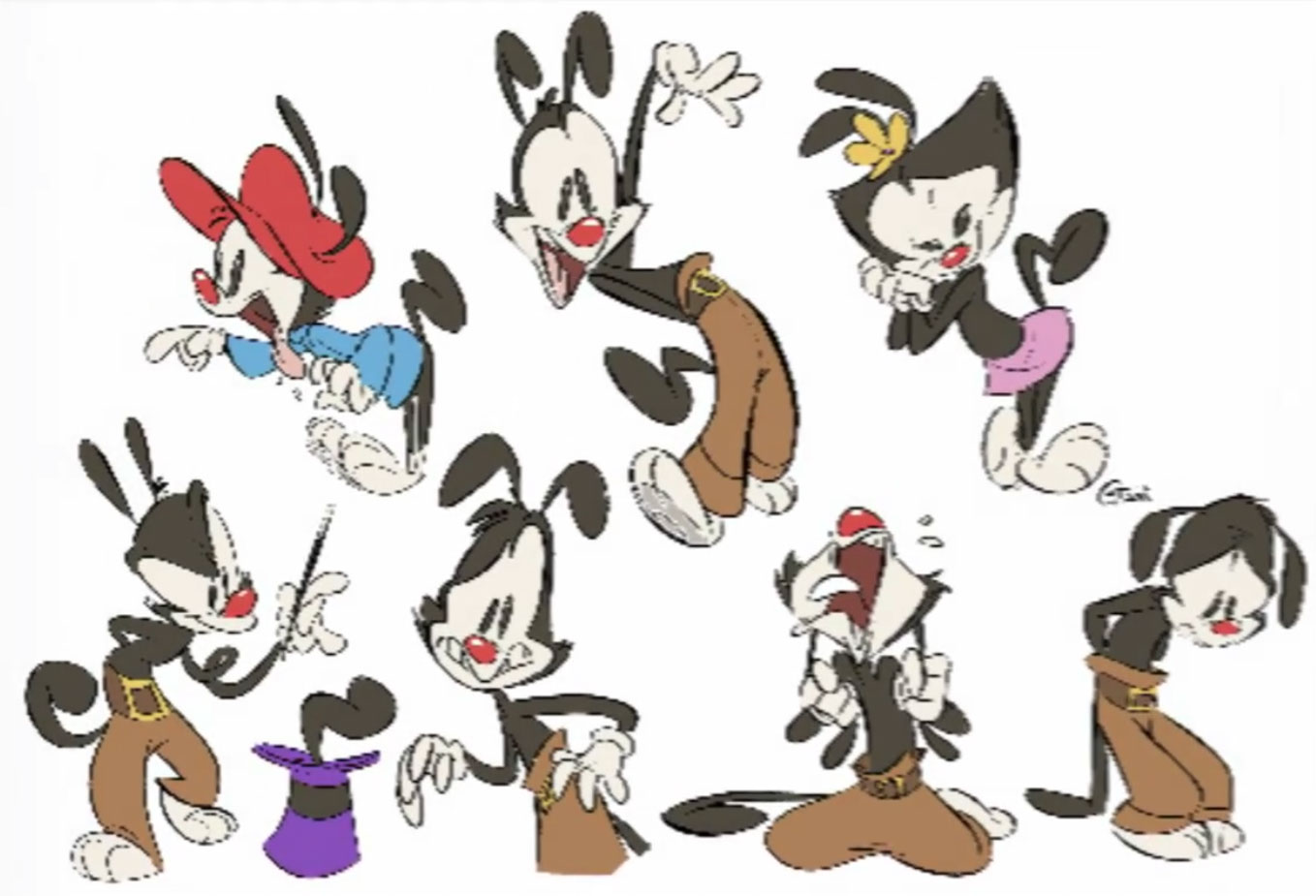
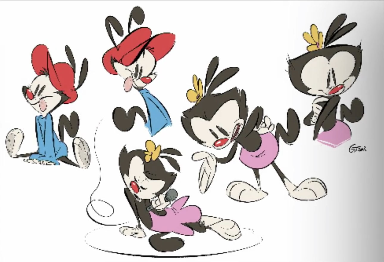
Comparison: new designs vs. old designs
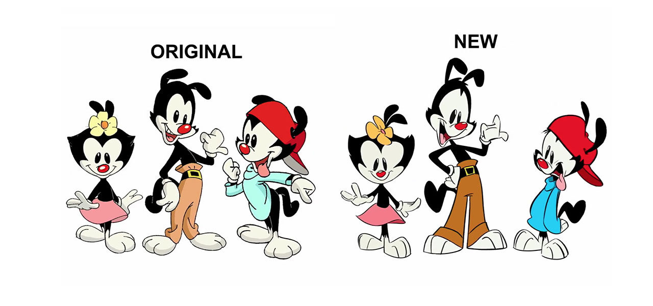
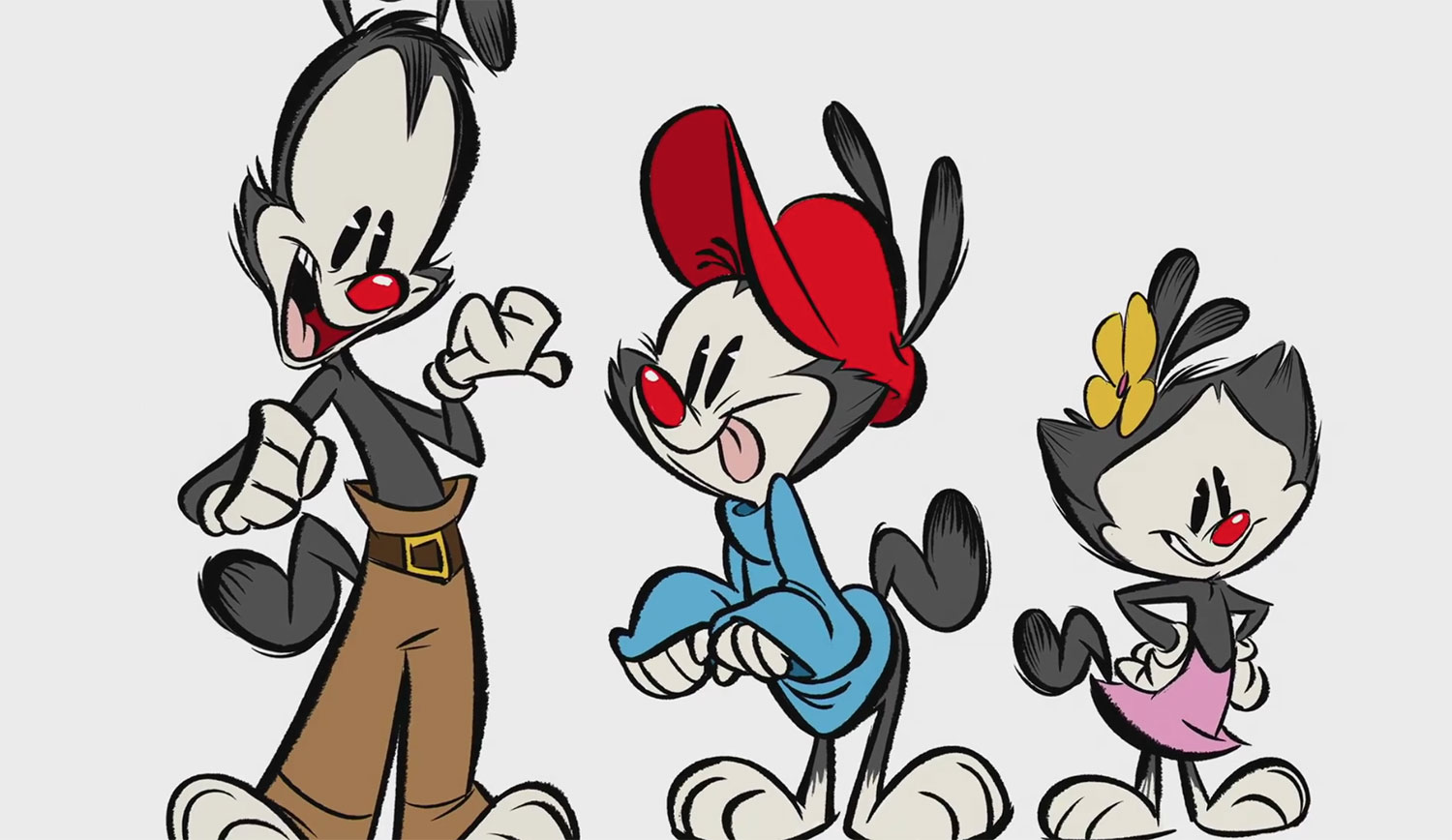
Swarr points out that when you see the new designs, they instantly feel familiar to fans of the original series, yet there’s also “big changes” in how the characters are drawn. “[I]t’s kind of like the designs you remember them looking like, not so much what they actually look like.”

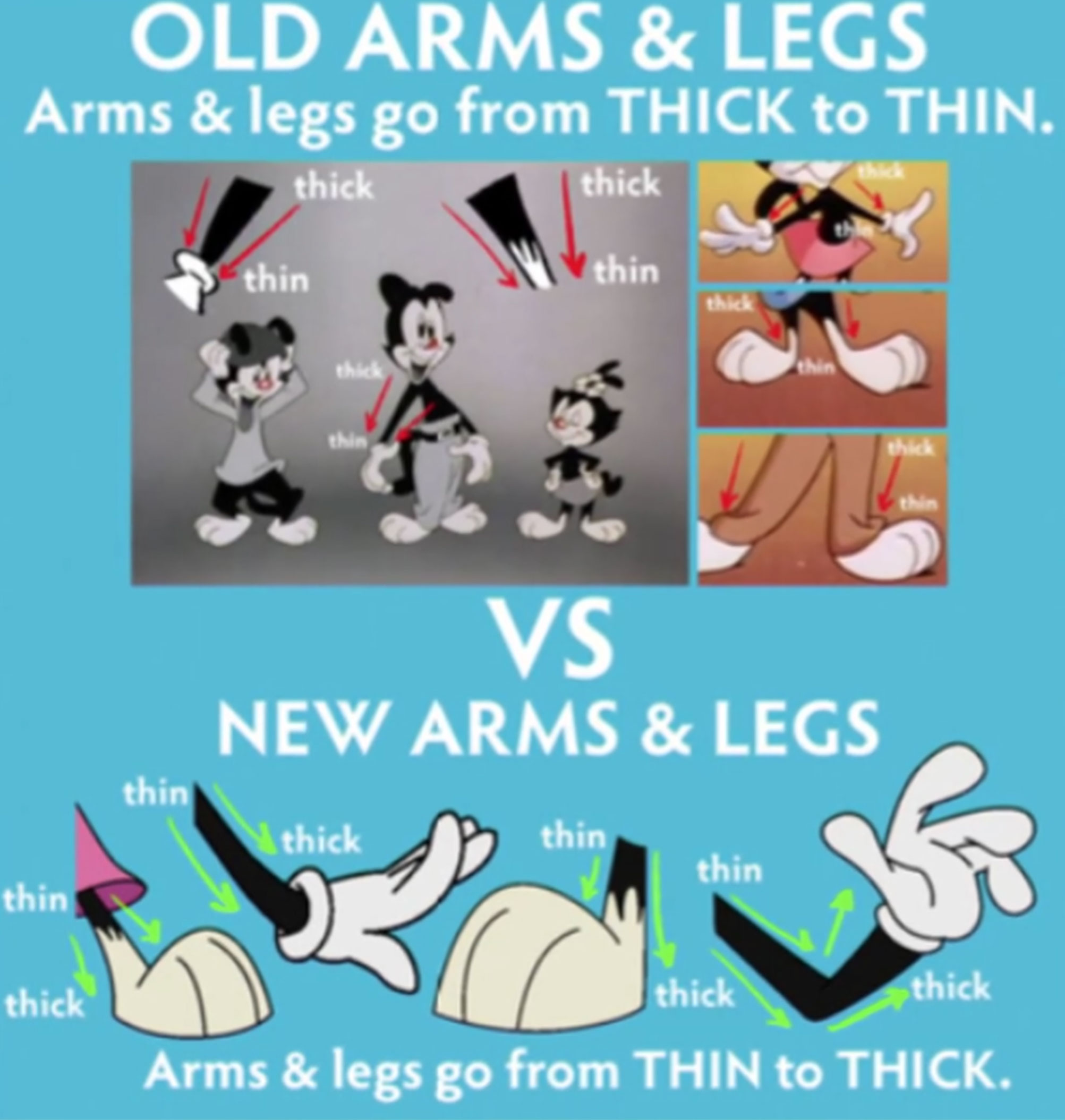
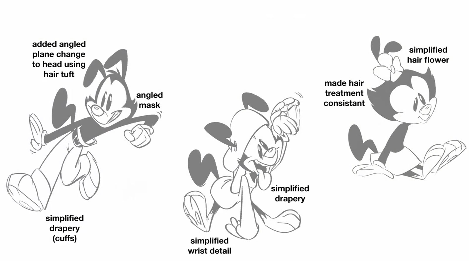
“The original characters had shoulders and elbows, like the actual thick to thin to thick that a normal human arm has, and [TMS] would just go thin to thick,” said Swarr. “We took all our cues from that.”
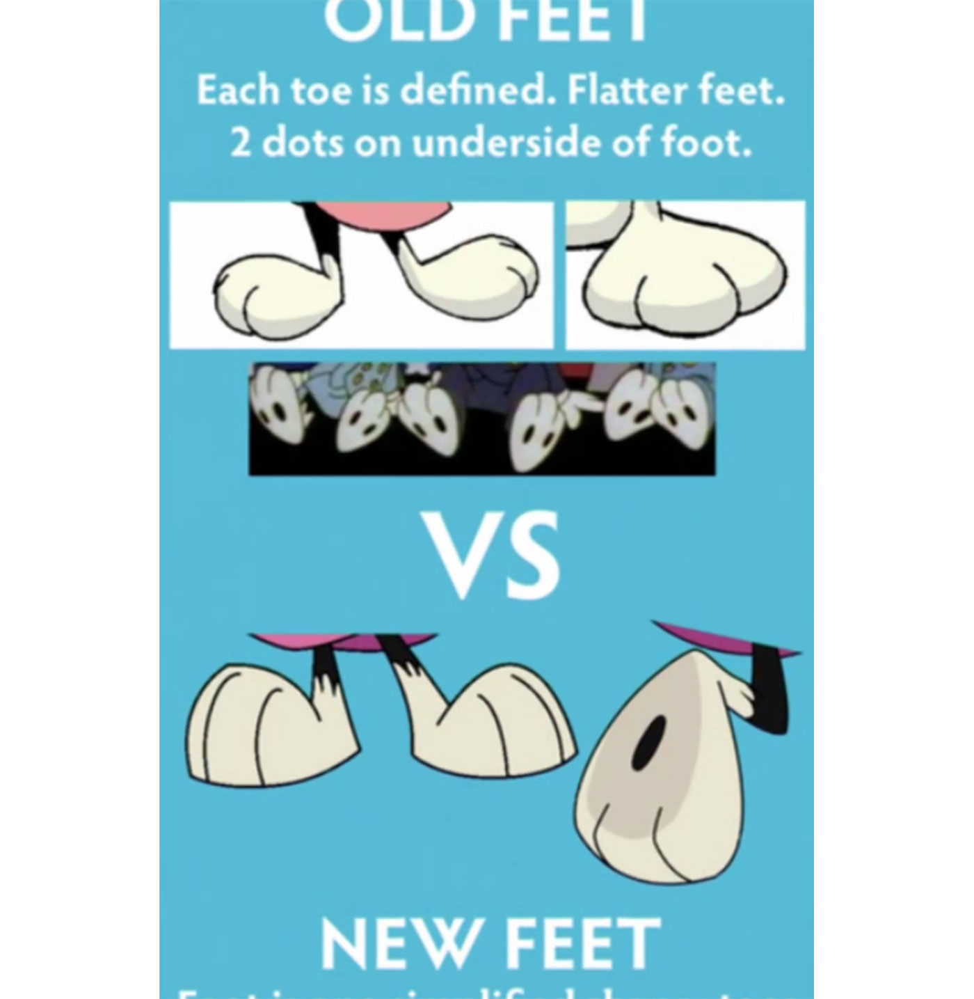
Tsai explained in more detail: “The old show [by TMS] was thick to thin, thicker at the shoulders, and then thinner at the wrist, but ours it’s kind of reverse, thinner at the shoulders and thicker at the wrist [and ankles], and just streamlining like the feet. For example, instead of individual toes, it’s one shape, and just simplifying how Wacko’s sleeve works, and keeping the angles in their muzzles.”
Making the characters’ eyes work consistently was one of the biggest challenges the crew encountered, according to Swarr: “The eyes [were] like a mystery. We had to go through all the episodes, sometimes they’re dot eyes, sometimes they’re not. Genevieve came up with this great idea: Let’s make fake eyes that you can’t see and then the pupils don’t go past that point, even if they’re going back and forth. And as soon as we got some of the animation back, we’re like, Ok, let’s just not move the eyes, it’s better to just move the whole head, because it just looked weird.… That’s what was cool; we had to create some rules to tie it all together.”
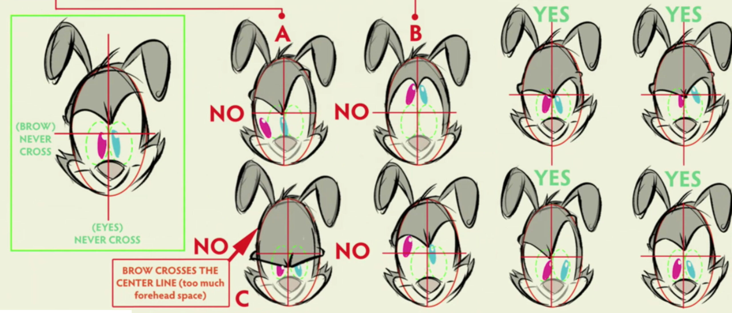
A key reason for trying to create a consistent set of rules for how the characters are drawn is because of the number of different service studios that are animating the new series. Besides Warner Bros. Animation in Burbank, California, which is handling all the pre- and post-production, there are at least seven different studios in three countries working on the new show: Yowza Animation in Toronto, Tonic DNA in Montreal, Titmouse in Vancouver, Snipple Animation Studios in Manila, Philippines, and three studios in Seoul, South Korea: Digital Emation, Tiger Animation, and Saerom Animation.
Backgrounds
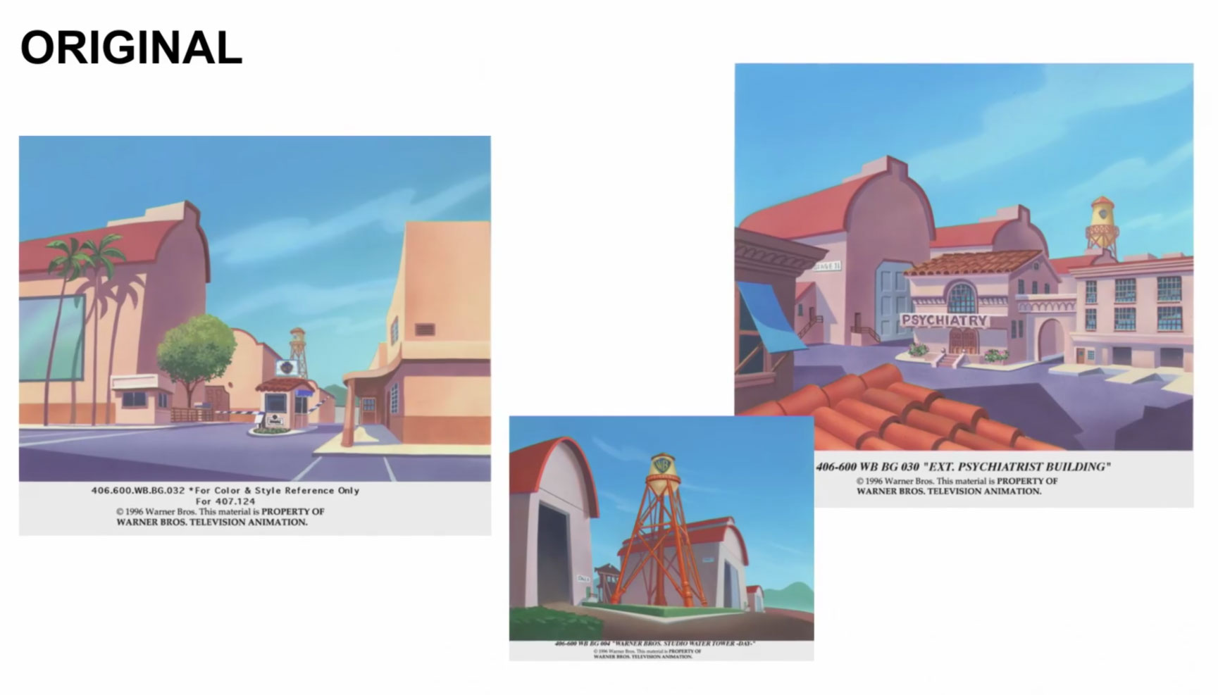
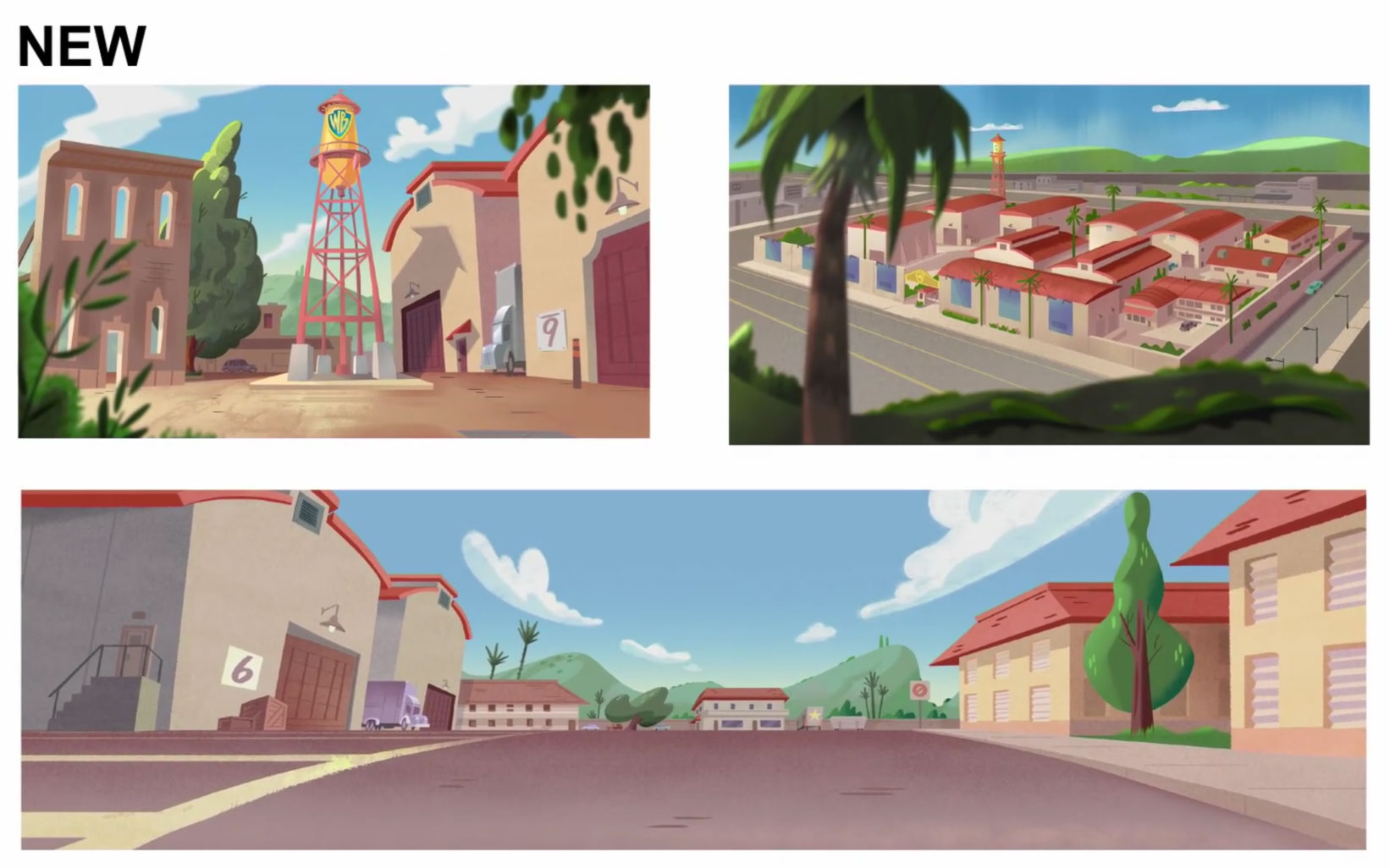
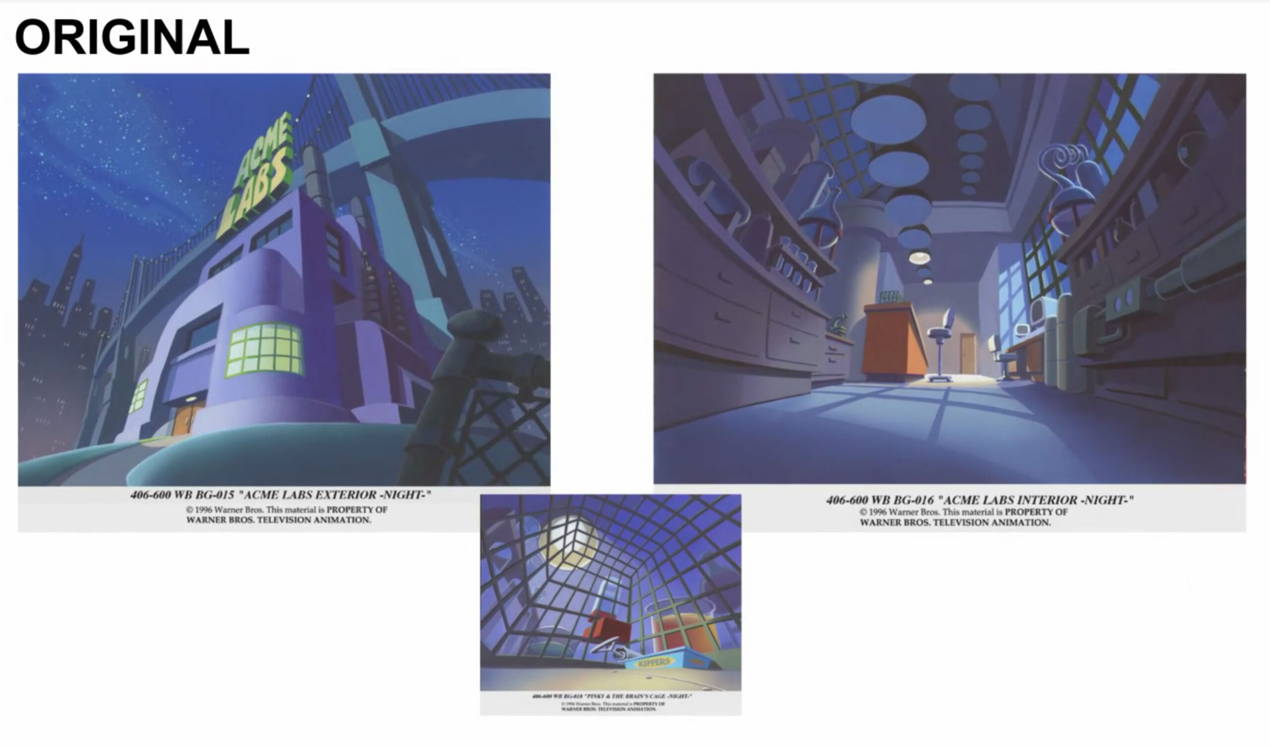
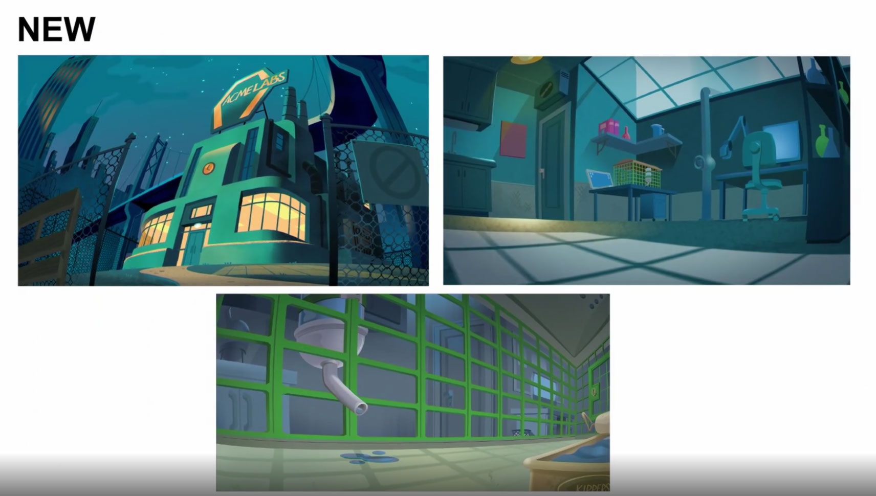
There was a less discussion about the overall art direction in the Ottawa panel than on the characters, but art director Roman Laney spoke about how the crew was subtly updating the look of the background paintings. “I think there were certain things about the original show that we felt were sort of remnants of the Nineties that we kind of wanted to stay away from,” Laney said.
He explained how they tried to add more crispness to the backgrounds, to match the new stylization of the characters, while avoiding the Nineties “remnants” like banana pans, “curvy” backgrounds, and overreliance on airbrush.
These examples below show how certain key backgrounds were updated for the Animaniacs and Pinky & the Brain segments:
