
The Oscar Shortlist Interviews: How The Films Were Visually Developed
This year, 15 animated shorts — not the usual ten — have been shortlisted for an Oscar.
To better understand how these films were crafted, we sent the same three questions to all the directors, to learn more about how they made their film and how they view the landscape for shorts today. We are publishing their answers across three features, of which this is the second.
The first piece, about crafting a story for a short film, can be read here.
Our second question:
Can you describe how you developed your visual approach on the film? Why did you settle on this style/technique, and did you consider others?
Alberto Mielgo (The Windshield Wiper):
I developed my [personal] style over the years, and because I happen to always art-direct my own films, I couldn’t choose another style. I never think too much about what sort of style or colors I want to use — it comes to me while doing it. The Windshield Wiper took a long time, and during the process we had to stop many times as I jumped onto other projects such as Spider-Man: Into the Spider-Verse. I wouldn’t say the short is the conclusion of my style, but it has been highly influenced by many of these other projects and vice versa.
Zach Parrish (Us Again):
We felt that chasing a more naturalistic rendering style would help to ground the world and make the rain feel real. It would also give us a great opportunity to play with reflections, and the theatricality of the colored lights and neon in the city. For all aspects of the film, we wanted a feeling of past and present. The use of neon was used to evoke the feeling of the 1960s but also of vibrant cities today. Because we wanted the film to feel intimate for our main characters, we also tried to make it feel slightly miniature. Larger textures, bigger and simpler details, and shallower depth of field paired nicely with a slightly caricatured world in order for the film to feel real but personal.
Weijia Ma (Step Into the River):
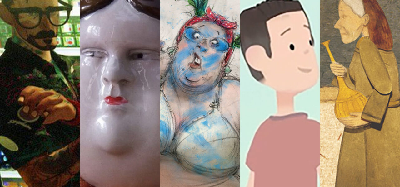
The first versions of the characters were more realistic, because I thought that would make people take it more seriously. But then I tried to make it look more like old Chinese comic books, and propagandist wall paintings. The shapes are simpler — easier for teamwork. The background was first painted all digitally. But I wanted the feeling of real textures, so we painted real pastel on paper, then modified digitally for lights and shades. I didn’t make the style too experimental in this film; everything serves the story, contributes to the strong emotions.
Bastien Dubois (Souvenir Souvenir):
My first approach was to go with a very simple, refined style. I really wanted people to be affected by what the film says, and to leave effects to one side. But then I started working with the illustrator Jorge González on a feature. I was so taken with our exploratory work on the project that I didn’t want to wait a few years before starting. So I suggested he do a “try-out” on the short. I’d also envisaged live action or even stop motion, but Jorge asserted himself! The decision to have two different styles came early. The cartoony style oscillated quite a lot between a more childish and a more punk look, before Gilles Cuvelier et Studio Train-Train eventually reappropriated it.
Dan Ojari (Robin Robin):
Illustrator Matt Forsythe, our character and production designer, infused the film with his unique bold and richly layered illustrative style. Matt’s designs were then translated into 3d by character sculptors and model makers, which was another hugely creative stage of the design process. We knew we wanted to use needle-felted wool as the main material. It has so many wonderful qualities, however it’s also something we hadn’t used before, and neither had most of the crew. Fortunately, there was some r&d time. As for the look of the wider world, the art department initially explored rendering everything out of needle felt. But we finally settled on using a variety of materials, as we found that the particular way in which everything was hand-carved and painted unified the aesthetics of the world.
Simone Giampaolo (Only a Child):
Only a Child is an incredibly eclectic visual project that displays almost every animation technique in the book. I see each animation technique as a “tribe” (or “nation”), and really wanted the film to metaphorically symbolize different nations (and therefore different human beings) coming together to share a common, crucial message. In order to visually unify the film, we gave big importance to the visual transitions between the different sections, making them as dynamic and creative as possible, and to the color palette, which evolves throughout the short from cold blue hues to warm oranges and red (symbolizing global warming).
Erick Oh (Namoo):
My initial concept paintings were all watercolor. So I decided to capture that tactile hand-made feeling in the actual film as well, because this is a very poetic and warm story. Once we settled on this look, we took it to the next level by inviting high-end vr technology. We recreated everything in vr by using Quill, which enables the artists to draw, paint, and animate very intuitively with their own hands. So ironically, even though it seems like a very technically complicated process, it provided by far the most intuitive flexible creative experience to myself and the artists. As a result, we came up with a look and aesthetic which are very organic watercolor and very three-dimensional at the same time.
Reza Riahi (The Musician):
In all the films and animation projects I’ve been involved in, I have tried my best to adapt not just the visuals but also the technique to the script. I believe that technique adds so much to a story. For The Musician, I knew from the beginning that I wanted to pay tribute to Persian miniature art and history and the roots of the resilience of the people from this region. To honor the richness of Persian miniatures, the incredible patterns and motifs, it seemed right to use traditional paper cut-out animation. I had never used this technique, and since I had imagined so many intricate details, I did a lot of research, testing almost all the papers and art supplies available.
Hugo de Faucompret (Mum Is Pouring Rain):
Apart from the story, hand-painted backgrounds were one of the main reasons I decided to make this film. Painting is for me so pleasant and deeply soothing, like a meditative state. At first, we mainly worked on the visual touch with Arthus Pilorget, the lead background artist, who has a wonderful vision of lights and atmospheres. We focused especially on the choice of colors and the way we wanted to use the natural patterns the brushes could offer to make wood or stone textures, for example. About the animation, I really wanted to keep this look of pencil-scratched line on paper. We worked with character designer Jules Rigolle and lead animator Eva Lusbaronian to find designs that best matched the spirit of each character. And finally, to simplify the lines to make them easier to animate.
Sandra Desmazières (Flowing Home):
The film uses animation on paper, with digital work that recreates the pencil lines and the vibrations of the pencilled shading. I draw with colored grease pencils. I love the color and the textures of paint on paper, and the play of transparency. I did sketches during my trips to Vietnam, and I tried to recreate the mood as I remembered it — the ambience at night, green tones — by giving the shots in the film a painterly look. I’d considered creating the storm sequence in painted animation directly on camera, and creating freer animations using sketchbook drawings, to convey the idea of a memory fading. But in the end, I abandoned those techniques.
Anton Dyakov (Boxballet):
The design crystallized over time. I am partial to a crude drawing style showcasing imperfections and individuality. Making the film at Melnitsa Animation Studio, with its extensive resources for producing hand-drawn animation in the academic style, helped to find and refine the aesthetic and overall look. When my vision of how the film should appear harmonized with where the production was, I knew we had the right design. This gradual uncovering was one of the most important stages for me in making Boxballet.
Hugo Covarrubias (Bestia):
Ingrid Olderöck, the woman who inspired this film, had German parents with Nazi ideologies. She received an education based on that, which defined her as a person. It was also said that this woman in reality had almost no expression on her face and was a person of few words. That’s why we decided to use a German porcelain doll aesthetic for the character design. The coldness, hardness, and fragility of this material matched her psychological characteristics and personality. For the sets and props, we used a more precarious and less expensive material, which contrasted with the cleanliness and brightness of the faces. We used cardboard for its more textured and less shiny side. It received a color treatment based on watered inks, which allowed us to maintain the opaque and desaturated texture.
Claude Cloutier (Bad Seeds):
I use very different graphic styles from one film to the next. And in fact, it’s always visual exploration that leads me to my next project: I draw freehand in various styles, ranging from very minimalist to very realist representational drawings. At the same time, I explore different media. At a certain point, a particular image ends up being the trigger for my film, and from it, I develop the concept, characters, and narration, and fine-tune the visual style and the technique.
Zacharias Kunuk (Angakusajaujuq: The Shaman’s Apprentice):
The story is there — we just follow the action. Working closely with the stop-motion animation crew, getting the costumes and set right, was the way to make this. Animation gives us freedom to properly show these spirits and traditions. I have seen other animators but these guys who work for Taqqut Productions do it right, and I like their style.
Joanna Quinn and Les Mills (Affairs of the Art):
Our films always focus on strong characterization and observation, starting with Les’s detailed character profiles based on observed people, their behavior, the space they inhabit, and particular incidents. Joanna interprets the profiles in sketchbooks, identifying visual characteristics and situations. She brings an energy and humor to the characters through her very distinctive drawn line, and the dynamism and energy of her animation. The animation is drawn on paper, then scanned and colored on TVPaint, and finally composited in After Effects. Joanna did animate on TVPaint for six months, but her animation lacked her hallmark liveliness and fluidity, so she admitted defeat and returned to pencil, paper, and lightbox.
Some answers have been edited for length and clarity.
.png)
