
Online Premiere: ‘Driving’ by Nate Theis
This interview is part of our coverage of animated shorts that are currently under consideration for the 2015 Academy Awards.
Six years ago, I called Madison, Wisconsin-based Nate Theis my “favorite animation director of the moment.” The evidence at that point was a series of quirky, funny advertising spots that Theis had created for the Wisconsin ad agency Planet Propaganda.
Since that time, Theis has expanded his freelance resume to include projects with prominent West Coast animation companies like Cartoon Network and JibJab, and in summer 2014, he completed his first independent film, Driving. The film, which has traveled the festival circuit for the past year and picked up multiple honors along the way, makes its online debut today.
Watch the film below:
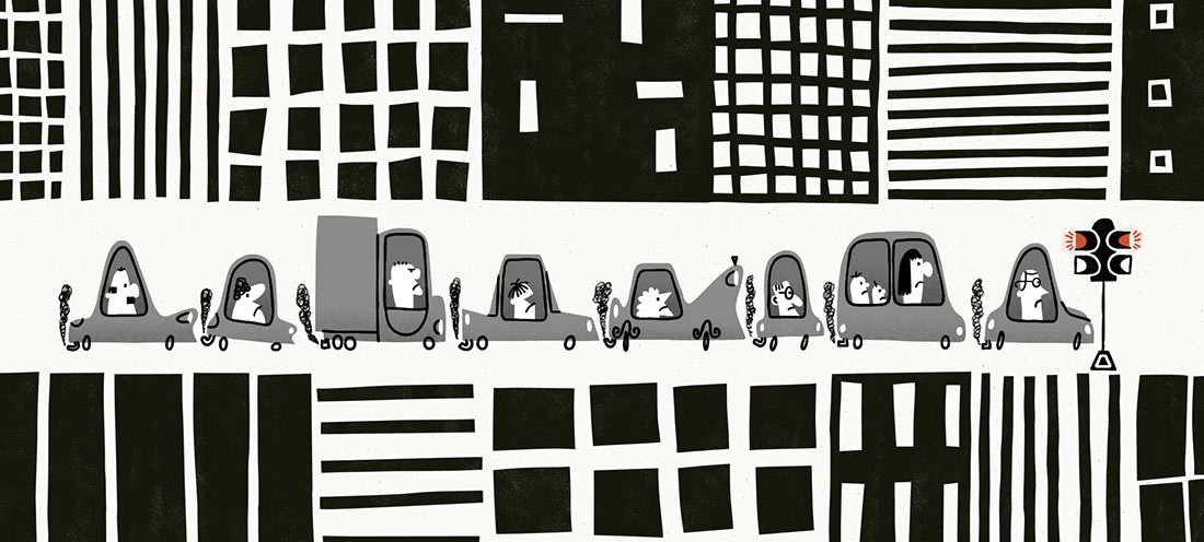
Driving’s basic scenario — the daily car commute — serves as the foundation for a funny, unabashed showcase of top-level cartooning, piling visual gag atop gag in rapid succession. Simple things — the twitch of a man’s nose, the loud music in a car — represent opportunities for Theis, and he mines every moment for comic effect. Some of the gags build from scene to scene, demanding patience for the payoff. Theis cites Jacques Tati’s Playtime as one of his favorite all-time films, and it would not be inaccurate to describe the visual humor of Driving as Tati-esque.
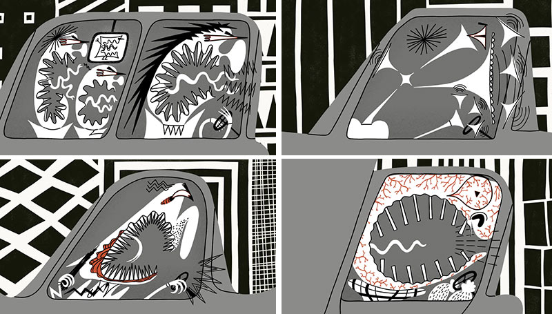
But Driving is filtered through a variety of other influences as well, perhaps most obviously the popular “Cartoon Modern” aesthetic of mid-century animation. Theis understands better than most that Cartoon Modern isn’t just a graphic style, but rather an approach to animated filmmaking that commits to finding stylized solutions. Driving is an accomplishment of design, from its elegant story structure that organizes the drivers into a single row and cuts between them in orderly fashion even as chaos builds within the scenes, to the animation, which explores every shape possibility of a character’s design. As frustration mounts for each driver, the characters break down into more abstract states, and by the climax, most of the characters have been reduced to brilliant graphic symbols of unrestrained rage.
Theis recently spoke with me via email in greater detail about his film:
Cartoon Brew: Someone who lives in Wisconsin seems like an unlikely candidate for making a film about road rage so I have to ask what sparked the idea for this film?
Nate Theis: There wasn’t a specific incident that sparked the idea. I guess it’s been a lot of little incidents over the years. Even though Wisconsin doesn’t have the traffic of LA or New York, the stress of driving can bring out the worst in people anywhere.
I’ve always enjoyed cartoons and films that make fun of human nature. When I was a kid I saw the Disney short Motor Mania. In the cartoon, Goofy is a mild-mannered suburbanite until he gets into a car. Once he’s driving, he basically becomes a crazed psychopath. I realized that this cartoon was making fun of something I noticed the adults around me doing and I thought it was great. That cartoon stuck with me over the years and, since then, I’ve paid attention to the way we act in cars. I guess Driving is kind of my version of Motor Mania.
Describe your process, from planning to animation.
Nate Theis: All the animation was drawn digitally with a Cintiq in Flash. I used After Effects to put the elements together and Photoshop for the backgrounds and textures.
In my opinion, the film took me way too long to make for what it is. One of the problems of being a perfectionist and not having a deadline is that decisions can drag on. Overall, it took about nine months. Before Driving, I hadn’t made a short film in quite awhile and it was a goal of mine to get back to that. Work kept getting in the way, so I eventually saved up for a few years so I could take time off and focus on it.
My process is pretty standard. I start concepting by simply sitting down and doodling ideas. From there I make a rough thumbnail storyboard and work on the style and design of the film. Then I make an animatic and use that as a blueprint for the final animation.
I’m a planner, so the animatic is the most important stage for me. I usually make really detailed animatics, even going so far as to roughly animate some stuff. I also do extensive sound design at that stage. The basic sound design I did for the first animatic for Driving didn’t really change too much in the final cut.
I like doing detailed animatics mainly to see how the story is coming together, but also because it helps me push the exaggeration. The first time I pose a character or animate I tend to be a little conservative. So, when I do the final animation, I try to push and exaggerate the poses and designs further than I first drew them, even if they already feel extreme to me.

Toward the end of the film, you start distorting the character’s physical appearances into an almost abstract state. How did you plan out those distortions — in the animatic stage or later on during animation?
Nate Theis: I planned those out in the storyboard and animatic stage, but the abstraction definitely went further and further the more I worked on the film. I was really inspired by Tex Avery and the idea of the cartoon take. In his cartoons, the characters’ reactions get bigger and bigger as the film goes along, so that was definitely an influence on the characters’ distortions.
I used key drawings to animate the designs. When I watch the film now, though, I kind of wish I would have animated straight-ahead. I feel the animation is maybe too rigid for what is happening to the characters. If I had loosened up with the drawings, it might have given the characters more frenetic energy and heightened the way they are feeling.
Sound is such an integral part of the film so it’s interesting when you said that you did extensive sound design at the animatic stage. Talk a little about that.
Nate Theis: I designed the sound early on at the animatic stage and it didn’t change too much after that. I had the idea of tying car horn sounds to people yelling before I had figured out anything else for the film. So I knew sound would play a large role.
For the final mix, I worked with a great studio in Milwaukee named Tanner-Monagle. They started with my original sound design, but made the mix much fuller. I went into their studio for about a week. We adjusted some of the sounds, added some here and there, and made sure the balance was good. They were incredible to work with and brought a lot to the film.
Among cartoonists, designers, and animators, name the ones you most admire or who inspire you most?
Nate Theis: There are so many! Although not an animator, I should mention Jacques Tati. Playtime is probably my favorite film of all time. I think his humor and use of sound are perfect for animation.
I haven’t done much stop-motion, but I love the films of Jan Švankmajer. His editing and sound design has been a huge inspiration. I think it’s pretty obvious I’m influenced by the Cartoon Modern style of the 50’s and 60’s. Especially animators like Fred Crippen, Ernest Pintoff, and Len Glasser. They all had incredible timing, funny designs, and moved their characters in interesting ways.
I already mentioned Tex Avery, but I should add Jim Tyer, Harvey Kurtzman and Saul Steinberg as other amazing cartoonists who’ve inspired me. As for newer artists, I’ve really enjoyed Olesya Shchukina’s work. Her latest film, The Elephant and the Bicycle, is my favorite animated short in the past year. Other current artists whose work I love include Nicholas Ménard, John Martz, Rex Hackelberg, Max Winston, Patrick Doyon, John Kricfalusi and Christy Karacas just to name a few.

.png)