How They Did It: Creating A 1920s Rubber-Hose Animation Style For ‘Waldo’s Dream’
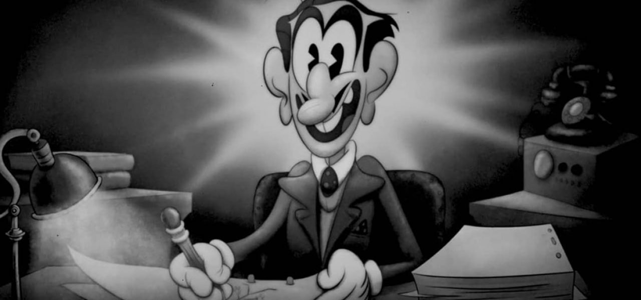
The upcoming Chilean animated feature Homeless, produced by Fábula and Lunes Animation Studio, has a decidedly contemporary look, however, the directors of the film wanted to have a short sequence in the feature made in the style of old Disney cartoons from the 1920s and early-1930s. To create that sequence, entitled “Waldo’s Dream,” they reached out to Colombia’s Venturia Animation Studios and director Juan M. Urbina.
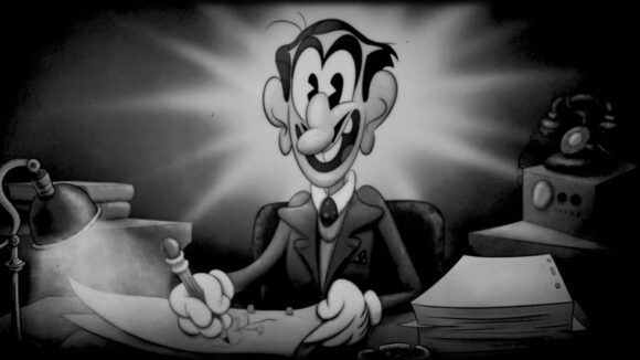
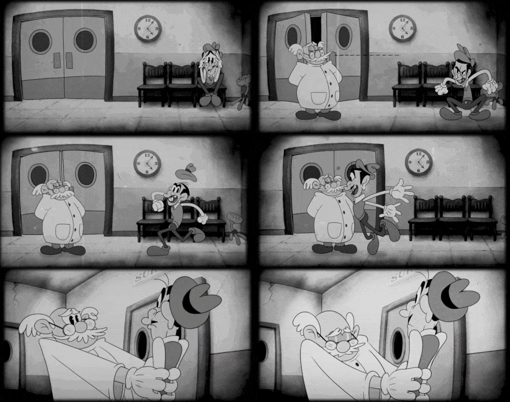
The first part of the “Waldo’s Dream” sequence, which is a riff on a certain famous American animation creator, was done in the classic rubber-hose style of old Mickey Mouse and Fleischer cartoons, while the second half takes on the more lush look of Technicolor animated shorts of the 1940s. The sequence has since screened as a standalone short at animation festivals including Annecy, Hiroshima, and Anima Mundi, and can be viewed below:
Cartoon Brew spoke to Urbina to learn about the techniques that artists at Venturia used to achieve an authentic 1920s feel for the sequence:
Art direction
Venturia Animation: “No matter how authentic the actual character animation process ends up being, the character and background design has to follow the rules of the era and ignore design trends that came afterward (for example stylized/cubist design), otherwise the result will be seen as contemporary. It might result in a very cool-looking style, but certainly not authentic. Our background painter Karlos Velásquez really nailed that painterly look using digital tools to mimic the watercolor backgrounds of the era.”
Animation
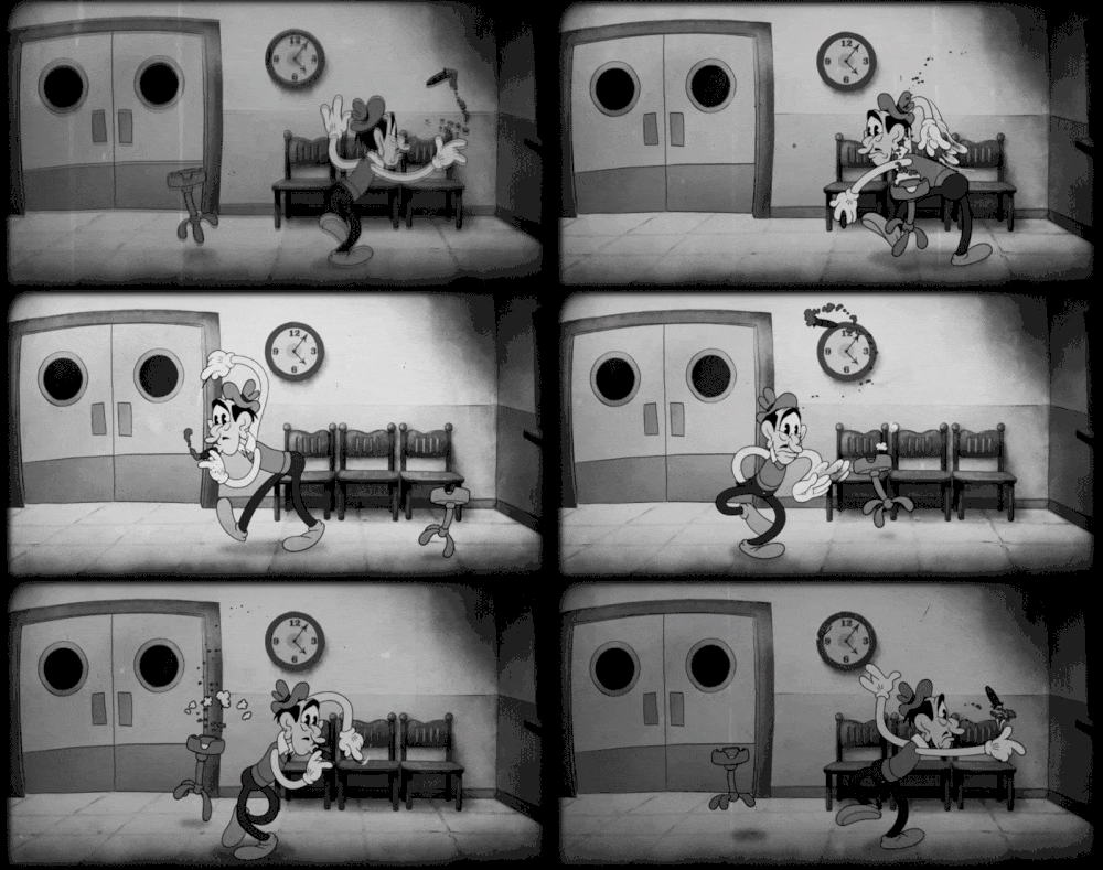
Venturia Animation: “The way to achieve the rubber-hose animation style is not just by hand-drawing the characters in funny vintage proportions (that comes from the design) but also in the way the animation arcs are planned and especially in doing that combination of quirky timing and excessive looping. Back in the day, all of the characters appearing in frame would move at all times (in fear that audiences would be bored by the lack of movement!), so in order to avoid spending too much money on each shot, they used the same animation over and over by doing loops. Richard Manuel Plata who served as animation supervisor is a master at doing that style. Plata and his assistant Meliza Mayor made a lot of intentional ink-and-paint mistakes on some of the shots to make it even more authentic.”
Compositing
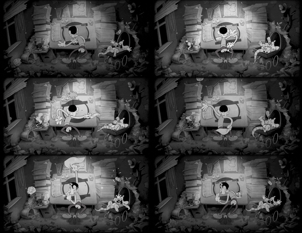
Venturia Animation: “Last but not least there is compositing. Juan Fermín Mulett, who was in charge of doing all the compositing for the piece, studied old cartoons very closely. One could almost say he spent most of his work days on the project playing shorts like the Mickey Mouse film The Mad Doctor (1933) on one screen while running After Effects on the other. He added lots of intentional errors, scratches, and overexposure to the piece. And the key element: before inking-and-painting was done through a computer, cartoon characters used to be physical sheets of celluloid over a background painted on a board, which means the characters projected a shadow on top of the background. By adding this detail intentionally on most of the shots, the authentic look was completed.”
Credits
A Creative Service by Venturia Animation Studios for Fábula, Lunes Cine TV
Sequence director: Juan M. Urbina
Line producer: Julián Urbina
Backgrounds: Carlos Velásquez
Compositing: Juan Fermín Mulett
Animation supervisor: Richard Manuel Plata
Animation: Joshua Schneider, José Gregorio Moreno, Camilo Ayala Nieto, Michael Abarca, Richard Manuel Plata
Animation assistant: Laura Meliza Mayor
Sound design for director’s cut: Carlos Reyes Serrano
Animatic: José Navarro

.png)