Go Way Behind The Scenes Of ‘Star Wars: Visions’ Volume 2 With Some Never-Before-Seen Artwork
Disney+’s anthology series Star Wars: Visions returned today with its second volume of animated shorts produced by leading independent animation studios from around the world.
We caught up with the filmmakers behind five of the shorts and asked them each the same two questions. What we got back was far more than we’d hoped for, so we’ll spare you a wordy intro and let the filmmakers do the talking. For more details about the series, you can check out our previous coverage here.
Julien Chheng – Studio La Cachette, Episode: “The Spy Dancer”
Cartoon Brew: How did you balance bringing your own artistic flare to the SW universe while also keeping the aesthetic recognizable? How much freedom did you have in the design?
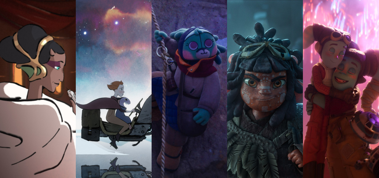
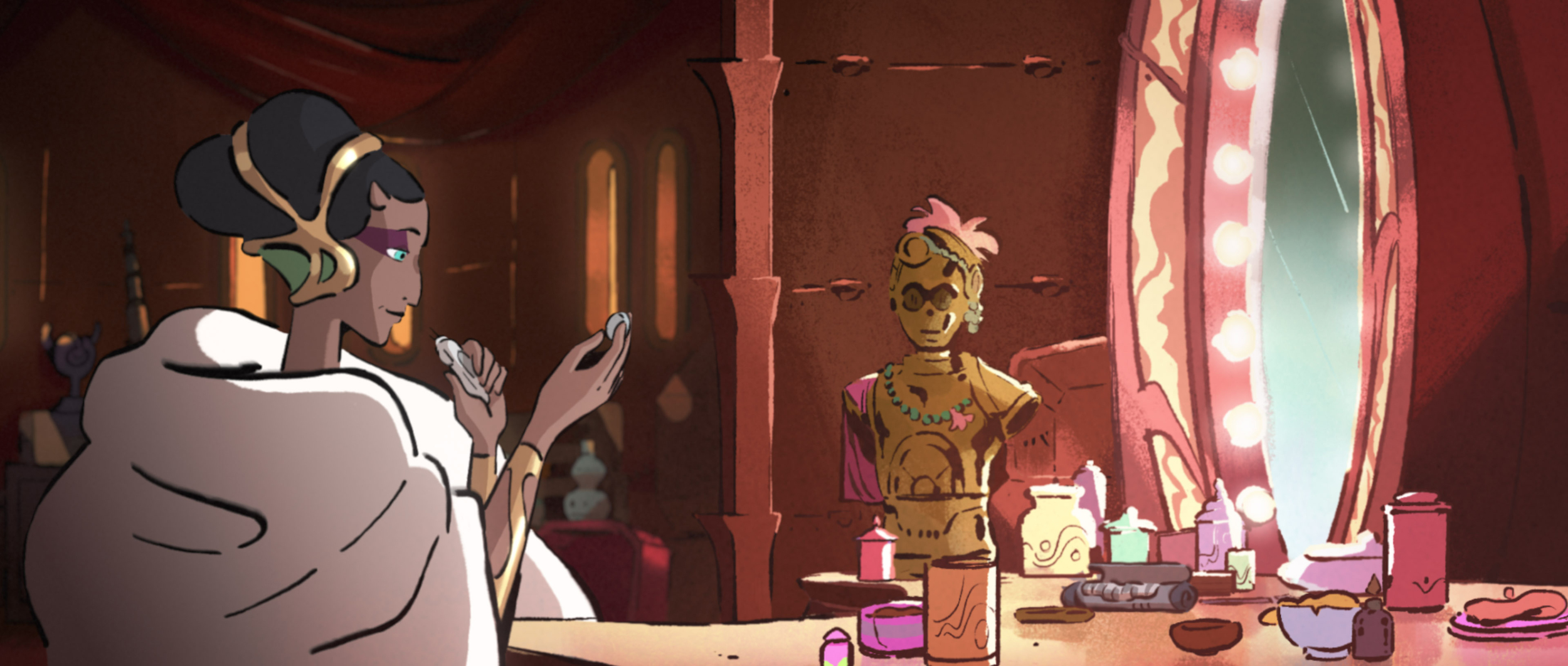
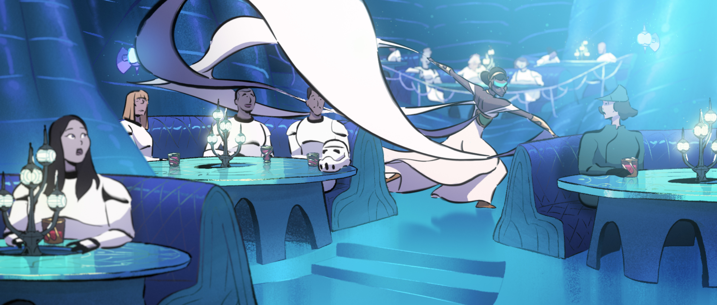
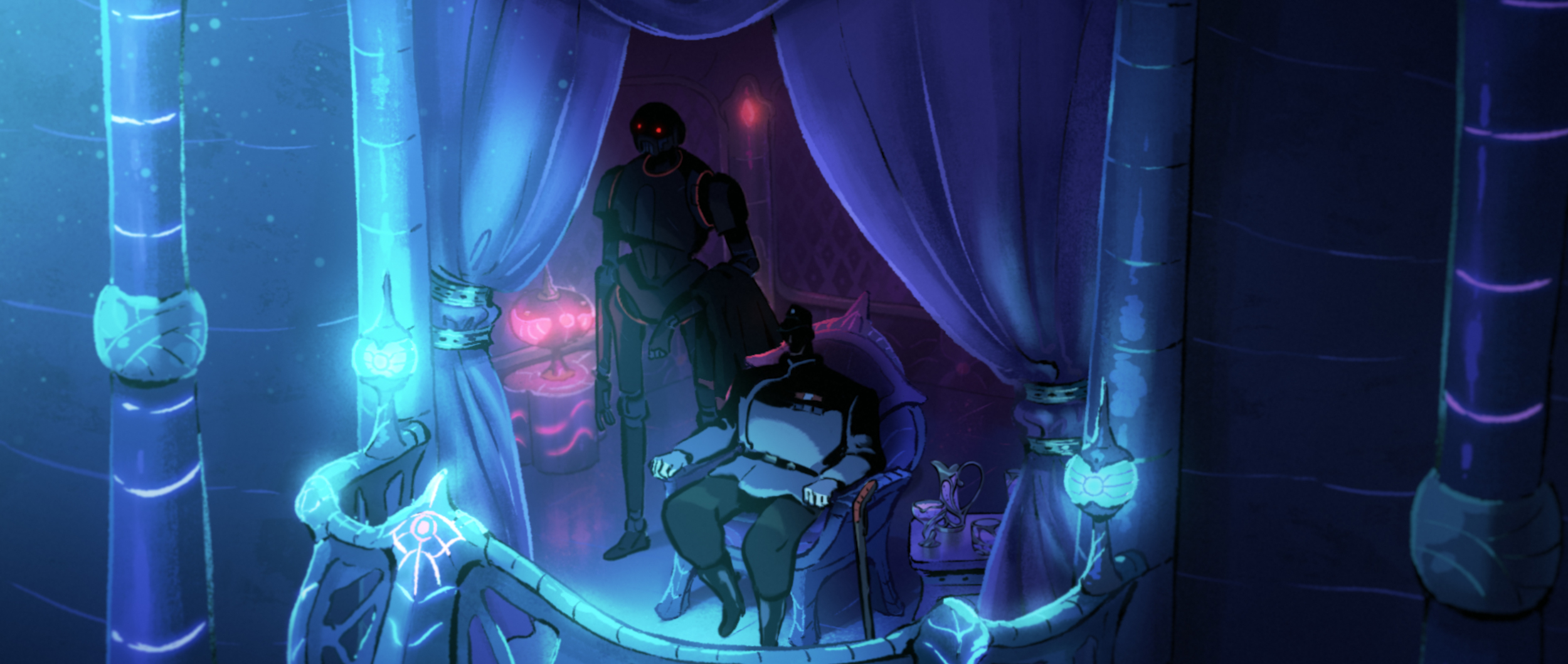
The Spy Dancer is a rebellion story where the hero dances in a very French-inspired cabaret. So, we kind of blended an atmosphere in the mood of Rogue One or Andor, with a more glamourous and colorful setup you can find in French cabaret such as Le Moulin Rouge. We did our research for the type of props, costumes, vehicles to design, as well as the lighting and color schemes of certain moments we like in the films. We implemented the menace of the Destroyer above the Cabaret because it set up the Star Wars identity right away and created different body types and faces for the stormtroopers and officers attending the show to make this moment more human and reliable, more realistic in a way.
We designed a whole new planet for the film, with this city and Cabaret very much inspired by the occupied Parisian Montmartre district, where during World War II you could find many cabarets hosting shows for the Nazi troupes. As we came up with this dancer idea, we invented a way for her to perform with her dress as if it was an ancestral martial art, that looks both beautiful and terrifying. We looked at fashion shows in France where the dresses look like they come from another galaxy!
We were very free to go any art direction we wanted for this short, so it was very challenging and satisfying to explore new ideas, far from the Force and the lightsaber fights in our case, and design the characters, props, and locations with our style, while always making sure our artistic choices would support the story.
CB: Despite being set a long time ago in a galaxy far, far away, each of these shorts feels uniquely local to the studios that made them. How much influence did you have on the narrative, and was it your intention to tell a specifically French story?
It was really a Carte Blanche from Lucasfilm, so we were free to pitch any story we wanted. It was clear that with studios from different countries involved in this season, the excitement would come from the type of stories all these studios with very specific and rich cultural backgrounds could bring to Star Wars. I wanted to tell the intimate story of a “side” character, a dancer like Jabba’s slave dancers or a performer you would find in the background of the cantina scenes in the films.
From the start, we also wanted our hero to be torn between taking action against the Empire and kneeling down in order to protect what is left of her family. And we started to look into the occupation in France, when real performers like Mata Hari or Josephine Baker used to be spies during the war, how these intrigues were set in romantic Cabarets in Paris, with the performers wearing very stylish outfits among groups of soldiers in their uniform. We felt we could create a story based on that which could crystallize interesting ingredients for an emotional Star Wars story.
Paul Young – Cartoon Saloon, Episode: “Screecher’s Reach”
CB: How did you balance bringing your own artistic flare to the SW universe while also keeping the aesthetic recognizable? How much freedom did you have in the design?
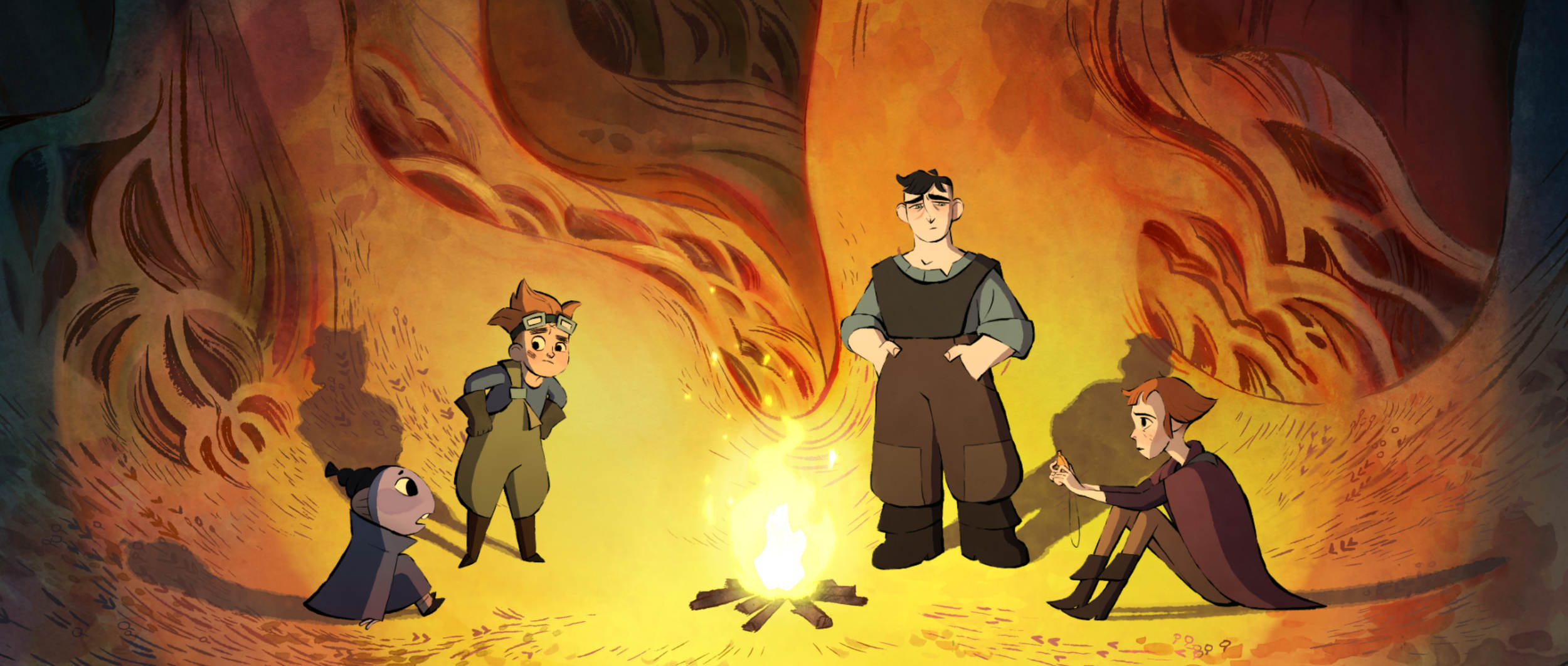
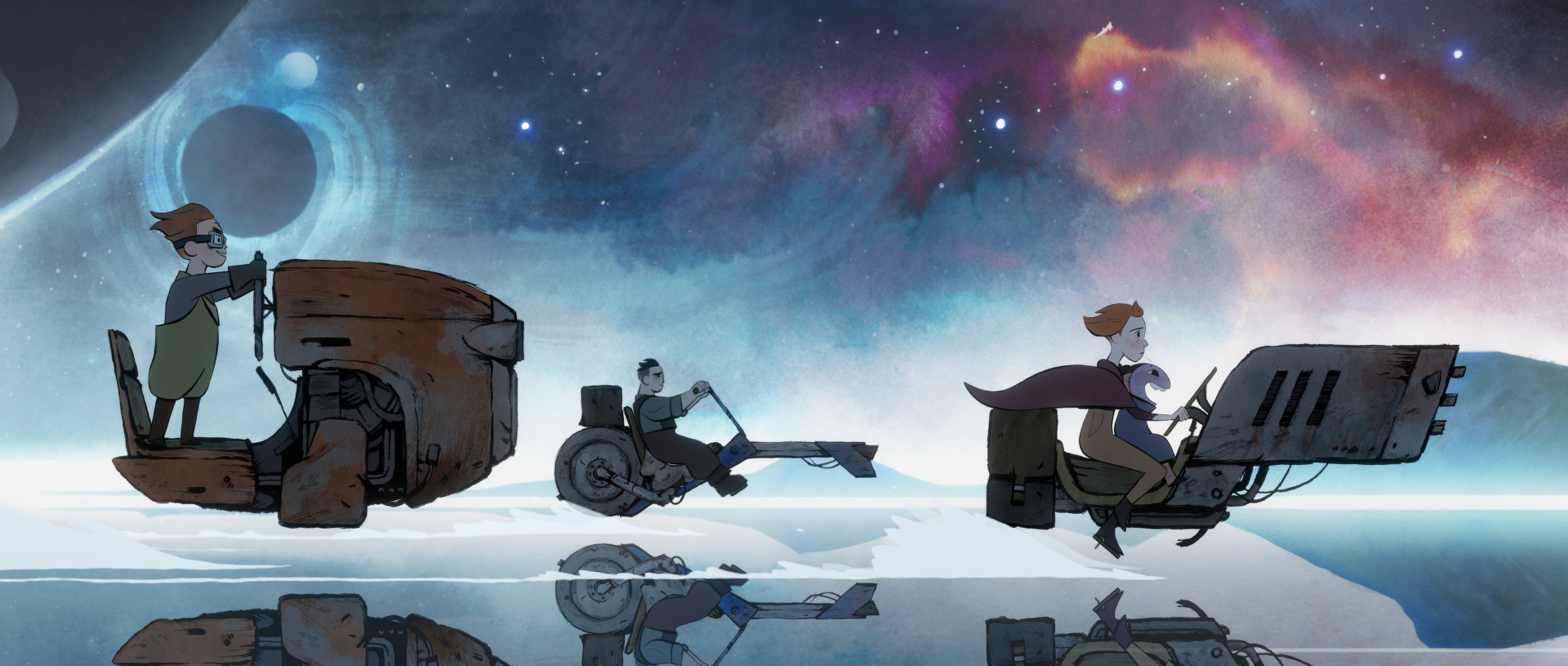
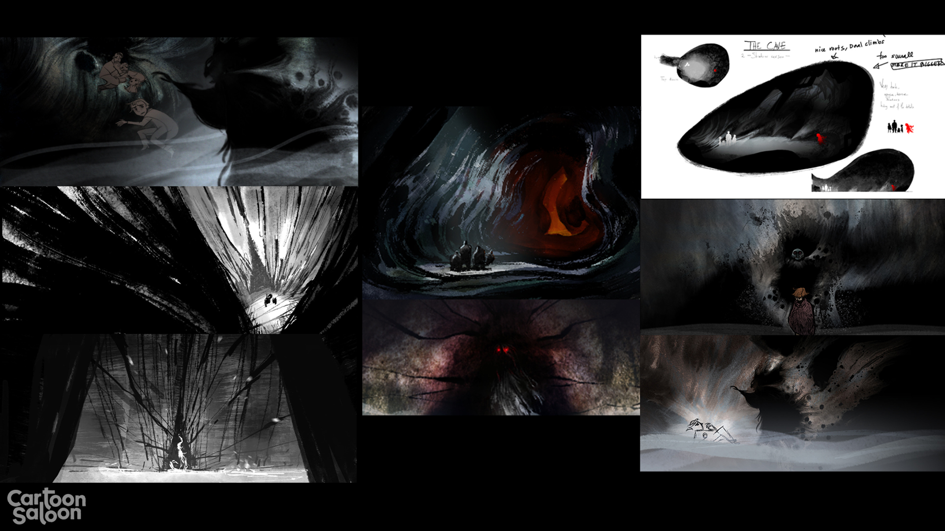
I was bringing the artistic flare of quite a few people in here as I was very lucky to be working with an amazing Cartoon Saloon team who have worked with us on a number of our past projects. Before Lucasfilm called about making this short, I had been trying to imagine what a Cartoon Saloon sci-fi film might look like. I’m quite a fan of Ralph Steadman and Ronald Searle, so I was keen to lean in on a pen and ink style and use the expressive nature of Ink to splash across the screen to help us tell our story. Almu Redondo, who art directed this film, did an incredible job achieving that with the team. Like other Cartoon Saloon films and series, we like to lean heavily on what hand-drawn animation can do with color, line, and shape to help tell the story visually.
Lucasfilm gave us a very wide berth on how we chose to visualize the film. I think that is very much the point of the Visions series, to go to studios and let them loose on the universe and see what they could come up with. Which is very generous!
CB: Despite being set a long time ago in a galaxy far, far away, each of these shorts feels uniquely local to the studios that made them. How much influence did you have on the narrative, and was it your intention to tell a specifically Irish story?
This idea didn’t come initially from a particular Irish thematic start, Jason Tammemagi, the producer and co-writer with Will Collins on this short, came up with the idea to try to make a twist on the cave in Empire Strikes Back that Luke Enters to face his fears. What would happen if there was not just a test of the mind in the cave, but something very real? From here we started to think of Irish ghost stories and the banshee, an Irish folklore character who screams in the night to herald the death of a family member.
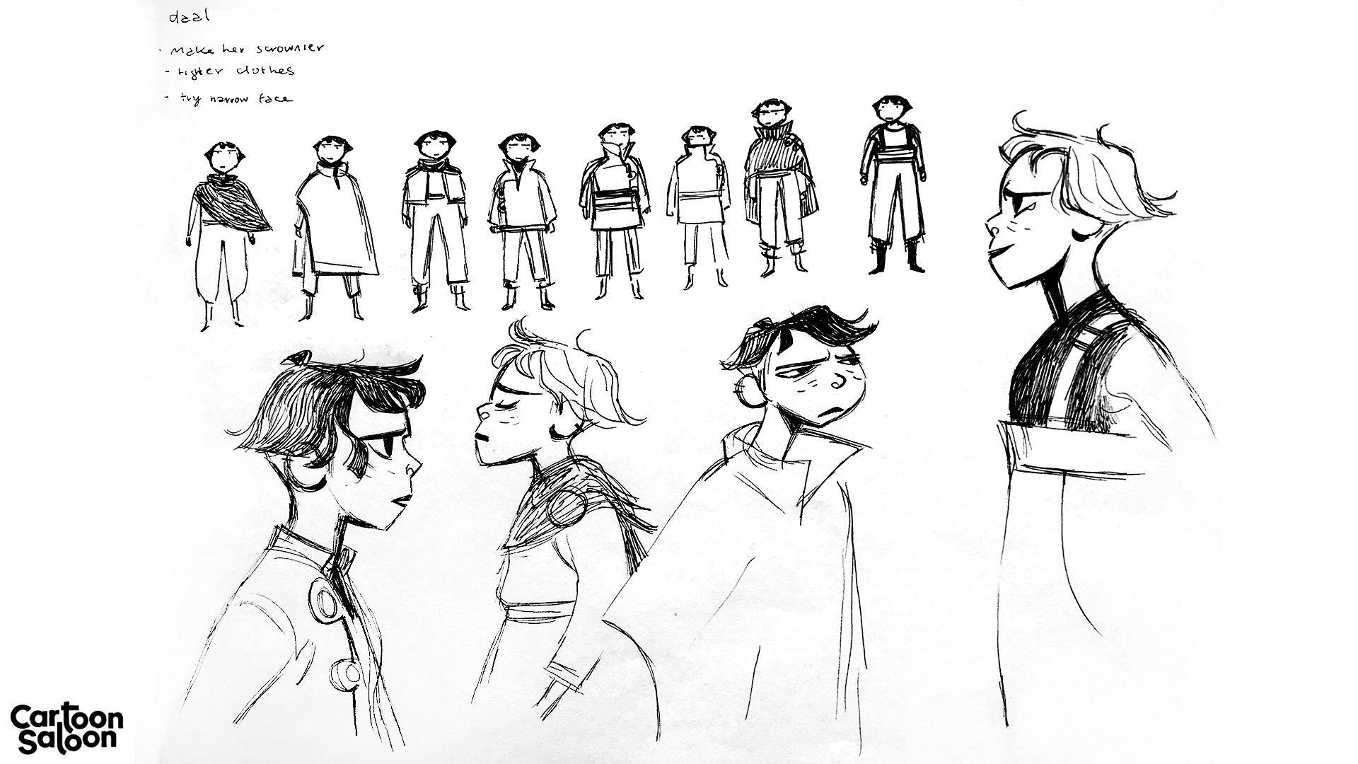
I also began to feel for Daal, what would it be like to keep a secret where you have been offered a ticket away from a life of hardship, but keep it a secret from her friends, perhaps keeping the secret because you feel guilty you get to get away and not them, or because you don’t want to be convinced not to go! I could relate to this with Daal personally.
It’s great in the development of a story and film when the characters you create start to talk to you to tell you what they will do next.
Again as with the visual take on the story, Lucasfilm left us very free to do what we felt the story needed and helped us along the way with very constructive steers to make it feel a little more Star Wars here and there. They, Jacqui, James, Josh, and Flannery, were very much part of the storytelling. It was a really joyous collaboration with all the team at Lucasfilm.
Additional thoughts:
I hope the fans out there enjoy watching the short as much as we enjoyed making it. I hope we brought something new and interesting to the Universe! It was probably one of the best creative years of my life as it was my first time taking on a director position at the studio, having produced for many years on Tomm Moore and Nora Twomey’s films. I want to thank them for encouraging me to direct and to thank the Screecher’s Reach crew. I was surrounded by amazing filmmakers.
Nadie Darries and Daniel Clarke – Triggerfish, Episode: “Aau’s Song”
CB: How did you balance bringing your own artistic flare to the SW universe while also keeping the aesthetic recognizable? How much freedom did you have in the design?
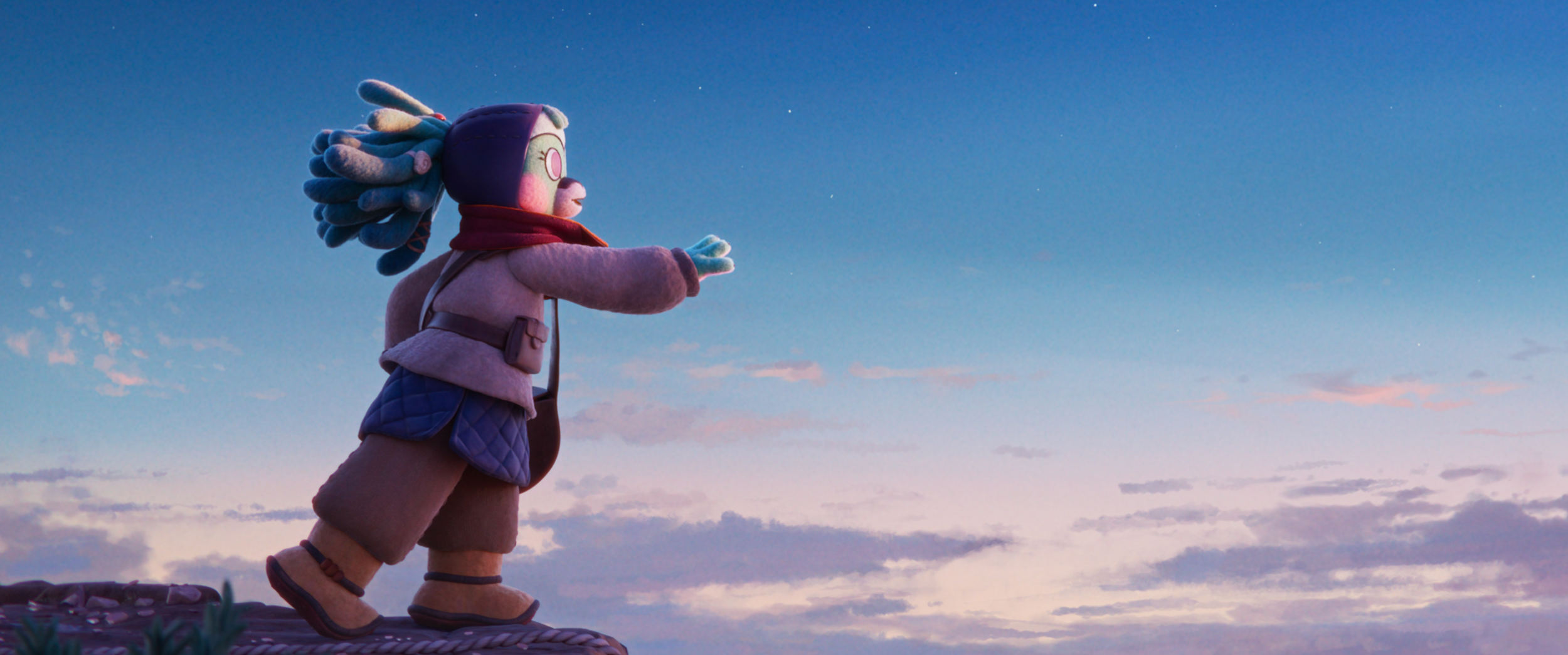
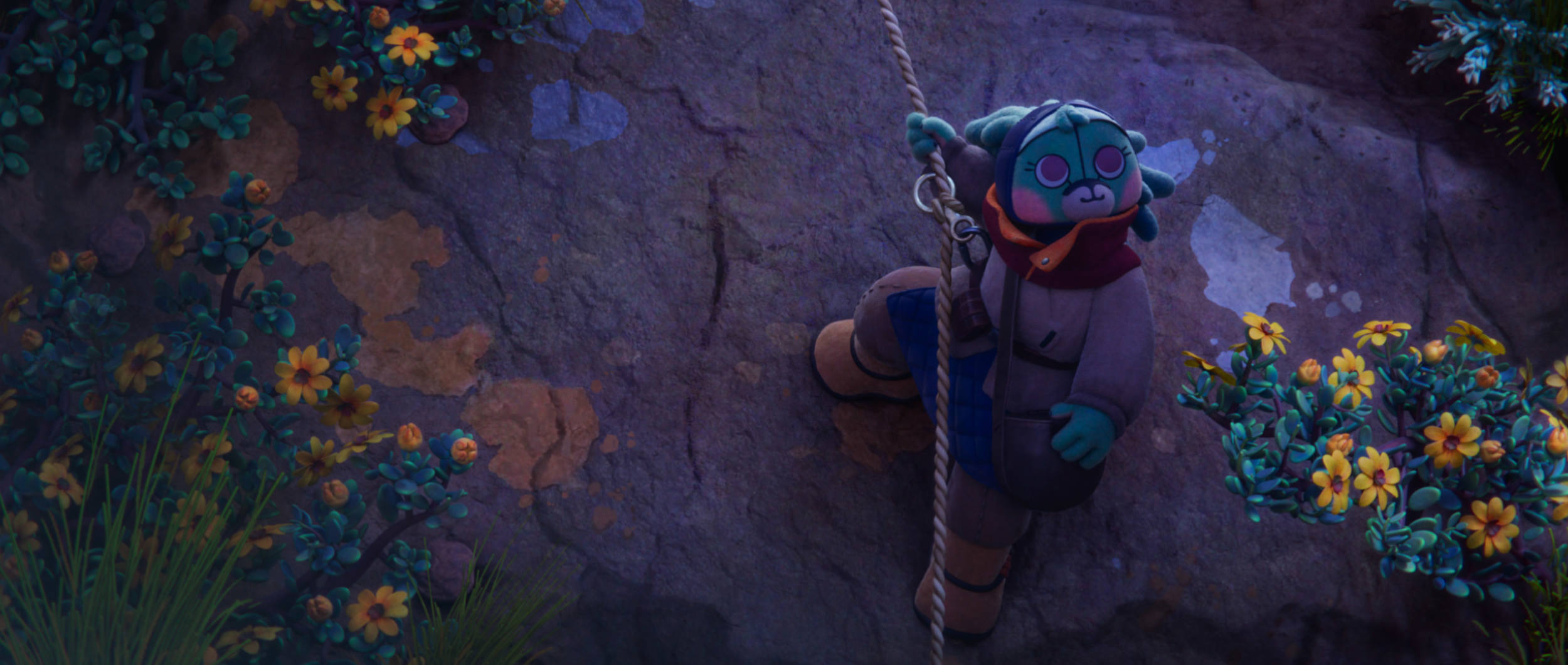
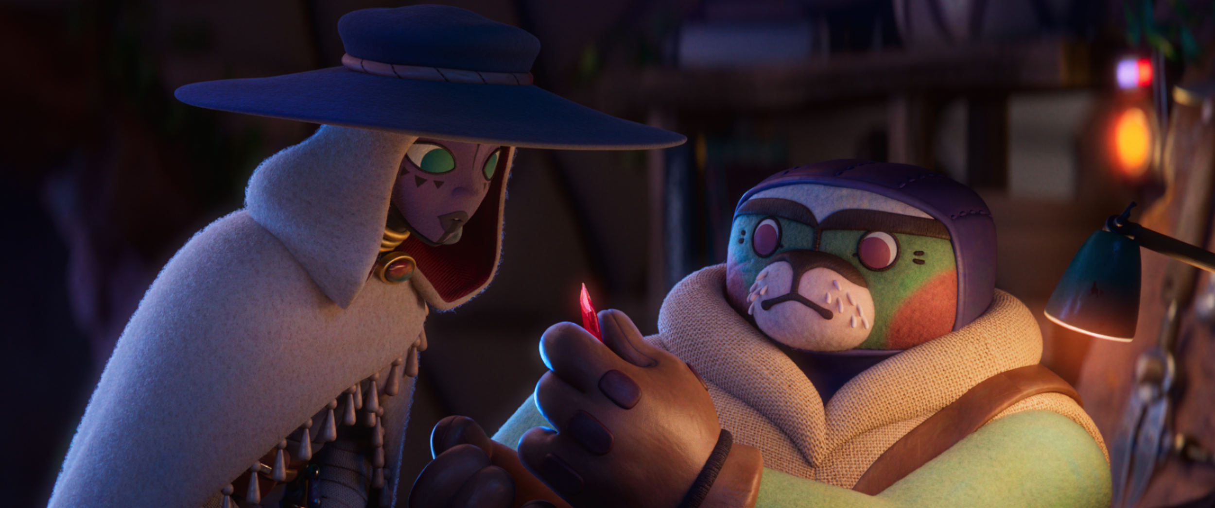
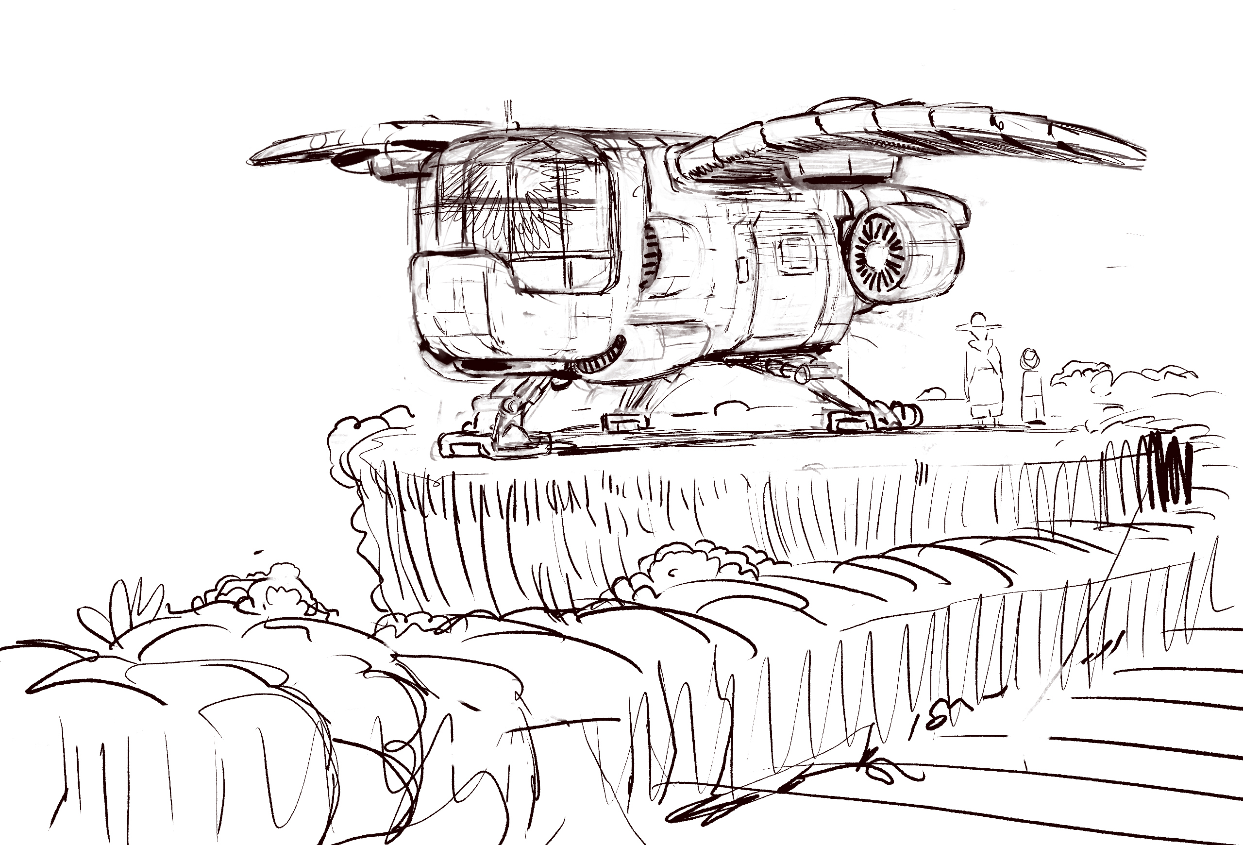
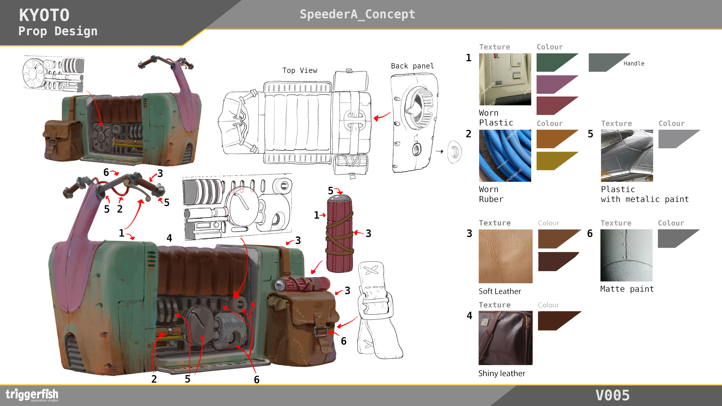
Lucasfilm afforded us a great deal of freedom in the project overall, design included. The aesthetic of Star Wars is hard to define yet very recognizable, and fortunately for us, its original philosophies and influences appealed to our own sensibilities. Things like visible manufacturing elements; bolts, rivets, pipes, etc., lived-in/used and ‘believable’ spaces, and drawing from WW2 era aircraft and vehicles, samurai movies, westerns, and medieval Europe. All of these things make for an extremely fun sandbox in which to play and leave plenty of room for our own ‘take.’
We wanted to bring a landscape to life that drew from our home, Cape Town, with its unique and beautiful fynbos vegetation and dramatic rocky coastline. Whether by choice or technical limitation, the original Star Wars films all take place in environments that are familiar to us; deserts, forests, and swamps. We felt that this was a way to ground the fantastical elements and help make things believable, at the same time giving us a license to include a landscape we feel deeply connected to.
CB: Despite being set a long time ago in a galaxy far, far away, each of these shorts feels uniquely local to the studios that made them. How much influence did you have on the narrative, and was it your intention to tell a specifically South African story?
As mentioned in the previous answer Lucas Film gave us a lot of creative freedom, letting us tell the story that we wanted to tell. For the most part, the story was discovered by us having long meandering conversations, excavating truths from each other’s and our own lives that felt like they would belong in Aau’s Song. We would then board and edit what we had spoken about, slowly shaping things as we went.
We are both South African and wanted to tell a story that was made from things that were true to us and our experiences. South Africa is an extremely diverse place, even the two of us are from very different backgrounds and cultures, and so rather than work from outward in, we started from the ‘inside’ and worked outwards, including what was true to both of us and only what the story required.
Additional thoughts:
Creating Aau’s Song was itself an adventure. Friendships were forged, tears were shed, and creative thresholds were expanded. Aau has left a warm imprint on our hearts, and we hope that her courageous spirit sparks a sense of adventure in people who watch the film. The film is ultimately about a child who feels a sense of purpose in her voice. We believe the human voice to be a powerful and often underestimated tool for connecting with unseen forces, a gateway to the deepest part of ourselves. We hope that Aau’s show of vulnerability and courage plants a seed of inspiration in people’s hearts, encouraging viewers to explore their own voices.
Punkrobot – Gabriel Osorio, Episode: “In the Stars”
CB: How did you balance bringing your own artistic flare to the SW universe while also keeping the aesthetic recognizable? How much freedom did you have in the design?
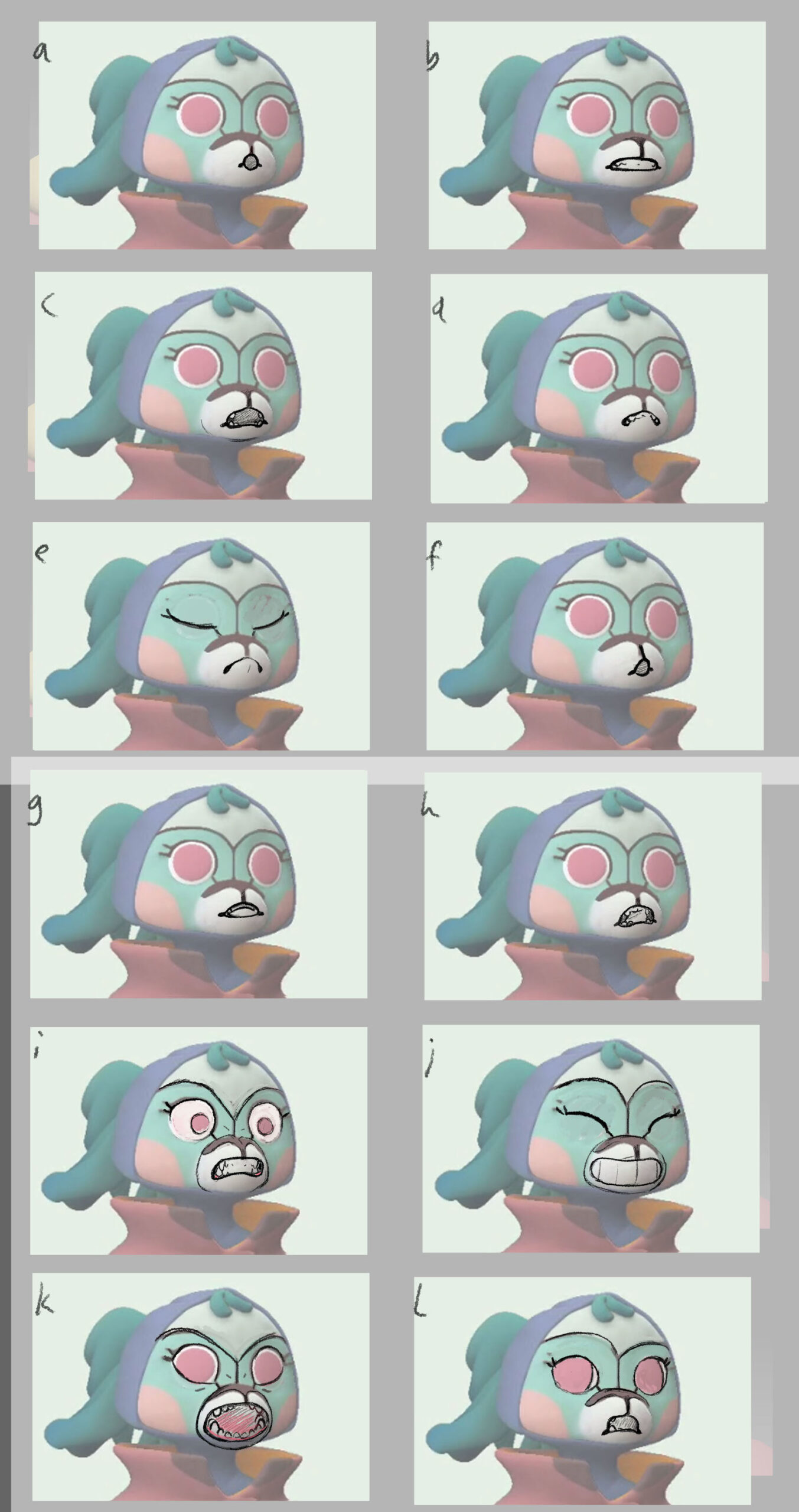
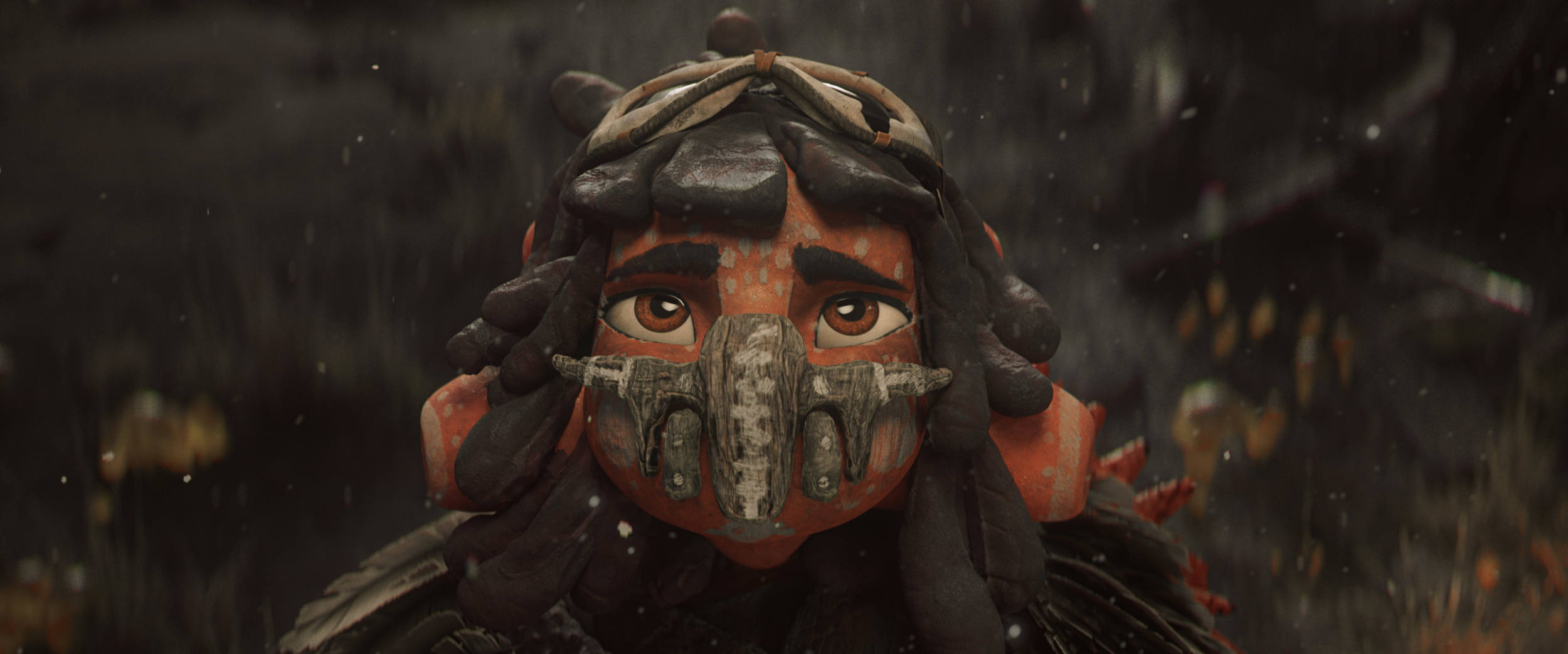
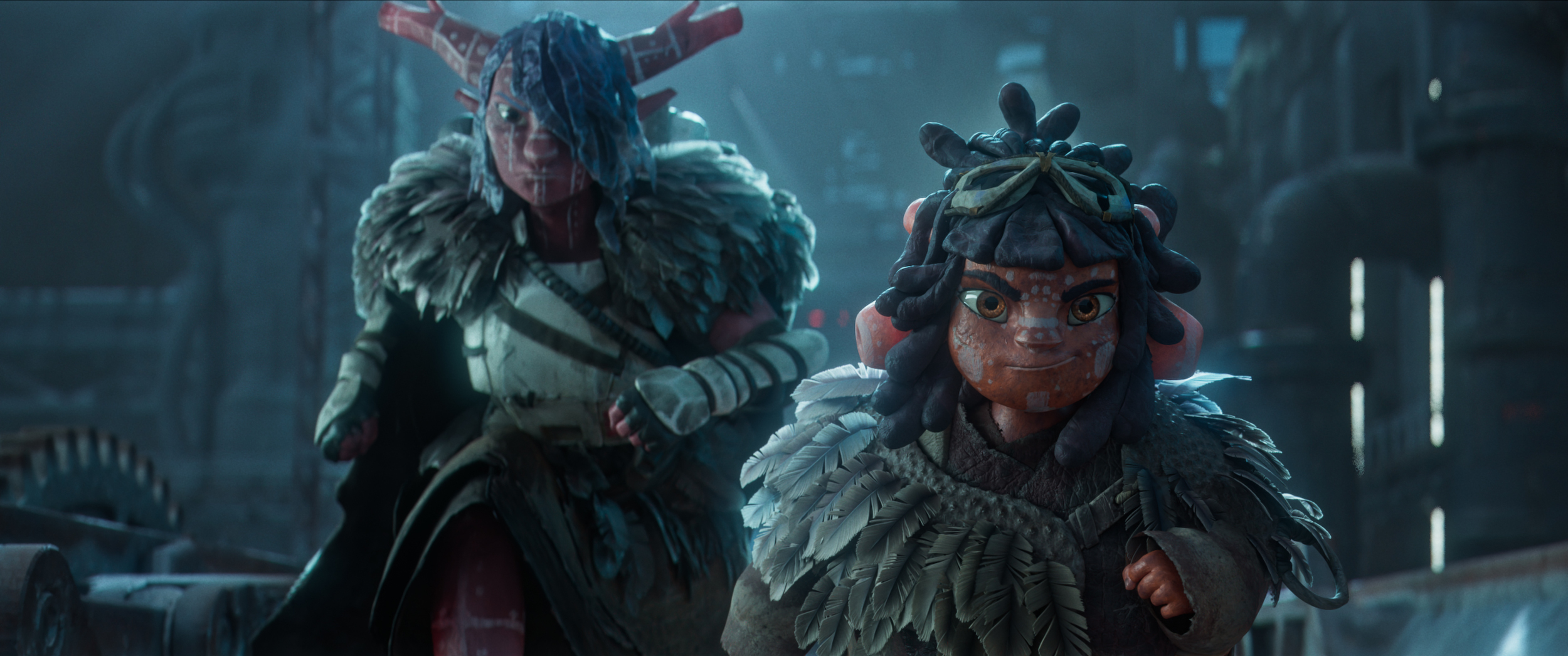
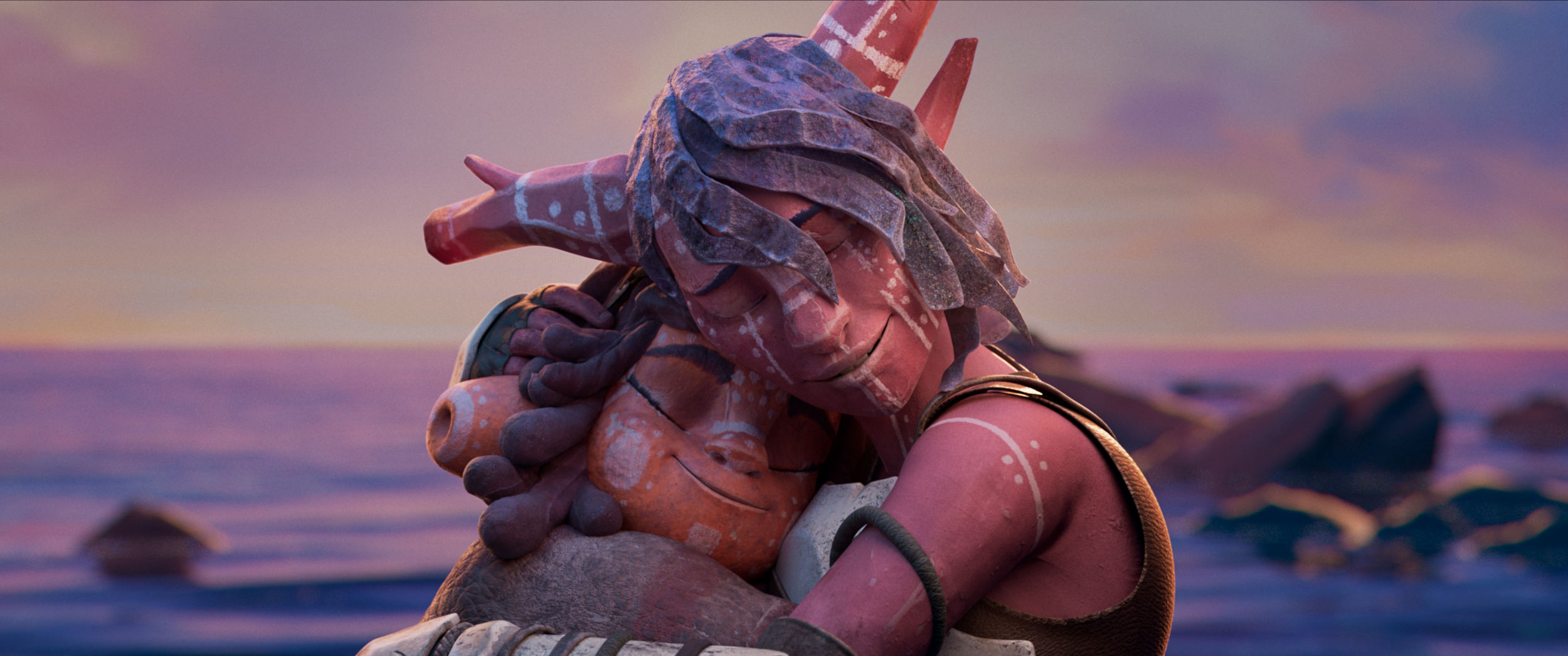
For several years now at Punkrobot, we’ve defined our style as a mix of 3d with elements of other techniques, mainly stop-motion. We first explored this style in the short film Residuos and then in the short film that won us the Oscar, Bear Story. Since then, we’ve continued to develop a technique that allows us to achieve a more detailed, imperfect, and at the same time more human and organic look than the typical 3d cg, which is commonly much more perfect and synthetic. This look arises from the reflection of our own Latin American experience and roots. We live in a society that is the opposite of perfection, but we want to embrace it and see it as a value of humanity and nature, rather than an error to be corrected. In that sense, our goal from the beginning with In the Stars was to create an animation with a lot of texture, a strong atmosphere, and a darker and grittier tone, even a post-apocalyptic look. This idea of creating a post-apocalyptic world, was very important because our main inspiration was the terrible history of colonialism and genocide in Patagonia. We wanted to convey the injustice and loneliness that survivors felt and are still feeling. We were fortunate that the Lucasfilm team supported our proposal from the beginning and gave us complete creative freedom, as long as we didn’t modify recognizable elements or canon of the Star Wars universe. In any case, the freedom they gave us was enormous, and at the same time, they provided us with narrative support to achieve the best possible story, always with respect to the story that we wanted to tell.
CB: Despite being set a long time ago in a galaxy far, far away, each of these shorts feels uniquely local to the studios that made them. How much influence did you have on the narrative, and was it your intention to tell a specifically Chilean story?
For us at Punkrobot Animation Studio, the most important thing in each project is the message delivered by our stories. In that sense, we always try to create stories that contribute to society, that contain positive messages, and that serve to reflect on our own actions and our own history. Following this foundation, from the beginning, we knew that our version of Star Wars had to have an intrinsic connection to the history of the territory that we inhabit. Many of the themes explored in Star Wars, such as imperialism and colonialism, are common in the history of all Latin American countries, and obviously, Chile is no exception. For the same reason, we wanted to inspire the narrative in the tragedy that occurred in Patagonia, in the south of Chile and Argentina. It is a way of honoring the original nations and at the same time making visible the horrors that the Chilean and Argentine states allowed at the beginning of the century. Despite being a terrible story, our goal is always to find hope in each story, to look for that human strength and ability to persist despite all the terrible things that humans can do to themselves. It is that inexhaustible fire of the peoples of the southern world that inspired us and what we wanted to share in our story.
For the whole team, creating this work was a unique experience. Many of the people at Punkrobot are fans of the saga, and having the opportunity to contribute a small part to this universe from Latin America felt like an opportunity we never thought would happen. Personally, in some way, I am fulfilling a childhood dream of being part of the Star Wars universe, but more importantly, I feel tremendously privileged to have the possibility to share with the world, through a metaphor, part of the history of the peoples of southern Patagonia. It is a story that is very important to me and to the people of Latin America. This is our way of talking about the responsibility and debt that the Chilean State still owes to the original nations and at the same time to address other fundamental issues in the current discussion in Chile such as water ownership, which is private in Chile and is in crisis due to climate change and mining.
Magdalena Osinska – Aardman, Episode: “I Am Your Mother”
CB: How did you balance bringing your own artistic flare to the SW universe while also keeping the aesthetic recognizable? How much freedom did you have in the design?
For me, the design stage was one of the best processes of production because there was so much freedom. Of course, it had to feel like Star Wars meets Aardman, but otherwise, I was pretty much left to do what I wanted – especially with the characters. I loved having control over the shapes, colors, and materials.
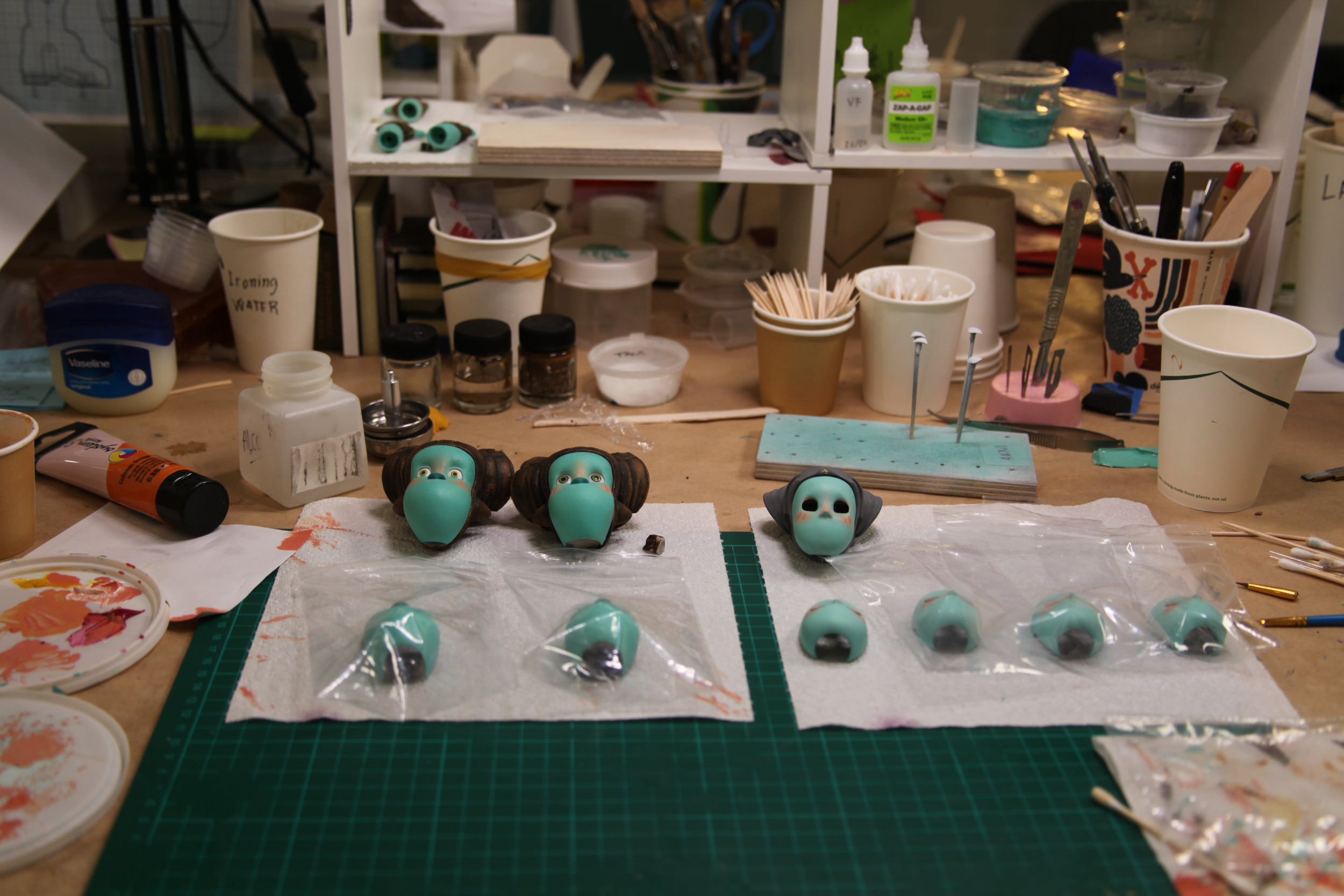
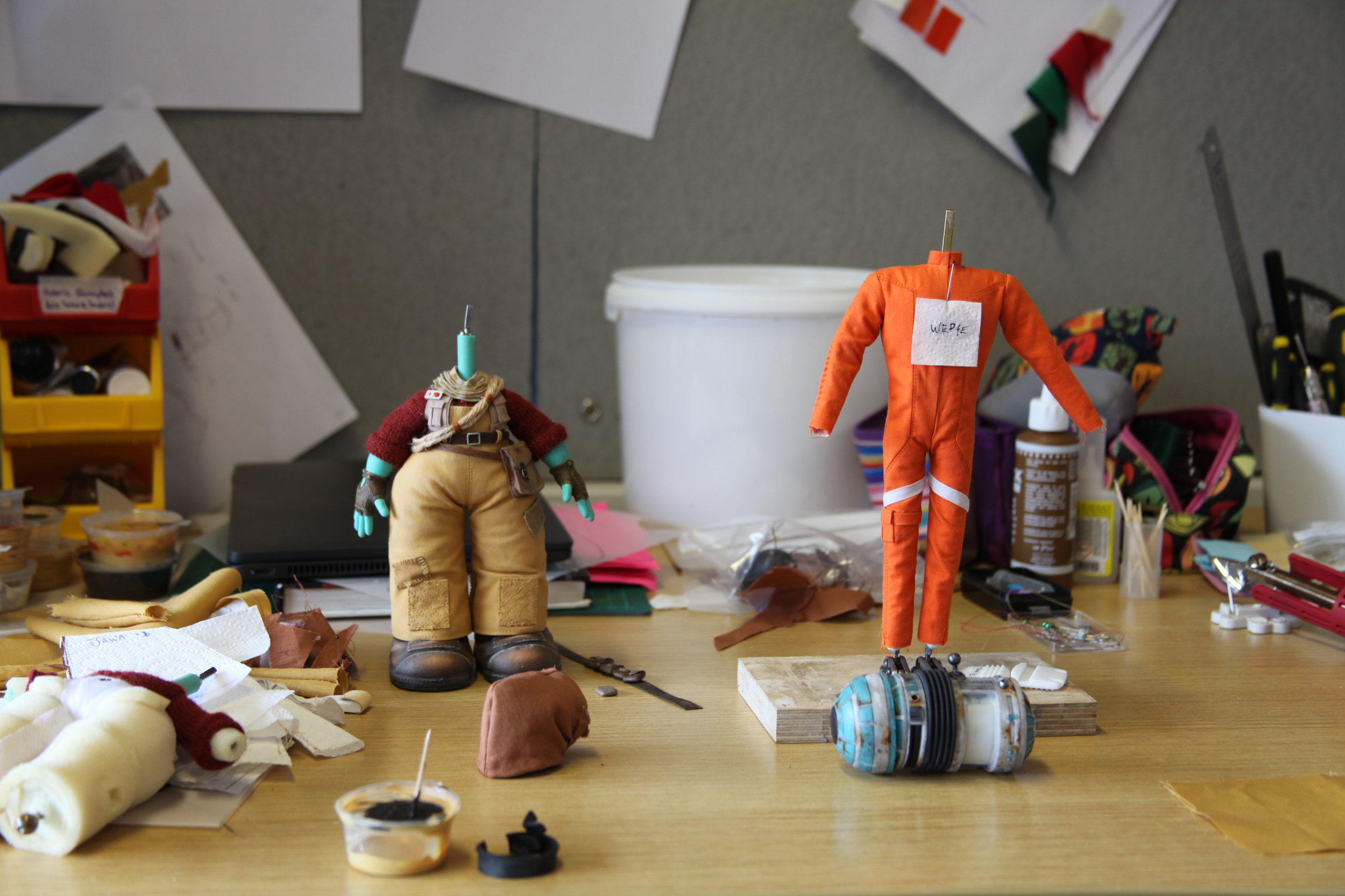
Usually at Aardman the puppets are made from latex or plasticine and tend to have a simpler color tone. But I wanted more detail and depth, and the use of real textiles, inspired by the rich world of textures and textiles from the Star Wars universe.
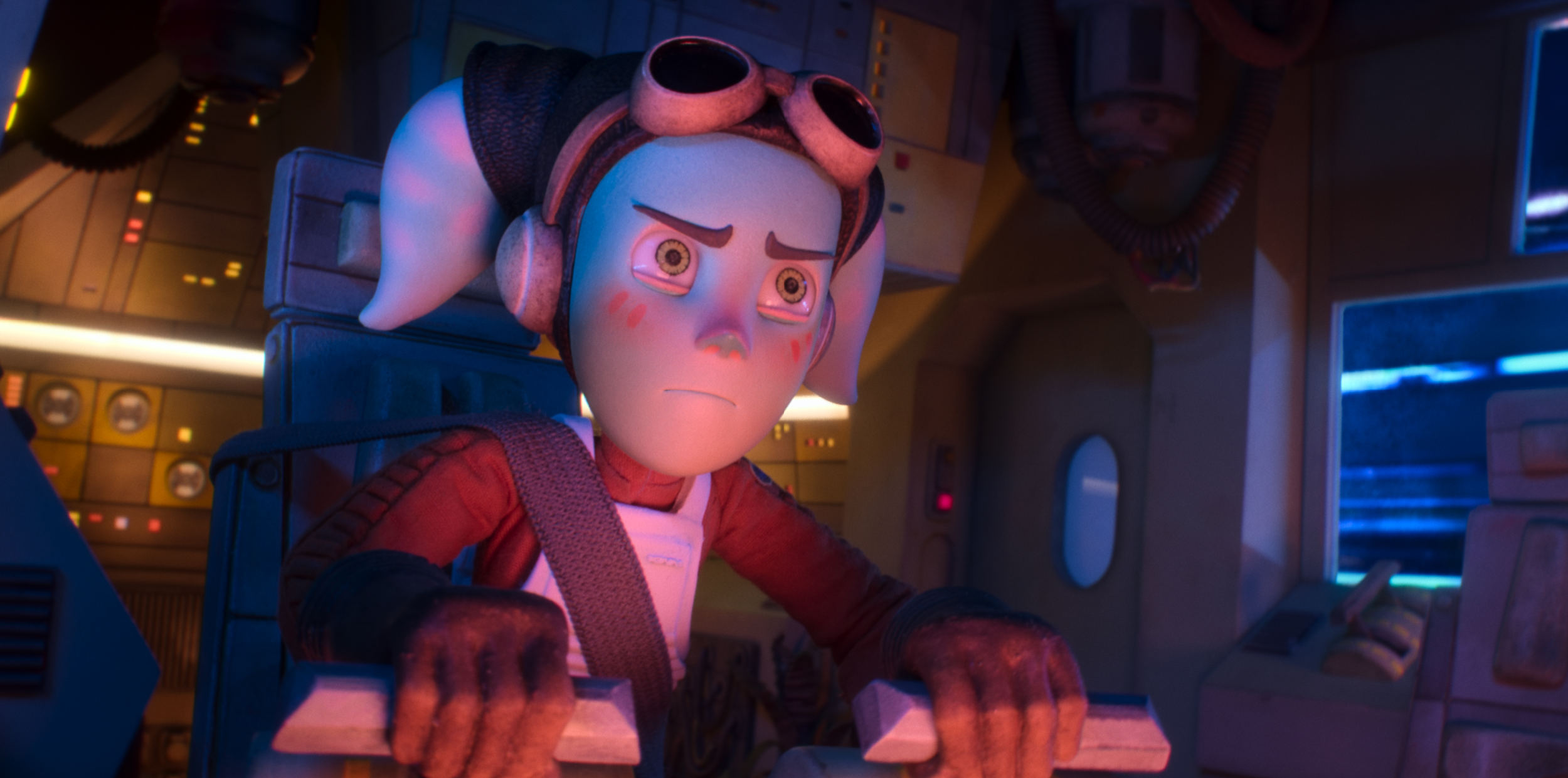
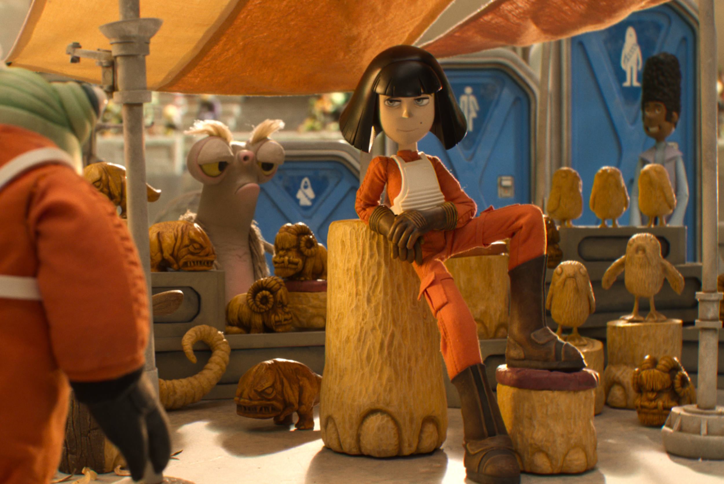
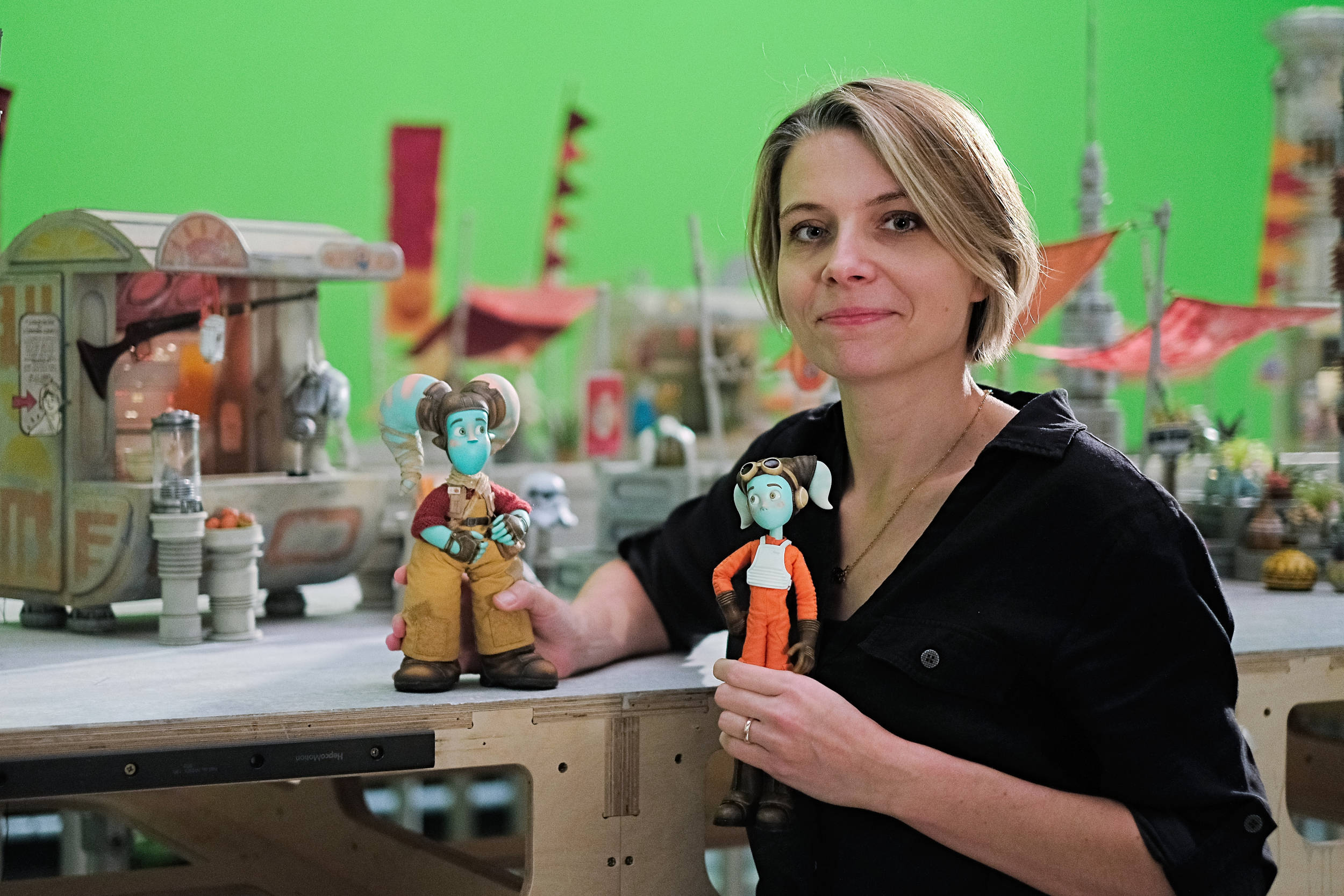
So the puppet team (led by the magnificent Sam Holland) created puppets that used a huge range of materials including resin, silicon, clay, and textiles to find the perfect look I was after. For the ribbed panel on the sleeves of the pilots’ uniforms, we used rice grains in the folds to achieve a look of tiny ribbed pillows. Kalina’s clothes were made to look worn and dirty and greasy. Her trousers for example were painted with latex and then painted to look aged. The faces have different tones of paint, the resin printouts have grainy textures; it was a dream to have the freedom to try out all these things!
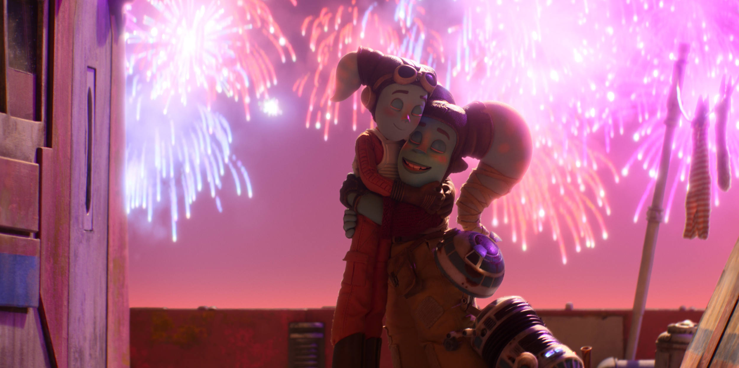
The wonderful Lucasfilm team gave us guidelines on costumes and symbols, etc. For example, the fact there are no buttons or zips in the Star Wars universe, or that the Jawa’s eyes have to be a very specific color. In terms of color, we spent ages choosing the blue for the faces and orange for the suits. We chose a tinted orange for Anni’s suit, yellow and red for Kalina’s, and a turquoise skin color to hint at their water planet heritage. It was about finding colors that made them stand out in the environment.
In fact, I wanted the film as a whole to have a color journey. The film starts in the early morning, goes into midday, then when the race happens goes into the sunset. All the colors work with our main characters’ feelings, especially when they argue and the light turns red. Then when all seems lost, they are literally in a dark tunnel, where then the light is blue and their emotions cool. Then it becomes orange and pink as they start working together again as a team.
We were keen to start on the color key script with Production designer Aurelien Predal very early on (before we even had the script!), so we knew exactly what kind of colors there would be for the characters and their journey.
I was also very lucky to work with incredible character designers Felicie Haymoz (Isle of Dogs, Fantastic Mr. Fox) and Andy Janes (Chicken Run, Shaun the Sheep, Wallace and Gromit). I’d worked with them before, they have quite different styles from each other, but a great understanding of what I wanted and how to bring out personalities and backstories through character design.
I usually base my characters on people I know. Anni and Kalina are based on me and my mum, and Z1, their malfunctioning droid, is based on my childhood “sausage dog” Zuzia who would often lose control of her bladder when excited.
We worked hard on the character shapes to have a strong and recognizable silhouette line-up. We also made sure the designs were funny and charming in typical Aardman fashion, but still with their own unique look. That’s why it doesn’t feel out of place to see Nick Park’s Cooker Robot strolling around in the background, or Gamorreans that look suspiciously like the Shaun the Sheep pigs.
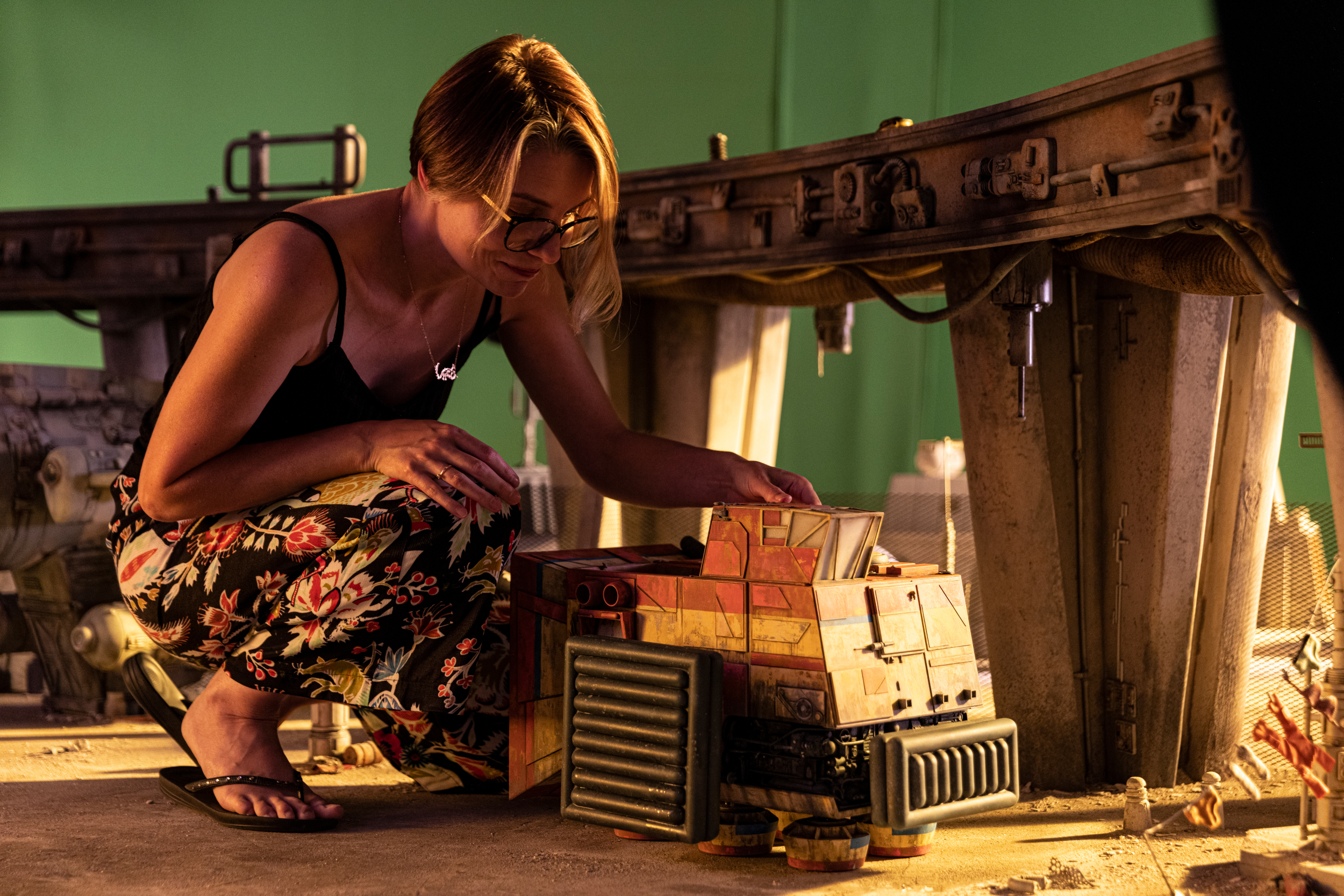
Similarly to the characters, I wanted the sets to tell the story, to have some kind of hidden meaning and depth. The spacetug for example is almost like another character. It is their spaceship but also their home and it used to be Kalina’s work vehicle (a type of space tugboat) before they moved to this new fancy planet Chandrilla. I was inspired by the idea that tugboats are these tiny but powerful boats that lead big ships safely to the harbor. It represents Kalina, who tries to help navigate Anni through life. It’s also intentionally shaped like a mechanical fish, representing Kalina and Anni being fish out of water in this new environment. Even the yellow and reddish color of the spacetug relates to Kalina’s colors.
Aurelien Predal and art director Andy Brown designed and made very diverse sets. The underpass where Anni and Kalina live, the Hanna City Flight Academy and school market, the tunnel, spaceships that take part in the race, and the spacetug where Anni and Kalina live – the cockpit with hundreds of practical lights and a living room/kitchen area.
It is such a rich universe, and I think we came up with a great combination of Star Wars meets Aardman, but with keeping a personal aesthetic too. I also love the fact that after so many years after the original trilogy we are doing a stop-motion Star Wars film because I think that stop motion and Star Wars are really a perfect marriage.
The original trilogy has a lot of stop-motion elements in it by the legendary Phil Tippett. It feels very handmade, tangible, and real and this is what we are doing too, but in miniature.
CB: Despite being set a long time ago in a galaxy far, far away, each of these shorts feels uniquely local to the studios that made them. How much influence did you have on the narrative, and was it your intention to tell a specifically British story?
It was very much the intention to tell a British story because Aardman is famous for creating stories that are very funny, character-driven, and of course… very British.
Aardman gave a lot of filmmakers and writers in the company the opportunity to pitch on this short, and I was thrilled to be shortlisted. In the end, only four of us presented our final pitches to Lucasfilm, and they chose my idea called “I Am Your Mother” – a positive spin on the iconic line from the original trilogy, exploring further the mother-daughter relationship and motherhood in general.
I pitched a ‘fish out of water’ story set in the SW universe based on my personal experiences of being an ‘alien’ – having left Poland to study as an animator and filmmaker here in the U.K. – and more recently becoming a mother. It was the relatable idea of not fitting in and feeling embarrassed of your parents.
I think having a story that felt authentic really helped me win the pitch, and the unique perspective on the “I am your Father” line. I described to them how, as a new mother, I would constantly analyze myself and also think about my own mother. I talked about the times I felt embarrassed, and how I’m sure that cycle will repeat; that one day I will be the one embarrassing my own child, because of my Polish accent or whatever.
I think when we’re younger or teenagers, learning about the world, we don’t often think about the sacrifices our parents have made, or we don’t appreciate them. We forget that most likely we owe our skills and talents to them, that we have inherited that from them.
So, this film is really a love letter to all mums, because I think they are often overlooked in films, but in fact, I think they are the real superheroes.
Lucasfilm loved the heart of the story and the core relationship between the mother-daughter characters, Kalina and Anni. But it wouldn’t be an Aardman story without a villain, so I wanted to come up with one worthy of being in the company of the most evil villains of all Star Wars and Aardman history… Julan and Dorota! Rivaling the likes of Darth Vader and even Feathers McGraw, they are the annoying, competitive, judgmental mother-and-daughter pair that every school in the galaxy has.
In terms of Britishness, my pitch centered around a treasured but slightly absurd British tradition (no, not giant vegetable growing competition)… Sports Day!
For those who aren’t familiar, Sports Day is a day where students at a school, and their parents, compete in various races and silly games (like egg spoon racing). It’s supposed to be good competitive fun, but sometimes the parents can get a bit too competitive. So that was the core comedic premise: “embarrassing parents in a public setting.” And in the Star Wars universe Sports Day is called The Annual Family Race Day and it involves racing your personal spaceship with your parents around the prestigious Pilot Academy.
We also had an incredible British cast – Maxine Peak, Charithra Chandran, Daisy Haggard, Bebe Cave. And of course, reprising his original iconic role as Wedge Antilles, the legendary Scotsman – Denis Lawson.
Additional thoughts:
I have talked about the visual side and inspiration of “I am Your Mother”, but wanted to bring some attention to the music which played a very important part too. Composed by Jean-Marc Petsas, the music had the challenging task to bring together the Star Wars and Aardman worlds and help support the narrative.
Our film is only 10 minutes, but it has a lot going on. There are complicated character arcs, comedy, and action scenes, drama and emotion, and a combination of diegetic and non-diegetic music.
In the script, we came up with lots of detail and backstory that is not on the screen, but I think the music actually brings out that detail and background in this esoteric/mystic way well-written music can do.
Jean-Marc came up with the beautiful orchestral score and wrote specific themes for Anni and Kalina, Julan, and Dorota, and the school race. It all helps the narrative and action feel more coherent. He also has a great sense of space and timing which is so important for comedy.
There is a big range of emotion in the cues, and even some Scandinavian-style thrash metal music for Kalina… instant vibes! She is a cool, larger-than-life, in-your-face mum. But Anni finds her a bit embarrassing, and the choice of music just adds to the tension.

.png)
