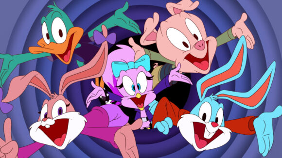
Series Craft: Artists’ Guidelines To Rebooting A 1990s Fan Favorite With ‘Tiny Toons Looniversity’
Amblin Television and Warner Bros. Animation’s highly anticipated reboot, Tiny Toons Looniversity, premieres today on Max and tomorrow on Cartoon Network.
The entire first season will be available on Max immediately, while Cartoon Network will debut a new episode each week.
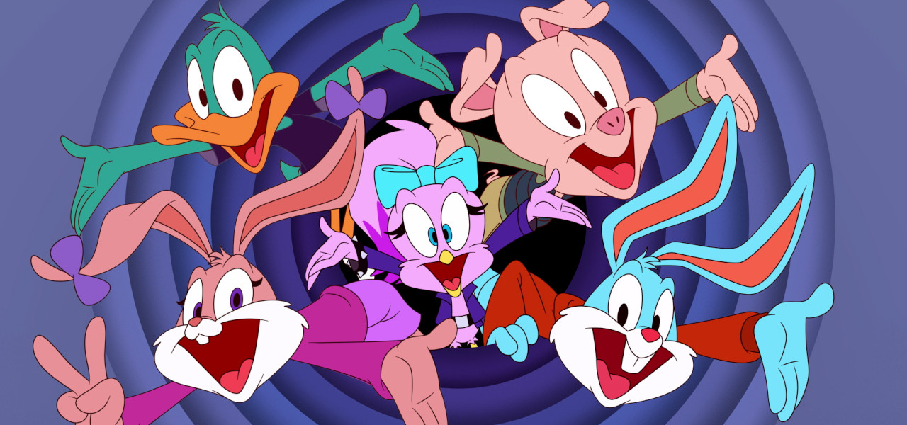
The series introduces a new generation of viewers to popular characters from the 1990-1992 original series Tiny Toons Adventures, including Babs and Buster Bunny, Hamton, and Plucky. But it will look familiar to their parents, who grew up with the crew three decades ago.
Erin Gibson (Attitudes!) and Nate Cash (Adventure Time) are co-showrunners and co-executive producers. Steven Spielberg, who executive produced the original series, returns as executive producer alongside Warner Bros. Animation and Cartoon Network Studios president Sam Register and Amblin Television presidents Justin Falvey and Darryl Frank.
Ahead of the show’s release, Cash shared a bunch of behind the scenes artwork with us and talked us through the guidelines the Looniversity artists followed in rebooting the Tiny Toons for the 21st century.
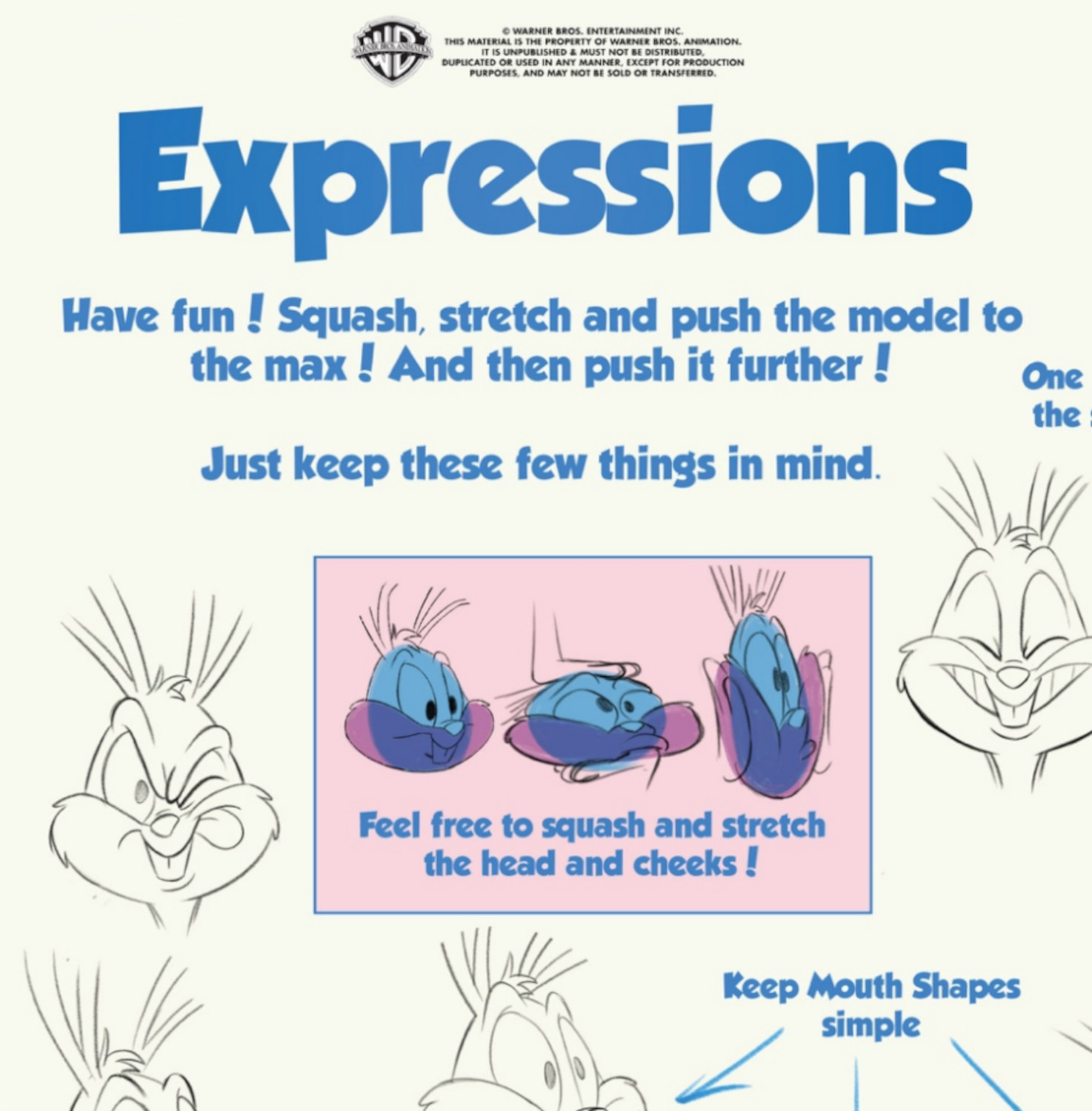
We started with a hardcore return to classic cartooning basics. No cheats. Just understanding volumes and how to wrap details on them with simplicity and appeal…
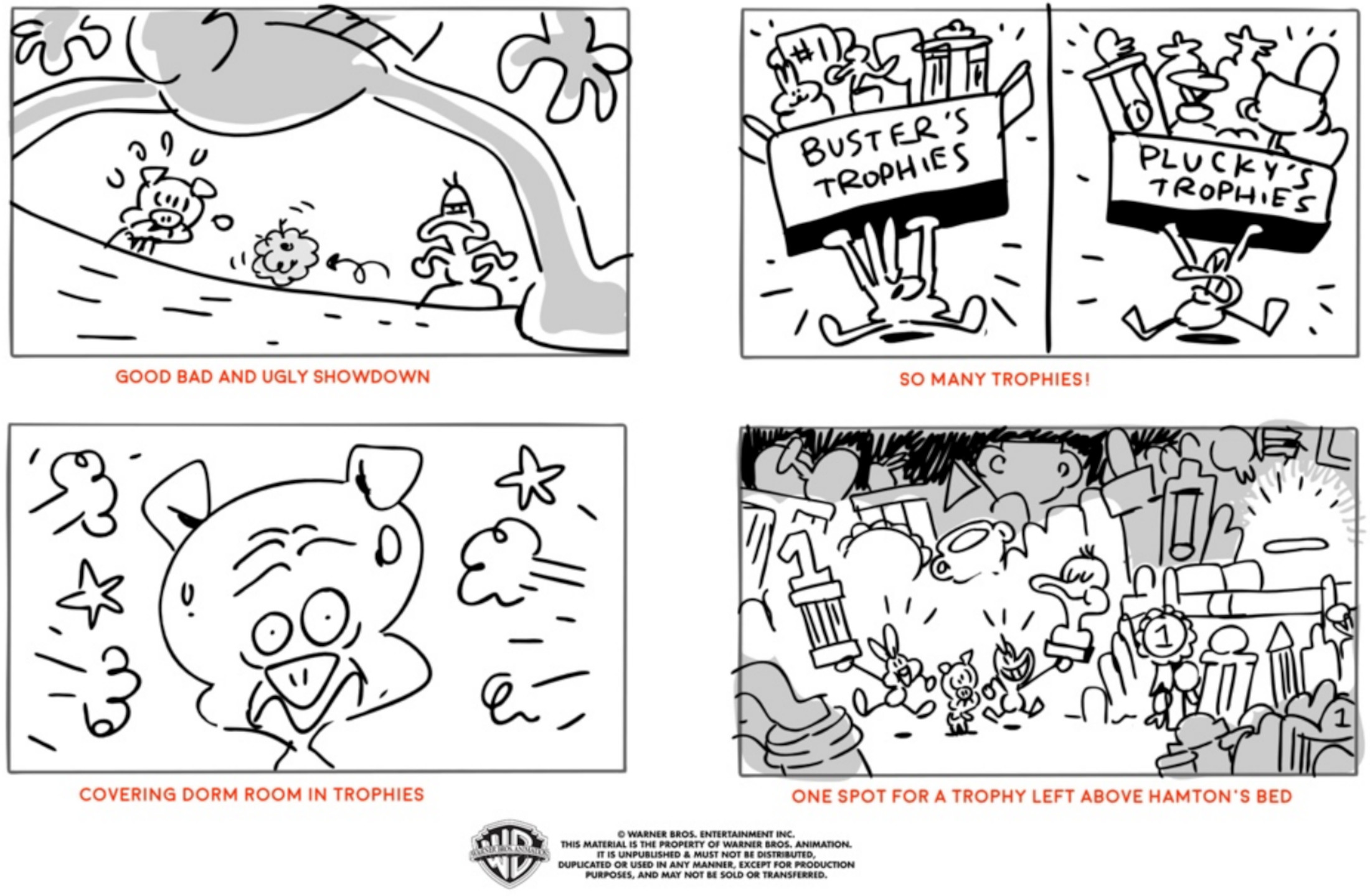
In between script handout and storyboards, there would be an “art pass,” picking out visually dynamic key moments to hit hard and make sure the story is tracking.
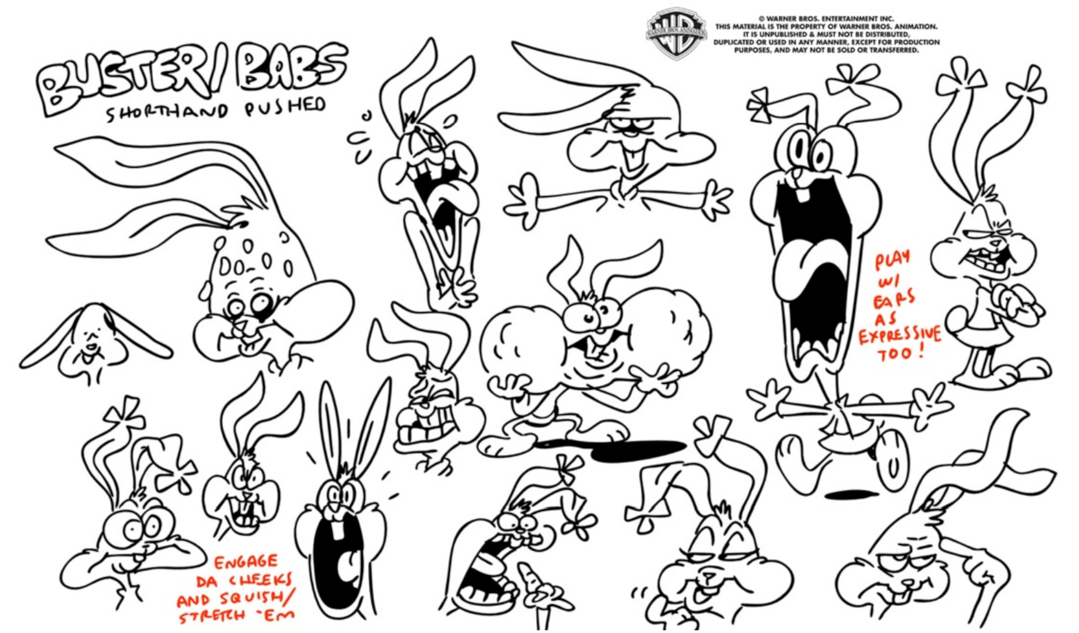
Our storyboard artists were encouraged to “break” the model for specific expressions…
Subtle details in the perspective drawn into the character layouts can add a ton of additional depth to a shot. Leonard Lee (character supervisor) makes some corrections to this shot.
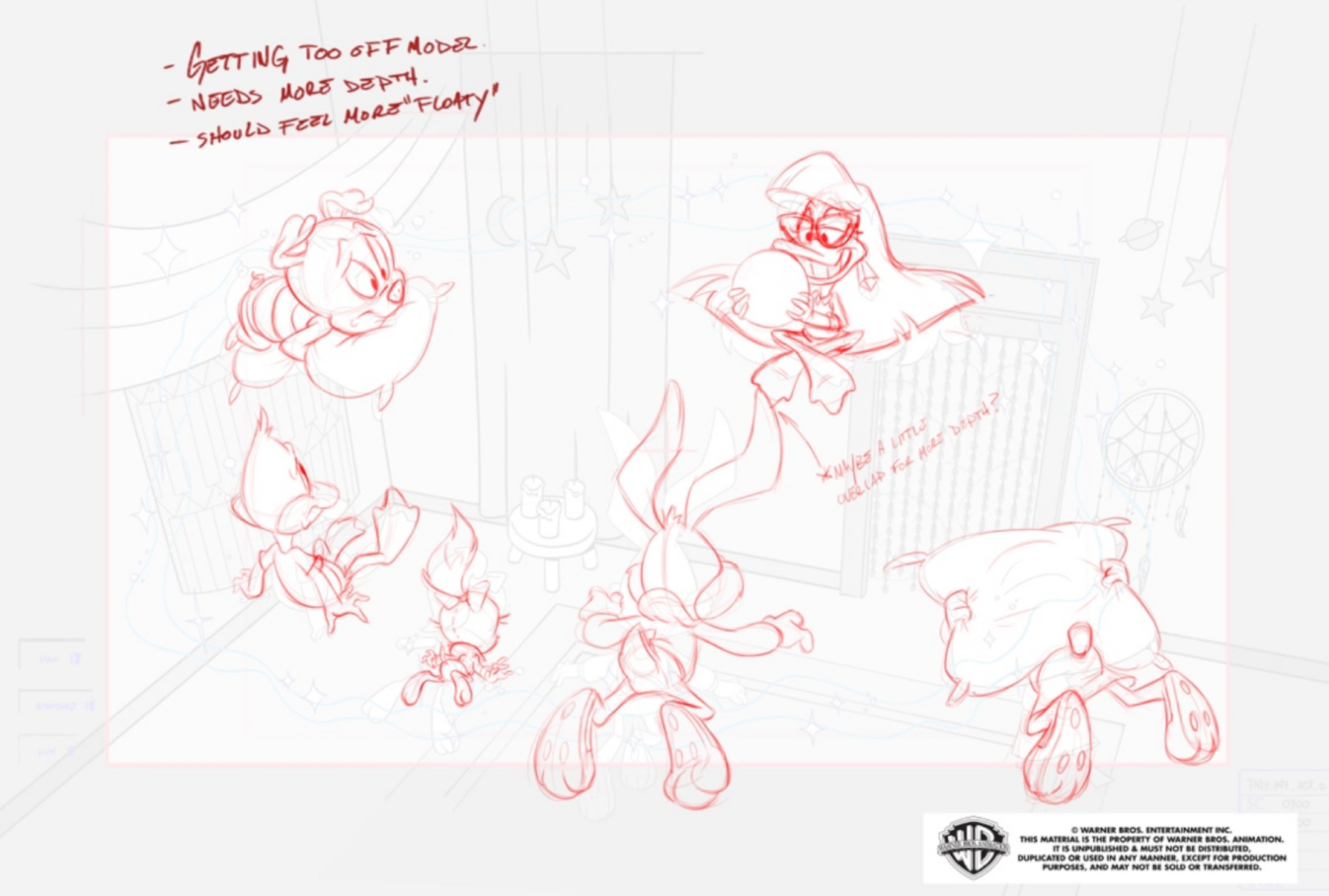
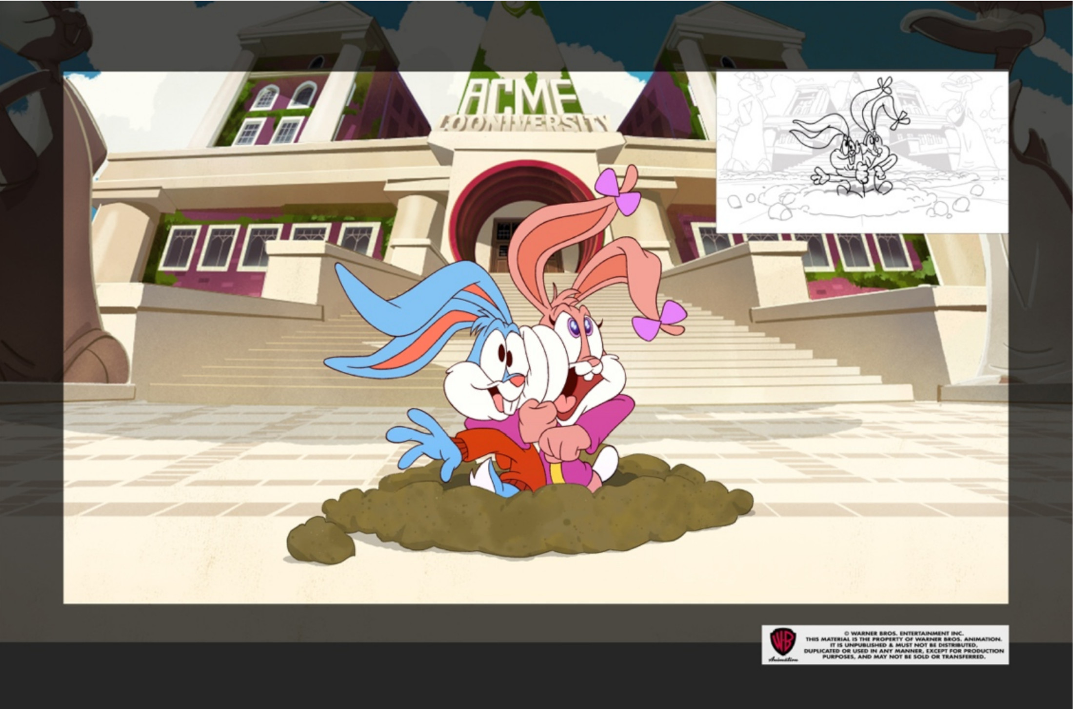
Can’t cheat that old-fashioned cartoon squish!
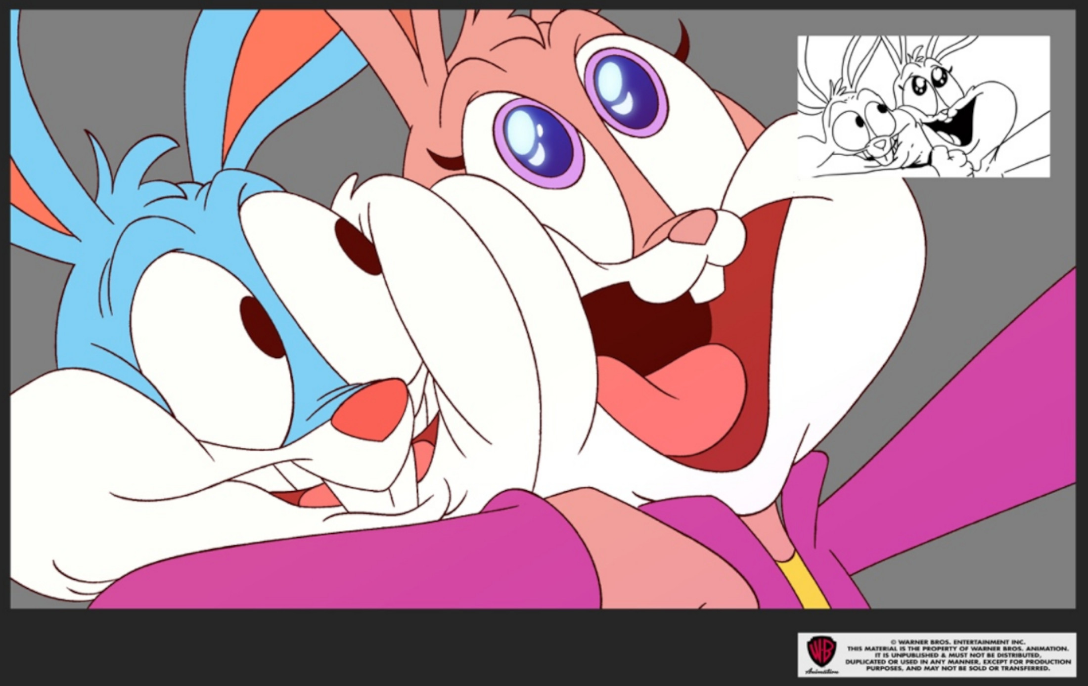
Close-ups of the characters are drawn with more detail and composed specifically for the shot so they don’t feel like just a “zoomed-in” version of the same drawing. (No cheating!)
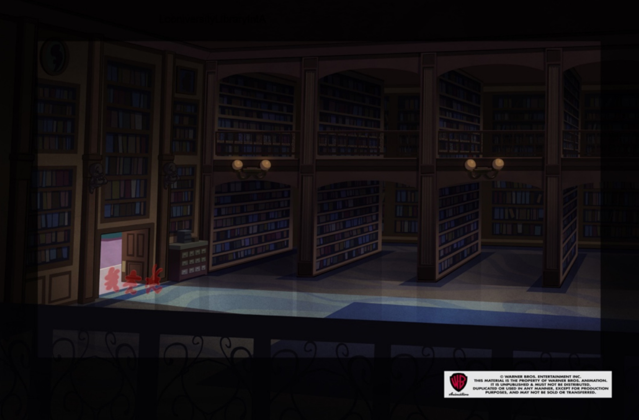
Lots of lighting setups to distinguish different locations on campus. Our color designers worked hard to strike the right balance of immersing the characters into their environment with just the right amount of color “pop.”
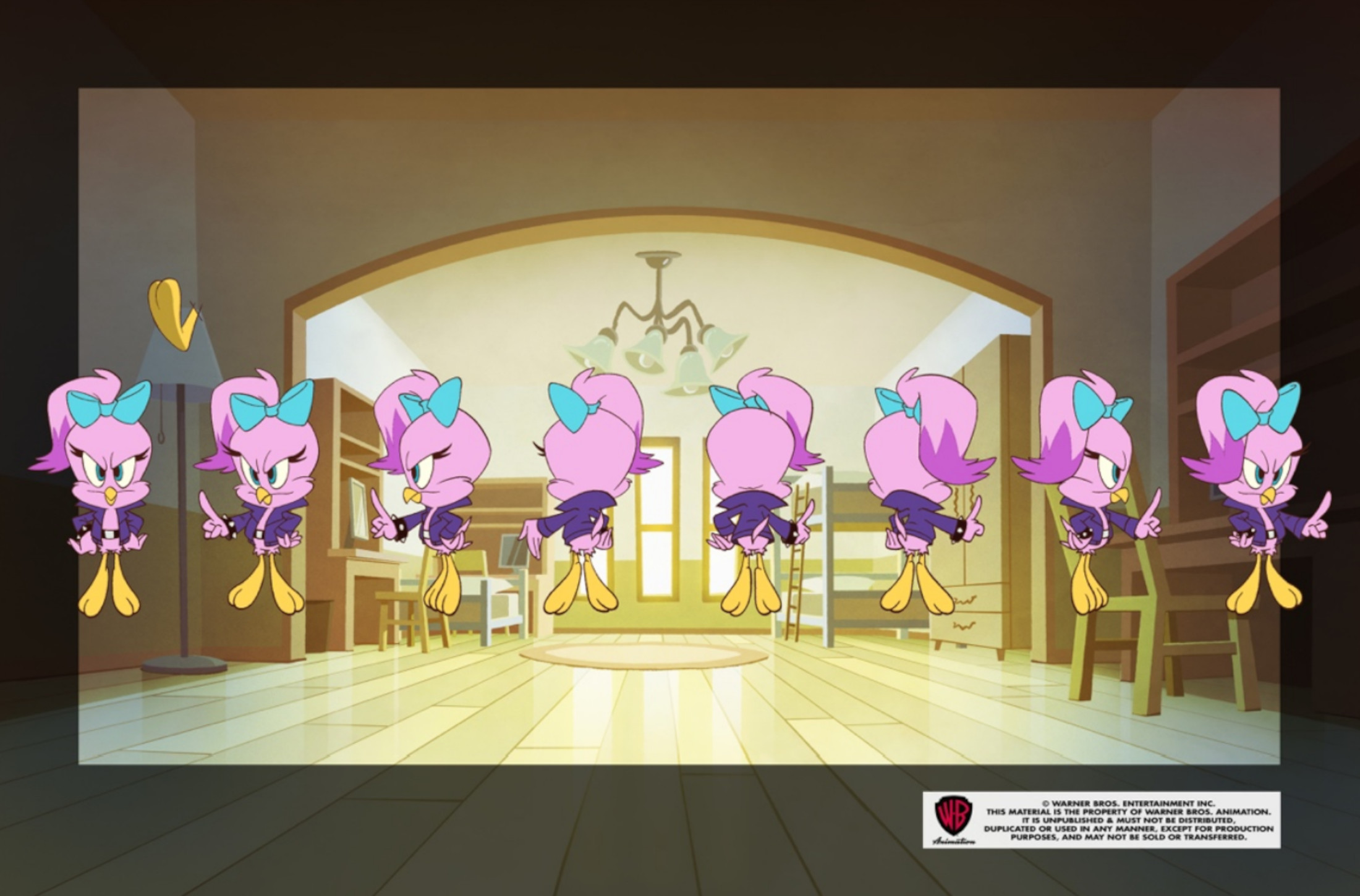
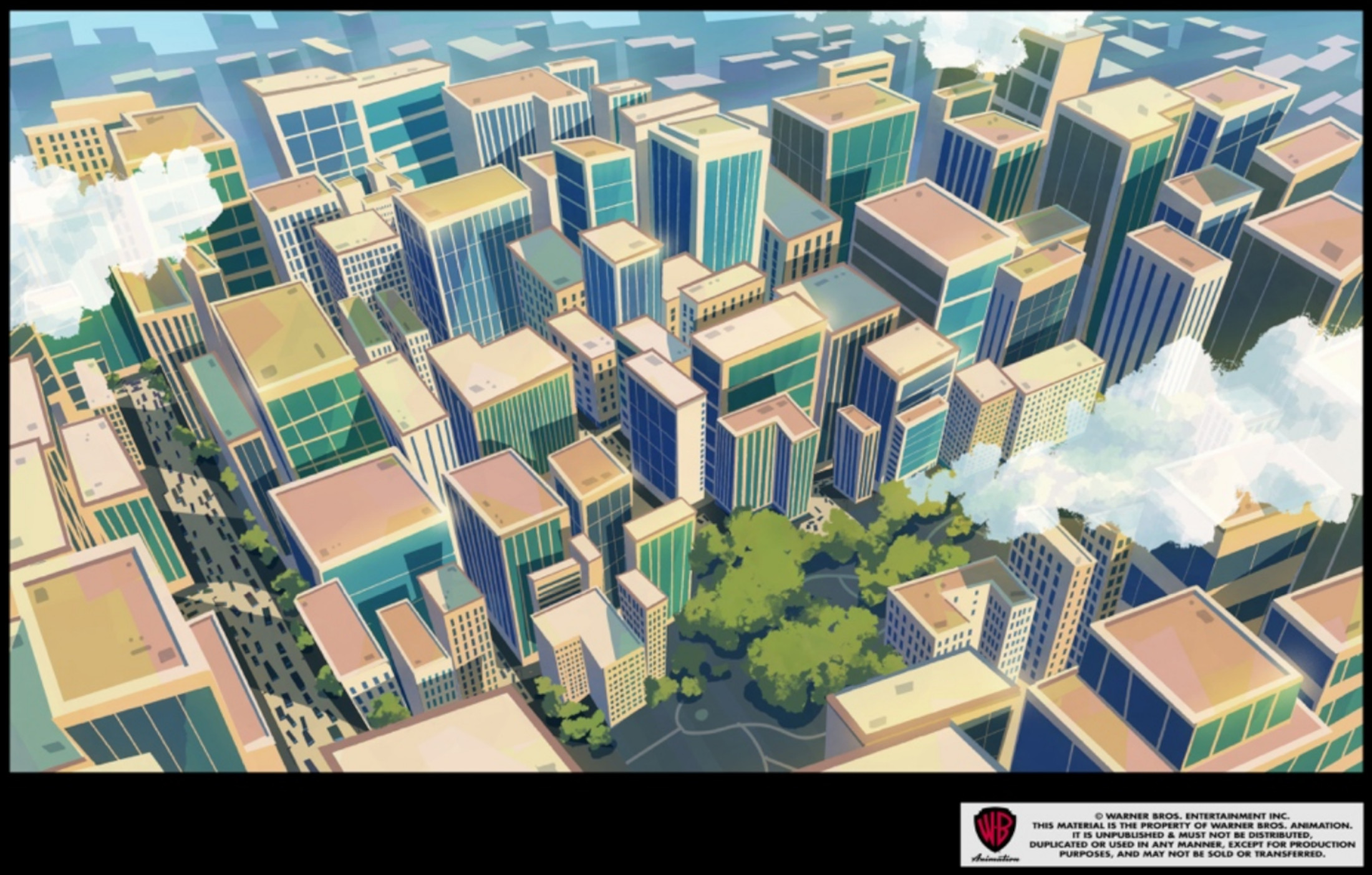
Traditional pan with the “movement” of the camera hand-drawn into the layouts. Old-school tricks are still rad.

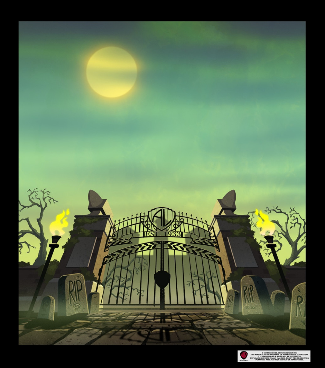
Spooky! Benjamin Lee (art director) showing off how to paint atmosphere and mood into an establishing shot to set the tone.
Ooh…! Where are they going?
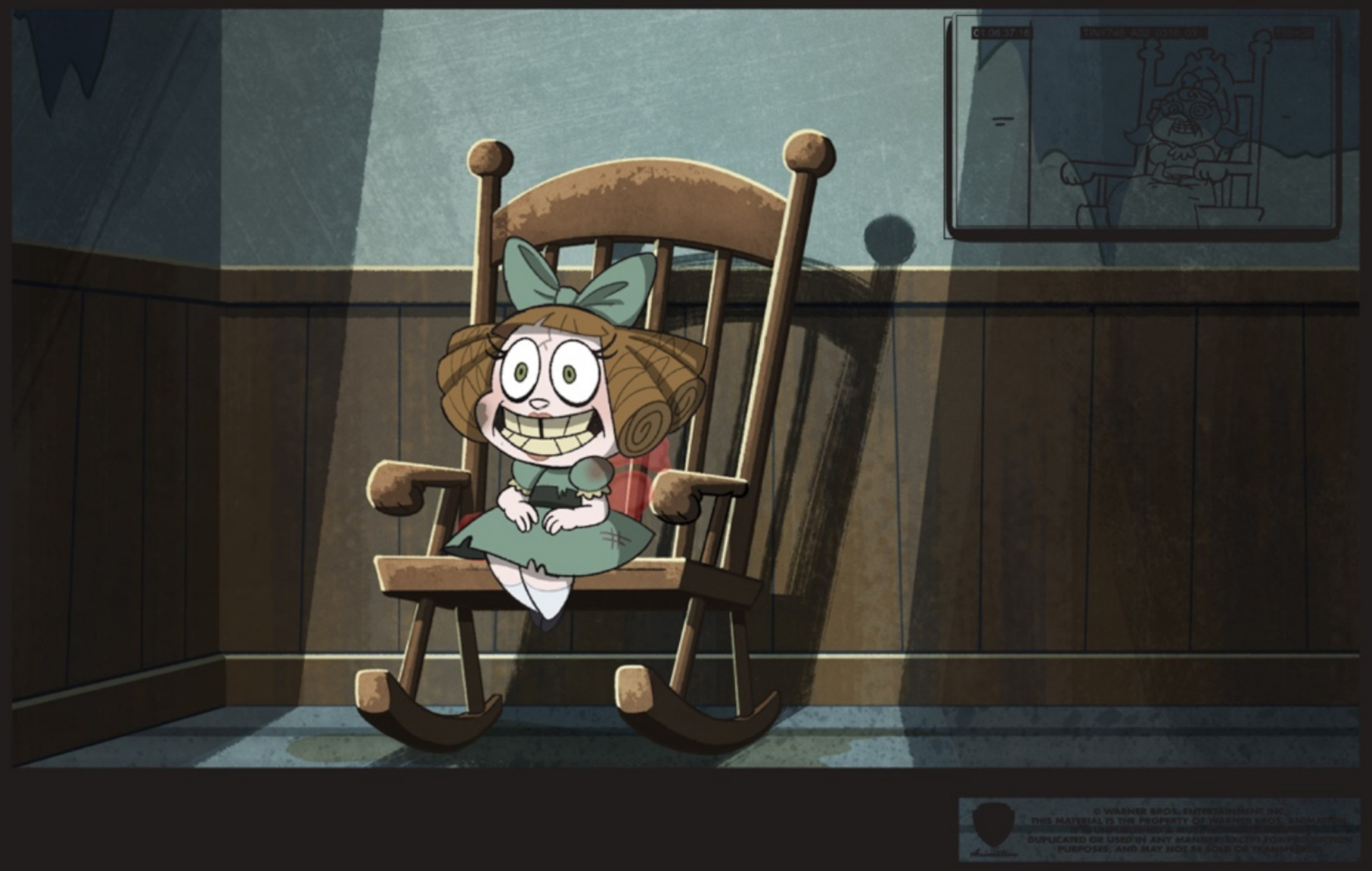
I’m scared. What is that doll?
Overall, it was a very collaborative process, with each department and individual artist bringing their “A” game.
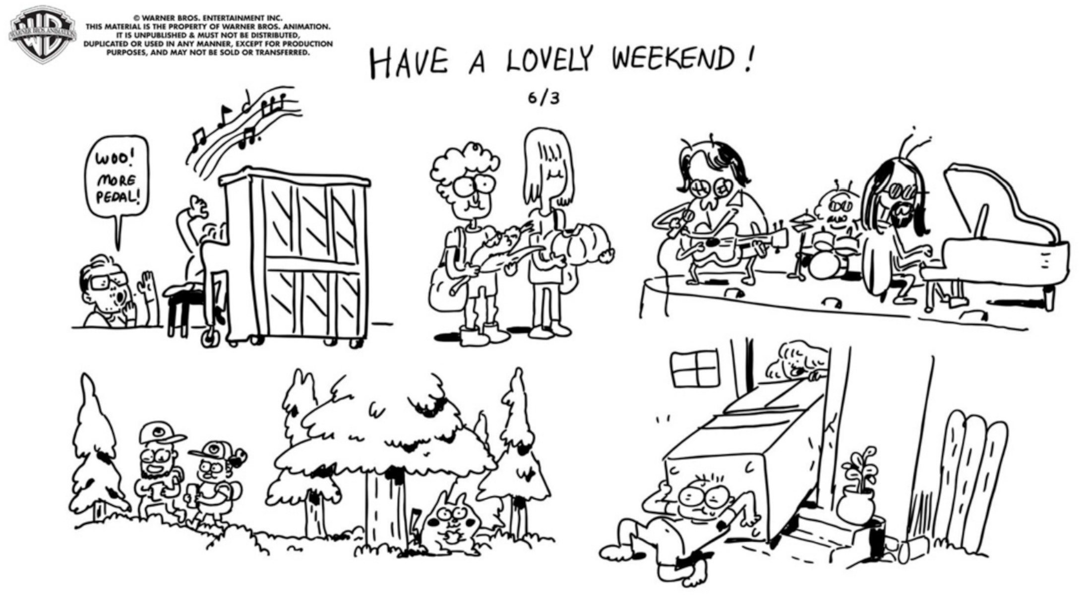
Crew unity was important. We made time to emulate the experience of working together in person with Zoom Show and Tell to share non-work-related stuff with the crew. Emiko “T-Bone” Sawanobori (animation director) ate bugs, Brooke Regalado (character design) showed us tricks she’d taught her dog, and Aaron McLeod-Bryant (storyboard revisions) shared his Mom’s yearbook he had recently discovered. And every Friday, Matt Yang (supervising director) would ask the directors what they were doing that weekend and compile everybody’s plans into a single-panel illustration.
