Scene Breakdown: The Creative Process Behind Apple’s Stop-Motion Series ‘Shape Island’
Apple TV+’s new kids and family series Shape Island comes out today, and to mark the occasion we sat down with director and executive producer Drew Hodges who talked us through a scene from the show and explained the craft behind the stop-motion production process.
Shape Island was co-created by book authors Mac Barnett and Jon Klassen, who serve as executive producers alongside Bix Pix Entertainment’s Kelli Bixler and Hodges. Ryan Pequin serves as co-executive producer and head writer.
Set on a charming tropical island, the show turns on three characters: serious Square, intrepid Circle, and tricky Triangle. Voice casting includes Yvette Nicole Brown as the Narrator, Harvey Guillen as Square, Scott Adsit as Triangle, and Gideon Adlon as Circle.
Building a World

Drew Hodges: Jon Klassen and Mac Barnett’s books were obviously foundational to our work. In those books, there is a lot of negative space on the page, which makes you really focus on the graphic nature of the characters, especially their eyes. We wanted this to feel like a real world, not really stylized or set in a void or anything like that. We also wanted to avoid over-clutter that could distract from the characters, which are always front and center.
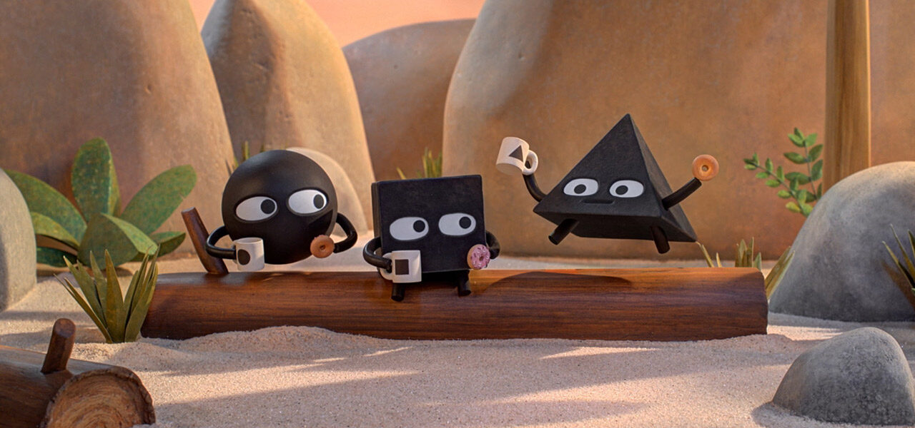
Within that world, we wanted to create a warm, cozy, inviting place where viewers would just want to hang out. In the following clip, it’s just a simple log, but it’s their hangout place. They come here and drink cocoa and eat donuts. What could be cozier than that?
During production, we had to answer the same big questions as any other stop-motion project. What materials are we going to use? What kinds of textures are we looking for? Will we use real plants or make our own? If we decide to make our own, how will we mass-produce the pieces we need in an economical way?

Choosing the Right Materials
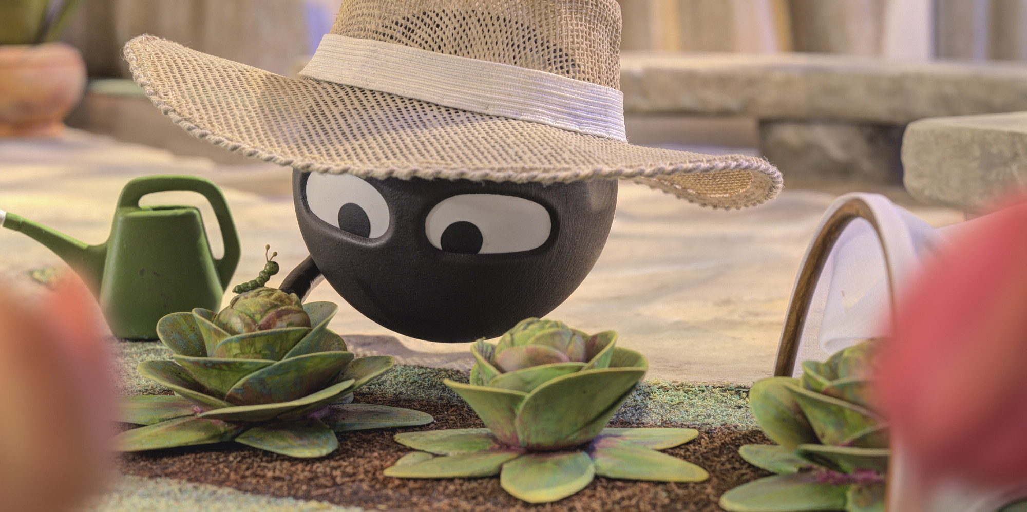
Hodges: Trees are always tricky because they have so many leaves, so in our show, you don’t often see the tops of the trees. You can see an example in this scene when they’re sitting on the log. For the plants that do end up on the screen, we wanted to use the painterly palette of the books. For a long time, we shied away from paper and tried different plastics, vacuum-formed thin sheets of plastic you can model, like on the trees in this scene. But for the leaves, we realized at our small scale the thickness of other materials was really magnified, so that led us back to paper.
There is always a fear with paper that when you shut down for the day and come back the next morning, things will have moved or settled due to environmental changes. It was a risk to use paper, but in the end, we had a lot of success with it. We made hundreds and hundreds of plants and silk-screened them, then ran them through a vinyl cutter that would make very precise cuts based on vector files of the shapes of leaves we wanted.
Constructing Characters
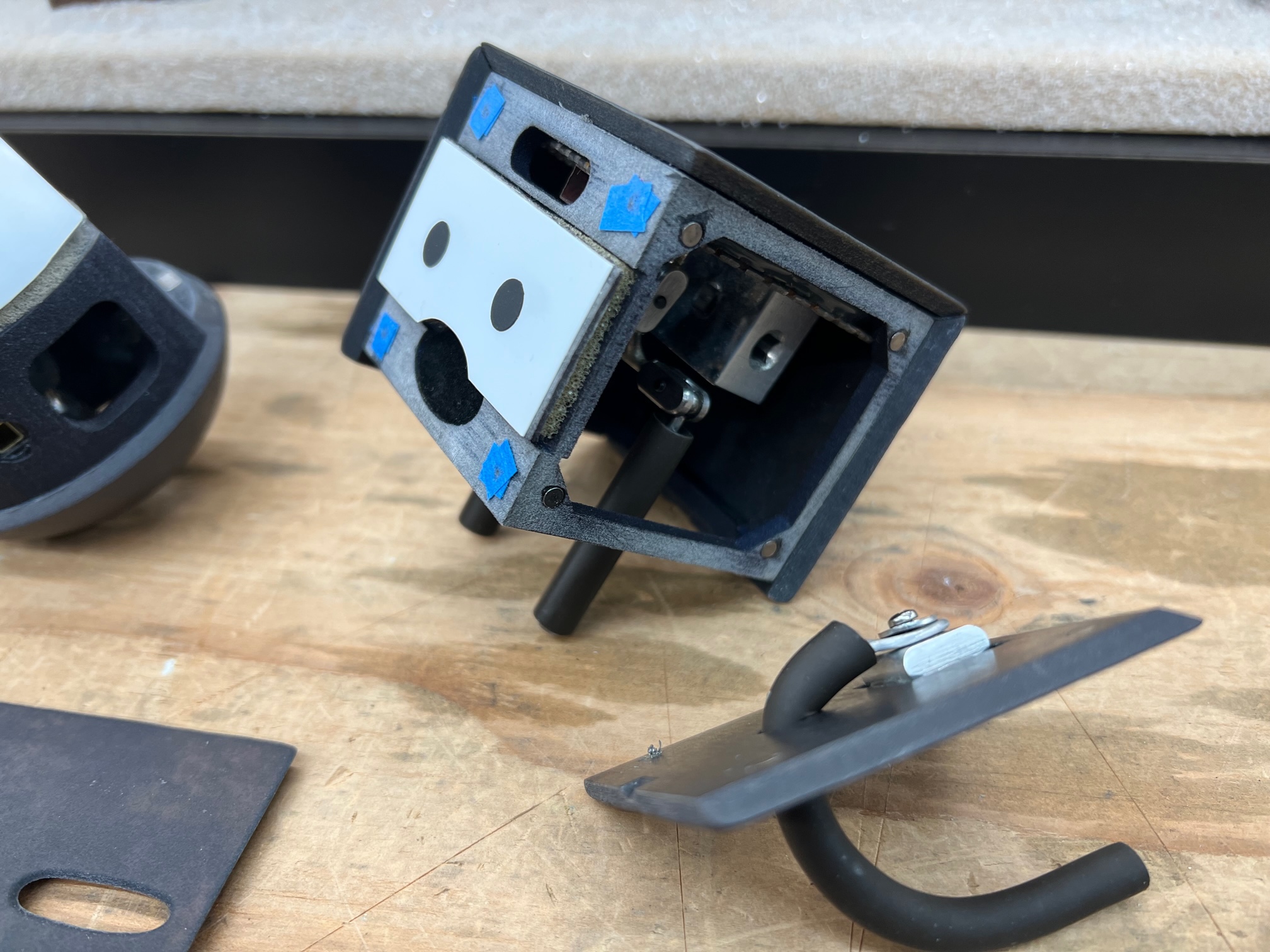
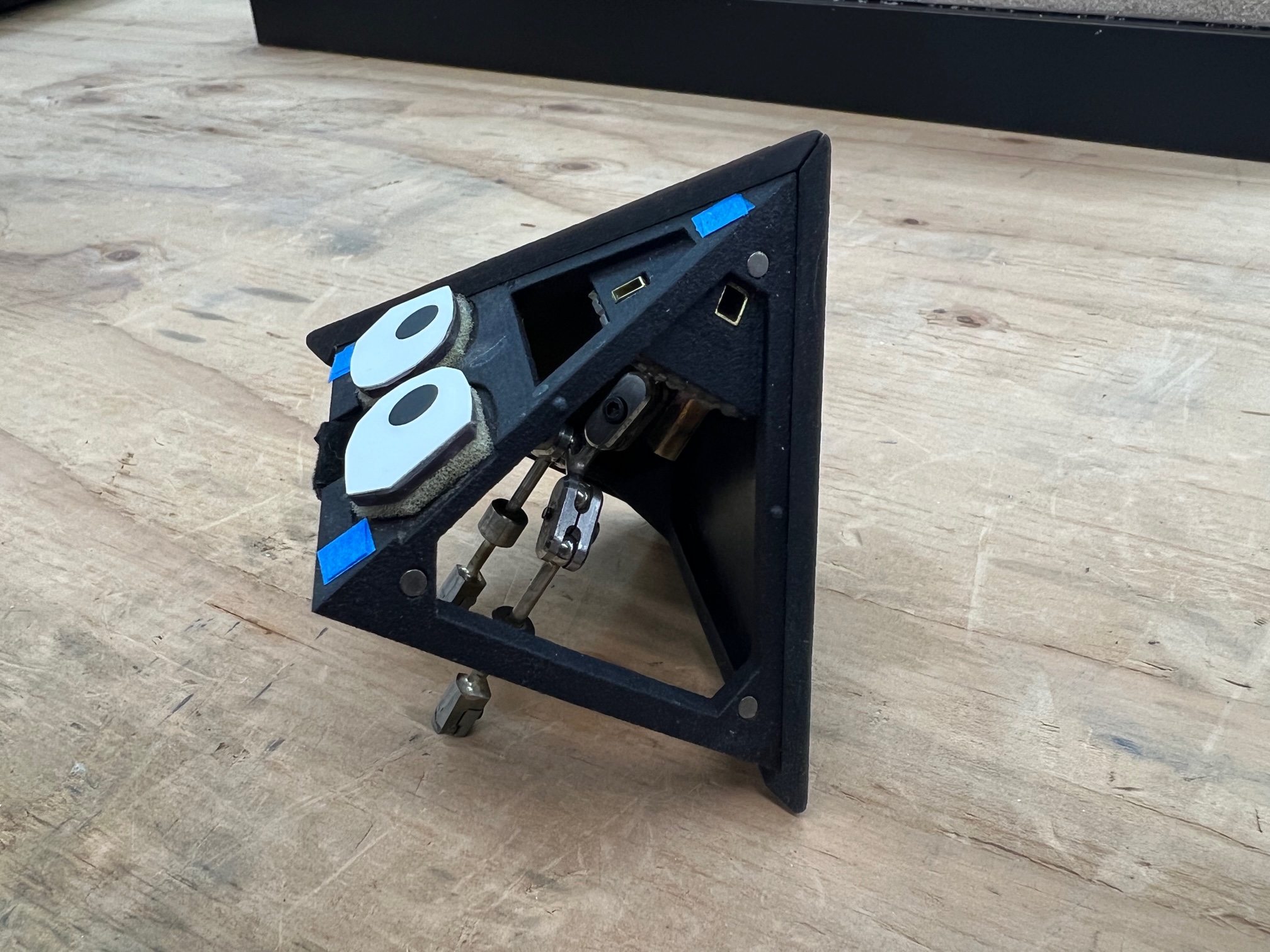
Hodges: Our characters are essentially built on a cage, and the sides are panels that pop off, a face, a side, a top. One of the more interesting things about our characters is that sometimes they have limbs and sometimes they don’t. We had to decide if we wanted to attach the arms or not. In the end, we ended up using a wire covered in a latex rubber surgical tubing that we could get a lot of quickly, that took paint very well, and that was flexible. We were excited with that solution because usually constructing arms and hands is extremely time-consuming, but with our method, we had all these different lengths of arms we used. There were thousands of arms; there was a whole industry dedicated to making arms.
Hodges: One of the bigger challenges with the arms was figuring out how the characters would hold something without hands. The clip here was one of the first scenes where we had to figure that out. How do they hold a donut? In the end, we figured out that if we extended the wire that’s inside the tubing of the arm and have it just continue out through the top, with a little hole in the donut, you can just stick the thing on the end. That method of holding something we ended up calling the donut arm. Anytime a character needed to hold something at the end of their arm, we said bring me a donut arm.
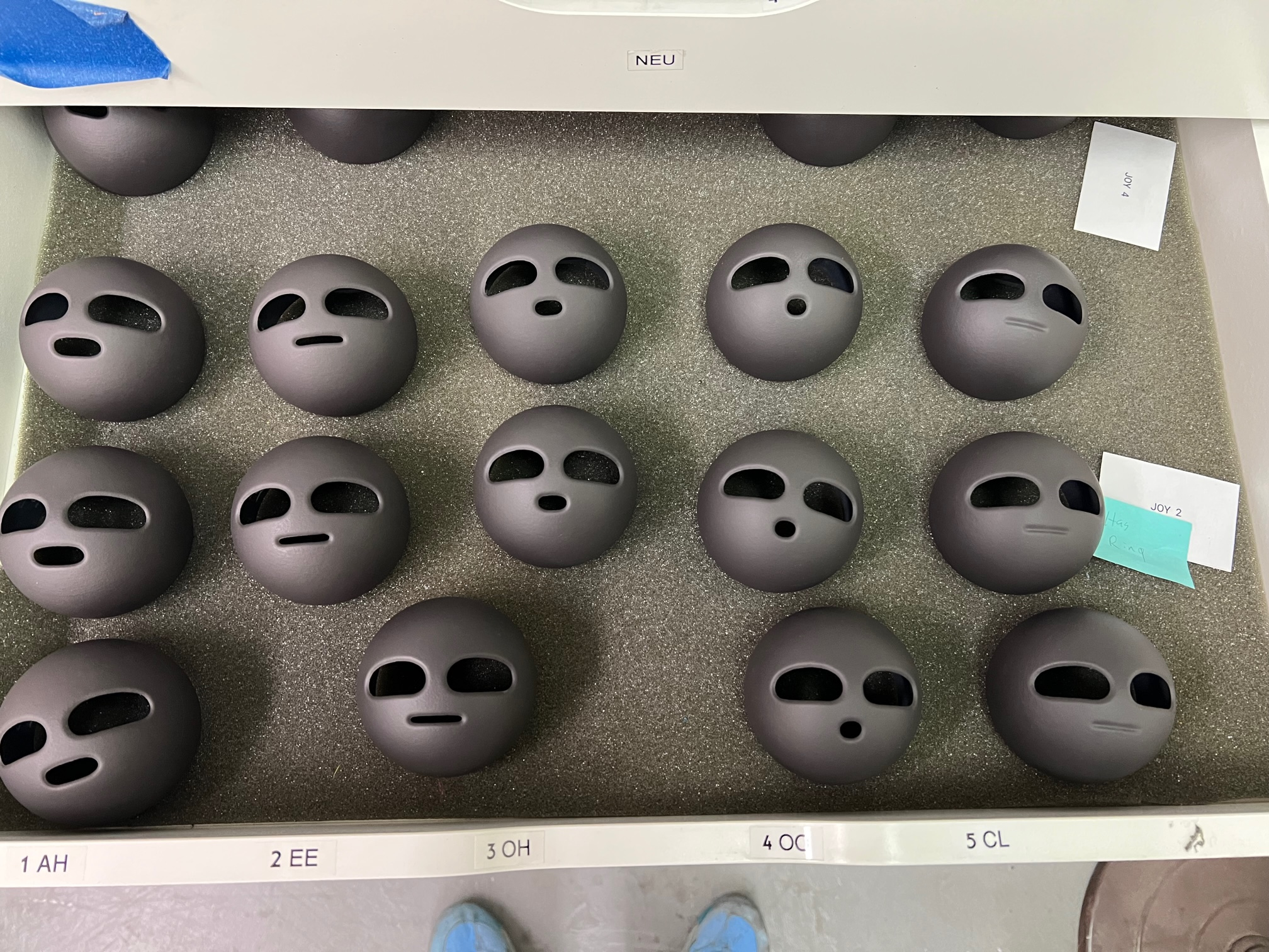
The characters do most of their emoting with their eyes, so we ended up only needing five different shapes for their mouths to cover dialogue. But, when you multiply the eye shapes and the mouth shapes, we had hundreds of combinations we could use to show emotion.
Creating Scale
Hodges: We wanted it to feel like a miniature world on a small scale. When we started, we could have made it anything because we were translating a 2d image. The characters could have been three inches or three to four times bigger than that. Smaller puppets would be really charming and clearly miniature, but the depth of field is so shallow that it’s almost unshootable in a way. Plus, the grains of sand would look bigger, and the thickness of the paper is exaggerated… We ended up with three-inch puppets, which are smaller than most stop-motion puppets but which allowed us to still manipulate them.
Keep it Simple
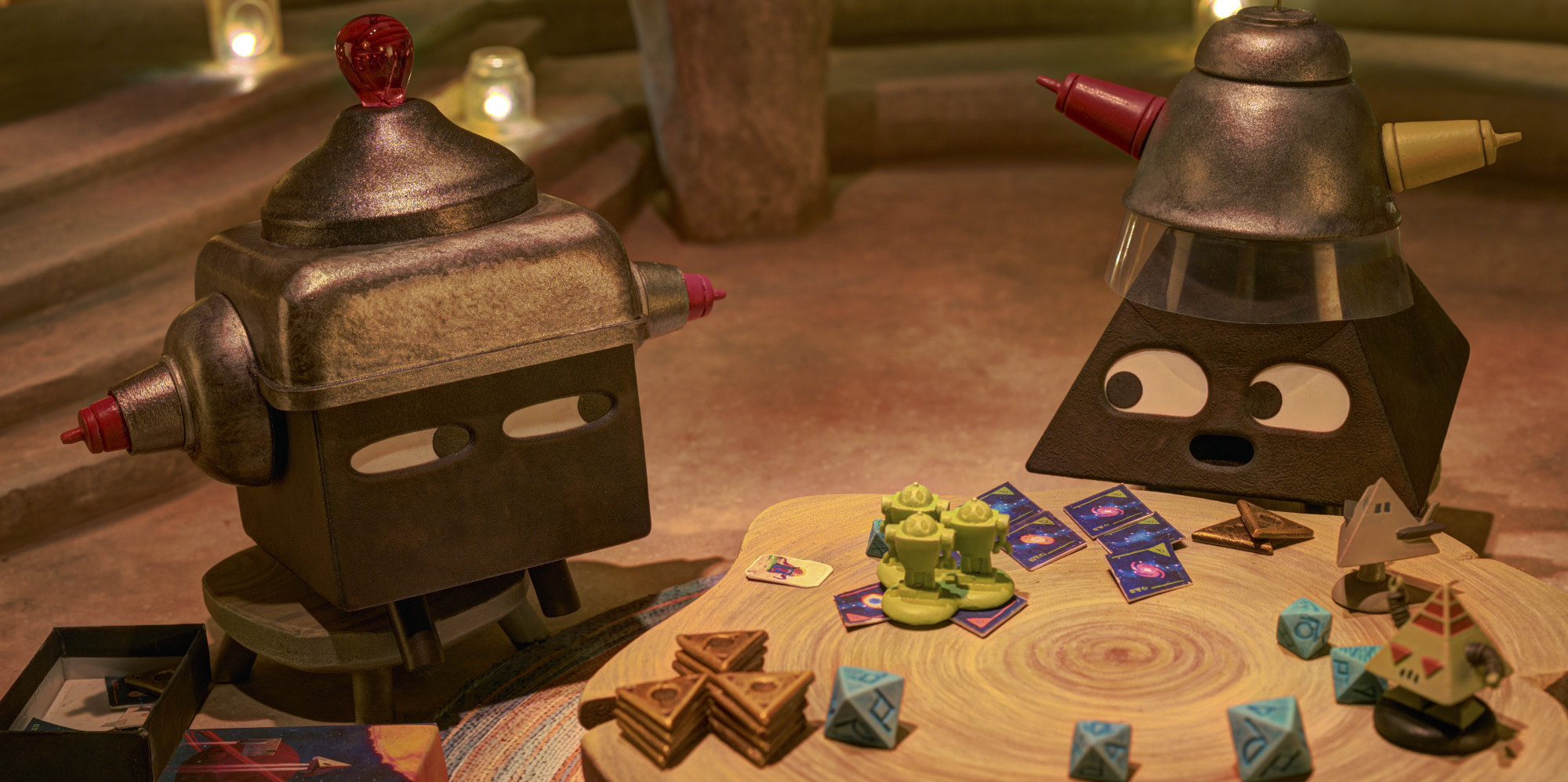
Hodges: As I said earlier, we wanted to avoid over-clutter that could distract from the characters, which should always be front and center. But everyone on the team is sort of telling their own story, so you know if someone went to the trouble of making something, we wanted to use it. Often on set, I saw something that moves, and if it moves can we use it? Can it be animated? Everything is very small, so it can be hard to animate. But in the end, those details are a lot of fun.
Off-screen, sound effects like seagulls cawing or wind blowing mean you don’t always need a lot of stuff in the frame. You don’t always have to see it to know it’s there. We knew the materials we’re working with and the builds we wanted to do, but everything had to be worth it in the end, in service to the story.
