
Guru Studio Reveals the Secrets of Its Preschool Hit “Justin Time”

This post is presented by Guru Studio
The preschool children’s series Justin Time is currently nominated for three ASIFA-Hollywood Annie Awards: Best Animated TV/Broadcast Production For Preschool Children; Outstanding Achievement, Directing in an Animated TV/Broadcast Production; Outstanding Achievement, Storyboarding in an Animated TV/Broadcast Production.
When it comes to historical shows for kids, the road is paved with good intentions, e.g., failed attempts and short-lived concepts that, regardless of quality in design and writing, never really find an audience. So much so, the general consensus in series development is that kids and history do not mix. It’s something that Frank Falcone, president and founder of Toronto-based Guru Studio had to deal with while developing their preschool series Justin Time.
“The first response out of everyone’s mouth was that you can’t do history for kids because they don’t have a concept of time,” says Falcone. “But I thought if we could just ignore the dates and the specifics—that we just make it about ‘back then’—it could be an introduction to history in a really basic sense.” The ‘back then’ that he refers to is the vague-but-fundamental idea of time in the young mind of a preschooler. “Children may not know what time it is or what day it is, but they do have a concept of ‘before me’ and ‘where I’m going,’ which is toward ‘Mommy and Daddy,’ which is ‘I’m going to be that.’”
 With two seasons completed (a total of fifty-two 11-minute episodes) and a third in discussion, the show has earned recognition within the industry, with a 2013 Daytime Emmy nomination for Outstanding Preschool Animated Program, eight Annie nominations including Best Animated Television Production for Preschool Children in both 2013 and 2014, and just this week, a nomination for Best Preschool Show at the 2014 Canadian Screen Awards. Justin Time now airs in over 70 countries on networks like Sprout, Disney Junior Canada, Discovery Latin America, and NBC Kids, where it was #1 in its time slot last year. It debuted as a streaming property on Netflix Instant early last year.
The series, which features a young boy named Justin who goes on make-believe time traveling adventures with his imaginary friend Olive and a lump of clay named Squidgy, was created by illustrator/designer Brandon James Scott. Scott originally conceived the project as an educational comedy utilizing cut-paper techniques while studying at Sheridan College, but he shelved the idea when it became “too ambitious.” Years later, while working at Guru, he dusted off the idea and pitched it to the studio. They greenlit the idea, at which time Scott began further developing the concept with Falcone and Guru vice-president Mary Bredin, who together serve as the show’s executive producers.
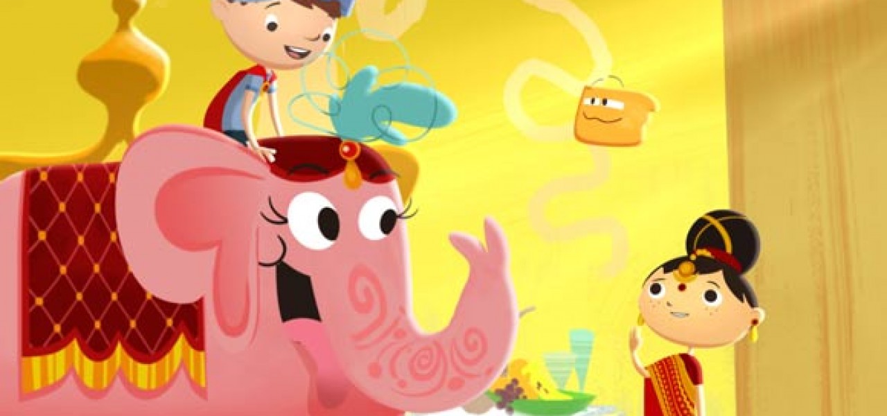
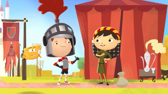
 As the show’s development continued, they aimed for a hybrid production style, one that combined the flexibility of a CG production with the charm and appeal of a classic drawn cartoon. “We did experiments and it almost did become a 2D show,” Scott admits. “[However] we ended up going with a CG package because it allowed us more freedom to do things with the camera. It’s sort of this mixture between 2D and 3D that we came up with.”
—Frank Falcone
“We considered several options like Flash,” says Falcone, “but [Flash is] pose-based, and about re-using and recycling. I thought, ‘We’re going to write some custom stories here, and they’re going to be very specific, and I want the animators who are good at acting to continue to develop their skills and their craft. Not suddenly go to a library method where they’re just pulling down some pose from a library.’ So we planned the system with Maya, but used the drawings generated in the art department without recreating them in CG. That’s our own little custom concoction. It’s a CG show, but the approach is absolutely 2D traditional.”
As show creator, Scott has been involved in every step of the production, from submitting script notes and sitting in on voice recordings to reviewing animation, but his primary role is as art director of the series. “When we have an animator that’s thinking too much with the 3D thing, I’ll just take a screen grab and do a draw-over and say, ‘This pose should be stronger,’” says Scott. “It’s not about thinking where the joints are necessarily bending in a 3D space, but how nice is the silhouette from the camera’s point of view.”
“[Working with a team is] definitely a learning experience, but I feel really lucky because we’re working with amazing artists,” Scott says, referring to the talent of crew members like Deanna Marsigliese and Sam Bradley, as well as Keith Chi Ming Lee and Paul Watling, both of whom have been nominated for Annie Awards for their work on the series.
Series director, Harold Harris, whose credits include directing the droll British series Bob & Margaret and the short-lived cult series, Clone High USA, also had a lot to say about the attention that goes into crafting the look of the show. “It goes to the sort of tenets of simplicity and composition,” Harris says. “We work hard at making the composition of the frames really clean and we are really conscious of how to use color to draw you to the story point.”
However, he is quick to point out that the significance of storytelling is just as important, if not more important than the visuals. “Sometimes it really doesn’t matter what the thing looks like – I love making things that look beautiful, but I also am willing to toss it all out in order to make something work: Keep it simple and funny, keep the quality in the story consistent, don’t cheat because it’s a kid’s show. The magnifying glass that we put on our show would be one where, as a parent, I’d want to watch it and enjoy it just as much as my kid would.”

