
Pictoplasma Conference Report
 The 1st Pictoplasma Conference On Contemporary Character Design & Art (my previous comments HERE) took place in Berlin, Germany from Oct. 28-30. Character designer Harald Siepermann (TARZAN, MULAN, BROTHER BEAR) who was profiled on the Brew a couple weeks ago, attended the conference and kindly shares a few thoughts about what he saw there:
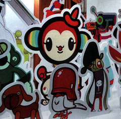
The purpose of Pictoplasma is to create a collection of characters that promote products or tell stories, or exist simply as a character or an icon. A quote from the program: “Industrial production conditions have created a universally applicable visual vocabulary. The recent increase of ideograms on Internet sites, adverts and packaging, street art and company logos can also be interpreted as a developing universal language. These characters however are not the result of standardised production conditions but are the outcome of the desire and ability to communicate with increasing numbers of people networks.”
I was amazed at the variety of the events at the Pictoplasma conference. There were many artists who presented their work, beautiful and innovative stuff from creative minds like Rinzen, Gary Baseman and lots and lots of others. I had expected to see a lot of soulless designy characters, fit for t-shirts and CD covers, without a personality or a story to tell. To be frank, I had expected to feel like a wine connoisseur in an exhibition of fancy bottles or labels. Of course those things were there too. As you know, some of them even aim for that approach, like Annlee, the character, which opened the screening by telling you that she is a product, a shell without a ghost, right to your face. Personally, that is not my cup of tea; there’s just too much obvious artificial self-pity in this.
But thankfully, there were also presentations by studios like Passion Pictures, showing the development of “The Gorillaz” and a preview of their future projects (SCARY GIRL and THE LOST THING), as well as studio aka, both of which I found extremely interesting. With aka’s work, I was particularly fond of JOJO IN THE STARS, a labor of love by one of aka’s art directors. It is in black-and-white and reminiscent of the ELEPHANT MAN, ERASERHEAD and Fellini’s LA STRADA. If you haven’t seen it, check it out. What these studios do – namely in British commercials – is utilize their state-of-the-art style to transform icons into characters, give them a story and most of all, appeal. Both Passion and aka have a way of dealing with 3D and incorporating it into their commercials and music videos that is extremely refreshing, innovative, and taking it further than anything I’ve seen in a major Hollywood studio production. This, at least for me personally, offers a glimpse at what could be (and should be) the future of computer animation, an approach that is so completely different from everything that DreamWorks and Disney have to offer. What I saw even made me think over my aversion against 3D and sort of reconciled my feelings about CG. It makes me hope for a different style and a different understanding of its possibilities as a storytelling medium.
I would recommend the conference to anybody who is looking for a forum that shows how the subculture deals with characters instead of the major studios. It is characters in the hands and hearts of the people, instead of the understanding of character by Hollywood executives. They, the young people on the street as well as the artists, are inspired (or not) by what they see in the movies and advertising and they make it their own. I found it very inspiring. It’s up to us to complete the circle and bring the fresh stuff that these designers are creating back into our animated features.
