From Picasso To Sonny Rollins: Pablo Lobato On Designing The Characters Of ‘Wendell & Wild’ (Exclusive Artwork)
Wendell & Wild launches worldwide on Netflix today, decades after the idea first entered the head of director Henry Selick.
To help bring that idea to life, Selick recruited Argentine illustrator Pablo Lobato, a novice in animation, to establish the look and, especially important in stop motion, feel of the Wendell & Wild characters.
Lobato’s work has appeared in newspapers and magazines all over the world, but his drawings have never moved and they’ve only ever appeared in two dimensions. As a character designer for a stop-motion feature, he was forced to unlearn and learn drawing techniques in equal parts. Things that have been second nature to him for years didn’t necessarily work in three dimensions and had to be forgotten, while techniques used by animators daily were brand new to the artist.
Cartoon Brew spoke with Lobato about the influences behind Wendell & Wild’s characters, his first time designing for animation, and if he’d like to work in the medium again someday. We also got a ton of great exclusive artwork to share.
Cartoon Brew: You’re famous for your caricatures and illustrations, but did you have any experience working in animation before you started on this film?
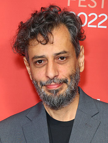
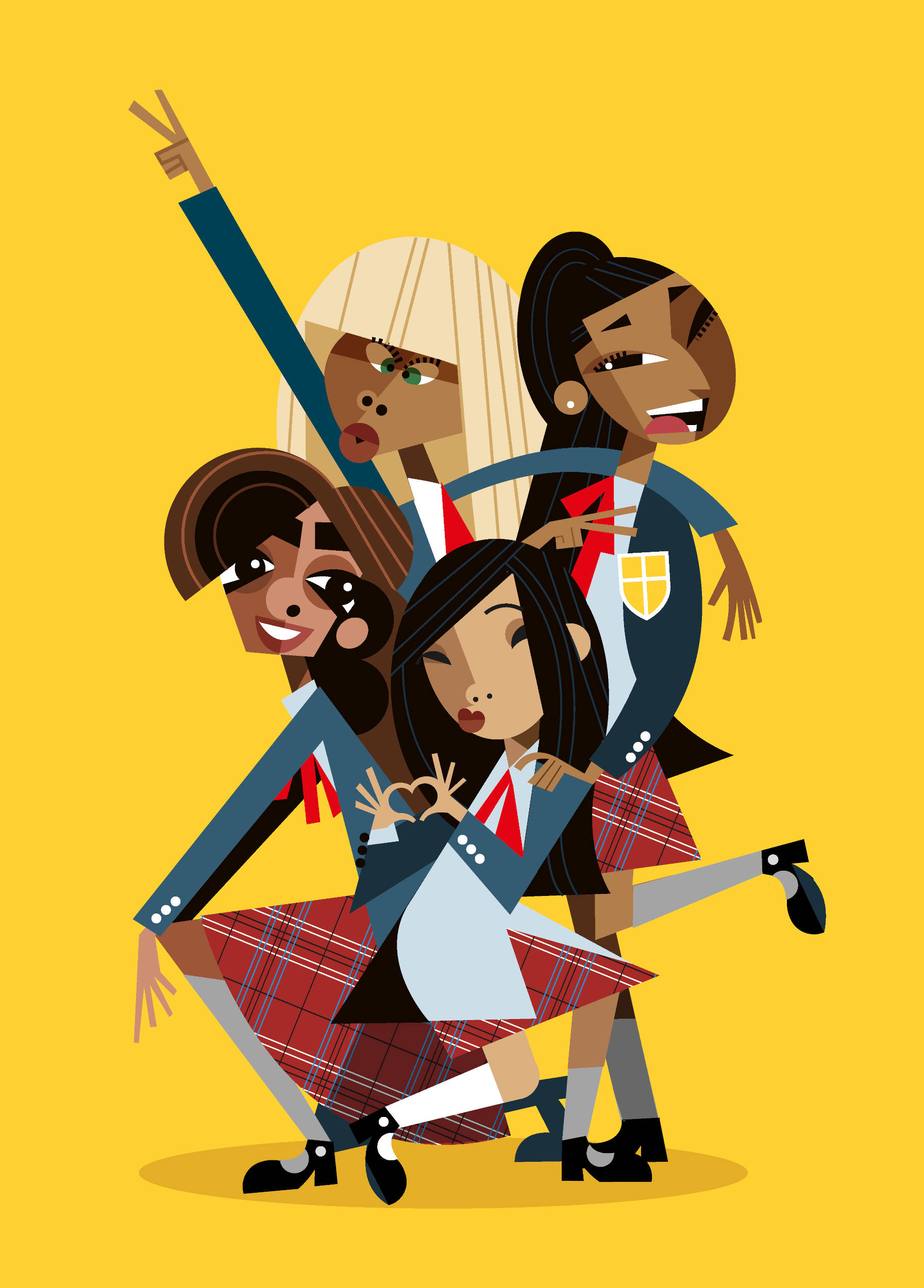
Pablo Lobato: No, this was my very first time working in animation. And actually, it was kind of a surprise to me because I work mainly for newspapers and magazines and things like that. My illustrations are always still. When Henry called me, I was absolutely surprised and worried about how my illustrations would translate into something 3d. When I started working on this, I thought back to my influences and what their work looked like when it was done in 3d. So, I thought of cubists like Picasso and how he was very influenced by African masks and sculptures and decided to start there. I found lots of beautiful and stylish geometrical inspirations in those African masks, and that’s where the main characters started. I tried to translate these African masks into teenage girls. I showed those sketches to Henry and he said “Ok, this is the one.”
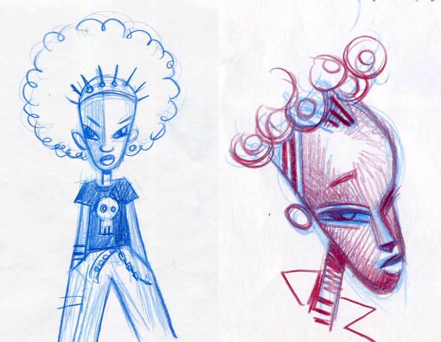
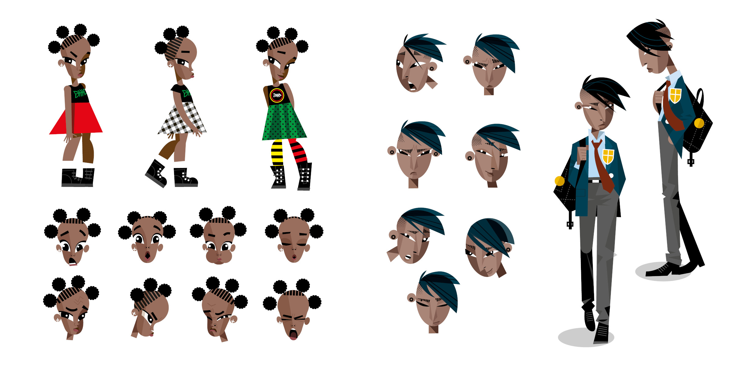
While your work has been exclusively as an illustrator, were you involved in adapting those illustrations as 3d models, or was that something you thought about while drawing?
At one point I caught myself thinking in 3d and what my work would look like in 3d, but in the end, I realized that was restraining me. In my traditional work, I play with shapes and geometrical [ideas], and by thinking in 3d I was avoiding certain things that I’m good at. Eventually, I had to tell myself, “Ok, that’s not my problem. I’m gonna do my thing, then [the 3d artists] will do their thing. They can figure out how to make my work 3d.” Of course, after they made the characters 3d I had room to give my opinions on things that came up, but in the end, I gave very little input because I always loved what they did.
While creating these characters in 2d, did you think about what they would look while moving?
That was something that took special care. Henry is the expert of course, and he would tell me about those kinds of things, reminding me that we eventually need to make these into puppets that can move. But even then, it was only a couple of tips. Mostly it was about making sure the characters looked like the same person from the front, the back, and from the side… I always had to be careful about that.
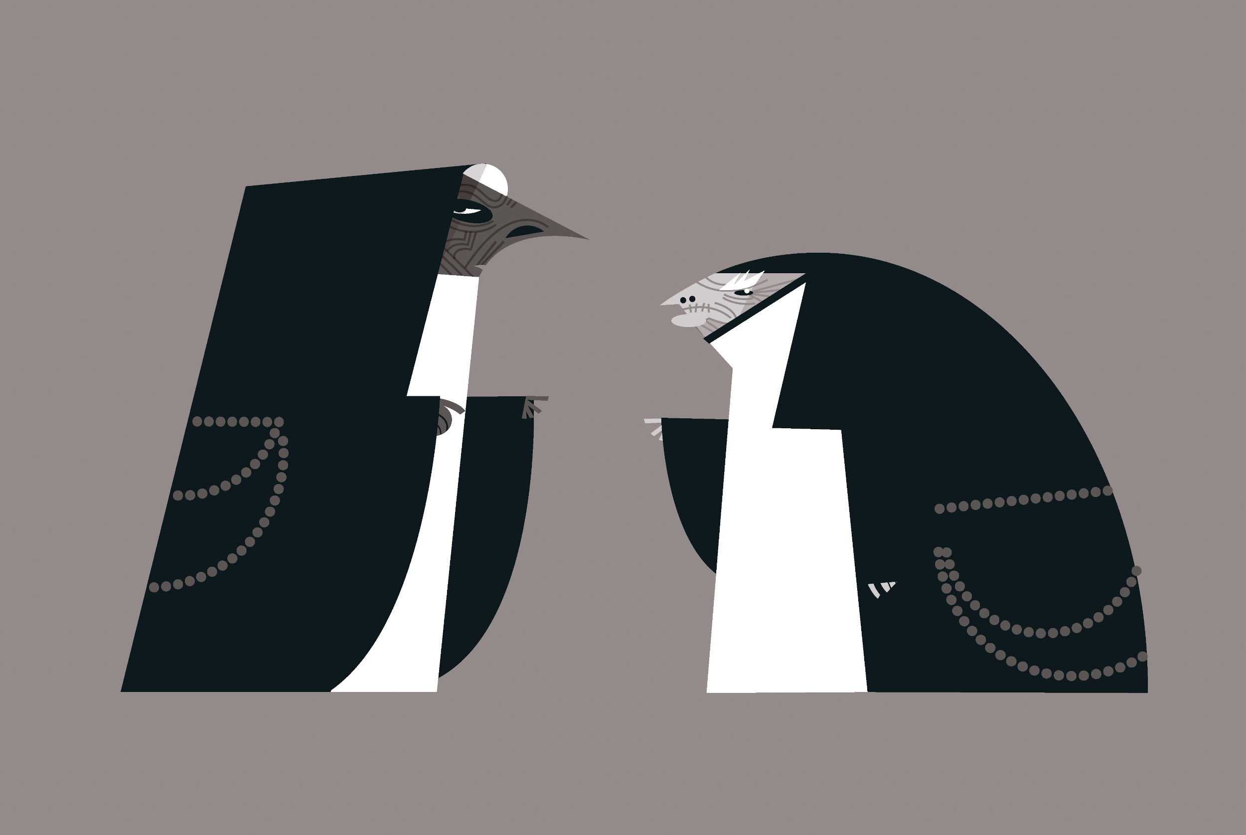
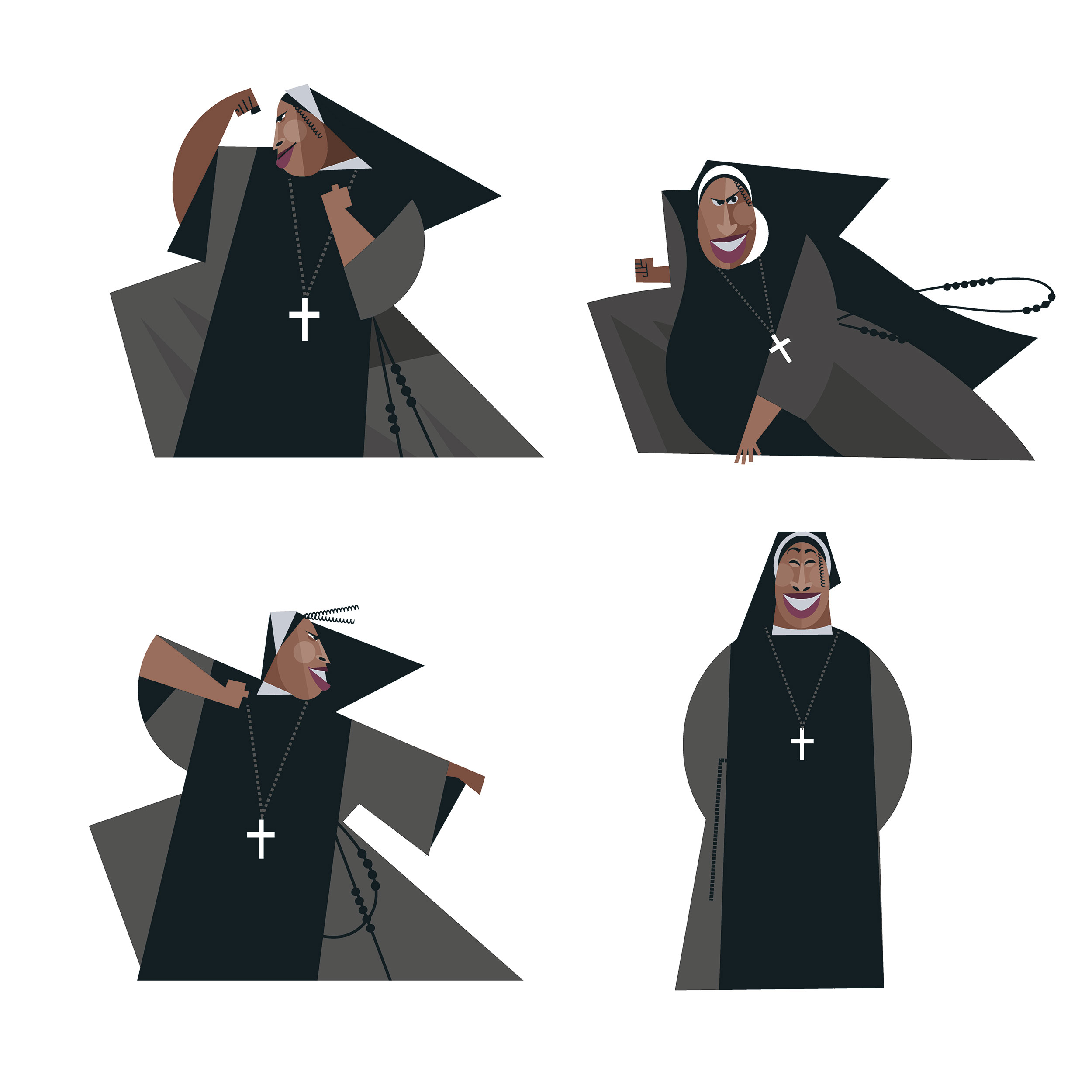
There is a clear stylistic difference between the characters native to the underworld and the human characters from our world. Can you talk about that difference, and the rules you had when designing the characters?
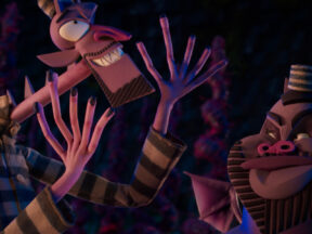
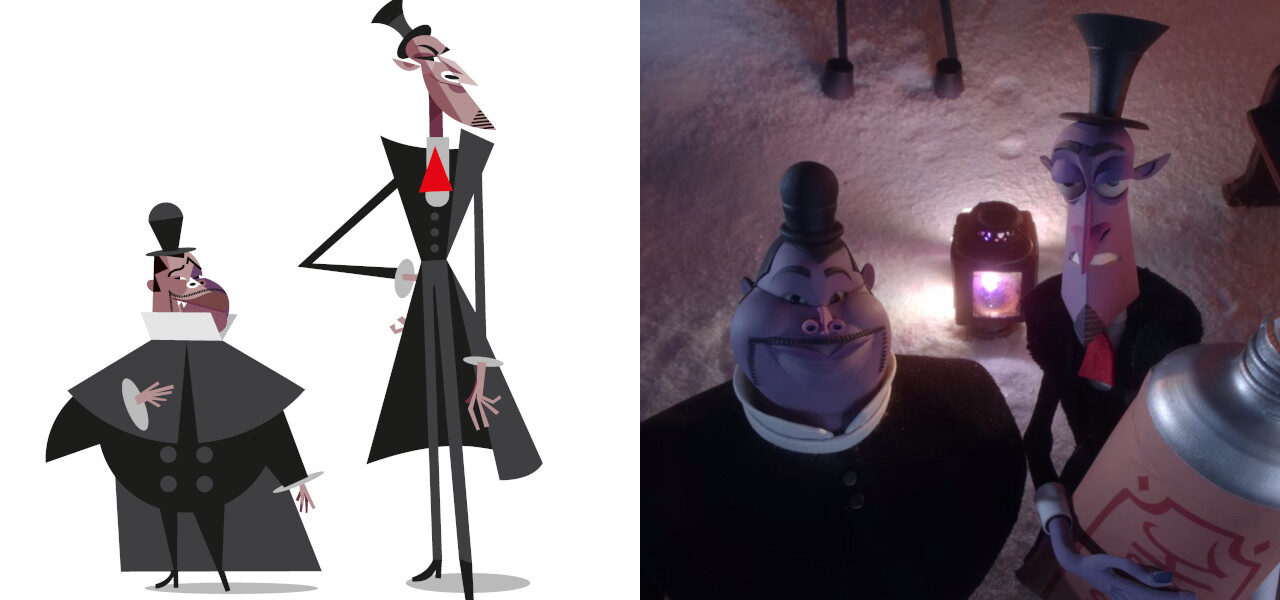
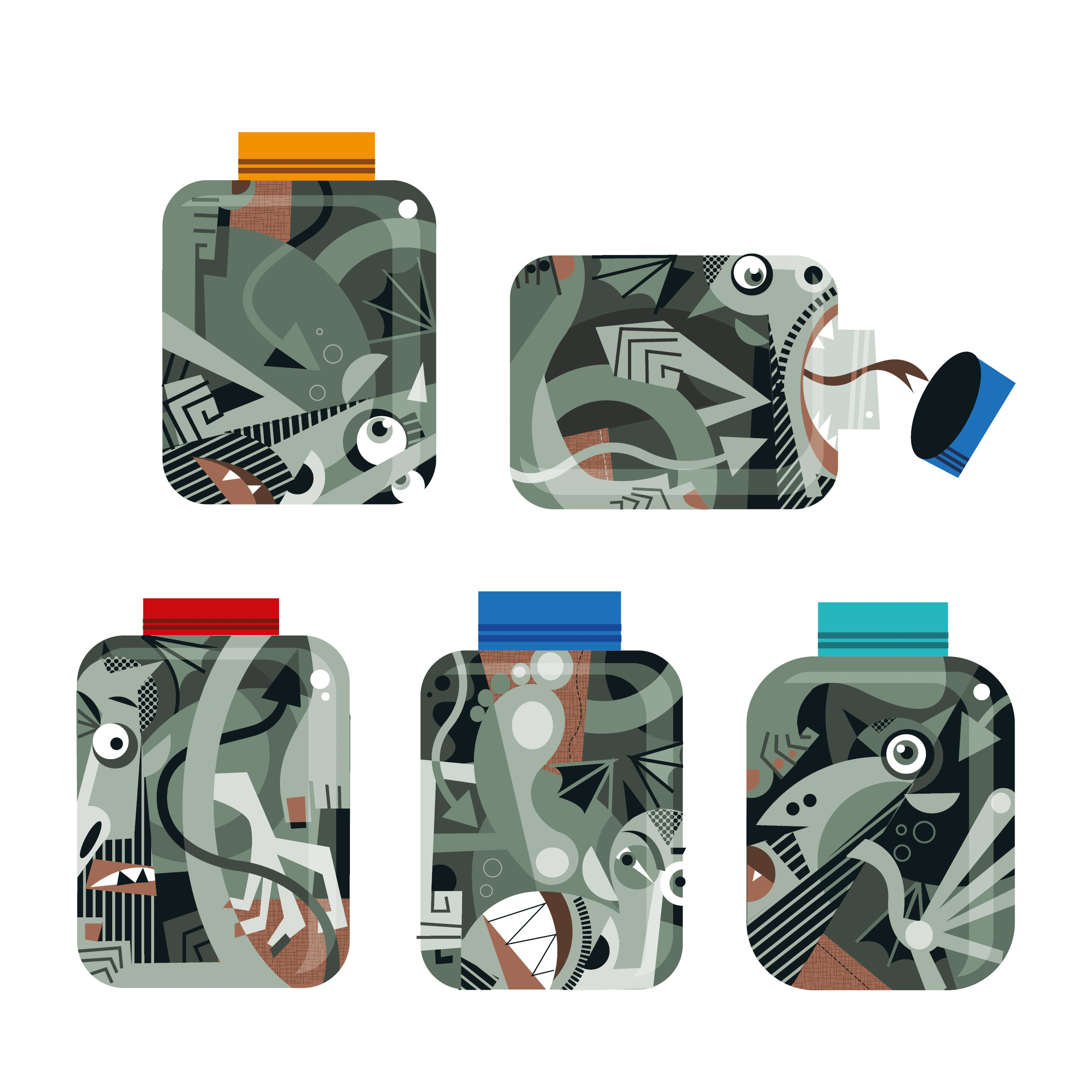
As you said, there are two worlds in the movie: the real world and the underworld. The idea of the underworld, the world of the demons, is more symmetrical and geometric, so more like my typical work. The real world then is more traditional and with textures from our world. So in my designs for the characters from the real world, I used textures and patterns that already exist in our world. For Wendell and Wild, when they were in the underworld, they had to match the underworld and look like they belonged there, so they were very geometrical and had little texture. But then those same two guys needed to have a neat and classical, very clean-cut, and sharp look in the real world.

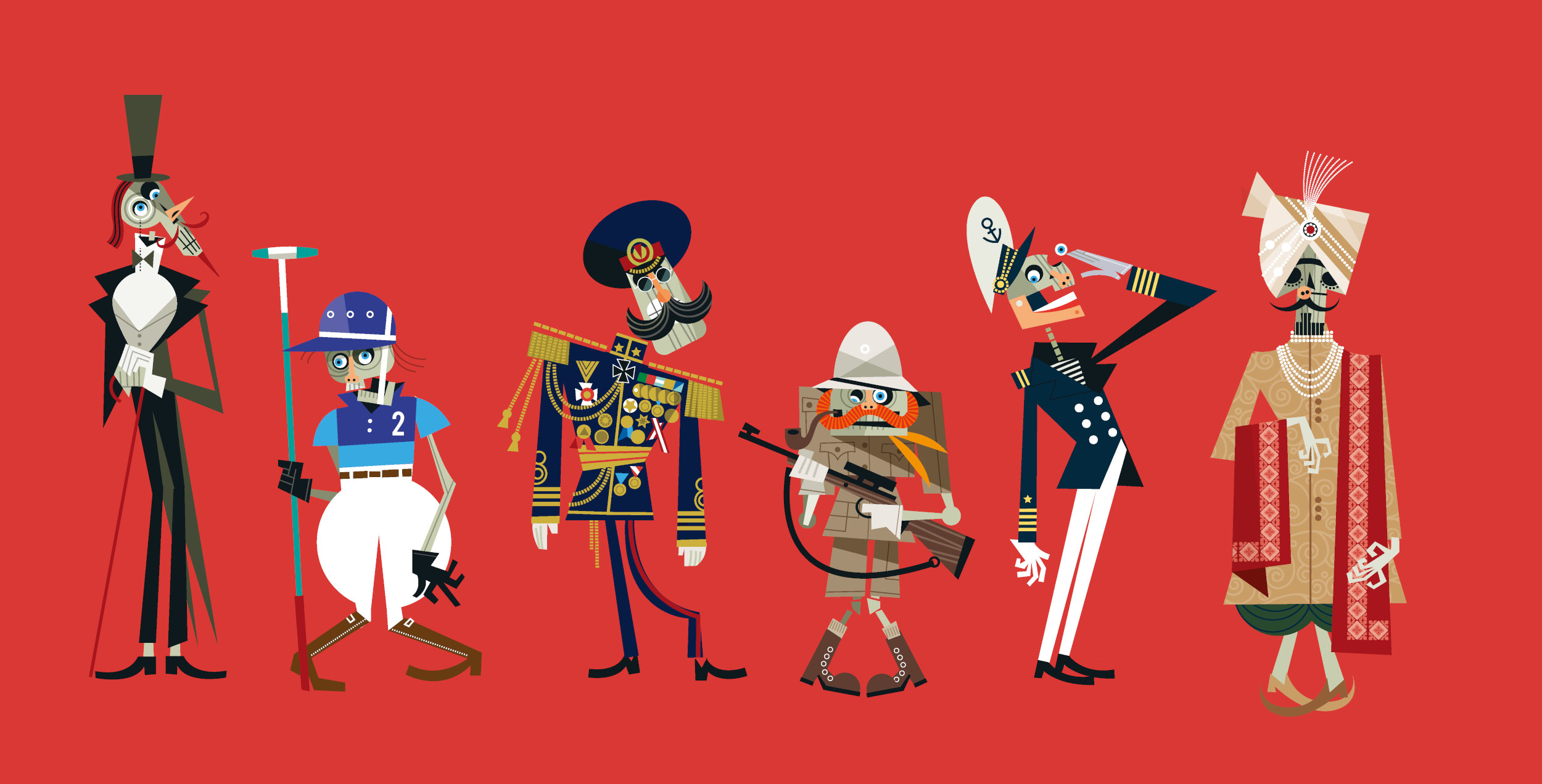
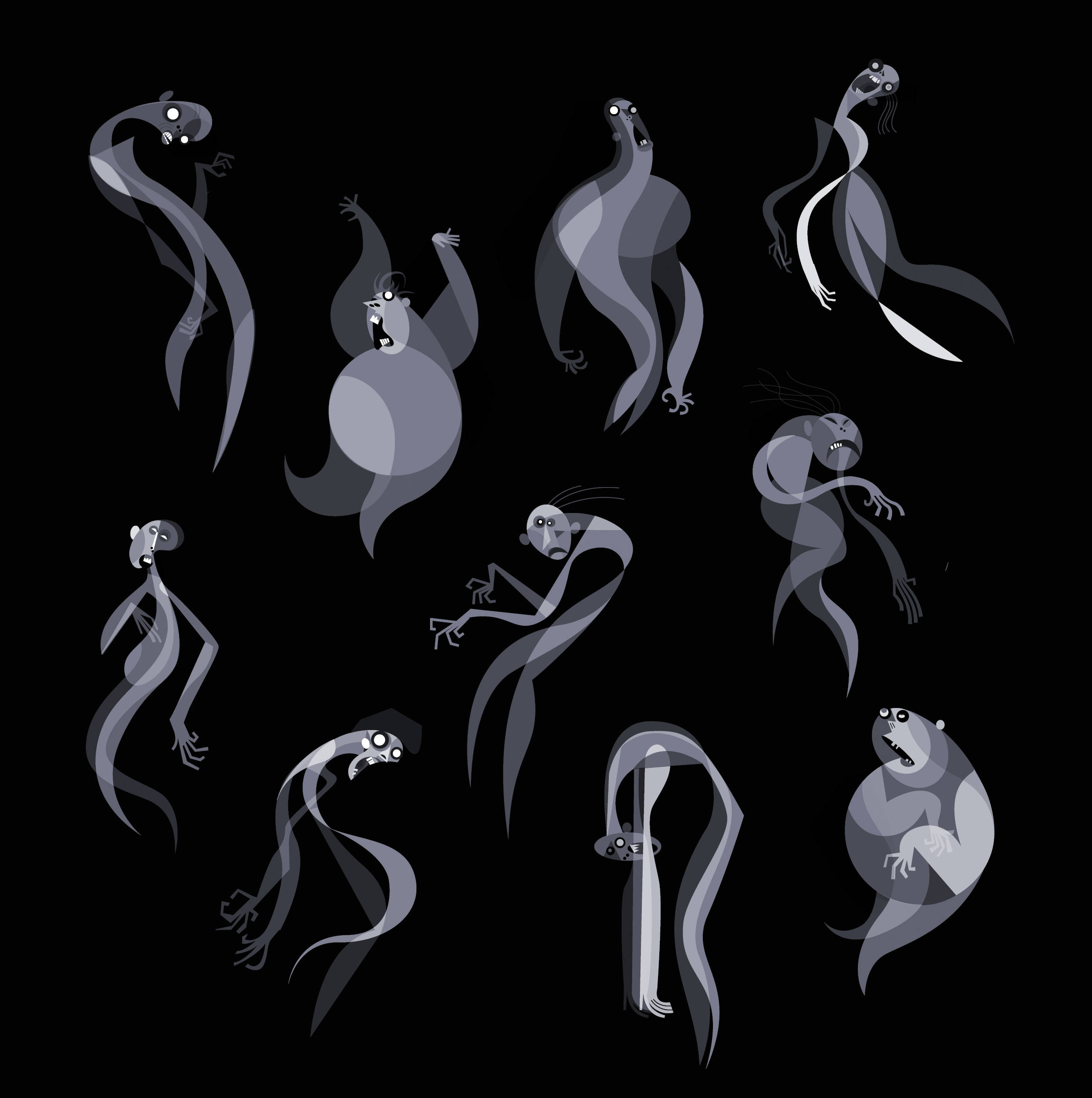
Wendell and Wild do seem to have a simpler design than many of the other characters. Was that a conscious choice by you, or is there a more practical explanation?
Wendell and Wild were the first two characters we designed. I spent months on those two guys and that was a period of me trying new things and trying to learn the craft while unlearning my craft. I’m a cubist, but to make these characters I needed to think more like an animator and I had to learn how things like geometry work in animation and how to simplify some of what I normally do. But I think it was good we did them first because they have a rougher feel to them, while the human characters are more real and sophisticated.
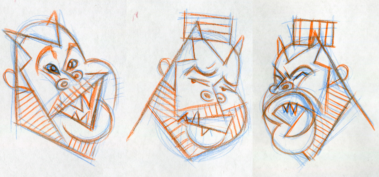
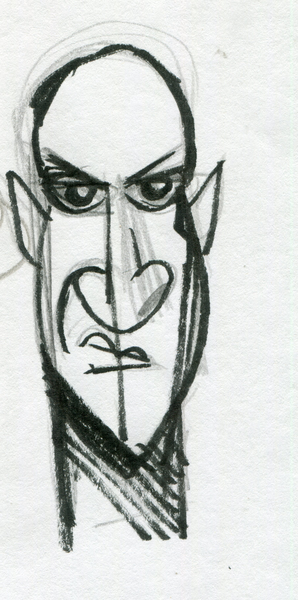
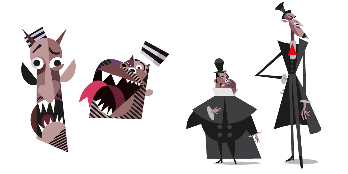
And those characters look like their voice actors, but I wonder how you came up with the look of the characters for whom you didn’t have an existing influence.
Henry had a special way of coming up with the inspirations for characters. He would come to me and say, “I want a mix of this person and this person,” and then I would have to create something working with those sources. One that kept coming up was Sonny Rollins, the musician, and although he didn’t ever make it into the movie, there is something of him in almost every character because I kept using him as an influence for so many characters. And, of course, some of the others are based on their voice actors like the priest [James Hong], Wendell, and Wild.

So now that your first animated project is finished and ready to stream to the world, how do you look back on the experience? Do you think you’d like to work in animation again someday?
I would love to do something more in animation. I knew this would be a lot of work, but I loved it. One thing I learned is how much teamwork there is in animation, and how cool it is to work with so many other people. As an illustrator, I’m used to working alone at home with my pencil and I’m not used to getting feedback and interaction from other people. But I discovered that can be a lot of fun and it makes your work better. I loved working with a team. Another big change for me is that I’m used to getting an assignment and finishing it in a couple of days. A magazine gives you a commission for a portrait and you send it to them in two days. This film was four years of work. It was a long time.

.png)
