Drawing On Classic References, ‘Boss Baby’ Director Tom McGrath Explores A Fresh Look
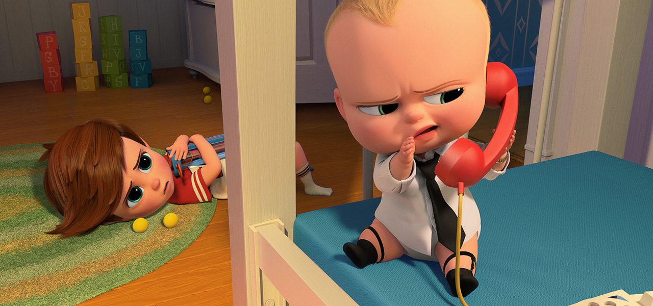
After co-directing each of Dreamworks’ Madagascar films and helming Megamind, Tom McGrath’s newest project is The Boss Baby, an animated feature based on a book by Marla Frazee about a baby in a suit who takes over his new parents’ house, much to the chagrin of his older brother Tim.

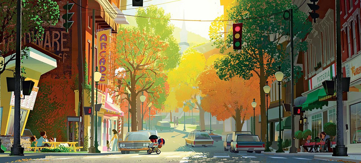
McGrath saw The Boss Baby as a way to shake things up a little in terms of animation and design at Dreamworks. And that’s exactly what the film does – eschewing the standard cg look for more graphic, stylized, and stark designs.
In this interview with Cartoon Brew, the director discusses how he came to those design decisions, how he drew upon classic sources of inspirations to inspire the look of the film, and how the child point of view was crucial in telling the story.
Cartoon Brew: It feels like the design in this film is something different from what we’ve seen before, especially in the look of the characters, which are somewhat simplified. Can you talk about that approach?
Tom McGrath: Well, I always self-criticize my own movies of the past and Dreamworks movies too, and I kind of felt around the whole industry that everyone was trying to do very realistic stuff. Even if they’re really caricatured designs, you’d still see all these pores and the blood vessels. To me it was this weird mixture. I loved animation when it was 2D, and that’s when I got into it 30 years ago. And I’ve been always trying to do in the computer what I loved about traditional animation.
I just wanted to approach it like you would a 2D movie. So I hired Joe Moshier [as our character designer], who is very graphic and very stylized, and I wanted the eyes to be more appealing, which is a slightly larger pupil. And I wanted to make sure that the modeled rigs could also do the kind of expressions you could only do hand-drawn.
It was challenging because initially there were too many controls on the characters for animators, so I sat with Carlos Puertolas, our head of animation. We actually shaved the number of controls in half so that we could make these really strong expressions. We’re both fans of Tex Avery and Chuck Jones. If you look at a film like One Froggy Evening, just the expressions that are drawn are funny. They could be a held drawing. And so we really wanted the acting and the broadness of the animation to shine like that.
How did that specifically influence the design?
Tom McGrath: There was a lot of work, knowing that’s the animation style we wanted to do, making the design supportive of that. It’s still a cg movie but we didn’t want to get overly surfaced. And everything that is surfaced is just painted by hand.

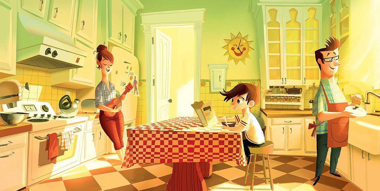
And so the characters kind of led the style of the world around it. We used a lot of the shape language from the 60s design movement to support the broadness of the design. Because, if you look at Boss Baby, his head would probably be the size of a pumpkin in the real world on a baby’s body. And so the backgrounds had to support that.
I noticed too that we were doing all these realistic films and I just realized that it was like realist paintings where it doesn’t feel artistic anymore. You don’t know where to look on a screen because it’s so cluttered. And so everyone who came onto the show, I’d show them the opening of Lady and the Tramp. And it’s this really pretty snowy town, and you go into this window with a Christmas tree, and that’s the only real bright color. And everything was kind of washed in washes and that sort of thing and it just kind of fell away, and it felt really charming and appealing.

That’s what I loved about old Disney backgrounds – they really led your eye. So anyone who would come on the movie I would show them this Lady and the Tramp clip and I would say, this is not what the movie is going to look like exactly, but it should be what it feels like. It should be easy on the eyes and really lead your eye to what’s important in the shot.
We realized that the palette was really important and we had to slap our own wrists and not add too much to it and make the characters the star and let the background support that. But it started with the character designs that Joe Moshier had done. With graphic designs it’s always challenging in 3D because you can turn them to a certain angle and you lose that shape language. But even with the animation we cheated a lot and played it to the camera so we could get really strong silhouettes and reads on the characters.
Because the film is presented mostly from the point of view of the children, how did that impact layout and cinematography in animation?
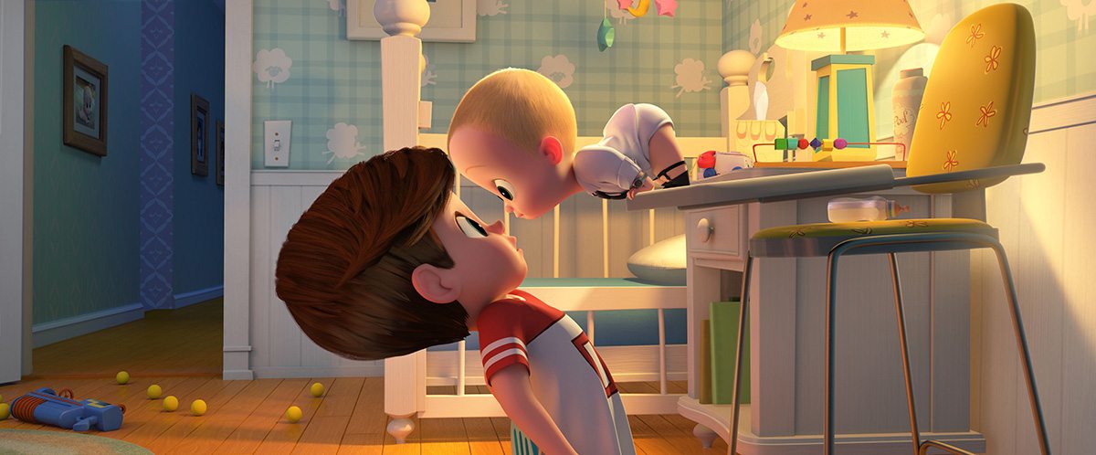
Tom McGrath: There was a lot of thought put into the camera work, which is very low to the ground, and on certain lens choices. We used wider lenses and put the characters closer to the lenses – it has a certain effect where it doesn’t feel claustrophobic but it’s that feeling of, when you’re a kid everything seems bigger. It’s like if you go back to your elementary school everything’s so small. Even the bathrooms.
But when you’re a kid everything seems really enormous, and then once the Boss Baby and Tim get out of the house they have to get across town, they go to an airport which has to feel massive because it’s important emotionally that you feel that this little kid is lost in this giant airport.
The cinematic language is always worked out in advance. When the character is at a loss or emotionally challenged, then the camera work is just more static. And then when the kid was in motion or elated or in charge then the camera motion becomes very fluid. And then we had a different cinematic language for when we go into his imagination, which is actually these fish eye lenses but they don’t have any distortion because they’re cg.
The depth of field is very important, too, and so you use that at certain points in the movie to underscore the emotion. And then sometimes for comedy’s sake you back off and do a wide flat shot just because it’s funnier and you can let the animators go to town on that.
Talk about finding what’s funny — do you try and board everything, do you work up some animatics just to see if a gag that has a lot of physicality is working?
Tom McGrath: Working with a board artist gets you probably 70 per cent of the physicality worked out. And then having the animators weigh in early is good too, but it’s always finding ‘business.’ And business is the most important thing I think for any storyboard artist. When you do a film you bring in reference material. I love to show storyboard artists films like Young Frankenstein because there’s always really funny business underneath the dialogue, that’s really the gold. You really want to tell the story as if the sound were turned down.
What kind of animation challenges did putting adult traits into the baby character bring?
Tom McGrath: For Boss Baby it was fun to modulate for the animators between a little cute baby head and all those business ticks that executives have. There’s a lot of these management training seminars that are online where they teach people to hold the volleyball because that’s a posture for your hands when you’re presenting, and all these little ticks, and the straightening of the tie and the adjusting of the cufflinks.
Now, there’s a point where he starts to revert to a normal baby. And so we needed him to modulate between having these adult characteristics but still be grounded in a little baby body. And then there’s points where he actually does go baby, which were fun to animate as well.
Also there’s these heightened reality moments. And for me it was just fun to actually go really design-y with that world when he’s in his imagination. So you’ll see a lot of inspiration from artists like Maurice Noble with really heightened design. And when we’re in the kid’s imagination we actually resurfaced the characters so they would feel more integrated with that.
The Boss Baby opens nationwide in the U.S. on Friday, March 30.

