Director Lizzi Akana On Creating Bandai Namco’s Code Vein Teaser
Last month, Bandai Namco grabbed attention online by releasing a mysterious animated teaser for an upcoming game. No title or description was given; the only clue provided was the hashtag #PrepareToDine.
Here’s that trailer:
On April 20th, the company revealed the title of the game – Code Vein – followed by a gameplay trailer that was released yesterday.
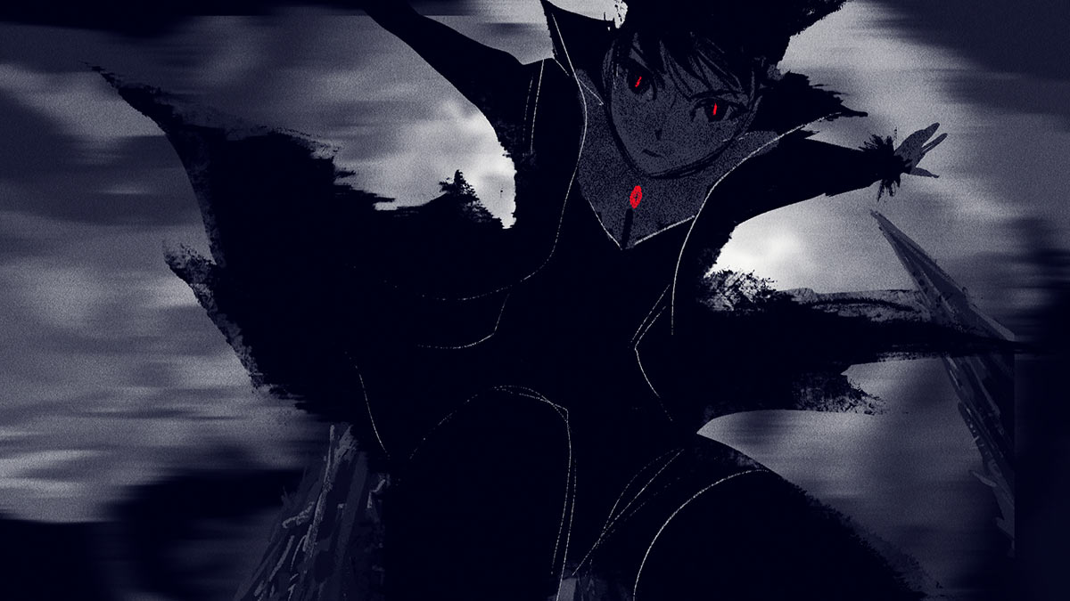
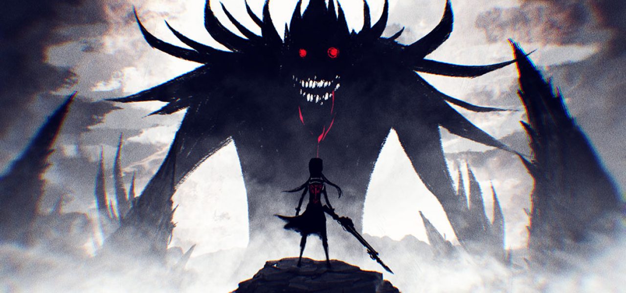
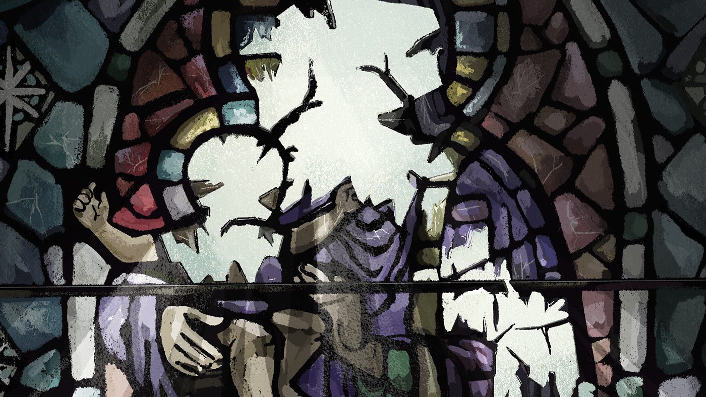
The cryptic 30-second teaser for the anime vampire RPG was intended to evoke the mood of the game and generate discussion, without giving away too much or replicating the game’s actual graphics. The assignment was presented to Brooklyn-based director and animator Lizzi Akana, whose work we’ve profiled on the site in the past. Cartoon Brew caught up with her, via email, to learn more about how she worked with Bandai to create this novel game promo.
Cartoon Brew: How did Bandai Namco find you for the gig? Did you have to pitch for the job?
Lizzi Akana: My brother, Stephen, is actually the brand manager for Code Vein at Bandai Namco and was the driving force behind creating this project. He specifically wanted to work with me as he is obviously very familiar with my body of work and thought it was a perfect opportunity for us to professionally collaborate together.
That said, I still had to do a formal pitch in order to sell Bandai Namco and the Code Vein team on the concept and aesthetic for the teaser, as this marketing campaign was a slightly new strategy for the company. Code Vein is a brand new IP and doesn’t have a pre-existing audience, so Stephen felt that commissioning a unique piece of animation would ultimately generate more interest and speculation prior to the game’s official announcement while still delivering the mood and theme of the title.
Did Bandai show you the artwork from the game beforehand? Your piece looks very different from the game’s art or gameplay, and I’m wondering how you and the game publisher decide on this direction?
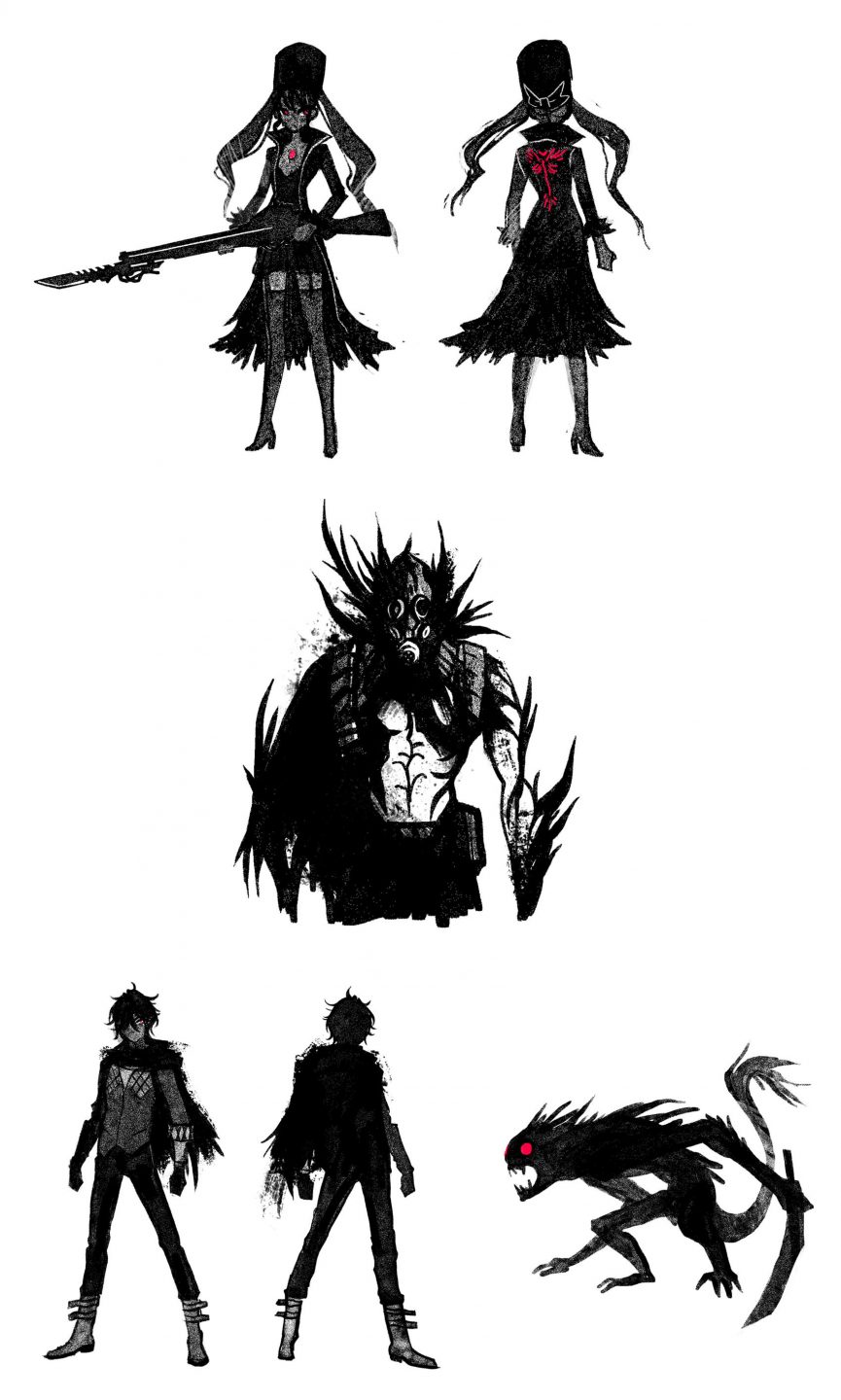
Lizzi Akana: We did have quite a bit of access to the concept designs and gameplay beforehand, but it was tricky because many elements were still in development so it was important that we not represent any of the unfinalized designs in full clarity. Because of this, there was a lot of back and forth initially in order to figure out how far away from the original artwork we could stray and what we were even allowed to show, but in the end we collectively decided that a stylized interpretation was the way to go.
It made sense for practical purposes, but through our discussions it was made clear that our primary goal was not to do a one-to-one representation of Code Vein, but to view it through an artist’s lens. It was also an opportunity to delve deeper into the mythology and explore the implied narrative of the game. Fans will soon see plenty of official artwork and gameplay direct from the source, but our teaser was meant to draw in audiences and create an air of mystery and excitement by offering something refreshingly new. Thanks largely to Stephen’s efforts, we were given a pretty long leash in terms of creative freedom, so we decided to run with it.
Relatedly, what was behind your decision to use a mostly monochromatic palette?
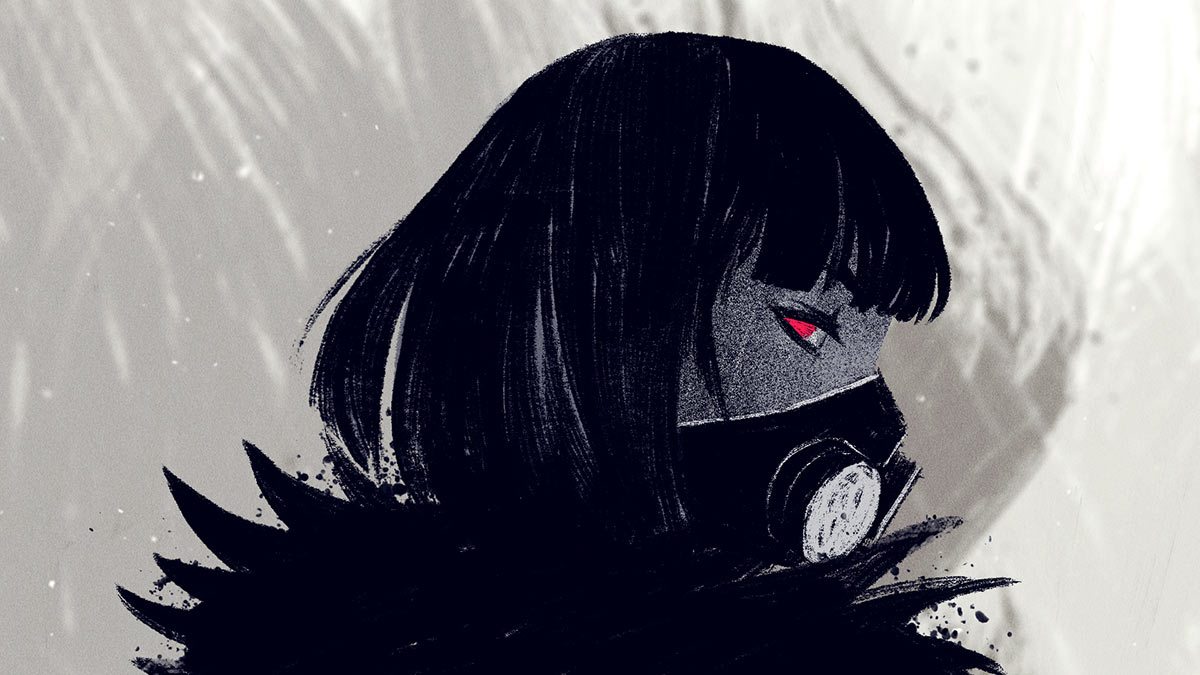
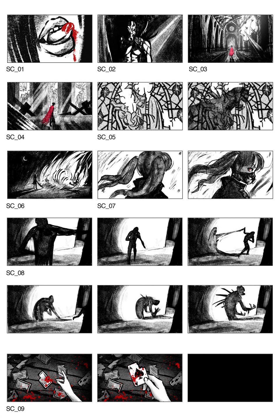
Lizzi Akana: That decision came pretty early on. It seemed logical from the beginning to use a limited palette for a post-apocalyptic world inhabited by vampire-esque creatures, but during the research process I also became very inspired by the film noir genre. As I mentioned before, we had the creative hurdle of introducing an audience to this world without directly representing too much of the original artwork, so film noir was an excellent reference point for creating striking imagery without revealing anything too specifically in high detail. Shadows and dramatic lighting played a huge role in helping create the right mood and atmosphere, but we pretty much used every trick we could think of to “show without showing.”
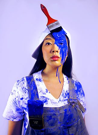
Young directors are often advised to have a recognizable approach or style, but I’ve noticed that you create new styles and approaches for most of your projects. Is your stylistic flexibility by choice or circumstance, and what benefits and/or challenges has it created for you as a director?
Lizzi Akana: I think a lot of that comes from the fact that most of the work I’ve done has been commissioned by clients. Perhaps if I made more personal work and promoted a signature style my portfolio be more cohesive, but as an artist who has been freelancing for the past 12 years, it’s been important for me to be able to produce animation using a variety of different methods and styles.
A non-animation hero of mine is the composer/lyricist Stephen Sondheim, and one of his primary principles of writing is that “Content dictates form.” I try to bear that philosophy in mind when I’m approaching a new project.
Sometimes the animation I work on is right in my wheelhouse and other times I have to go way outside my comfort zone, but ultimately my job is to satisfy the needs of the client so you learn to adapt. While the diversity of my work might be a hindrance from a branding standpoint, it’s been liberating to not be pigeonholed into doing the same thing over and over. Every job has a new set of challenges, and with each success I discover a new set of skills that I can add to my toolbox.
Can you provide some basic details about the production about tools, crew, and production length?
Lizzi Akana: All of the animation and backgrounds were created in Photoshop and then composited in After Effects. (Some of my animation was roughed out in Flash, but Marika [Cowan, animator] works exclusively in PS.)
From start to finish we had around two months to create the teaser, with our skeleton crew on staggered schedules. I filled the role of creative director, producer, and animator on the creative end of production, and Stephen Akana spearheaded the marketing campaign at Bandai Namco and was our liaison to both their U.S. and Japan division.
Our animation was part of an international teaser campaign, where both the title and even description the game were held in utmost secrecy. The only additional clue given beyond the animation was the hashtag #preparetodine.
You mentioned your animator Marika Cowan. Who else did you work with on this spot?
I cannot overstate Marika Cowan’s importance in practically every phase of production on this project: she undertook the role of character designer, storyboard artist, and animator, and ended up animating some of the most challenging and memorable shots in the entire piece (including the heart-stopping final action sequence).
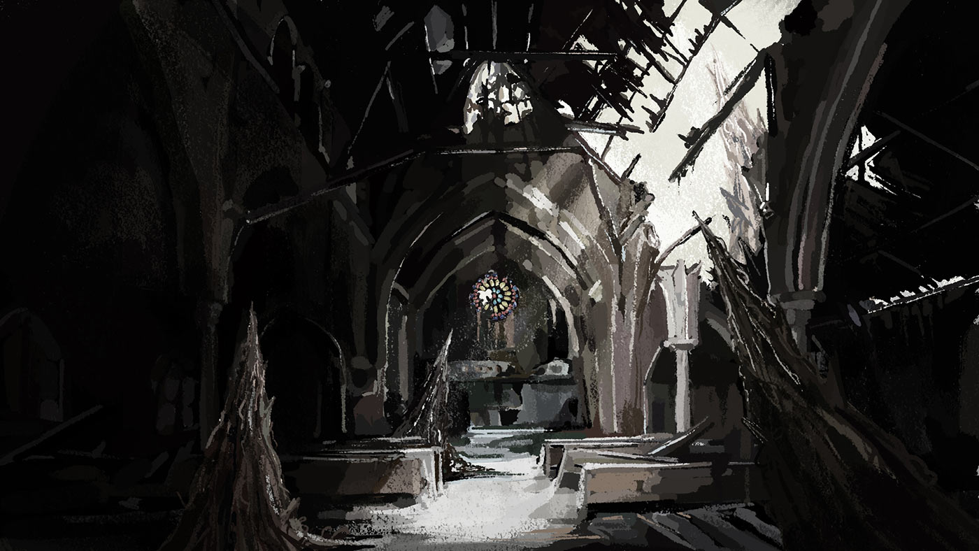
Another invaluable contributor was our background artist, Jennifer Leaver. Not only was she lightning quick, but as our characters were often hidden in shadows or had their backs to the camera, the environments played an essential role in driving the suggestive narrative that we were trying to convey.
In compositing, Andrew Macfarlane was able to take these elements and add a level of atmosphere, depth, and polish that elevated the animation beyond my wildest expectations. I rarely have the opportunity to have an original score accompany my animation, and Fritz Myers haunting music was the perfect soundtrack to weave our disconnected vignettes together. And last but not least, many thanks to Stephen Akana, who not only spearheaded the entire campaign, but who was a key creative voice throughout the course of the production. As a director, the best case scenario is to be able to hire talented people and get out of their way, so I feel incredibly proud that every single member of my team was able to leave an indelible mark on this project.

