
Open Season 2‘s Coloring Page Clumsiness
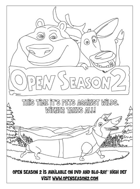
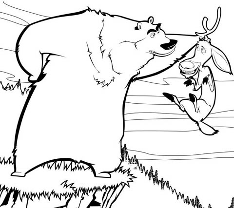
I’ve discovered over the years that studying a studio’s movie advertising and film promotion collateral is often a good way of gauging the studio’s overall health. For example, compare this coloring page that Sony Pictures Animation created for the first Open Season:

to what arrived in our email yesterday from a PR company promoting Open Season 2:

This is a fairly significant lapse in quality control. How hard is it to have an artist spend a couple hours whipping up a proper illustration of the studio’s franchise characters? Instead they created the line art by tracing the contours from a CG model resulting in an awkward, wonky, tangent-filled piece of crud. Infer what you want from this little promotional piece, but I don’t see successful studios like Pixar and DreamWorks making these type of bush-league mistakes.
For the record, the PR company also made us this offer: “We are happy to offer DVD giveaways with this coloring page as well.” I think we’ll take a raincheck on that offer.

