
Making ‘Toy Story 4’: How Pixar Created New Characters For The Franchise
Toy Story 4 shouldn’t have worked. Its predecessor had wrapped up the franchise’s narrative arc perfectly. The new film spent years in development as the script underwent extensive rewriting; the crew admit that they struggled to find a story worth telling. Meanwhile, John Lasseter stepped down as the film’s director, leaving his co-director Josh Cooley to helm the film alone.
Fears about what the bumpy history might mean for the film were dispelled when it came out last June. Fans were relieved to find that Pixar had pulled off yet another entertaining, highly polished feature. By and large, audiences agreed that this new installment was justified by its innovations on franchise formulas. It became the fifth Disney film to gross a billion dollars last year, and is now the frontrunner in the animated feature category at the Oscars.
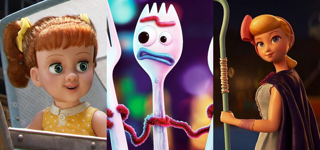
Key to the appeal of Toy Story 4 is its roster of new and revamped characters. Its artists have spoken extensively about the research and production processes on the film. Drawing from a range of interviews, we’ve compiled their most interesting comments below, focusing on three characters — and one set. The comments shine light on Pixar’s evolving approach to everything from characterization to texturing. Follow the links for further insights.
Bo Peep
A mere supporting character in the first two Toy Story films — and absent from the third — Bo Peep returns as a protagonist in the fourth, partly in response to pressure from fans. She’s so central to the story that, during production, the team code-named the film “Peep.” Now living without an owner, she’s no longer a mere love interest for Woody — she’s been reimagined as a plucky adventurer.
A crew of artists, animators, and writers known as “Team Bo” was given the job of fleshing out her new identity. After discarding various ideas, they settled on Bo as a kind of action hero, but they were keen to avoid the clichés of that genre and imbue her with a feminine grace. For reference, they looked to gymnasts and ballroom dancers, as well as tomboyish action leads like Rey from Star Wars.
“I loved being part of the process of putting a strong woman on screen,” directing animator Becki Tower explains to AWN. “Because that makes you really think, ‘What do I see as a strong woman?’ You ask yourself, ‘Why do I think this visually represents that idea? Or this?’ … You do a lot of soul searching regarding your own biases and stereotypes.”
The team had to recreate Bo from the ground up, as modeling artist Tanja Krampfert tells Awards Daily: “We couldn’t use old assets to create her for Toy Story 4 because she was always a[n] original background character.” The artists visited a porcelain factory and a doll fabrication shop to get inspiration for Bo’s design. They realized that they’d have to break some rules of how porcelain moves in order to turn her into the dynamic character they wanted.
However, they were able to light and texture her material far more realistically than in the previous films. As supervising animator Scott Clark tells Nerds and Beyond, “In the first movie, the limitations of the medium made everything look plastic, even the things that were supposed to look porcelain. By the time we get to Toy Story 4, we can actually do the subsurface scattering. We can do the little cracking that gives her that porcelain look.”
Mara MacMahon, a character designer and rigger on Team Bo, elaborates in an interview with Today: “One of the things [the team] noticed about porcelain is that when it goes into the firing process, the glaze softens everything. So unlike Woody and Buzz, you don’t really get sharp details on Bo. So things like her nostrils — you barely see them — are soft and melted, her eyelashes painted on. Even with her hands, the animators were posing them like a doll’s hands: an actual porcelain’s fingers are group[ed] together because they’d break off as single fingers.”
Forky
Forky started life as a plastic spork, and turned into a sentient toy when the young girl Bonnie gave him a makeshift face and limbs. The breakout star of the film, he embodies troubling existential questions about what it means to be a toy. This was the idea from the start, as Cooley tells Deadline: “We looked at our own kids and [said], ‘Our kids play with anything. Like, my kids will pick up a rock, and pretend it’s a truck. So, does that mean that rock comes to life?’”
As an entirely new kind of character, Forky was especially appealing to the artists and animators. However, his design posed a problem: unlike the others, he’s made out of an assortment of materials. Bob Moyer, Pixar’s supervising technical director, discusses this with Creative Bloq: “[The animators] really animated the pipe cleaners to feel like pipe cleaners, and his googly eyes to rotate and never quite focus. There were a lot of technical challenges in Forky to give something that felt really simple, but actually had a lot of complexity in how animation could work with him.”
A key task was to give the character’s movements a ragged, disjointed feel, as befits a toy made by a child. Producer Jonas Rivera tells Screen International that this required an adjustment: “A lot of the animators were coming off Incredibles 2 where they were doing beautiful work with complex characters, and we essentially gave them a stick figure.” After seeing their initial work, Cooley insisted that they make Forky look “crappier.” They obliged.
The team played extensively with sporks; animator Claudio de Oliveira even asked his three-year-old daughter to create her own Forky. He tells Vulture that the key to the character was keeping his backbone stiff — as a hard plastic spine would be — and giving him zany facial expressions: “The way that he moves his mouth, it’s a very particular burst of energy on every little different mouth shape. I was trying to infuse that kid energy of always being on their tippy-toes.”
Tony Hale (Veep), an actor with a knack for neurotic comedy, was brought on to voice the character. He became central to Forky’s development, workshopping various voices, and giving the animators inspiration with his own physical performance. He tells Vulture: “Having done a lot of animation, you almost have to do the same physicality you would if you were on camera. That energy needs to be channeled into a microphone. You don’t have a raised eyebrow, or a certain look.”
Gabby Gabby and the antique store
Gabby Gabby is a 1950s pull-string doll with a sinister manner and posse of terrifying ventriloquist dummies at her command. She is, in effect, the film’s antagonist — the first female villain in the franchise — but we learn that her hostility is caused by a deep-seated loneliness. The main challenge for her creators was to make her at once ominous and sympathetic.
Cooley tells Deadline about the inspirations for Gabby and the antique store she inhabits: “My parents took me into tons of antique stores growing up, and they are dusty, and old, and creepy, and have a haunted house feel to them… We did a lot of research on this film, too, went to a lot of stores. There were always creepy dolls from eras past, and there were always ventriloquist dummies in a corner somewhere — usually broken, which makes them even more terrifying.”
Unlike some of the other, more human-like toys, Gabby moves very much like a doll. Her stiff gestures, slow-moving eyelids, and plastic texture give her an uncanny appearance. In contrast, her henchmen are revoltingly floppy. Ironically for ventriloquist dummies, they’re among the few characters who don’t talk.
The staging of Gabby’s scenes was also crucial to her characterization. Rosie Cole, sets technical director, describes their approach to Indiewire: “We built her home with multiple layers and props. We gave her a sewing kit and a throne that she sits on, overseeing the front of the store. It resembles a fancy apartment building.”
Stephen Karski, a sets supervisor, adds: “Gabby’s cabinet is very purposefully situated in the center of the store so that she can see everything. We made it very dangerous for any of the toys to be traveling in the store because Gabby and the [ventriloquist] dummies who live on top have complete control of the whole store.”
The store, which became the biggest set in Pixar history, was the most complex element of the entire film. Disney’s official website quotes Thomas Jordan, another sets supervisor: “To a toy, an antiques mall feels like a city, so we built an antiques mall that was 8,000 square feet with more than 10,000 items for sale. All of the items are arranged by theme. There are rugs, which indicate where customers will be walking around so the toys know to avoid being seen, and lots of places for them to hide.”
The store is full of glass, light sources, and therefore reflections — which creates a lot of work for Renderman, Pixar’s proprietary rendering software. Not only that, it contains both toys and humans, and thus needs to exist at both scales.
As Moyer tells Creative Bloq, “We really needed to believe… that every single part of the antiques mall was done to a ‘macro’ level. We had a lot of interplay of trying to make things look good from a distance and also things looking good super-close up, where you’d see dust and procedurally generated cobwebs, for instance.” The task of rendering this set in photorealistic detail ate up a big chunk of the film’s reported $200m budget.


