How They Did It: Playing With Music And Geometry In ‘The Emperor’s Newest Clothes’
Hans Christian Andersen’s devilish story The Emperor’s New Clothes revolves around a playful conceit: an arrogant emperor is promised a set of clothes that will only be visible to the wise, yet is given no clothes at all. As he parades naked through his kingdom, nobody — least of all the emperor himself — calls him out, for fear of being taken for a fool.
Perhaps because of its scope for visual game-playing, The Emperor’s New Clothes has proved attractive to filmmakers, including animators, over the decades. When Simón Wilches-Castro was offered the chance to give the tale a makeover, he jumped at it.
The result is The Emperor’s Newest Clothes, a characteristically bold work from the Colombian-born artist. The half-hour special, which debuted on HBO in November last year, revels in the absurdity of the story: Wilches-Castro tells it with bubble-gum colors and flamboyantly angular designs. The eye-popping visuals are a perfect fit for the high camp of William Finn’s original songs.
Below, the director guides Cartoon Brew through the myriad influences on the film’s design. His comments are edited from longer answers sent by email. Although Wilches-Castro is based at Titmouse, The Emperor’s Newest Clothes was made at Starburns Industries.
The characters

Wilches-Castro: The limitation of creating a set of characters framed by simple geometry presented a very interesting challenge, in design as well as animation. We really wanted them to express a unique personality and have a “way of moving” that was specific to their form.
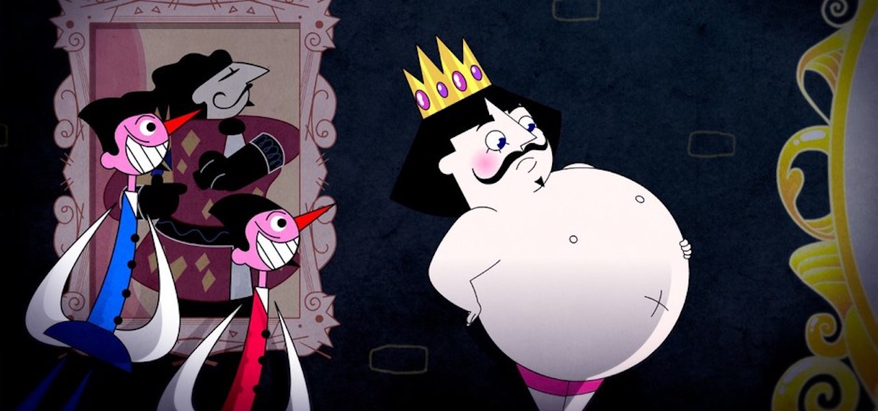
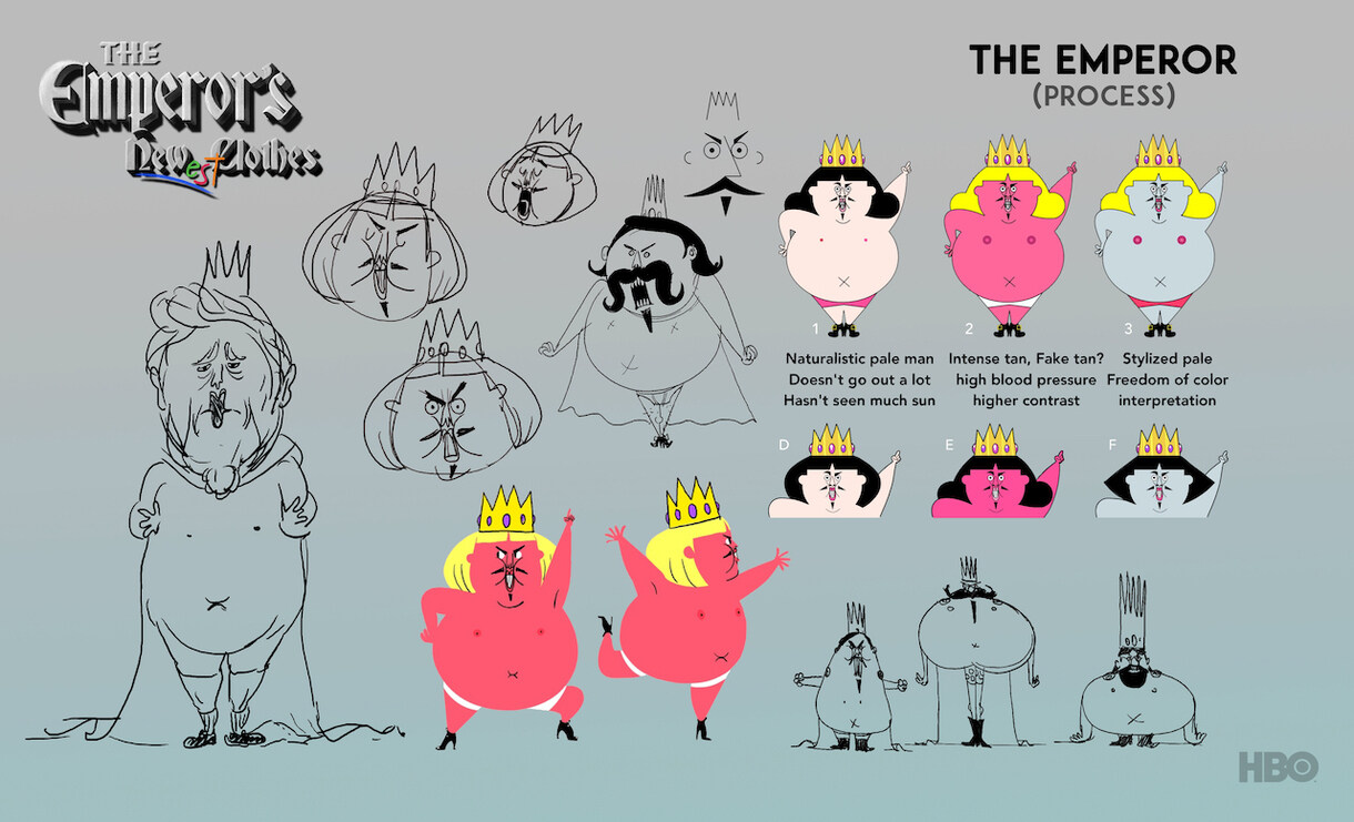
The emperor’s shape was supposed to show a life of excess and comfort, with the attitude of a delusional person who believed himself to be a Greek statue. His legs and arms are disproportionate to the size of his body which made his movement short, clumsy, and awkward. This made for very interesting animation during his big dance numbers.
Thomasina was designed to be the opposite of the emperor. She’s a small and seemingly powerless figure, which makes her final victory over the emperor all the sweeter. She is animated the most traditionally out of all the characters. Her movement would express that she is the one sane person in this kingdom of insanity.
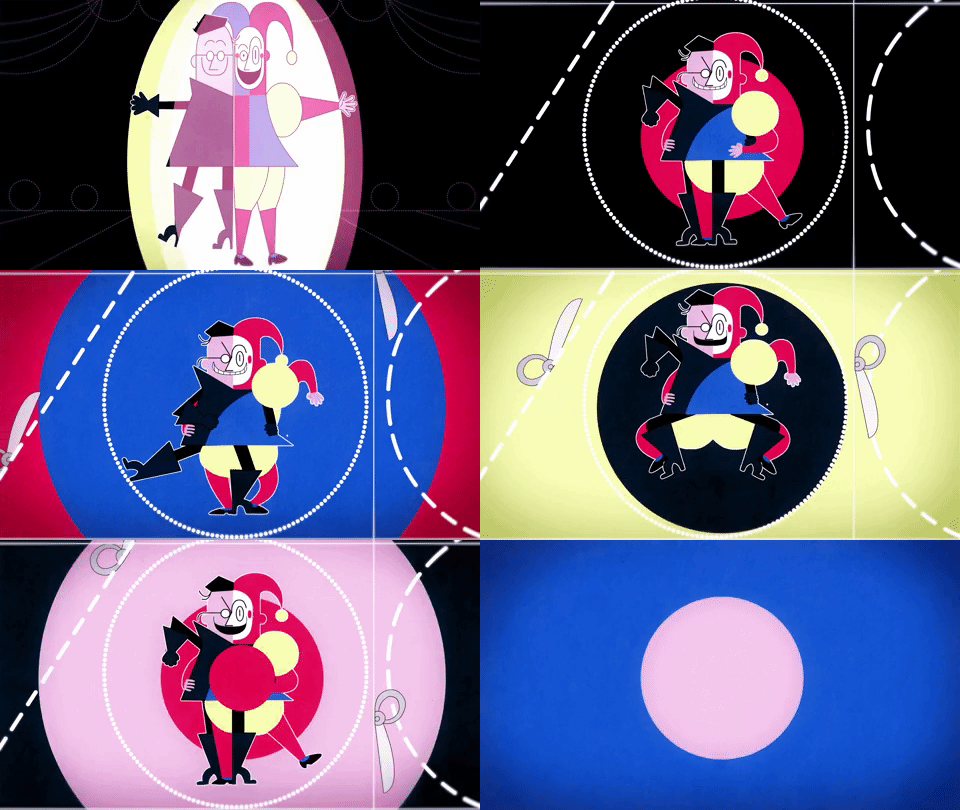
The jester, Syco, and the military advisor, Phantic, were designed to be visually opposing figures but aligned in their lack of scruples. Syco was inspired by the mobiles of Alexander Calder, and Phantic, who is rigid and dull, by Japanese tangram games. They come together in a musical number, so their design needed to fit together as one weird mutant, which made for a very fun puzzle to solve.
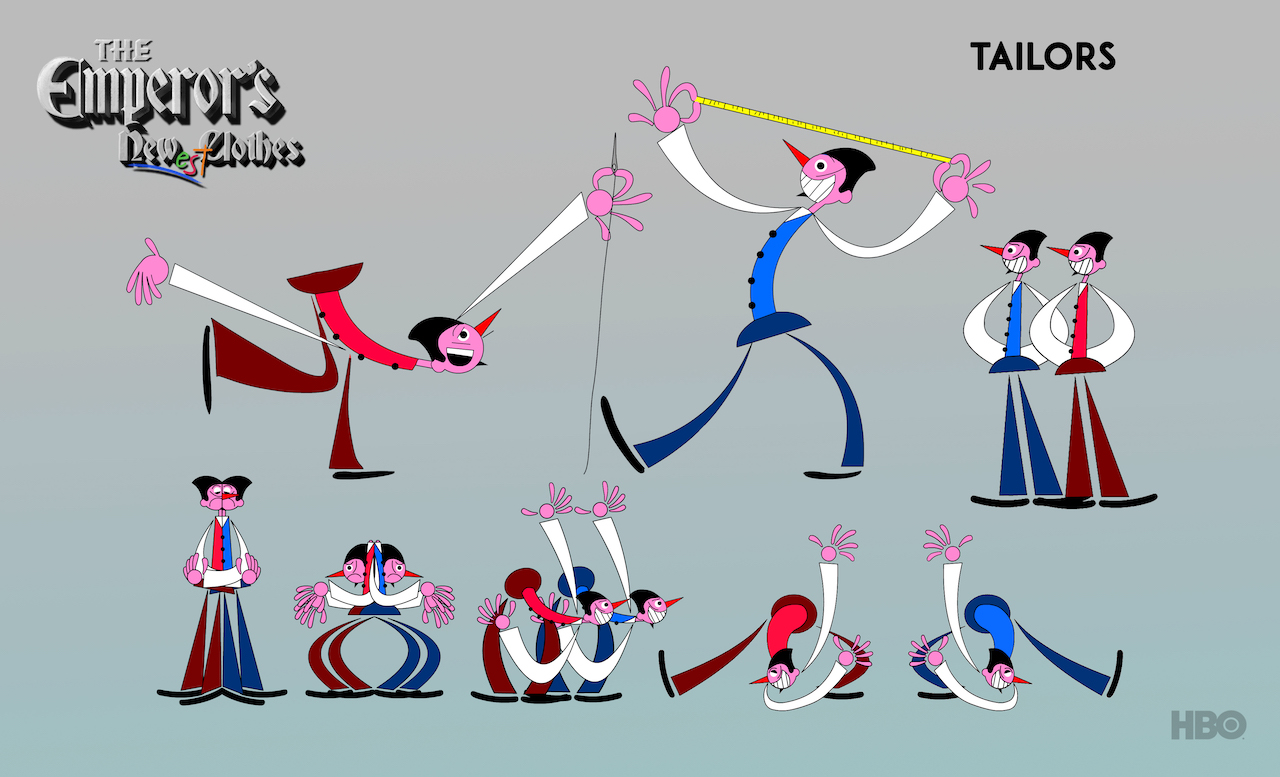
The tailors came last. I was almost out of ideas after coming up with the main cast, and out of exhaustion I decided to draw only their profiles. Big eyes, big smile, and hair like a shark’s fin. I wanted silhouettes that would always be legible, so I detached their limbs from their body, which gave them a slithery movement when animated by Richard Ramos. These two characters proved to be among the most popular designs of the show.
The world
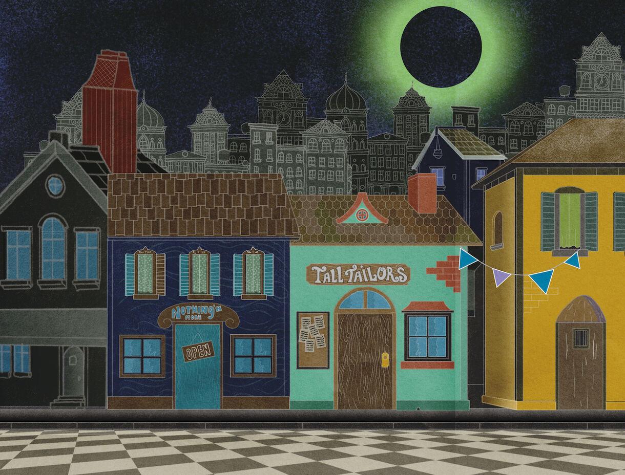
Wilches-Castro: Once we had the characters and the general aesthetic of the film defined, Galen Pehrson came in as art director and helped create the world. A hard challenge, as he had to make something that made sense and no sense at the same time. For this he led a talented group of designers — Simon Estrada, Ilana Schwartz, and Sullivan Brown — whose challenge was to design an upside-down kingdom inspired by medieval art where perspective is used selectively and irreverently.
Because the film was about “truth” and “facts,” I wanted to create a world that wasn’t trying to represent any sort of photographic realism. Instead of “the illusion of life,” we were trying to go for “the disillusion of our times.” No suspension of disbelief, so we wanted it to look surreal, cubist, and sometimes nonsensical. I drew inspiration from the Bauhaus artists: Kandinsky, Klee, and especially Oskar Schlemmer, the author of one of my favorite pieces, The Triadic Ballet.
The music
Wilches-Castro: Another very unique aspect of this project was a constant back and forth between the music and the visuals of the project. The songs by William Finn inspired our first visuals, which then helped Michael Starobin, our composer, arrange the songs to reflect each character’s temperament. Out of these arrangements, our animators — Luke Freitag, Lars Ingleman, and Ramos — would work on choreographies based on songs that were tailor-made (no pun intended) for the designs of their characters.
Constructing these musical numbers was one of the funnest things I had to do. I wanted to juxtapose the Broadway quality of the Finn’s songs with the stylized visuals of our design schema and see what would come out. I’m a huge fan of Busby Berkeley, whose work is as graphic and striking as the work of the Bauhaus. We also made various nods to one of my favorite films, Yellow Submarine, which is characterized by its resourcefulness when laying out its musical acts.
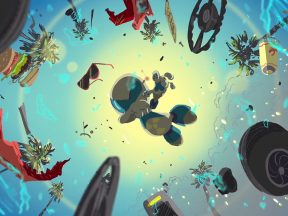
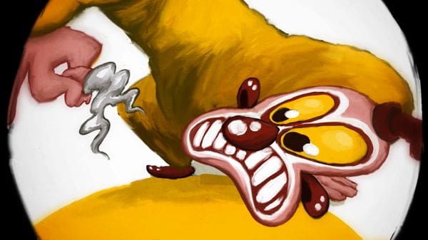
The Sycophantic song was by far the most interesting one to animate. Inspired by the “Elephants on Parade” sequence in Dumbo, I wanted to make this “nightmare” like an improvised collage. It didn’t have a storyboard or proper animatic. I just had a library of assets that I would arrange linearly according to the music and see what would come out. You don’t know if the thing is going to work, but undeniably it makes for something unique and creatively very refreshing.

.png)
