How They Did It: ‘Missing Link’ Production Designer Nelson Lowry On The Complexities Of Hybrid Production
Seasoned production designer Nelson Lowry has honed his craft on Laika’s stop-motion hybrid features. He has worked on Paranorman, Kubo and the Two Strings, and most recently Chris Butler’s Missing Link. This epic tale of an English explorer’s adventures with a Yeti-like Sasquatch is considered the studio’s most ambitious film to date.
Prior to being at Laika, Lowry moved around different productions, including Wes Anderson’s Fantastic Mr. Fox and Tim Burton’s Corpse Bride (as art director). After three features with Laika, which is based in Portland, Oregon, he’s embraced a creative process that thrives on challenges.
“Things that used to be insurmountable are now kind of common to us,” he tells Cartoon Brew over the phone. “And because the directive from [Laika president] Travis Knight is to keep pushing the boundaries of the technology, we have to do that on each show.” Effects like water simulation, digital backgrounds, and particularly the atmospheric perspective in certain shots are feasible now and add value to the storytelling.
On Missing Link, Lowry’s key tasks as production designer included meetings with director of photography Chris Peterson and vfx supervisor Steve Emerson. They would take the most difficult storyboards and categorize them into what they called “buckets,” each with a different level of complexity.
The first level of complexity was a foreground element with just a matte painting behind it. Next, it would be a foreground element, a background miniature, and a small vfx extension. Each categorization kept raising the stakes of difficulty, cost, and time. This process helped the team to decide what could be feasibly constructed physically, and what would need to be created digitally.
Lowry’s team consistently collaborated with Laika’s in-house vfx department to bring each piece of the project into existence. “We’re not just giving them marching orders; we’re working with them and they’re bringing stuff back to us,” he says, adding that considering how tangible the stop-motion discipline is, his work feels essentially like building live-action films.
Below, Lowry goes into greater detail about his work on Missing Link. He talks about what was built and what was done in post-production, the scale of the characters, the cultural references he employed, his fascination with color palettes, and the specifics of sets like the imposing Shangri-La or the Santa Ana train station.
Building physical elements for the vfx team to enhance
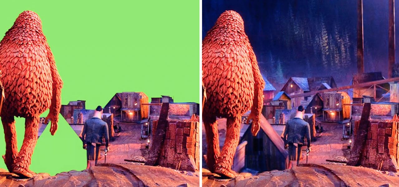
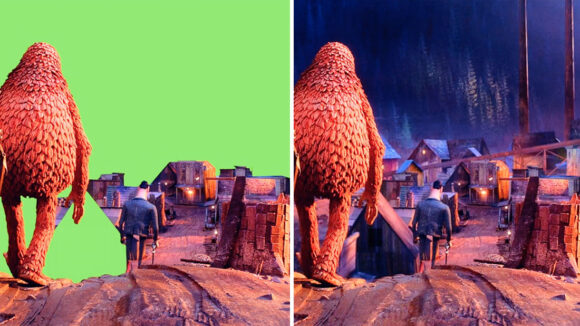
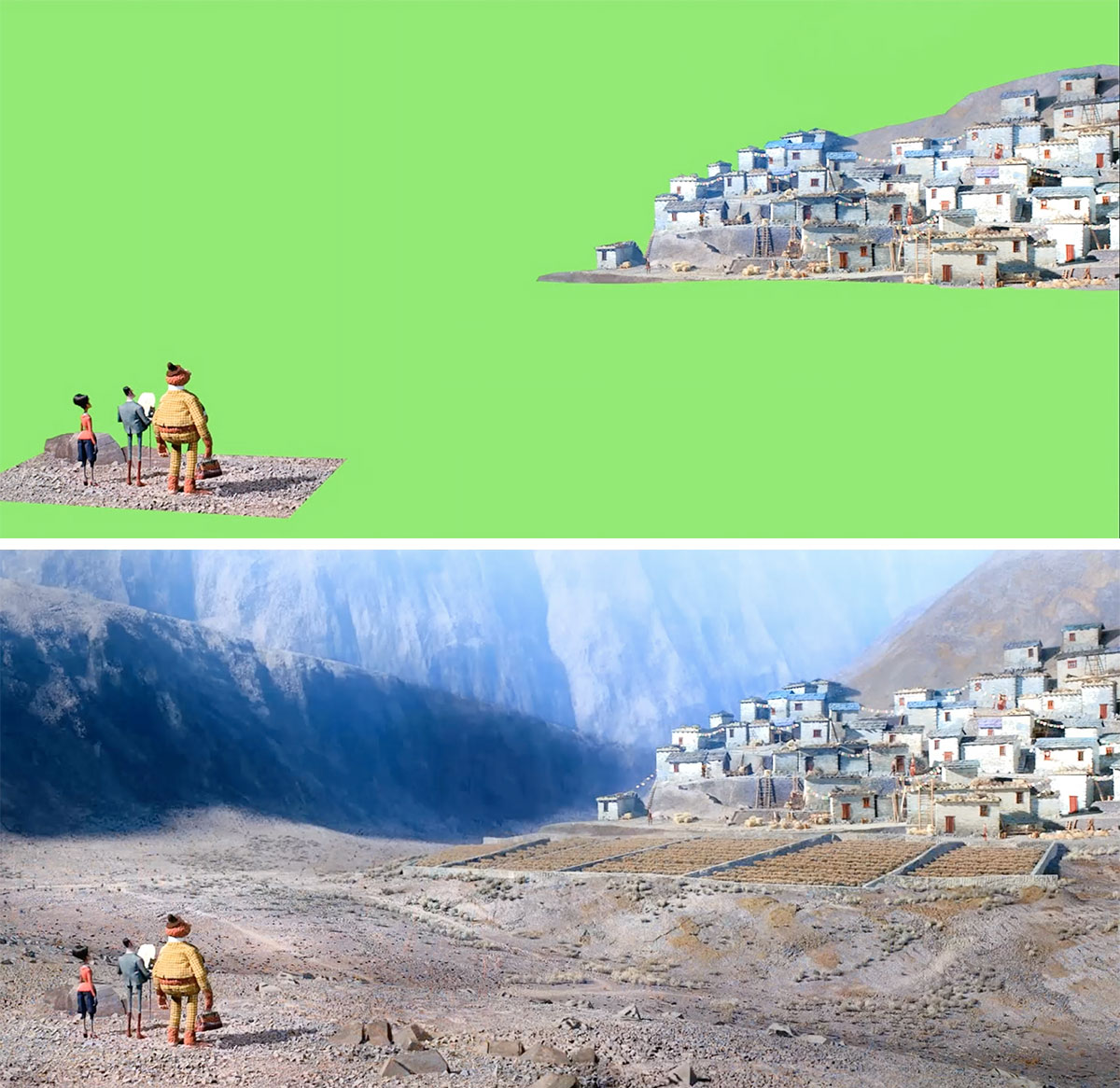
Lowry: We try to make things as practical as possible. We don’t exclude the vfx team and then expect them to clean up our mess later. We actually work with them. Let’s say we have a character standing in front of a mountain range. We can’t expect the vfx team to handle a mountain range without some kind of physical build. We often build maquettes — say, a mountain that’s about four by six foot — then detail them and shoot them onstage with green screen.
We’re trying to imbue the backgrounds with as much of the practical build [as possible]. If we can’t build it, we’d like to give the vfx as much preference as possible. We’ll build something, we’ll shoot it, and then we’ll have a really nice practical element that they can base their digital extensions on. I find it very jarring when I watch a film and I can really see where the breaks are.
But each shot has its own thing and if there’s a move with a camera, we have to match-move and scale that move for the miniature as well, so that adds yet another level of complexity. Usually complexity comes pretty exclusively with scale. Our sets can get quite large, but we’d only have these discussions for something we couldn’t practically build because it’s too big, or there’s too much parallax or depth perception.
Scaling down the characters
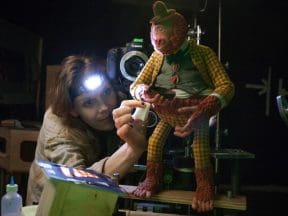
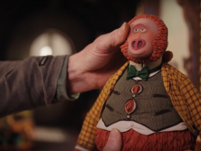
Lowry: [With Missing Link] we scaled the puppet down because we had the advantage of not having a child, a small character, being the center of the film. The human characters like Sir Lionel were smaller than our normal human characters, and that was just because Link [the Sasquatch] was so big. The sets were about 5–7% smaller than usual, which collectively over a whole show is significant.
But we had to also do that because of the number of sets. We had never done anything with this many locations. At one point we had upwards of 90 units shooting, and those couldn’t be much larger, or we wouldn’t have been able to fit it all in. There were about 70 unique locations and probably about 100 sets, with duplicates or reverses.
Using better previs and Terragen
Lowry: Previs helps you design the shots before you go into huge time-consuming builds. We never want to overbuild anything, so the more we can tell what kind of lens we’re going to use on the camera, how deep a set’s going to be, what the extension is going to be like, the better. That’s a not a new tool, but we’re using it more and it’s really helping us.
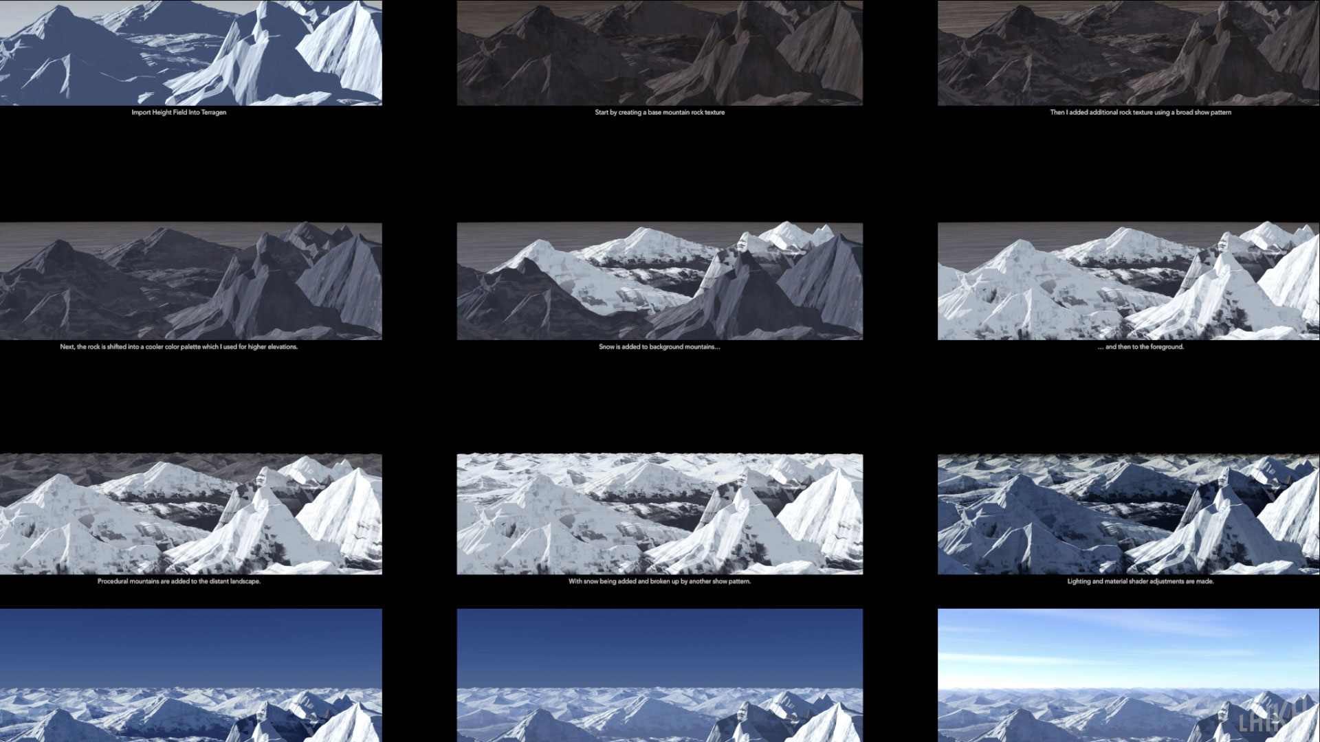
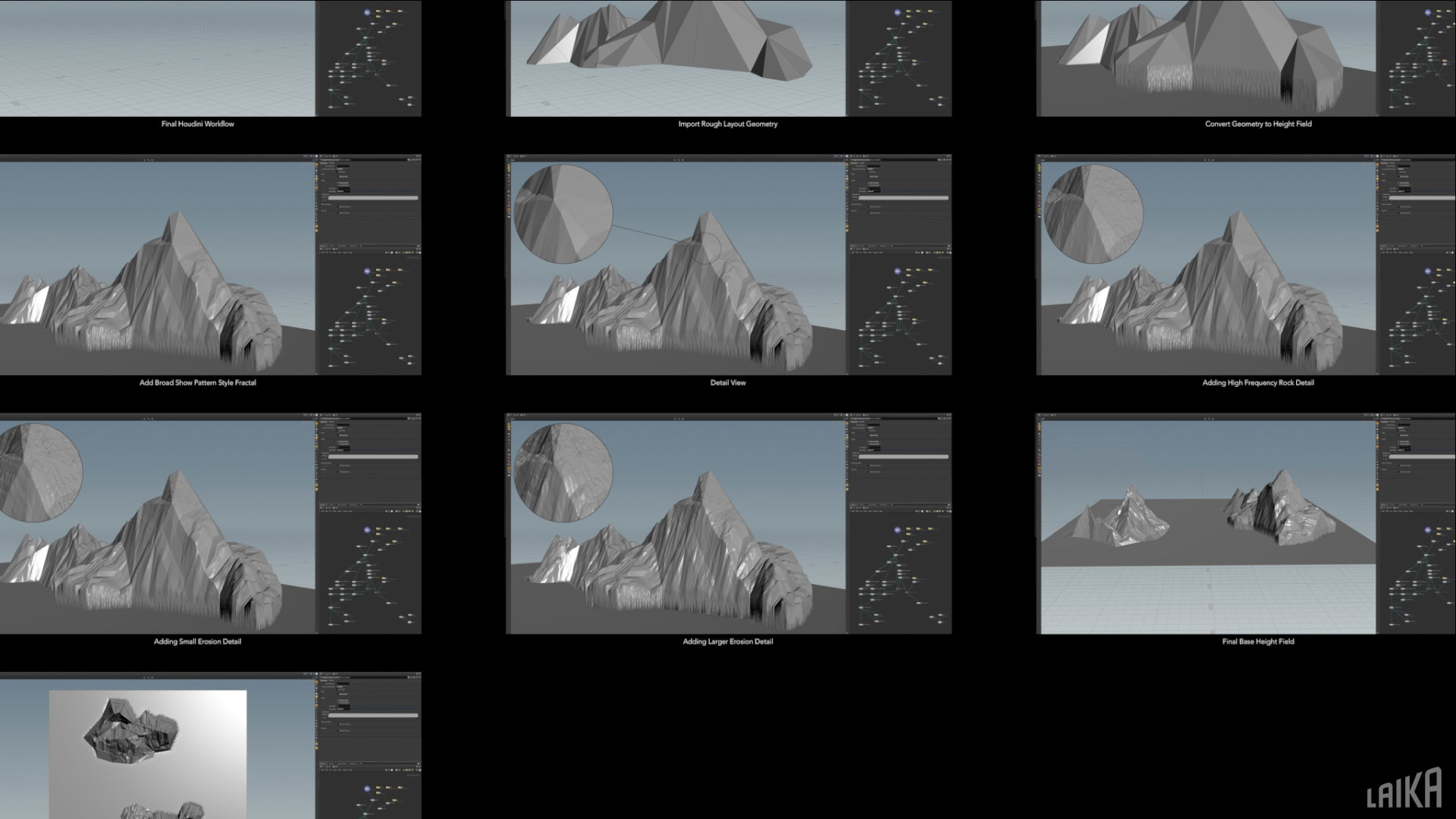
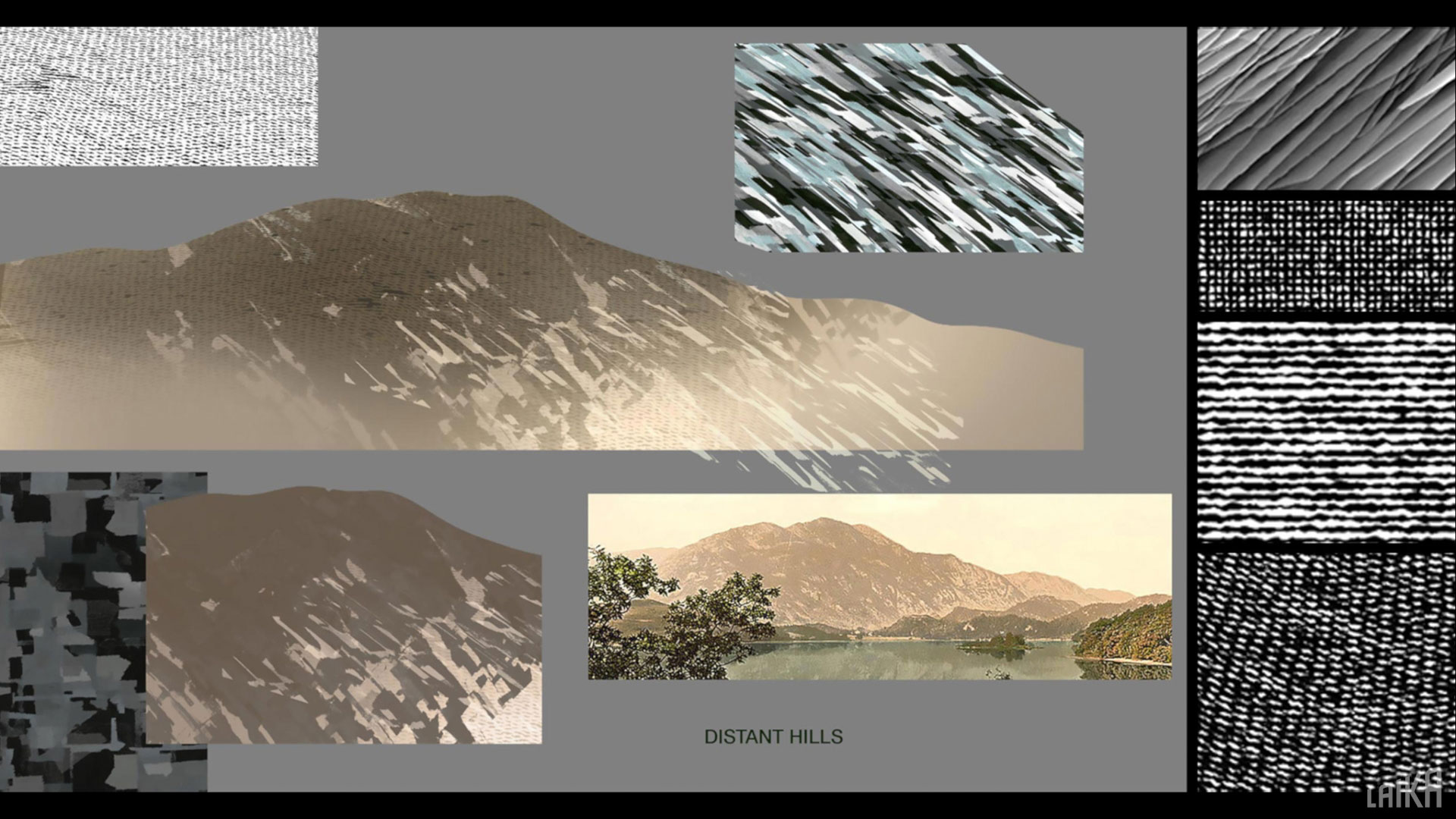
And then there’s new programs like Terragen, a world-building software. We have an amazing artist here who takes something that could be quite procedural and puts a lot of art into it, breaking the rules of how it works to make it look more like our sets. There’s always new stuff to help us make the films.
Creating culturally specific design references
Lowry: One of my favorite things about my job is that every time I design an environment, I learn a lot about the place, unless of course it’s all fantasy. For Missing Link I researched different parts of the world during [the late 19th century]. Just looking on the computer wasn’t good enough, because there wasn’t the depth of information that I needed. So I went to places like historical societies. Old antique postcards are amazing — there are lots of those images that have never been scanned and aren’t available online.
On the other hand, culturally I’ve always been very careful and respectful, long before the “woke” culture, because I like to keep things non-denominational unless it’s a really big story point. I avoid all religious iconography because an animated feature is not the place to include that. We also hired a cultural sensitivity person who really helped us make sure we were on track, especially for the Himalayas. We didn’t want to misrepresent it. It was both a history lesson and a culture lesson for me along the way.
I often say that our imaginations are not as good as we think they are, and that real life is way more interesting. We leaned heavily into what the places really looked like. Even the sequence of colors of the flags in the village represents the different energies of the earth. There’s meaning to the way they arrange those flags.
Reducing color palettes
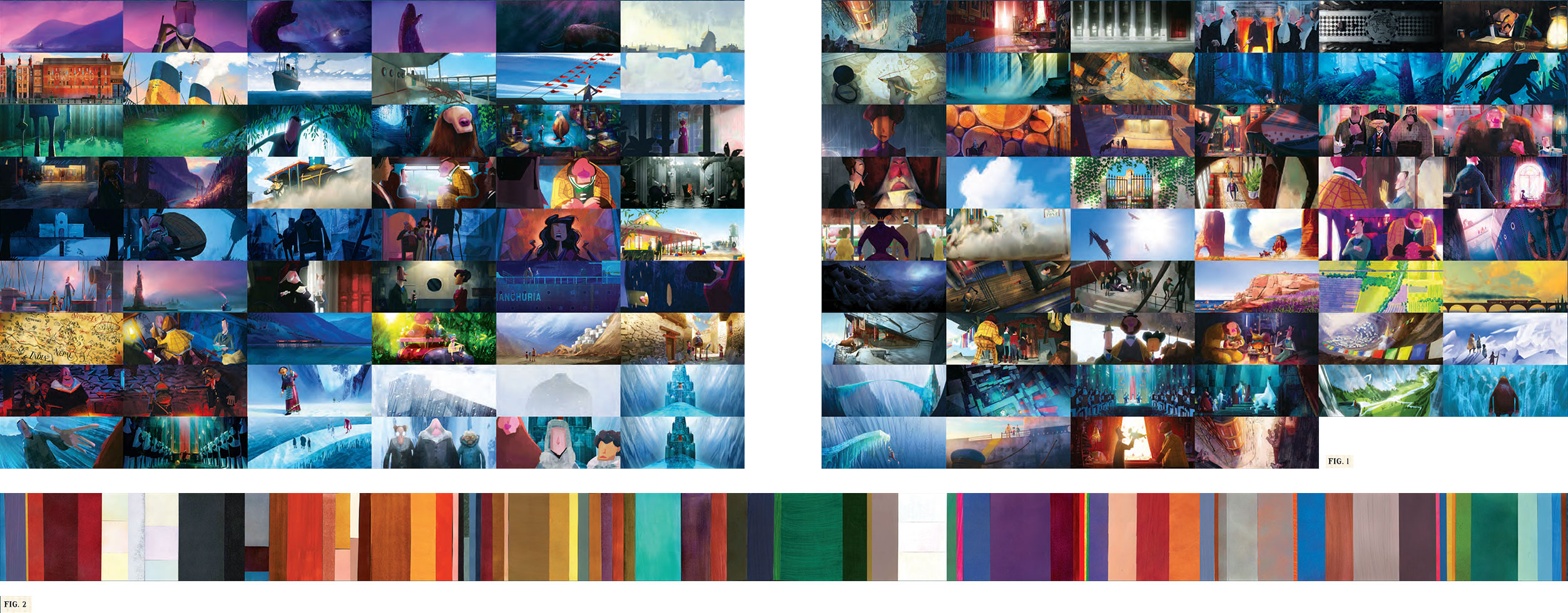
Lowry: I’m passionate about color palettes for films. I usually take the whole film and identify all the locations, and then I start applying primary, secondary, and tertiary color notes for each one of those environments. Then I put that into a color script. This is before I deal with any kind of emotional arc of the film — it’s just to show what the local color of things is. I look at the patterning of the color across the film.
In Missing Link, we reduced the color palette of each location pretty intensely. I don’t think you’d notice it necessarily, but each location has three colors, basically. A set might have one, two, or three primary colors, and then within that an object might be of contrasting color, like a red book or a desk. For example, Pacific Northwest has blue, green, a violet, and a rusty brown.
I believe that the whole film design needs to reflect the sensibility of the character design. Because the characters are so beautifully animated, you might forget how stylized they are, but they are absurdly stylized. Mr. Link is an avocado, Sir Lionel is a series of tubes on a sort of rectangular body — his head is a tube with a triangle stuck on it for a nose.
I made sure that the shape language and the entire film reflected that, but I also reduced the color variance, thinking that everything had to follow that simplicity. I felt like if the colors of the world were too realistic or representative, they might stand out.
Set: Shangri La
Lowry: We’re always trying to build things practically, because we think that light falling on a model has a lovely feel to it. Sometimes people say to me, “Why don’t you just do that digitally?” And I often say, “Because it’s harder.” Building things isn’t as hard as it seems if you’re good at building things. Our on-site construction shop and model shop were able to build Shangri La pretty quickly.
It’s nice for us to have lots of physical reference. For any shots that do become digital, we know exactly what things should look like. It’s also just cool to have physical assets to send around. Some of those are being broken down and shipped around for display. It’s really nice for people to connect with our films by actually going to these locations. That’s different than just looking at a monitor on a stand, or a digital model in a gallery.
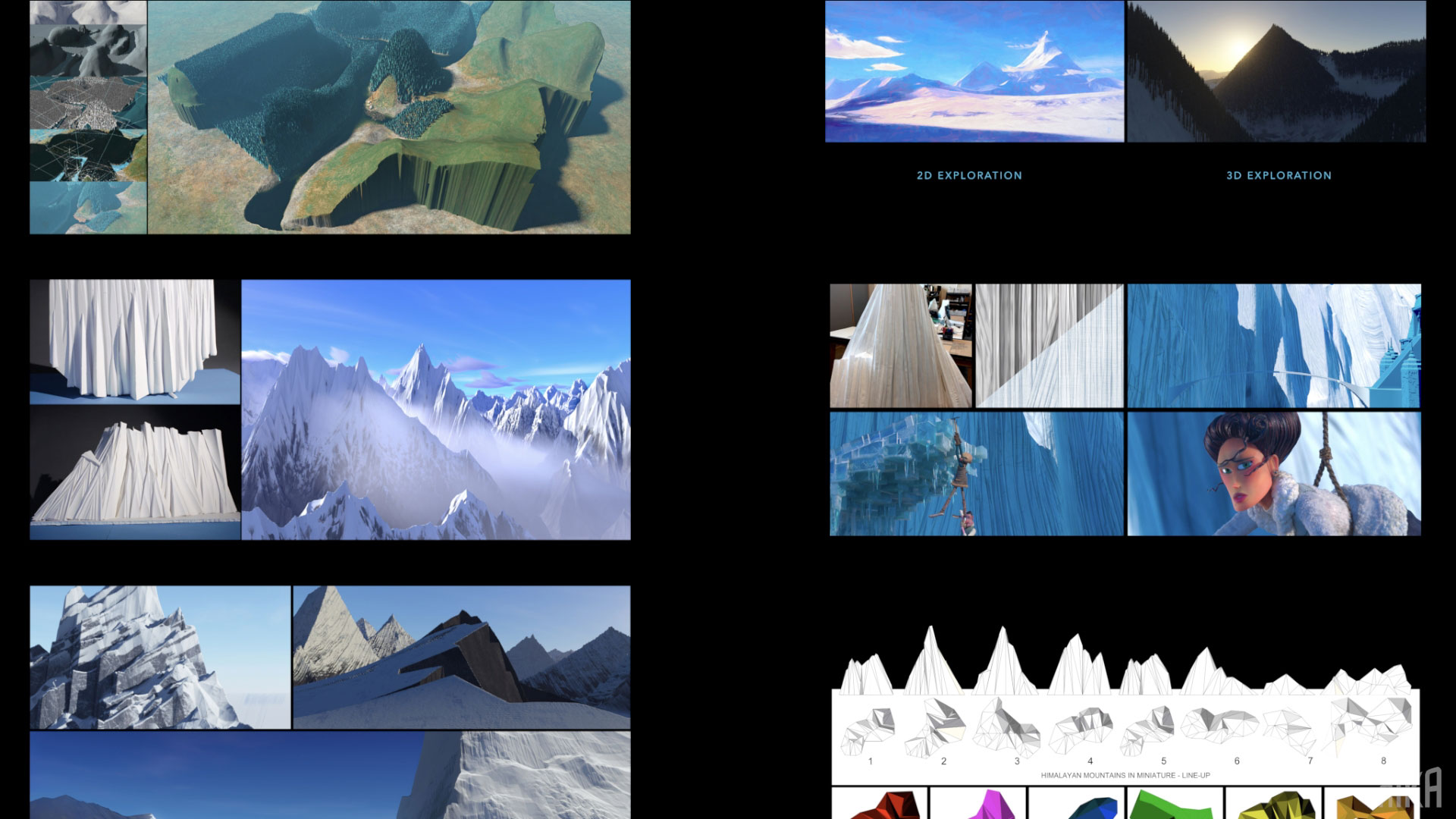
Shangri La was a pretty straightforward build, but the environment around was really hard to do. It’s all about the scale and making it feel like a real place. The third act takes place in a pretty barren situation. The rest of the film is very rich and detailed, and suddenly we’re on this ice bridge with a temple in the background and ice walls. We spend a lot of time there, so it really had to feel like a real place. The temple was icing on the cake, just sitting there looking nice.
Lighting is so important. Especially for the third act, which takes place at high altitude, against a blue sky, with one light source, basically — some bounce light, which on its own doesn’t make things look nice. We had to do a lot of things with the surfaces of the material. For the ice we had to find a water-clear casting material so that it felt real. And the detailing on the ice and snow had to have speckle on it, so that it looked broken up, and when the light hit it, it felt like it had scale.
Set: Santa Ana train station
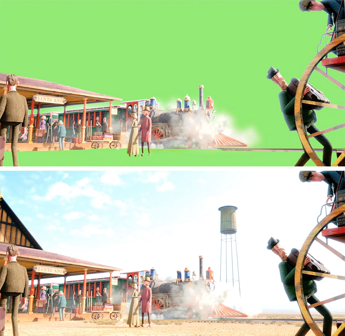
Lowry: For the shoot-out sequence at the train station, we had to create one light source of sun bouncing around under a porch, and a vast exterior digital extension. Then we finally decided to build the train full-scale because we needed something to moor all the characters to a location. In that high-noon scene under the porch, the light bounces around the shadows. We didn’t want to do that digitally, because so much of it affects the actual shooting on shots.
A lot went into the designing and planning of that. If we had followed the reference, we’d have used stark red paint, but it wouldn’t have lit very well. Instead, I opted for a bright yellow, knowing that the light would bounce around and it would be a nice stage for all that action to play out. It was a tricky set to create, but it feels like a real place when you watch the film.
For the scenes inside the train, we created a set with walls that pull away, because we didn’t want to have to digitally place those walls in. The mechanical department made this cool rig that pulled the walls away on a track; the animators would get to the characters and then the wall would go back in place. That wall moved away and went back again thousands of times, and registered perfectly every time. You never saw any kind of pixelation.
