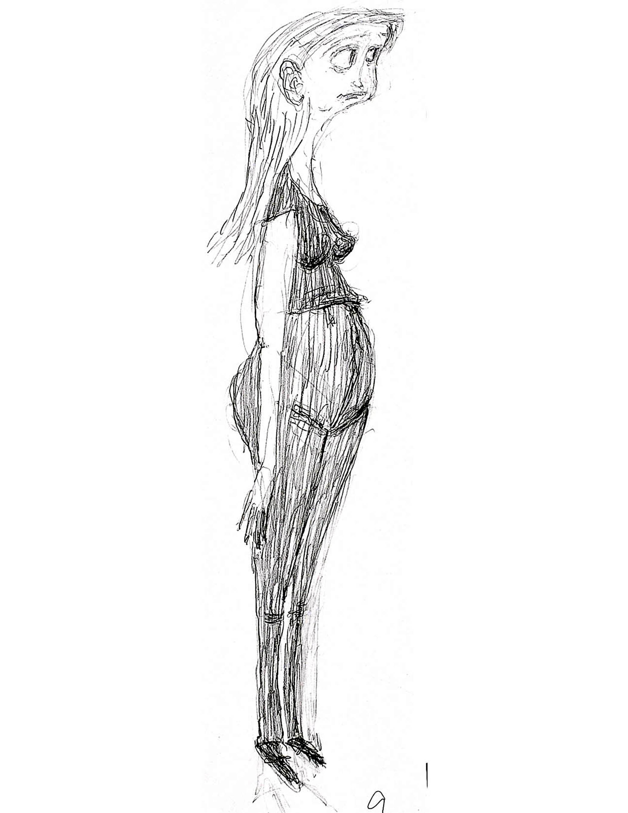
Meet “ParaNorman” Character Designer Heidi Smith
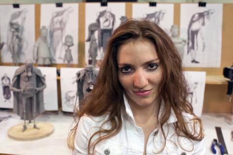
On August 17th, ParaNorman, the second feature film from Oregon-based animation studio Laika (Coraline), will hit movie screens nationwide. The film’s veteran co-directors, Sam Fell (The Tale of Despereaux) and Chris Butler (The Corpse Bride), decided to bring in some exciting new blood (no ghoulish pun intended) to make it happen. One of the new stand-outs has been the film’s character/conceptual designer, Heidi Smith.
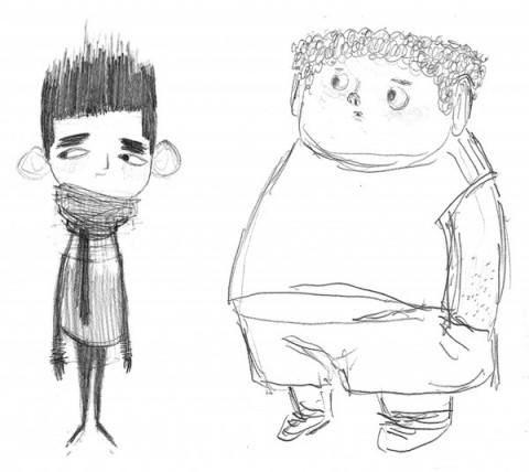
Smith came to Laika for ParaNorman back in 2008, just three months out of CalArts and beating out several notable contenders to develop the characters and aesthetic of this stop-motion feature. At CalArts she studied under greats like Mike Mitchell, and her years as a student were a big influence on this, her first major professional project. In fact, it went so far as having ParaNorman‘s lead character, Norman, based visually on a childhood photo of one of her professors.
With influences as varied as Yuri Norstein, Richard Williams and Stanley Kubrick, Smith had a lot to pull from to give ParaNorman its unique look. Cartoon Brew spoke with Smith earlier this month by phone about her experiences working at Laika, working with co-director Chris Butler and seeing her drawings be transformed into maquettes, set pieces and clothing.
Chris: The ParaNorman crew said they hired you because your work looked “scrappy and unhinged,” and had a bit of “nervous quality.” How would you compare the portfolio you got this job based on with the kind of work you ended up creating for ParaNorman?
Heidi: Because I worked on ParaNorman for so long, I think the style I used changed a bit as the project developed. My style changes, and I think that’s natural for an artist. You change and you grow, and I think that you get stronger. Your observational skills get stronger; your inspirations change.
Maybe in the beginning with that portfolio and my first bit of work for ParaNorman my work was kind of more boxy; it seemed a little more rectangular and boxy. As time went on and I worked on it with the others, my style became more organic, especially in the line-work.
Chris: Seeing as how this was your first major project after graduating college and you worked on ParaNorman for two years, I’d imagine this is the most detailed and length project you’ve ever done — professionally, personally or for college. What was it like having that amount of time to grow into it?
Heidi: I think it allowed me to really explore as an artist. ParaNorman’s co-director Chris Butler was really great to work with; his passion made me passionate. It was hard to run out of creative energy working at Laika, as there was always a passion there. I really became a stronger artist for working on this film.
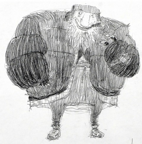
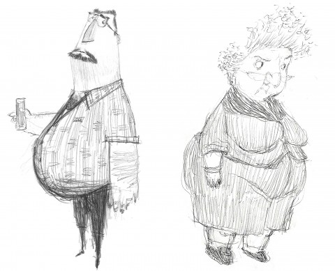
Chris: I’ve read that some of the characters, like Neil, pretty much stayed on track from the original designs to your finished versions, while others had quite an evolution — I’m talking specifically about Mr. Prenderghast (pictured above). Can you think back and tell us how you came up with your rendition of Mr. Prenderghast, which was reportedly far different than the original version before you came on board?
Heidi: When I read the script, I would just go with what I felt the story needed. Chris Butler didn’t give me any kind of guidelines or art; he just told me to read the script and have a go at drawing the characters.
So what I went with was my gut reaction. I would do a bunch of drawings, and then Chris and the others would tell me which ones they gravitated towards and we’d go from there. I found out later that Mr. Prenderghast was originally drawn to be a skinny person, but my rendition they went with was as a fat, hairy guy.
Chris: I heard a story that the lead character in ParaNorman, Norman Babock, is based on one of your professors at CalArts. Is that true?
Heidi: [laughs] Yes, it’s absolutely true. Norman Babcock from ParaNorman was completely inspired by one of my favorite instructors from CalArts, Norman Klein.
During my final year at CalArts, before I knew anything about ParaNorman, I told Norman Klein that I wanted to make an animated film about him when he was a kid, so Norman actually brought me an old photo of himself at his sister’s wedding. He was probably 12 years old at the time. I made a photocopy of it for reference. Oddly, after graduation, a recruiter from Laika contacts me about working on a project called ParaNorman! I thought,”Now, this is my opportunity to make my animated Norman Klein idea happen!” It was too perfect!
Chris: How would you describe the aesthetic in your work on ParaNorman?
Heidi: It has a lot of asymmetry. That’s one of the things they told me they liked about my portfolio coming into this project; they liked the asymmetry and “nervous line” of my work, as you said. It had a scratchy looseness they were looking for. One of the things they pointed out that they liked was that, for instance, in a character’s eyes one pupil might be bigger than the other. They liked it being different.
Chris: Overall, was there a specific moment in the two years you spent on ParaNorman where you feel you got on the right “wavelength” for the design aesthetic for ParaNorman? Was it a specific character piece, or a conversation?
Heidi: Well, for the longest time I spent all this time developing characters; you know, just churning them out. Around the fall of 2009 —
Chris: About one year into your work there.
Heidi: Right, around the fall of 2009 Chris Butler pulled me aside and asked me to take a pass at the props and the overall look of the town. He said he was going to eventually hire someone else to do the finished product, but he wanted me to give it a shot at giving the setting the same look as the characters. That’s when I think I felt like I was standing on solid ground.
Chris: As you said in the beginning of our conversation, this is your first major professional project out of college. What’s it like entering into such a massive production?
Heidi: I was so excited to be brought onto the project. When I was first hired, I thought I’d be joining a group of a gazillion other character designers working in tandem. When I arrived and saw I was pretty much it, it really invigorated me. I never dreamt I would be designing hundreds of characters for one movie. I was surprised at first, but it quickly became kind of a natural thing, if that makes any sense. When you think about it, it’s not that unusual; you want the movie to look like the characters, and you want the characters to look like they all come from the same world.
Chris: Although ParaNorman features hordes of zombies, this isn’t your typical zombie movie. One of the interesting things about it from a character design standpoint is how the movie shows what the zombies were like when they were human beings. As the character designer, how did you go about creating the human and zombie versions of some characters?
Heidi: That was really fun. [laughs]
Once we really got into it, I thought of it as this horrible “before and after” type think like you have on those television commercials or newspaper ads where you have someone boring on the left then they’re made up to look wonderful on the right, except for ParaNorman they’re made to look like zombies in a “before and after” kind of thing.
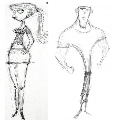
Chris: What’s it like seeing your drawings come to life — not drawn animation but as maquettes and puppets for this kind of stop-motion production?
Heidi: I thought it was amazing. It’s been amazing to work with Kent Melton, who sculpted all the maquettes. He was just as passionate as Chris Butler, and his work inspired my own work. He wasn’t afraid to take risks, which pushed me to do the same with my drawn work. I felt like he not only captured the spirit of the characters I designed, but he made them look better in his own way.
Chris: How did the process work between you two?
Heidi: Well, he would take a drawing and work from that. Sometimes he’d come to me and ask me to do a turnaround of a character to help him, usually of a specific feature like a nose or a helmet. He and I went back and forth to figure out what he needed, and for me to see what was possible with his work. We developed a really good communicative relationship.
Chris: I’ve been told that for the puppets, Laika went so far as to study the textures in your drawings for the clothing. Can you talk about the detail you put into those drawings and it being translated to actual fabric and puppets?
Heidi: One of the more memorable parts of this project for me was when Chris Butler asked me to do these sketches of textures. They would take those drawings and print them out and use them as fabric and what not in the costumes and sets.
Deborah Cook, ParaNorman’s costume designer, was amazing to work with. She would sometimes bring in interesting reference material she had found and bounce it off me to see how I could use it in my designs. Â One instance that I distinctly remember was her bringing me this classical painting and she asked me to study the tree bark in the piece and develop a texture based on that. She really encouraged me to do really weird and interesting textures, and not anything I would’ve thought of on my own. It was really exciting to work with everyone at Laika.
NOTE: Heidi Smith will appear in person with fellow ParaNorman artists Kevin Dart, Pete Oswald and other Laika designers to sign The Art Of ParaNorman book and do a Q&A; Sunday August 19th at noon, at Gallery Nucleus in Alhambra, California. Admission is free. See the movie, then go meet the artists themselves.
