‘How Much Fear Do We Put In The Story?’: Gustavo Steinberg On His New Brazilian Feature ‘Tito and the Birds’
Tapping into widespread distrust and prejudices against those who are superficially different in our globalized, yet divided world, Brazilian director Gustavo Steinberg (and co-directors Gabriel Bitar and André Catoto) envisioned their feature Tito and the Birds as an animated antidote for unfounded fear. Earthbound science fiction was the chosen conduit for the intuitive creators to confront economic inequality, classism, racism, and xenophobia.
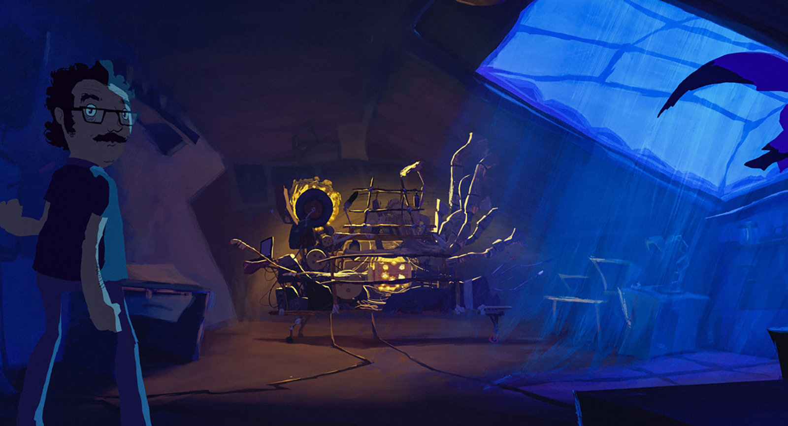
Its titular hero is a young boy whose scientist father has dedicated his every breath to inventing a device that would allow him to communicate with birds. To Tito’s dismay, his dad’s relentless efforts have led to a schism between his parents. His father’s departure from the home aligns with the alarming rise of the “disease of fear,” a condition that turns people into zombie-like creatures, with the potential to devolve into something far worse.
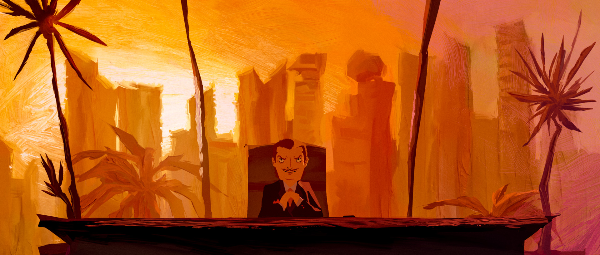
Expectedly, this monstrous crisis benefits a tyrannical villain eager to profit from the unsettling situation by selling a new life in gated communities for those wealthy enough and not infected. Encouraged by his friends and prompted, at first, by his wish to see his father, Tito sets out to finish his father’s beloved machine. Since birds may hold the secret to eradicating the mysterious illness, the kid’s crusade becomes all the more imperative.
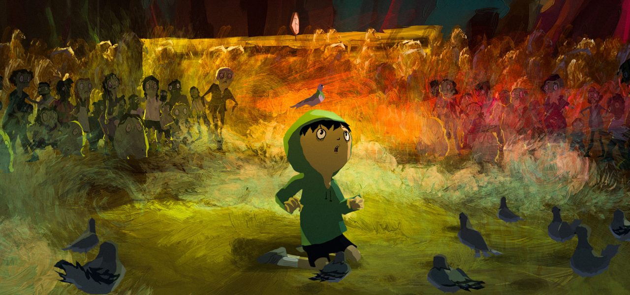
Intensely textured and summoning expressionistic influences, the highly stylized animation features oil paints for the backgrounds and unconventionally designed characters for a lightly spooky and tactile look. Making his animation debut, after previously working in fiction live action and documentary, Steinberg achieved a final product that’s irrefutably distinctive but grounded on a traditional premise, and elevated by the intellectual and moral concerns it contemplates.
On a sunny Los Angeles morning last October following the film’s premiere at the Animation Is Film Festival, Steinberg sat with Cartoon Brew to cure all our curious inquiries on the technical intricacies of Tito and the Birds and the topical issues it deftly addresses.
Cartoon Brew: Considering the complicated political and social moments Brazil, the United States, and many other countries are currently grappling with, Tito and the Birds is a rather timely film. Did the initial impulse to make it come from what you saw happening in the world?

Gustavo Steinberg: The original idea was to talk to kids about this thing that I call “the culture of fear,” this new fear brought by the media that has some political and economic implications. I also wanted to create a possibility for parents and adults to talk to kids about this, because sometimes we have a hard time finding the proper way to start a conversation about serious stuff that’s going on in the world, because you don’t want to say, “The world is shit,” to your children.
They must be happy, but at the same time we should talk to them about those things, specifically about this culture of fear. We discuss the implications of that, we discuss the reasons, but we don’t discuss how it operates, and I think it’s really important to understand that, so that you actually know what is going on. We wanted to develop a film that could show the fear disease in a very graphic and straight to-the-point way.
There were several different techniques used in the making of Tito and the Birds, including oil paintings. How did you arrive at the decision to use a mixed media palette to create the film?
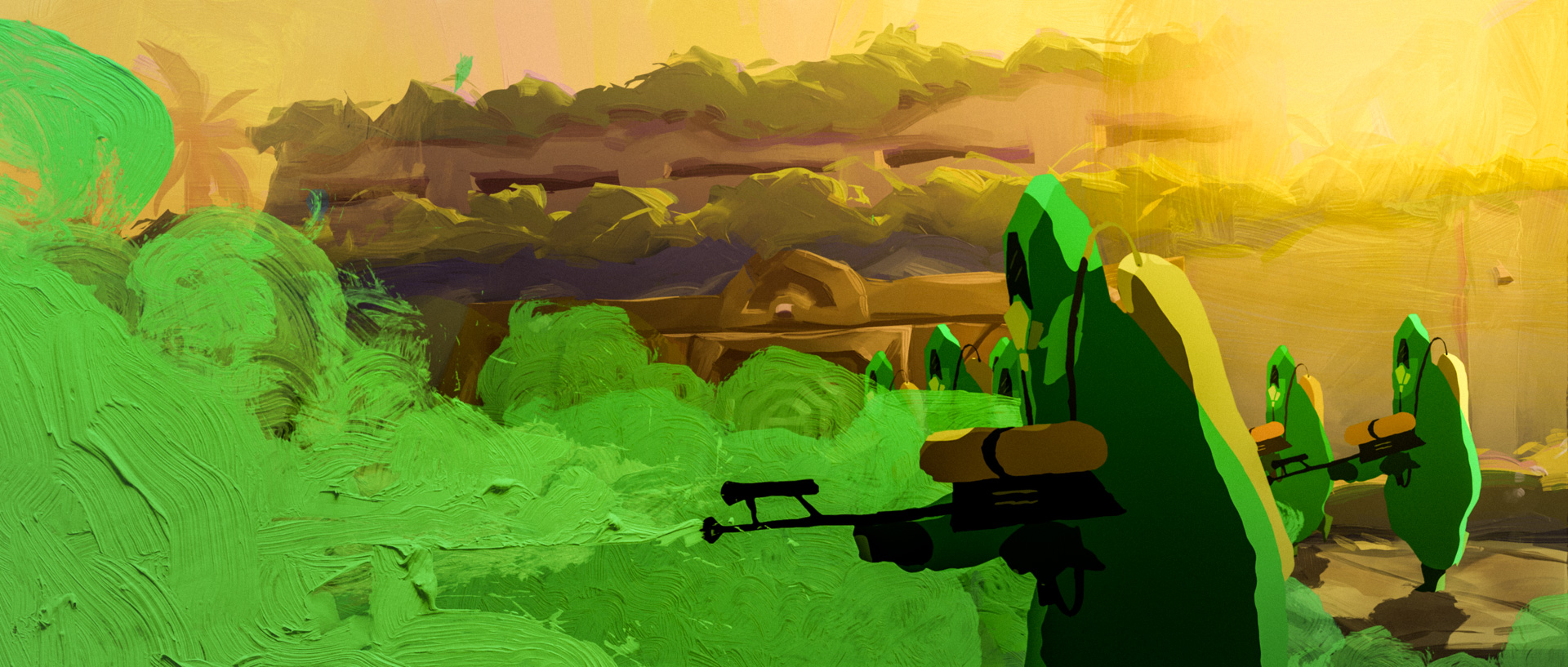
Gustavo Steinberg: First we developed the whole film, and we researched a lot to find aesthetics that we thought would tell the story best, so we studied expressionist painters who worked in oil as a big reference to tell a story about fear. We wanted to use as much oil paint as possible; ideally, we would have made it all with oil paint, but it would have been impossible.
We came up with a few solutions to make it really look like oil paint, within the realm of technical possibilities and the budget we had. We chose some specific brushes in Photoshop that would look like oil paint, and we also developed our own library with actual oil paint scanned and brought into Photoshop as brushes.
We knew from the start that compositing was going to play a big part in this project, so we planned everything so that we could use all its benefits. One of the co-directors, Gabriel Bitar, was also the head of compositing, so he was really anxious for this time to come. We hired Split Studio to do the animation and backgrounds, but for the compositing we put a crew together ourselves, headed by Gabriel.
When it got to him, then we actually used oil paint, specifically for special effects like smoke, water, light, and expressions, like when the pigeons would move, that was actually stop motion, frame-by-frame oil paint on glass.

With the knowledge that, using Photoshop or digital technology, you can recreate that oil painting feel, what’s the difference between having the real thing as opposed to recreating it digitally?
Gustavo Steinberg: It’s quite different. You can see the actual pressure of the strokes being applied in different ways on the screen, so it’s really a texture thing. Also, the light that reflects on the paint, it’s quite different from the options we had in the digital library. Of course, the library took us halfway there. Most of the paintings were made with Photoshop, but for the little details, we had real animated oil paint that gives an extra touch. It’s not really three dimensional, but it gives it depth. If you look at all the smoke in the end of the movie, the helicopter flying, and the ocean, there’s oil there, and when cars drive by, there are no cars, the effect is just a stroke of oil paint passing by paired with the sound.
How was the peculiar character design in the film developed and did it evolve throughout the process?
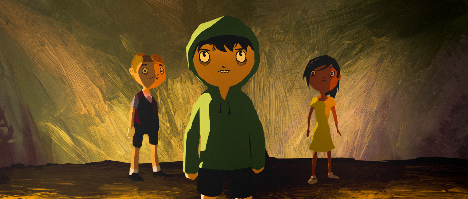
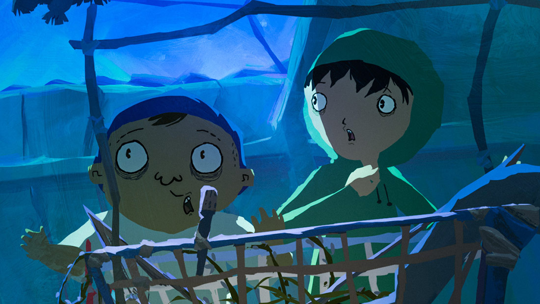
Gustavo Steinberg: They evolved a lot. In the original character design they had very big hands, but one basic element that stayed intact from the beginning to the end was the way we played with the eyes. The eyes had to grow, so they were always round, but had different sizes throughout the process. Also, we depicted all characters as a little tired, even children; they have bags under their eyes.
We had to plan very carefully, because if you do a lot of these things all over the character, then you have to animate all of that and it’s not very easy. We had to be very precise about where we would put the details and how. Since the eyes were very important to the story, we concentrated more there. The big hands we had at first were difficult to frame, so they became more humanoid.
You could say that we achieved the final look of the backgrounds before we achieved the final look of the characters, which was a good thing because the backgrounds are so dense and so intense that we had to find the right characters to integrate into them. Once we had the backgrounds, we decided that the characters were going to be more humanoid. Then there was a very talented artist named Vini Wolf who had a brilliant idea to make it even better.
After we had already given up on having external outlines for the characters since there are no straight lines, we created cut-out animation in Toon Boom Harmony—so we actually had puppets. There was a lot of room for the animators to draw in scenes that needed more movement. The characters’ imperfections also helped in terms of the production pipeline, because animators were able to distort the characters and change the lines.
Fear and the unsettling ideas it fuels are prominently reflected in the backgrounds and the characters’ aesthetic. How did you and your team find the balance in terms of how dark the film could go, while still being appropriate for children?
Gustavo Steinberg: We were not trying to show virtuosity. Of course we wanted it to look very beautiful; each frame needed to be like a painting that you could hang on your wall, but it’s not about virtuosity. It’s about telling the story properly. You have to understand that it’s a film for kids, so we had to be very careful not to cross a line with the story so that kids would not walk out of the movie theater, because then the movie wouldn’t be very effective.
We had to have enough fear there so that they would physically understand what we were talking about, otherwise it becomes too intellectualized and it wouldn’t speak to kids. All these strategies: the intense backgrounds, the music, and the characters that exhibit fear were to achieve this. The music is beautiful, but also intense and a little dark. It’s interesting because it was probably the biggest concern in terms of the storytelling: “How much fear do we put in the story?” Very early on during the development stage, we ran some focus groups with actors reading the script for kids. We wanted to talk to them and see how much fear they wanted, and they actually asked for more.
Of course, reading is one thing and actually watching it is different and we were aware of that, but there were a few things that were a little naïve in the script at that time, because we were scared of showing fear. We then managed to add another layer of fear to the story, and that was very important, both for the narrative and also for the aesthetics of the environment, the backgrounds, and the characters.
One of the most interesting characters is Buiú, who is the nanny’s son and evidently from a lower class. He doesn’t go to the same school, he doesn’t get into the wealthy kid’s house, and he doesn’t speak but he has great abilities.
Gustavo Steinberg: He was a very special character, and the basis for the progression of the disease. We had to start from a standard human and go to an egg-shaped figure, and that was not easy to do in 2d. The fact that he’s the son of Tito’s nanny is a small detail in the story, but everybody gets it.
We wanted to play with the fear and the contradictions in society at different levels. There’s the macroscopic level like the media, tyranny, or fake news, all of which are more abstract for a kid to understand, so we also played with contrasts between the different characters: we have a super rich kid, one who is middle class, and another who is middle class but not white. Sarah is the kick-ass female character, then you have Tito, who is shy, and then Buiú, who is even shyer, and they’re all friends. We created these contradictions to show how outside influences play out at the kids’ level.
The development of Buiú as a character was really interesting. He was Tito’s good friend from the start, but we were trying to empower him by making him a strong part of the story even though he doesn’t speak. He did speak like three lines in the earlier stages of the script, but then when we were recording the voices it didn’t feel right, so we decided that he was not going to speak. When we decided he was going to be the hacker, everything fell into place. He became a very important character, and Tito really needs his cooperation; he can cooperate and be friends with someone from a different social class.
Was your intention to represent a wide spectrum of Brazilian society by creating this collection of characters?
Gustavo Steinberg: Yes, but I think it’s not only about Brazil. The joke is that Brazil has been dubbed “the country of the future,” and the intention behind that phrase was to say, ”We are going to be a major country,” but I think actually the rest of the world is catching up to Brazil. The rest of the world is becoming more polarized like Brazil. It’s much worse in Brazil than other places now, but the difference between rich and poor here in the United States is increasing drastically, and in Europe as well.
The composers who worked on Tito and the Birds—Ruben Feffer and Gustavo Kurlat—were also the team behind music in the Oscar-nominated Boy and the World. However, they are very different scores. Was their previous work what persuaded you to bring them on?
Gustavo Steinberg: That’s exactly how we went about it. I loved the work they did in Boy and the World, so I talked to them and said, “I totally love your work. This is going to be totally different from Boy and the World, but it’s going to be great.” We did that very early on. We didn’t even have the script ready when we started to compose, because we really wanted to develop the film already having the original soundtrack and songs.
We never used any temp music when working on the animatic. It was developed with the original soundtrack already in place. When we saw that there was a need for a new theme, we called the composers and said, “Okay, I think we need a new theme for this.”
But the basic themes were composed early on. Of course they evolved a little, but the basic themes we kept from the start, and then we continued developing new themes for different scenes. I did that so early on because, as I said before, it was one of the main strategies to translate fear to younger audiences. I knew that the music was going to play a big part in it, so I thought it was really important to have that certainty from the start.
How challenging is it to fund and produce a 2d animated feature in Brazil today?
Gustavo Steinberg: I think what puzzles some people about this story is that it tackles a tough subject, but at the same time it has a very traditional plot: a hero’s journey. The fact that it’s a traditional storyline helped a lot. People were a little concerned and didn’t know if it would work. Europeans, especially, would say, “This is not going to work, because if it’s a serious movie, it has to be serious it cannot be fun; and if it’s a fun movie, you have to do it like Pixar.” It’s interesting that a few people pointed that out, but I believe we can have a fun movie, make it beautiful, and make it tell a story in a more artistic way. The feedback from children was amazing. We’ve had five year olds talking about the textures after watching it.
Is there a growing industry or community of animators working locally or are projects mostly isolated opportunities?
Gustavo Steinberg: It’s growing, especially for tv, because about five years ago a new law was implemented that establishes a quota of 5% of national content on primetime tv, and that completely changed the landscape for animation, because most of the national shows that do well are animated. The most watched show on Cartoon Network in Brazil is a Brazilian show. Americans were really concerned about this arguing, “There must be freedom of choice. We cannot have quotas!” Then the law passed and they had to obey it, so they started to acquire local content. When they noticed people liked it they were like, “Give me more!”
Local productions across Latin America—animated and otherwise—have a difficult path to succeed at the box office because they go up against American films. What are Tito and the Birds’ prospects at home in Brazil?
Gustavo Steinberg: Yeah, we cannot release in January in Brazil. During the holidays there is Pixar, Disney, DreamWorks, so nobody’s going to pay attention to us. We’ll open a little later. It varies place to place. For instance in France, they have regulations so the big studios cannot advertise on tv and competition is fairer. You can actually release a small film alongside big ones. It’s more or less the same thing because you depend a lot on reviews. Of course, you can put posters in the metro, and [big studios] will always have more money, but if you do a very focused thing, reviews and word of mouth can take people to the movie. I’m learning this now because I’ve never distributed internationally on this scale. From a producer’s point of view, I also wanted to do something that had the possibility of becoming more international, because it can be dubbed, and even though it’s still niche, it’s more accepted abroad that way.
Shout Studios will release Tito and the Birds in a limited number of U.S. cities starting in late January. The film is currently nominated for an Annie Award for Best Independent Animated Feature. For more info about the film, visit Shout’s website.

.png)