Going Into and Beyond Peyo’s World for ‘Smurfs: The Lost Village’
Kelly Asbury’s Smurfs: The Lost Village, opening today in the United States, is Sony Pictures Animation’s newest feature film, and one that had a raft of source material to draw from.
American audiences would perhaps be most familiar with the 1980s Hanna-Barbera animated television series, and the previous live action Sony feature films. But this new film aimed to follow the original Peyo comics and drawings much more closely. That meant Sony Pictures Imageworks, responsible for animating the film, would have to embark on a new design and visual effects effort as the Smurfs leave their village safe haven to explore the Forbidden Forest and meet some unexpected new characters.
Cartoon Brew speaks with production designer Noelle Triaureau, animation supervisor Alan Hawkins, and visual effects supervisor Mike Ford about the lengths required to match Peyo’s world — and also go beyond it.
Smurf by design
Although Sony had already done those two live action/cg hybrid Smurfs films featuring highly detailed and photorealistically lit and rendered characters, this new fully animated feature was intended to go back to a more stylized aesthetic. Character designer Patrick Mate came on board to adapt the ‘classic’ Smurf characters and design new ones, such as the dragonflies, all the while drawing on what Peyo had established.
“We don’t really have much anatomical detail,” said production designer Noelle Triaureau. “The hybrid films needed to be more realistic to be a counterpart to real humans on the screen, but with our film we went with something more simple and stylized and charming in some ways, because they were more true to the original drawings, the original design.”
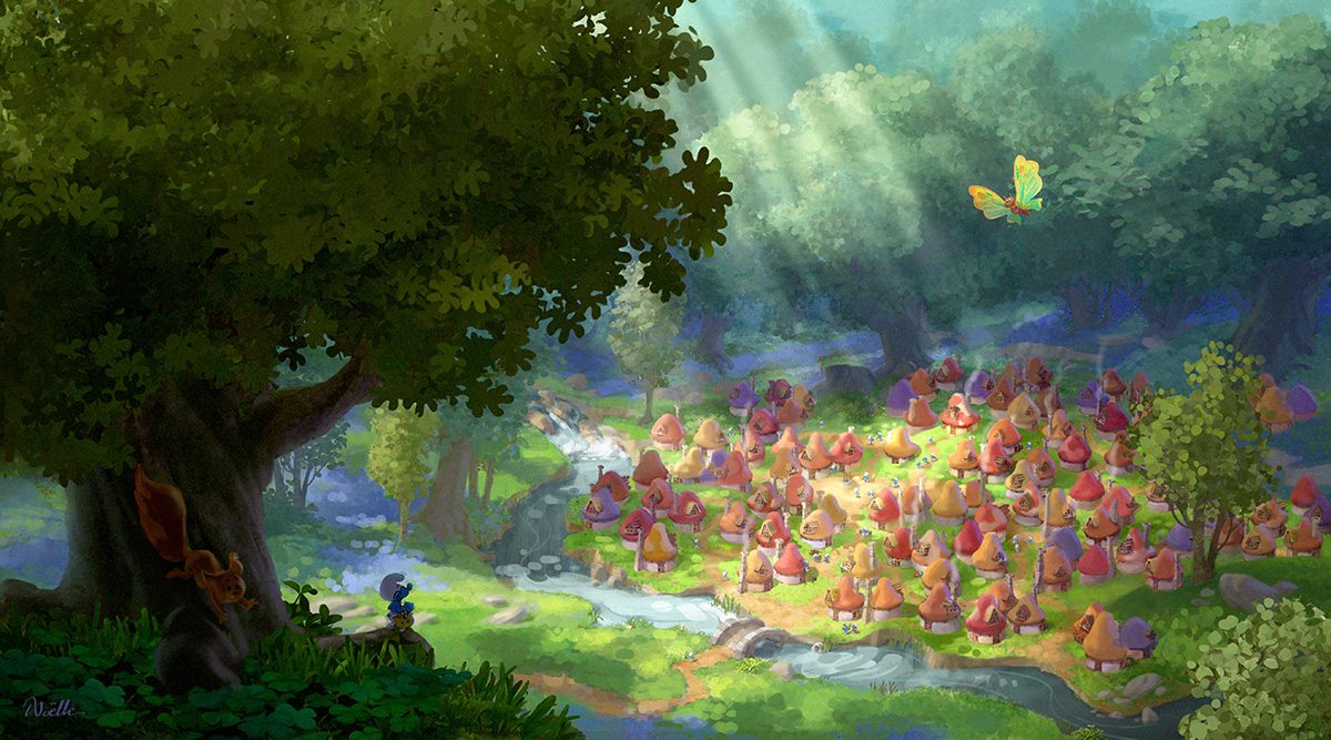
Meanwhile, Triaureau and her team studied the imagery of the comics in order to fill out elements of the familiar-looking Smurf Village, finding that in Peyo’s drawings everything was drawn over-sized to emphasize the stature of the characters. They would be sitting at a big table, holding a large spoon or fork, for example. This playful approach to scale was something emulated in the production design of the new film.
“The other thing that was typical of Peyo especially in the village,” added Triaureau, “is that when we have wood elements they tend to be sanded wood. When we have objects, they don’t have sharp corners or pointy edges. Kind of like the houses, they have those mushroom shapes. They’re soft and rounded, bouncy and buoyant, a little bit like the Smurfs themselves. So the shape language was all about making you feel like they must live there because the objects are reminiscent of their own design.”
How to animate a Smurf
When it came to animating the Smurfs, animation supervisor Alan Hawkins also made a concerted effort to study the Peyo comics for inspiration and particular character details. Some of these were things that had to be part of the final look; others proved to be more challenging to deal with.
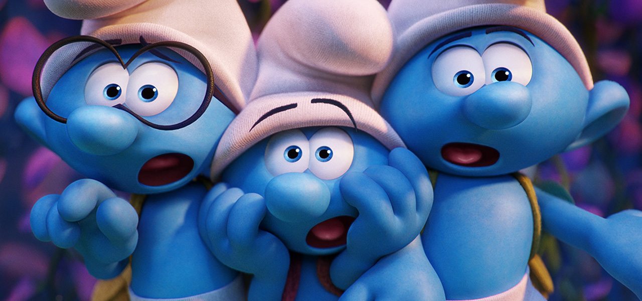
“There wasn’t any little piece of skin between the two eyes [in the comics] that had existed in the original films because they were slightly more realistic,” said Hawkins. “Peyo always drew them with an overlapping ‘smooshed’ together eye shape which is pretty common in cartoons. So the first thing we did is, we started looking at how we could change our system to accommodate that design. We hadn’t done a film where the character’s eyes had been like that before here at Sony, and all of our rigging standards are based off of two separate eyes.”
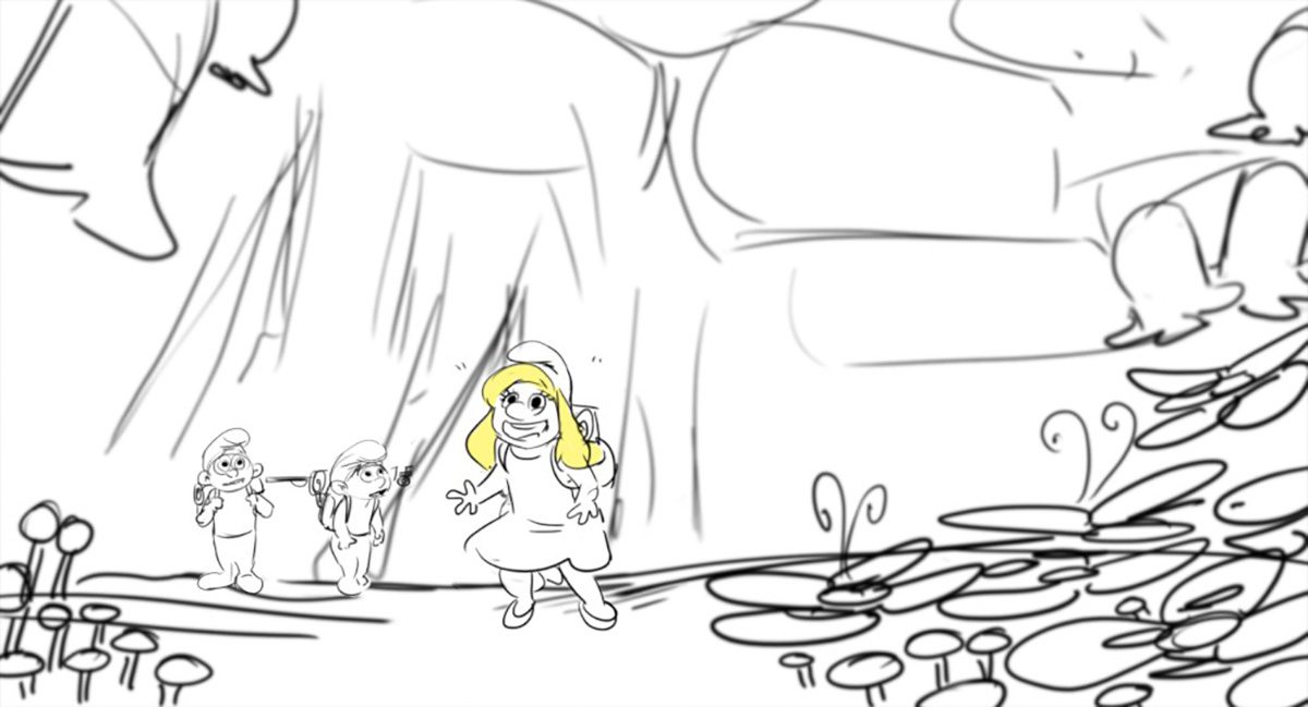
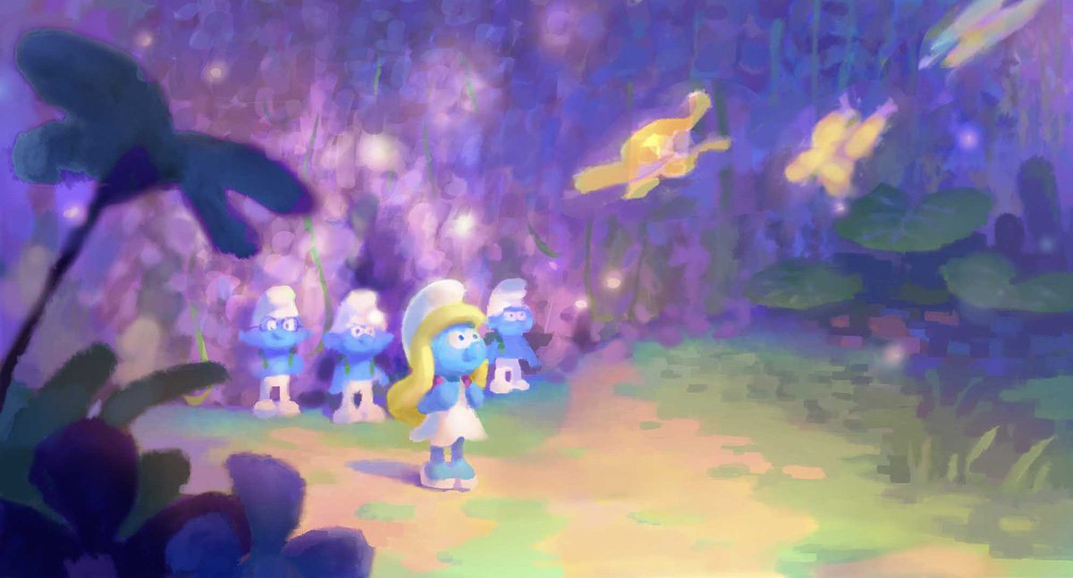
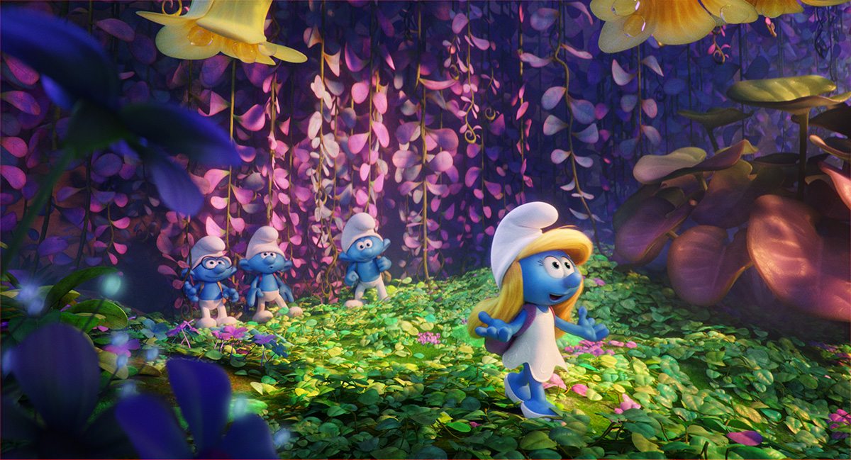
“You could see where the two eyes met at the base of the nose,” continued Hawkins. “We started to just call it the ‘triangles’ in animation because if you presented the character without that little piece of information where the two eyes came together with that little blue triangle on top or bottom it kind of began to look like a goggle or a mono-eye type of thing. And so we realized that that little piece of information was crucial for maintaining their consistency and making sure that they look like Smurfs.”
Another eye-related consideration was the Smurfs’ eyebrows. In the comics and cartoons, observes Hawkins, the eyebrows are often drawn going up away from the eyes, and even over hats. Sony’s animation team devised a way to get the eyebrows to sit off of the head and in front of the Smurfs’ hat with some floating geometry.
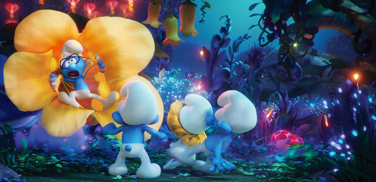
For the mouths, Peyo’s drawings often presented the Smurfs with a slight tilt to the side – a challenge, says Hawkins, as the heads are essentially a squashed sphere. “We had to make mouth shapes that looked good to camera but in actuality they were kind of broken as far as like z-depth. So the top lip would be much closer to camera than the bottom lip because it was curling away from the perspective.”
The Smurfs’ bodies and limbs were kept relatively simple – a single rounded shape made up a fist, for example, rather than having knuckles and individual fingers. Again, this fit in with the translation from the comics. For movement, the animators drew upon some of the techniques they’d mastered on the Hotel Transylvania films that really push the squash and stretch factor. On those projects, the character rigs were pushed to the extreme and then required custom model blend shapes that the animators made themselves. Smurfs was not as intense, explained Hawkins, “but what that tool gave us was the ability to really clean up and simplify lines and make sure the design was maintained.”
A river of ideas
Since the Smurfs do leave their safe village and explore a wider, scarier world, there was ample opportunity for the filmmakers to also try new things and depart (a little) from the Peyo universe. That was something enabled by the inclusion of the Forbidden Forest. Here, the Smurfs discover exotic plant life, bioluminescent bunnies, and a magical levitating river.
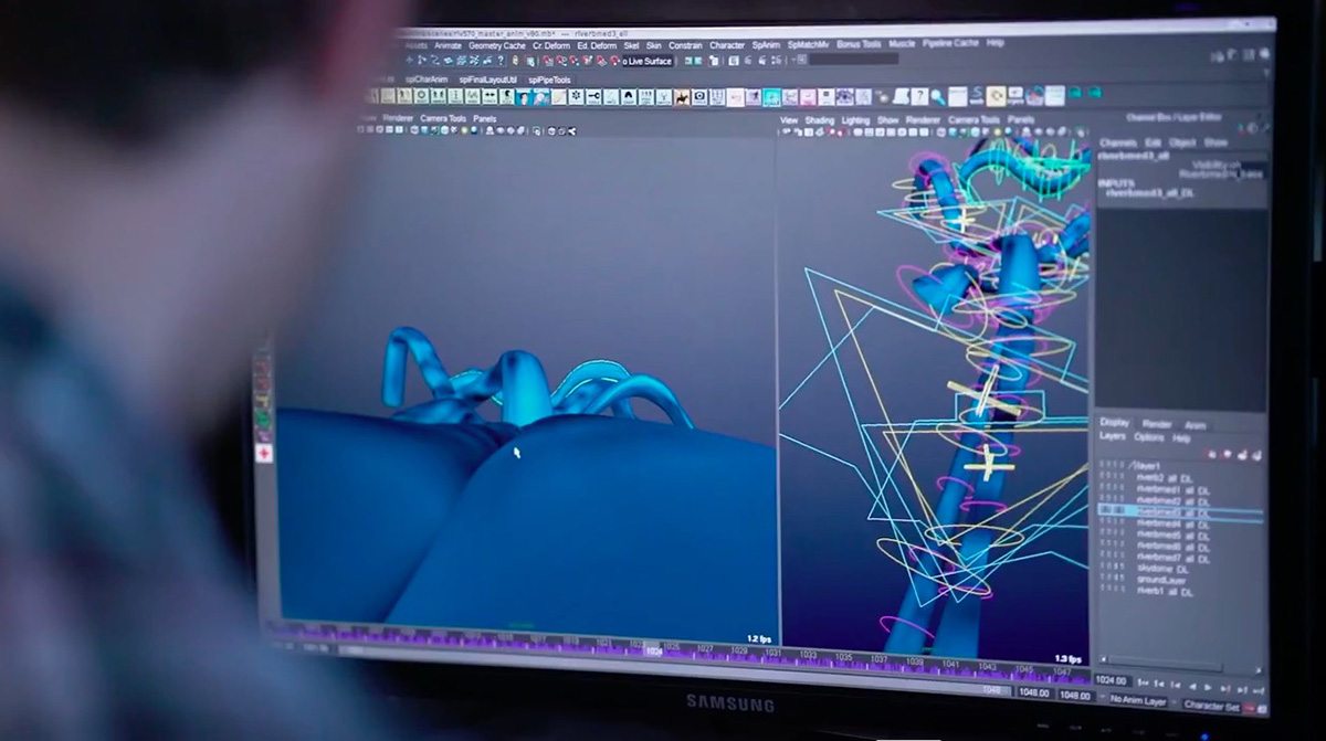
The river, in particular, was something that would require close collaboration between animation and visual effects since the characters sail along via its gravity-defying current. To make the river – the streams of water were dubbed ‘ribbons’ – a tube-like animation rig was built after the scenes had been blocked out in boards. “We had this super-long rigged tube with clusters all along it,” said Hawkins. “We would animate the river going up and down, and it guided the performance of the characters. We would constrain the boat to the tube, and sometimes have multiple tubes intertwining and separating.”
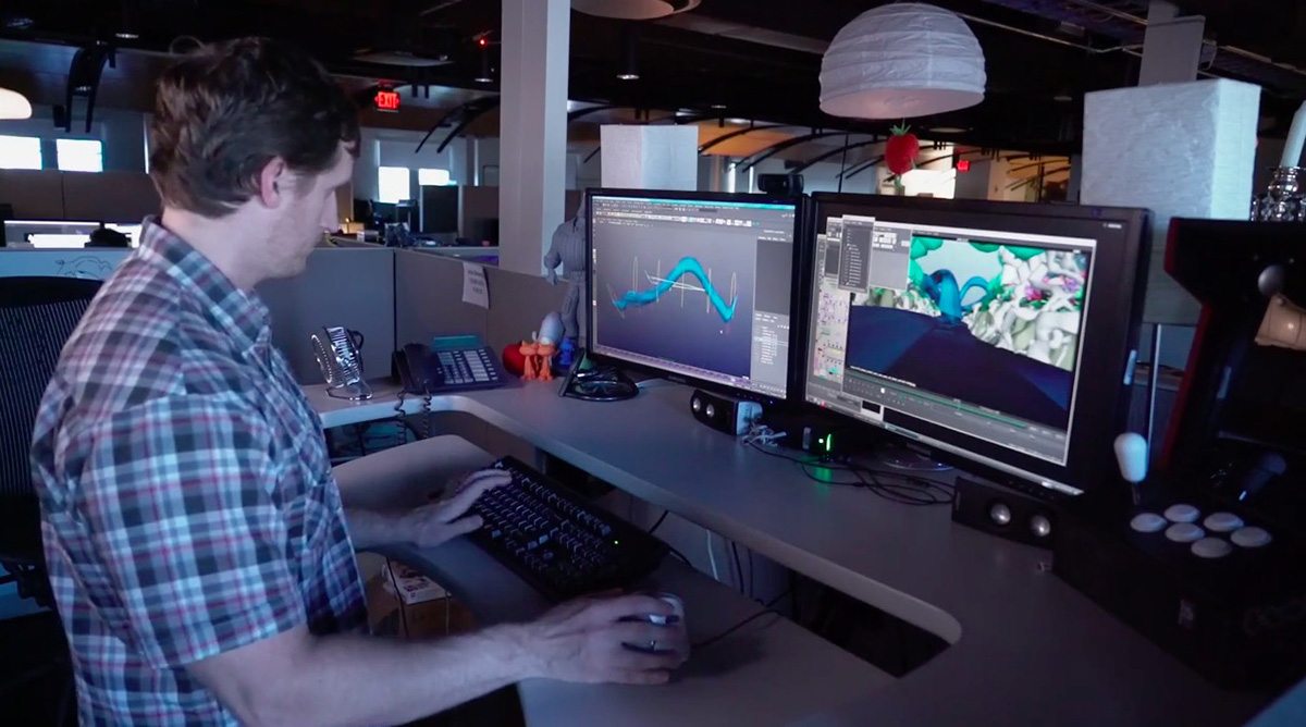
The effects department then had to simulate the water surface using the animation as a guide. Earlier, some research had been carried out to determine how the water should behave in the ‘ribbons.’ “We actually referenced a lot of NASA footage where we have astronauts playing with water in space and wringing out a towel or floating a big ball of water across a room,” said visual effects supervisor Mike Ford. “You could see as things start to spin or you get a little bit of an acceleration you actually get droplets that come off.”
Using Houdini, effects artists simulated the water to both flow, have choppiness, and have drips down below. Since the surrounding Forbidden Forest had many bioluminescent qualities of its own, a creative addition made to the river was a ‘bioluminescent path’ running through it. “It would get churned up and activated almost like an algae bloom whenever the water would contact something,” said Ford.
