
An Animation Analysis Of ‘Spider-Verse’ By Animator Jean-Denis Haas
The big night is over and Spider-Man: Into the Spider-Verse is now an Oscar-winning film, but the real fun starts next month when the film will be released on Blu-ray and animation lovers can start studying the film frame-by-frame.
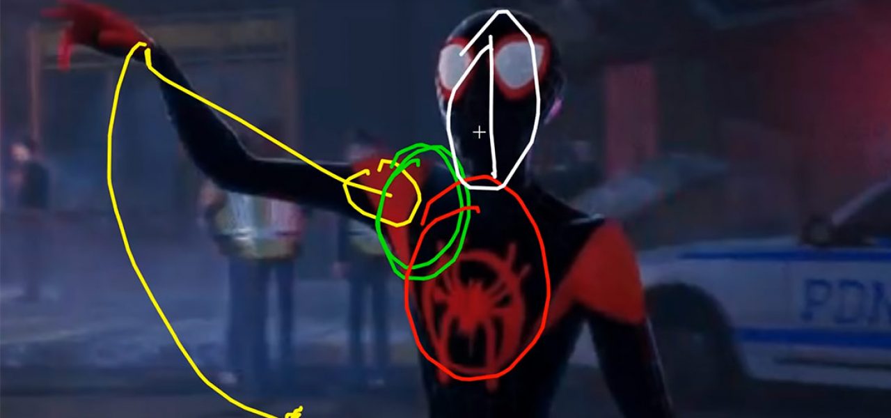
In anticipation of that release, Jean-Denis Haas, a senior lead animator at Industrial Light & Magic as well as an instructor at Animation Mentor, released a terrific video yesterday where he talks about his appreciation of the film’s animation using clips that have already been posted online:
Haas’ half-hour breakdown helps to explain what sets apart the performances in Spider-Verse from other animated films. Much of the praise for the film thus far has centered around the film’s boundary-pushing visual style, but after you watch this video, you’ll most definitely have a new appreciation for the animation performances as well.
There are two areas in particular that Haas focuses his analysis. The first is the interaction of the characters with props and clothing. In Spider-Verse, props and clothing are not just cg elements placed into scenes and onto characters, but they play a role in the storytelling. How Miles takes off his backpack or how he puts his hands into his hoodie are specific creative decisions that add layers of complexity and nuance to his performance, and help to create the feeling of a lived-in world, which is extremely difficult to pull off in cg.
The second key observation by Haas centers on the framing of action. One of the old-fashioned holdovers from the classic days of animation is that all acting needs to be clearly staged and visible to the audience. But that’s not how the real world works though and it’s not how acting works. The Spider-Verse filmmakers understood this and attempted to create a more cinematic approach to framing and staging where not every gesture and movement is played to the audience.
An example of this highlighted by Haas is when Miles steps out of his dad’s car, and closes the door of the car with his foot. It’s something I never even noticed when I saw the film, and that’s because you never actually see his foot closing the door. While the foot is offscreen, the shifting weight of Miles’ body and the closing door make it clear what’s happening.
That type of attention to detail, having Miles do things as a teenager would without drawing blatant attention to the behavior, almost never happens in animation. And even if audiences don’t pick up on every moment, the overall effect was certainly felt by audiences.
