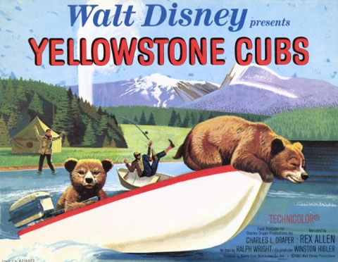

Worst. Disney Poster. Ever.

I guess this is slightly O.T. as the film referenced here is a live action short.
I was at a horror movie convention in Burbank yesterday (Monsterpalooza ’09) and found this piece (above) in a box of cheap lobby cards. I couldn’t take my eyes off it, nor could I couldn’t stop laughing at it. This has to be the worst Disney poster/ad art/promotional painting I’ve ever seen! It looks like a Bruce McCall-National Lampoon spoof – but it’s the real thing. It’s so stupid looking, so God-awful, even the logo/typeface is so boring; I can’t believe they thought this would be an effective come-on to a film, even a short. I bought it for $2.
Is this the worst poster Walt Disney’s name was associated with? I don’t mean worst film… I mean, of all the films Walt produced in his lifetime, was this the lamest movie poster to bear (no pun intended) his name? If not, do you have a better candidate?
UPDATE: Kevin Kidney posted a follow up on his blog, with a full image of the original painting used in this poster.

.png)