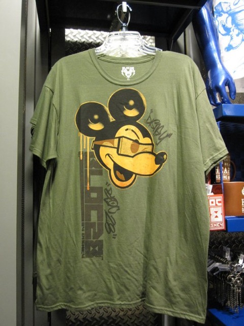
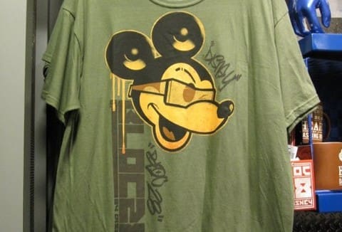
Six Awful Examples of Disney’s Urban Fashion
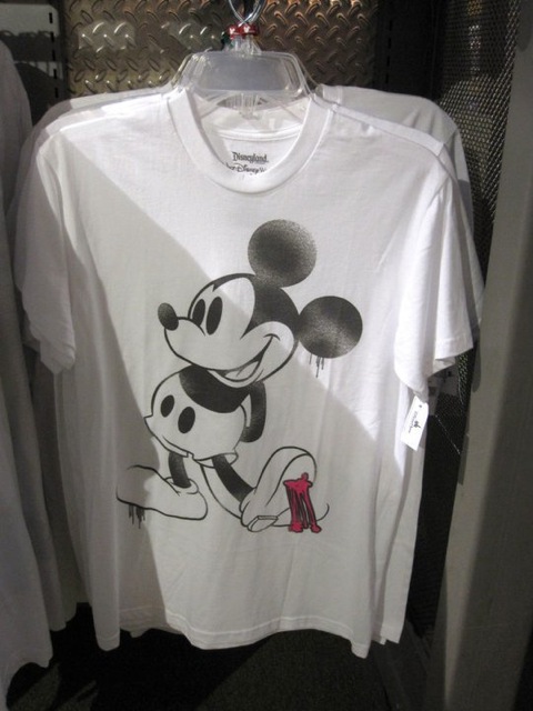
What was Disney thinking when they introduced their “Graphic Edge Collection” last fall?
Corporations that try to appropriate urban culture for profit simply end up looking out of touch and dishonest. They become to urban culture what wiggers are to the hip hop world.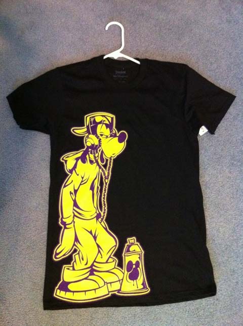
Seriously?!? This is what someone in Disney’s consumer products thinks graffiti looks like? Researching what you’re recreating is apparently not part of the job description.
Believe it or not, somebody earned a paycheck to create this aesthetic monstrosity.
Someone at Disney momentarily lapsed into thinking they were a twenty-year-old hipster that designs shirts for Threadless competitions.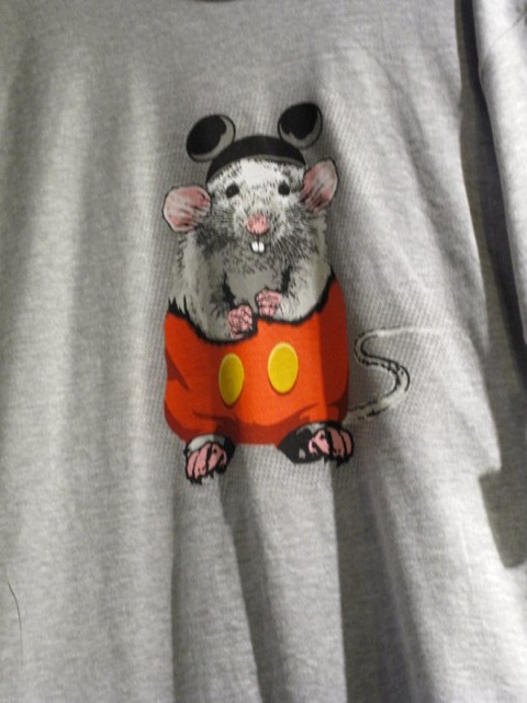
“Graphic Edge” is another way of saying “stiffly posed and poorly drawn character.”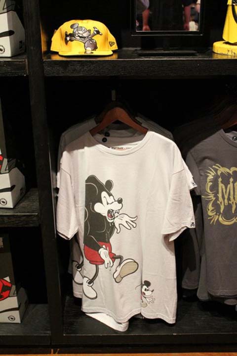
Remember how well it worked out for Warner Bros. back in the Nineties?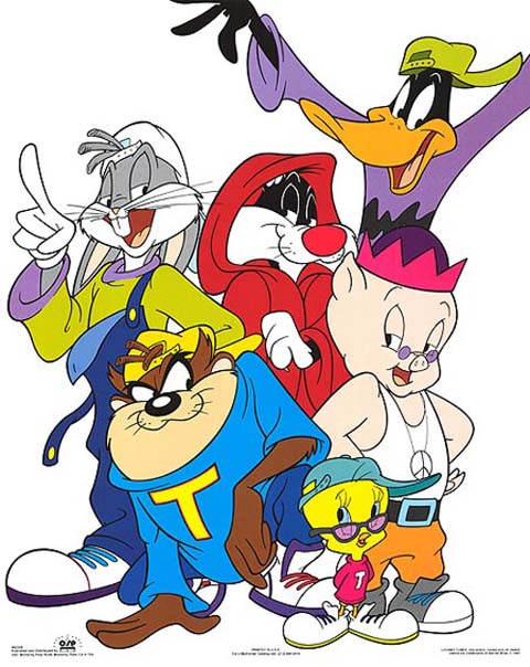

.png)