
CBTV: ‘Ophelia: Love & Privacy_Settings’ by Bin-Han To
The 2014 edition of Cartoon Brew’s Student Animation Festival ends today, but we’ve saved one of the finest for last: Ophelia: Love & Privacy_Settings by Bin-Han To. The short was produced at Filmakademie Baden-Wuerttemberg in Germany.
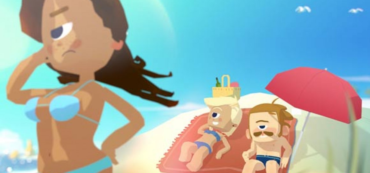
Billed as a “romantic comedy about ‘The End of Privacy,'” Ophelia succeeds as a funny story first and foremost, but is underpinned by a thought-provoking critique of the blurring boundaries between public and private thought. Privacy in the digital age is neither an easy topic to illustrate nor to make entertaining, but Ophelia uses animation expertly to express the issue. Visually, the film has the currently en vogue low-poly-CG look, but it looks far lusher than other films in the style thanks to novel art direction choices that emphasize color and lighting.
Continue reading for comments from the filmmaker Bin-Han To:

THE IDEA
I like making pretty pictures, and privacy in the digital age is a topic that’s interested me for some years. So that’s that. Originally I didn’t even want to direct my own graduation film (and preferred to work on other students’ projects), but my professor Andreas Hykade had the feeling that maybe I had something to ”say.” One fun pub night out, friends and I came up with the idea to cartoonify this theme of privacy loss, to exaggerate it in an accessible and funny, if slightly raunchy way. It wasn’t my intention to enlighten the topic from all angles and to present solutions; that’s not the strength of a three-minute animated comedy. You can read essays and books on that. But if the film is fun, and at the end just maybe makes you think a little about the problem of privacy loss, I am content.
On a personal level, the visual design of the film was also a main point for me—visual development is my speciality and I particularly love the work with colors and light. I found it attractive to bring together many different locations, and light- and color-settings in one atmospheric, coherent arc.
TOOLBOX AND PROCESS
The film is a flat shaded CG-film with painted backgrounds. We mainly used Maya, Photoshop, Premiere, Nuke. The characters were modelled and rigged in 3D, but were pretty low-poly and blocky; we wanted to reminisce of early 3D videogames that used as little polygons a possible. On the other hand I wanted to have appealing, rather round shapes in the faces. So I used animated textures in the face, which were projected onto the 3D characters, and kept the expressiveness and simplicity of 2D shapes. I love lighting; it conveys so much atmosphere so quickly. So even though the look is simple, I wanted to include lights and shadows. For this I used lights with hard edged shadows, which define the volume of the characters, while still keeping the flat, cartoony look.
CHALLENGES AND LESSONS LEARNED
I’d say the most important thing I learned is something that I knew already before, but everytime I work on a project, I learn it anew: the awesomeness of working with an engaging team that pushes the film more than I ever thought of. It’s such a beautiful feeling of inventiveness and surprise whenever somebody suggests or contributes something small or big that makes the film better, and that you yourself never even considered. Seeing little footprints of other people in your film feels wonderfully satisfying.
INSPIRATIONS
It’s obvious in the background designs that I had chosen the beautiful cities of Portugal as a kind of leitmotif for the film’s visual design, which was like a main straw I could always cling to. I like giving designs and stories a clear identity with a specific, sometimes regional flavor. I think that nowadays cartoon designs tend a bit more to the generic side of things, which often makes sense. But, personally, I like to explore and show somebody else’s point of view, their world and their history. There’s beauty and truth in what we have in common (and animation shows this well and often), but also in the things that differentiate us. Mediawise, the inspirations for this film are a mixture of the surreal, heartbreaking stories of Shigesato Itoi (“Earthbound,” “Mother 3”), the character designs of Yoichi Kotabe and Osamu Tezuka, and the crazy flair of Don Hertzfeldt. Besides these, my daily routine starts with stretching in the studio by headbanging to Black Sabbath.
WHERE YOU SEE YOURSELF IN FIVE YEARS
The challenges and the environment for young animators have changed and continue to do so: the age of classic TV and cinema (in their economic, industrial, but not their creative sense) seems coming to an end, and it’s up to all of us to figure out inventive ways to connect with our audience, but also to make financing quality work possible in the first place!
A lot of young animators move into the realm of interactivity: for a generation grown up on videogames, borders between disciplines dissolve, and I, too, see myself as a “stuff-maker” rather than a strict animation director. So, even though my skills lie in filmmaking, and I’m now a represented animation director at Woodblock.tv, I don’t actually stress too much whether my next project is a film, a game, an illustration, a napkin-sculpture or a virtual reality experience. But the thing that’ll always remain most important: doing ambitious work with people you enjoy, and make a little money along the way. This is the kind of project I want to make.
FOLLOW THE FILMMAKER
Personal blog: Biniman.tumblr.com
School website: Institute of Animation, Visual Effects and Digital Postproduction at the Filmakademie Baden-Wuerttemberg
 Cartoon Brew’s Student Animation Festival is made possible by the generous support of our Presenting Sponsor JibJab, a company that has shown consistent commitment to supporting young and emerging talent. We’d also like to extend a thank you to our grand prize award sponsor, Microsoft.
