
Cartoon Brew TV #8: ‘The Story of One-Eyed Ophelia Jackson’
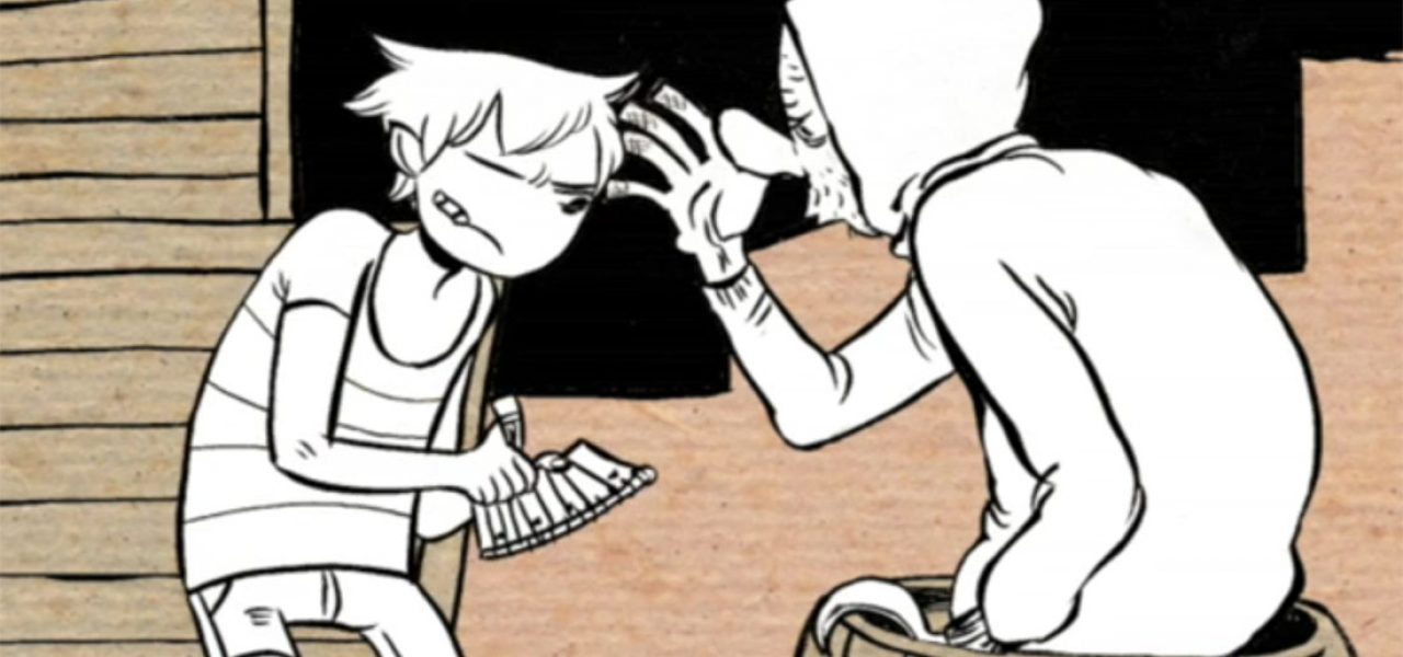
This week’s short, The Story of One-Eyed Ophelia Jackson is a 2008 graduation film by Kat Morris from School of Visual Arts. The eye-catching short, about the luckiest girl in the world, Ophelia Jackson, and her encounter with a Sea Witch, stands out for its confident drawing style and sophisticated sense of design.
Recently Kat Morris has contributed to the Adult Swim series Superjail. To see more of Kat’s work, visit her blog or check out this experimental short animated in Ralph Steadman’s style.
The filmmaker will be participating in the comments section so if you have any questions for her, feel free to ask. Here are some production notes about the film from Kat:
From initial concept to finished film, The Story of One-Eyed Ophelia Jackson took approximately nine months to complete. Everything was drawn with graphite on animation bond, then inked with a Kuretake brush pen, scanned, and composited in AfterEffects. The final look was achieved by assigning levels of grey to different layers in AfterEffects, and then applying a scanned texture (a book cover) over the entire composition. I tried to keep everything lo-tech to prevent the film from feeling too polished.
The script was both very difficult and amazingly simple to come up with. I knew I wanted a voice-over narrative that took place by the sea, but it wasn’t until I drew Ophelia that I knew the direction I wanted to go in. I think as an artist, I am first and foremost a storyteller, therefore I made it my primary goal to create characters I cared about. The characters dictated the tone of the story, which in this case resulted in a less quippy take on Fractured Fairy Tales. The story was further brought to life by Allan Todd, the actor I was fortunate enough to find to read the script.
Thematically, I wanted to explore the relationship between the Maiden and the Hag (like Vasilisa and the Baba Yaga) . I love and hate archetypal characters: on one hand they’re boring and cliched, but on the other hand, they can be much more efficient at conveying ideas and emotions, especially in short stories. With Ophelia and the Witch, I wanted to create two characters that were both archetypes and individuals –‚ Ophelia is young and naive, but also prideful and selfish, while the Witch is old and mean, but ultimately just a lonely woman who likes to play games.
Visually, my aim was to display as much of my personal aesthetic as possible. Ophelia began as a doodle on a scrap of paper, while the witch was designed after the soldiers in Raoul Servais’s Chromophobia. The secondary and background characters were all gleaned from pages in my sketchbook. I’m not a very strong animator, so I tried to design each shot to work well as a still image, which is probably why the film has a “comic book” feel to it. My advisor, Don Poynter, really kicked my ass to make sure those compositions were the best they could be, I owe a lot to him.
A selection of pre-production artwork from the film:


.png)