2024 Oscars Short Film Contenders: ‘Remember How I Used To Ride A White Horse’ Directors Ivana Bosnjak Volda And Thomas Johnson Volda
Welcome to Cartoon Brew’s series of spotlights focusing on the animated shorts that have qualified for the 2024 Oscars. There are several ways a film can earn eligibility. With these profiles, we’ll be focusing on films that have done so by winning an Oscar-qualifying award at an Oscar-qualifying festival.
Today’s short is Remember How I Used to Ride a White Horse, the third film co-directed by Ivana Bosnjak Volda and Thomas Johnson Volda. Produced by Croatia’s Kreativni Sindikat, the film earned its qualification by winning the Animation Avantgarde International Competition at Vienna Shorts.
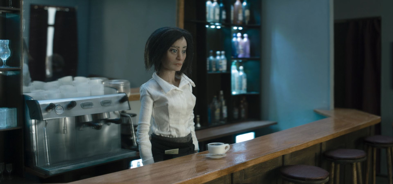
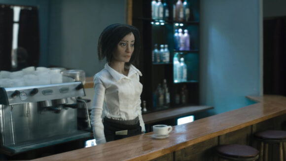
The stop-motion short features a server who feels trapped in her daily routine. A drab color palette and some clever camerawork create a sense of unease shared by the film’s well-designed characters and the audience.
Cartoon Brew: The background distortion and vibrations really heighten the sense of eeriness in this film. Where did the idea come from to use this technique, and were there any difficulties executing it?
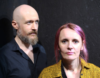
Ivana Bosnjak Volda and Thomas Johnson Volda: Our intention from the outset was to create an atmosphere in the film that would enhance this feeling of unease. As a visual metaphor, the vibrations of the scenography became, for us, a representation of the instability of our protagonist’s consciousness. The initial idea was that the physical world around her was temporal while she remained stuck in her apathetic condition. For the shots in which we offset the stable animation of the characters with the vibrating backgrounds, we made a series of animation passes. The first was with the stable animation of the characters, then several without the puppets, but with the whole cafe set moving. The set was built on wheels and had a motor with a piston to drive it backward and forward. Later, the characters were combined with layers of the vibrations in post-production. It was challenging to initially configure this set-up, but it was imperative for us to capture the effect on camera.
What was it about this story or concept that connected with you and compelled you to direct the film?
The initial concept for the film was inspired by our shared feelings of apathy and the melancholia brought about when one doesn’t know how to or cannot find a way to move forward. These feelings have troubled us both, hampering or completely disabling our creativity. We wanted to impart these emotions into our characters and create a film that conveys this seemingly dissenting characteristic. We chose to create a film that is also more minimal in its scenography detailing, removing unnecessary visual distractions and focusing on the atmosphere and emotional journeys of the characters. In many ways, this is our most personal and self-reflective film.
What did you learn through the experience of making this film, either production-wise, filmmaking-wise, creatively, or about the subject matter?
Remember How I Used to Ride a White Horse is the third film we have co-directed, and we believe there is a visible advancement in our practical skill set compared to our earlier films. However, aside from the craft of model-making and stop-motion animation skills, our approach to the narrative and creative concept has developed over the course of making these films. This film was particularly poetic and introspective, and it was challenging to move further away from traditional narrative structures. Being honest in the film and dealing with our inner selves throughout the production wasn’t easy. Perhaps feelings of isolation and loneliness enhanced the themes in this film. Nevertheless, we learned to find the motivation to create, especially when animating characters battling their own apathetic conditions. We also learned that sugar, under the heat of studio lights, does not flow well through funnels, but salt is a suitable substitution.
Can you describe how you developed your visual approach to the film? Why did you settle on this style/technique?
We normally start our creative process with a few visual images that persist in our minds. Some of the imagery was developed over a long period. It often feels that we are attempting to remember a film that already exists somewhere in our shared consciousness. The dreamy, emotional atmosphere as the central motif guided the visual design of this film. Having a rich and overwhelmingly detailed scenography, normally a tradition for stop-motion films, felt counter-intuitive. Instead, we wanted this film to be minimal and focused on our protagonist’s emotions. We are inspired by the work of Andrei Tarkovsky, David Lynch, and Apichatpong Weerasethakul. The director whose work was perhaps more consciously inspiring for this film is Roy Andersson. We wanted the atmosphere of the cafe scene and the color palette to pay homage to Andersson’s style.

