
The Oscar Shortlist Interviews: How Each Film Founds Its Visual Style
Fifteen animated shorts have been shortlisted for an Oscar this year.
To better understand how these films were crafted, we sent a series of questions to all the directors, to learn more about how they made their films. We are publishing their answers across three stories this week. This is the third and final piece in the series. Part one can be found here and the second installment is here.
Our final question:
Can you describe how you developed your visual approach to the film? Why did you settle on this style/technique?
João Gonzalez (Ice Merchants)
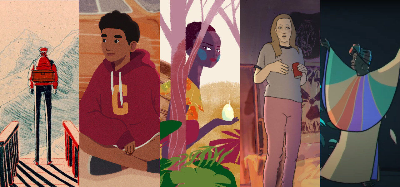
I knew from the beginning that the film was going to be made in 2d, frame-by-frame animation not only because it’s the type of animation I feel more comfortable with, but also because I felt it would suit this story better. Aesthetically speaking, the film is based on my illustration style, which incorporates strong shadows, the use of wide perspectives, and limited color palettes. In my films, I always try to find a way of incorporating elements that I appreciate visually and in terms of sound, in a way that can also benefit the film conceptually and narratively. Also acting as the composer for my films, apart from the art direction, it’s important for me to start working on the soundtrack from the beginning of the film’s production, as that will also give me ideas that will influence the visuals, and vice-versa. Both visuals and music “grew” organically at the same time throughout the film’s production and, at least for me, are equally important to establish the film’s tone.
Robert-Jonathan Koeyers (It’s Nice in Here)
Since the film is centered around contradicting perspectives, we knew early on we wanted each of the character’s memories to be represented by their own visual style. This also made it much clearer for us why the film had to be animated in the first place and what makes animation such a powerful medium. As the story was taking shape, we realized that we could have our characters inform a lot of our choices. Every moment in the film is seen through their subjective and highly tainted points of view, which means that all our visual choices had to be a representation of what their inner world looks like and how they would remember things. To further emphasize the contrast between our two main characters, we also decided to work with different animation software; using Adobe Animate for Imani’s perspective and TVPaint for David’s. Not only did this affect the visual outcome of the film, but it also significantly influenced our entire approach to our characters and to our workflow.
Amy Bench (More than I Want to Remember)
I really wanted the audience to be an active participant in the film, for people to feel – as much as they could – that they were on this journey with Mugeni. Visually, I am interested in the way storybooks communicate in “master” images and wanted to translate that idea into the film. So this was the initial concept, having images that would linger on screen maybe more than we’re used to, letting the viewer sit with them awhile, like walking through an art gallery, but in film. Focusing on master shots and slower animation allows Mugeni’s voice to really be heard. There’s a bit of space. I am trained as a cinematographer so working in a new visual medium was exciting for me and I sought out Maya Edelman, whose work I’d seen and admired, to design the film. I was drawn to her use of color and metaphor and her sense of play. Maya says, “The visual style of the film is in line with the overall trajectory of the illustration style I’ve been evolving on other projects.”
Sara Gunnarsdóttir (director) Pamela Ribon (writer) (My Year of Dicks)
Gunnarsdóttir:
For the past 10 years I kind of developed this way of working where I shoot a lot of reference footage of myself and my husband as stand-ins for natural movement and tone. I started doing this in part because I have worked so much within live-action films and I really want animation to co-exist within that medium without being too crass or loud. Also, I work with characters that are either based on real people or actors to achieve a character design that matches the semi-rotoscoping method well. This approach was perfect for My Year of Dicks, where I really wanted “everyday” scenes to feel natural for us to really connect with the characters as if they are real people (and Pam is very real indeed). Then when we go into Pam’s head and her perspective completely takes over; we have all this room to push the animation to create a contrast between how she sees things and what is actually happening to her.
Jérémie Balais, Jeff Le Bars, Raúl Domingo, Colman Domingo (New Moon)
Colman and Raùl approached us because they liked one of our previous films, a short documentary about James Baldwin. It had a very realistic graphic style. So we started with that because we wanted to collaborate and go with them on a creative journey. The script is adapted from a play A Boy and His Soul written by Colman fifteen years ago, so it was important to place New Moon in the live theater universe. It was a way for us to anchor the film in the original work but also allowed us to establish certain visual rules that we would subsequently break through the course of the film. We truly enjoyed building this little 3d theater and allowing Colman’s character to evolve in it freely. There was something incredibly reassuring about setting New Moon in a closed space. It also allowed several worlds that fit like nesting dolls into the film: the reality of the theater, the subsequent entrance into the world of Colman’s memory, and – in turn – the entrance into the magical realm where the New Moon allows the possibility of anything, especially if you reach for it with a pocketbook or hands held wide open.
Lachlan Pendragon (An Ostrich Told Me the World Is Fake and I Think I Believe It)
I wanted to invite the audience behind the curtains to watch the film “backstage” so to speak. The visual approach needed to show off its artifice in a way that made sense and wasn’t too distracting. So, for most of the film you’re watching through an external camera monitor leaving glimpses of the behind-the-scenes around its edges. This shows how the film was made while you’re watching it, but still has the functionality needed to tell a story.
Juan Pablo Zaramella (Passenger)
The context of my story was a public space, where we usually see each other’s surface and we judge based on this first exposed layer. That’s why I decided to work in stop motion with paper. I used just a few color lines to distinguish characters and decided to put these flat puppets into a volumetric space to contrast with them. I chose monochrome backgrounds because I only needed to describe general locations without giving them a particular relevance.
Spencer Susser (Save Ralph)
I wanted to make a stop-motion film in a documentary style that felt slightly off the cuff and captured. Typically, when you show someone the reality of what happens to animals in cosmetic testing labs, instinctively they cover their eyes or look away. I knew we needed to do something different to deliver the message. By doing it in stop motion, it allows a rabbit to talk and be relatable and tangible. Ralph’s so likable that you go along with him and empathize with him. You’re brought on a fun journey into his world. By design, it’s a misdirect and by the time we deliver the punch, you’re already in. In terms of the art direction and design, it was important to make Ralph’s apartment feel real and not an imaginary place. I wanted it to look lived in with little details – trash cans overflowing, stains on the carpets as if a hundred other rabbits lived in that home before him. And make sure it looks real and not like a set.
Sander Joon (Sierra)
The film’s style was both driven by the ultra-colorful rally graphics and the minimalist black and white stop-motion animation about a car race made by my father in 1980. My father’s animation was another starting point for Sierra and it’s also included in the film! Since stop motion is essentially 3d, I decided to animate Sierra also in 3d, with 2d Matisse-esque cutout aesthetics to create a sense of play and add a tactile feeling to the film. Keeping the characters simple, helped us to remove some of the technical barriers and made us feel like we were animating actual stop-motion puppets. I also believe that minimal characters are so much easier to relate to.
Špela Čadež (Steakhouse)
I’d used the multiplane collage in my previous film Nighthawk and we were impressed by the endless visual possibilities it offers. In Steakhouse, we wanted to go one step further and make the most of this wonderful analog technique. The difficult subject and violent story were a good contrast to the soft, blurry atmosphere that we were able to achieve with this technique.
Uri Lotan (Black Slide)
The tactile, concrete aesthetic of stop motion juxtaposed with the naive, childlike charm of children’s book illustrations creates a striking contrast. The visual style feels mature and childish at the same time as if seeing the world from the perspective of a child who has a newfound, more adult outlook on life, much like our protagonist Eviah who undergoes an emotional transformation.
Peter Baynton, Charlie Mackesy (The Boy, the Mole, the Fox and the Horse)
Mackesy:
I always thought, even before the book was made, that it would be interesting to see the characters move, and I did try to animate them myself, not very well, on my phone – so it’s always been in my head that they could move. I was involved in how they moved right from the start and worked with the incredibly gifted animators, to bring them to life. I was inspired by the whole team and learning the craft and discovering how animation is made.
Baynton:
The film is 2d hand-drawn character animation, composited onto (digital) painted backgrounds, with 2d effects animation and character colors added in compositing. The driving principle behind the development of the visual style was a desire to be as honest and faithful as possible to the spirit of Charlie’s drawings, and to make something that felt like his drawings had come to life. We wanted the film to be a traditional 2d production, partly because quite simply we were adapting 2d ink drawings, but also because we felt it suited the timeless, or maybe old-fashioned, qualities of the book. We spent a lot of time finding an inking style and approach that was both accurate enough to carry subtle animated performances and loose/lyrical enough to feel true to Charlie’s drawings.
Elizabeth Hobbs (The Debutante)
Each frame was drawn or painted with ink or paint or created with collage on A6 paper. I work quite quickly and each image is captured under the rostrum camera with a digital SLR whilst the ink is still wet. I shot each scene a few times in different ways to give our editor Mark Jenkins more material to cut together. The shots weren’t planned too much in advance, my goal was to create a situation in which the process contained a degree of surprise and joy for me and to generate imagery that underpins the themes of wildness and spontaneity in the film.
Wendy Tilby, Amanda Forbis (The Flying Sailor)
To help us sort out the action and pacing of the story, we built our first animatic using archival footage, photos, and drone shots as backgrounds. They proved to be inspirational, and it soon became clear that if we needed to blow up a city AND capture the depth and realism of these photographic images, 3d was the way to go. Aesthetically, we were aiming to combine a rinky-dink model train set quality with a vintage hand-tinted postcard look. As we wanted the sailor to feel distinct from his environment, we animated him in 3d with Blender, then rendered in our usual 2d painterly style in Photoshop.
Laura Gonçalves (The Garbage Man)
The Garbage Man is animated in 2d, frame-by-frame drawing and uses two different techniques: the pencil brush and the oil pastel. Throughout the movie, memories told at the table send us on a journey between the present and the past, and for me, it was very important to distinguish those two moments visually. The present is represented by the expressivity of the pencil line in a more monochromatic environment which contrasts with the vivid colors of the memories, which are painted in oil pastel. The choices to use 2d and pencil lines were a continuation of my previous film Three Weeks in December in which the sketching pencil lines represented the present, it’s part of my visual language as a filmmaker. 2d animation also has the potential to invent worlds and occupies limitless space, which is great for creating movements between time and space.
Answers were edited for length and clarity.


