See The First Piece Of Concept Artwork From Each Of This Year’s 15 Oscar Shortlisted Animated Shorts (Exclusive)
Oscars nomination voting begins on Thursday, and before members cast their ballots, we wanted to spotlight the highly unpredictable animated short race.
We asked the filmmakers of all 15 shortlisted shorts to send us the first piece of artwork they made for their film and to explain what inspired the look of the pieces.
Here are their replies in alphabetical order.
Boom
Directors: Gabriel Augerai, Romain Augier, Charles Di Cicco, Yannick Jacquin, Laurie Pereira de Figueiredo
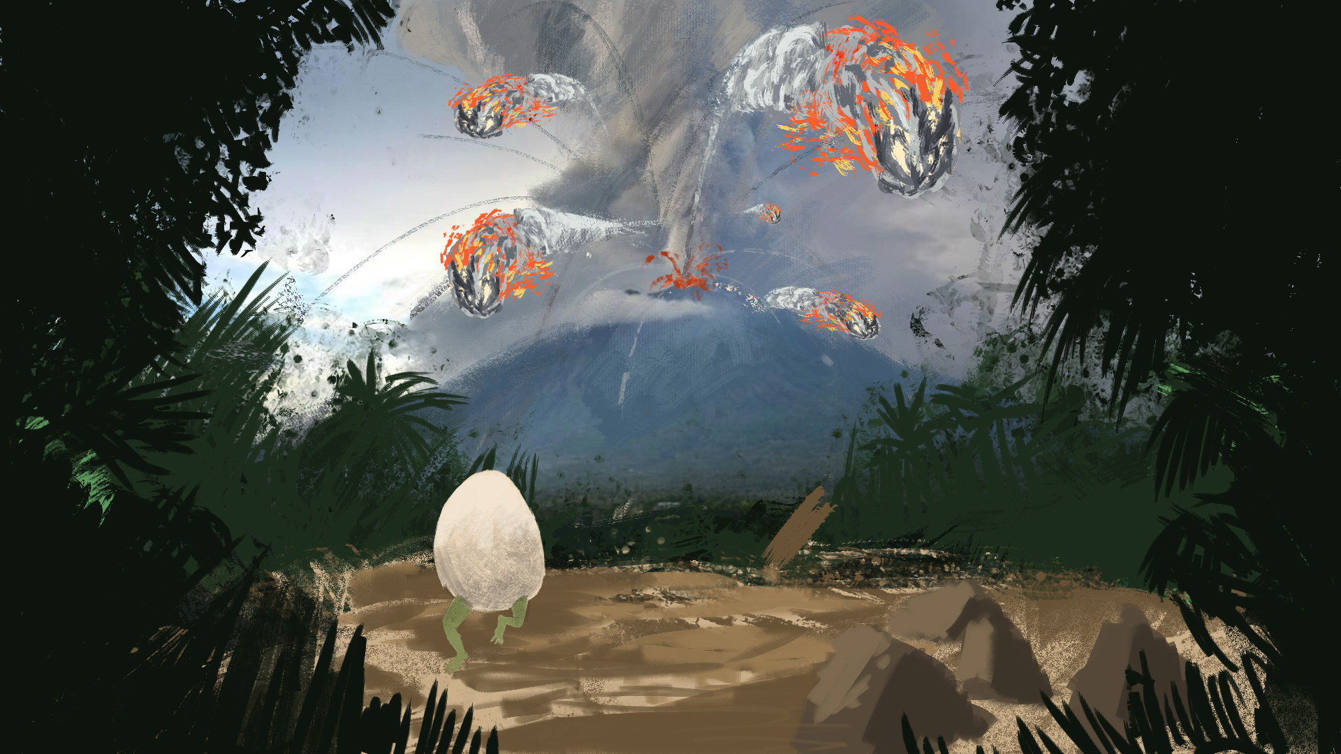
This drawing was the first Romain made to present his idea to the educational team. It focuses more on showing what the story will be about rather than the look because we already knew we were going for a realistic-looking 3d rendering. What inspired the original idea was putting dumb characters in a chaotic environment that overwhelms them, mixing a comedy with a big-budget disaster movie.
Dog Apartment
Director: Priit Tender
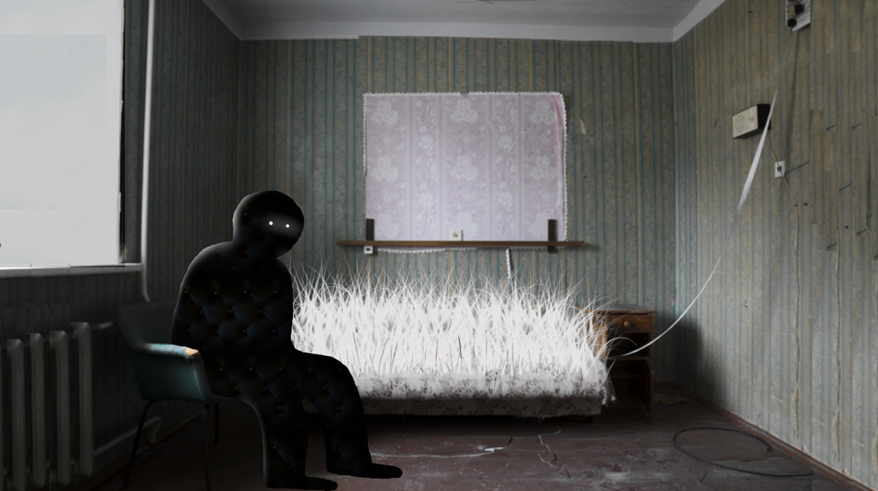
I made most of the sketches in photo collages using Soviet-time interiors, exteriors, and rural landscapes. To build up the world of the film, I found collage more effective than drawings. It enabled me to communicate my vision to the set designers, puppeteers, and DOP [director of photography].
Eeva
Directors: Lucija Mrzljak, Morten Tsinakov
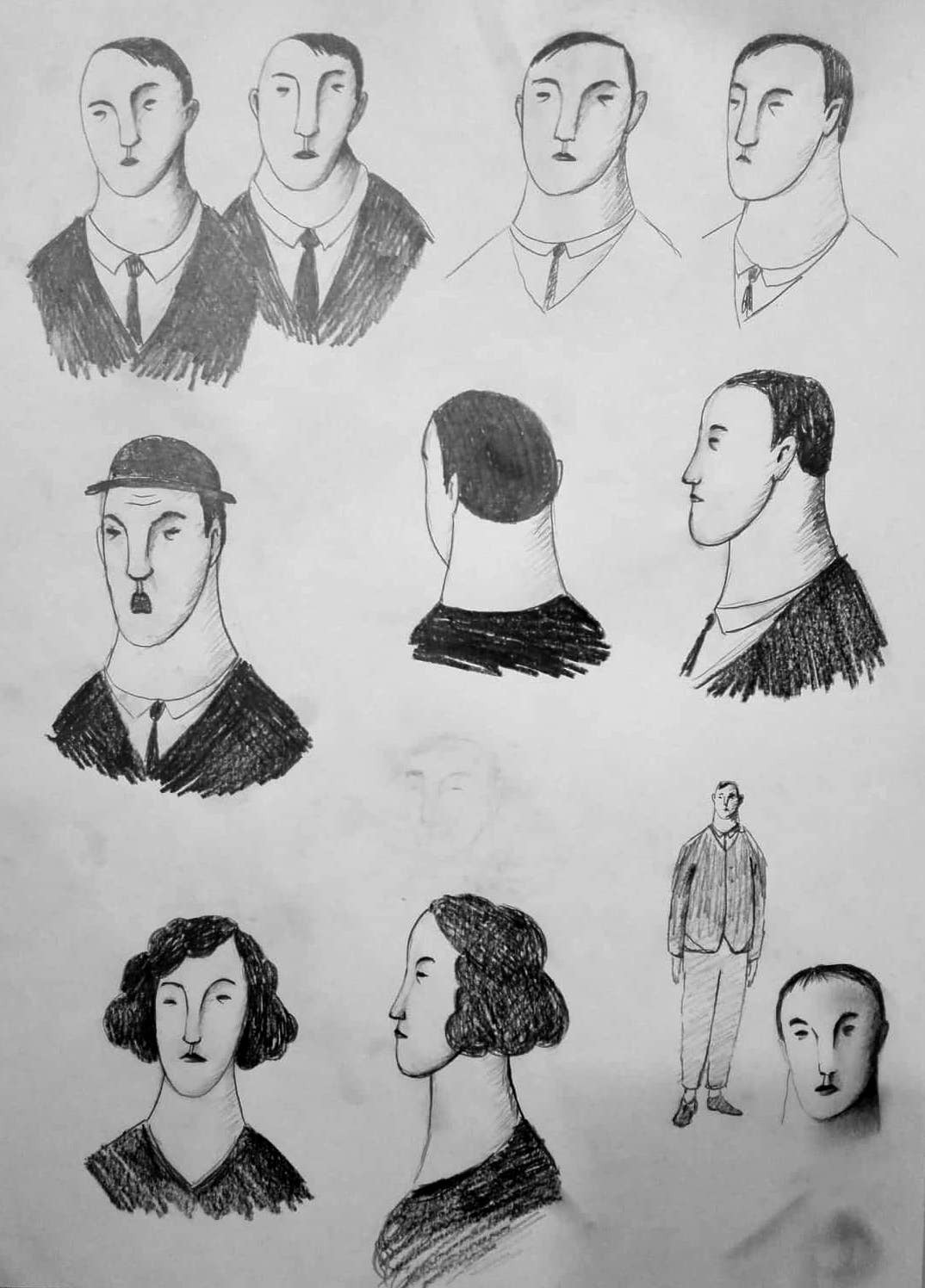
Basically, it’s just the character design for Eeva and different male characters. It took a long time and many sketches until we finally found the right faces. After that, we could build the rest of the film’s universe, search for the color scheme, draw backgrounds, and create the overall atmosphere. I think while drawing the characters, somewhere in the back of my head I thought of Modigliani’s characters with elongated faces and black eyes.
Humo
Director: Rita Basulto
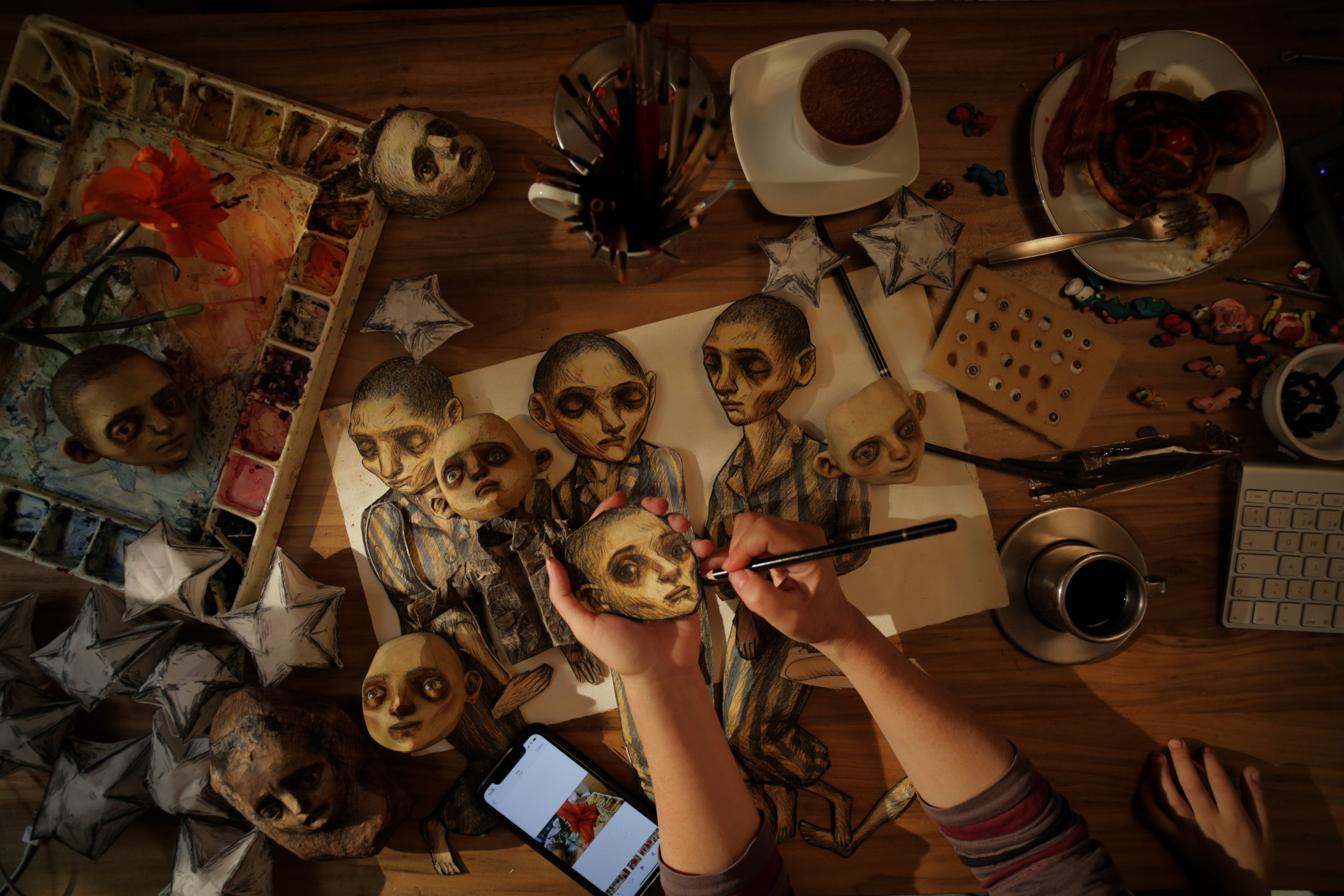
The aesthetic proposal in Humo was initially inspired by the beautiful illustrations of the book, but as it was a story told by a child, it had to reflect reality with deliberate innocence, appearing childish but full of poetry and simplicity. War and sadness washed color into our world, like a subtle watercolor in contrast to the harshness of chiaroscuro charcoal in these three-dimensional drawings, evoking the German expressionism of artist Käthe Kollwitz and the forcefulness of the war images reflected in her vignettes.
I’m Hip
Director: John Musker
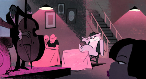
This little thumbnail study, drawn and painted over a very crude, scribbly story sketch I had done, is the work of the great Italian artist Claudio Acciari. I loved several elements of it that became the hallmarks of the visual approach to my short I’m Hip: a vibrant but limited color palette, a strong value structure, and a combination of linear and planar textured elements in the BG that do not necessarily conform to the lines of the forms.
A Kind of Testament
Director: Stephen Vuillemin
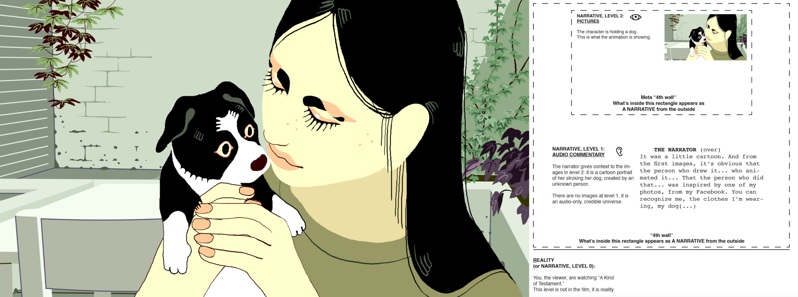
The first things I drew were this picture and this diagram. Out of all the people I showed the diagram to, no one understood what the concept of the film was… I guess it was making it look way more complicated than it actually is!
Letter to a Pig
Director: Tal Kantor
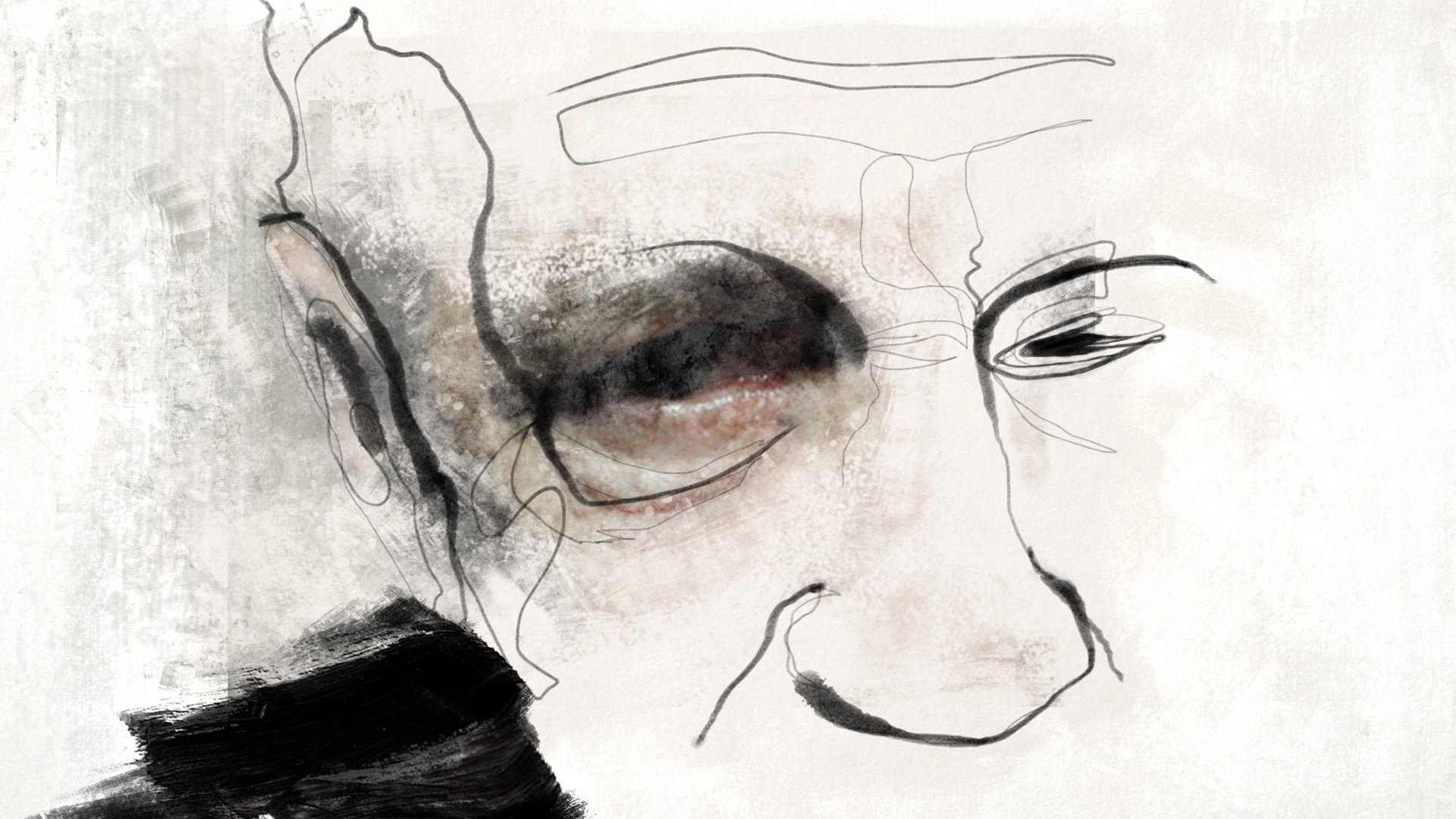
I was looking for a visual language that could express the fragility and complexity of human emotions while evoking the feeling of an elusive and broken memory—something fragmented and incomplete. I aimed to craft a collage that blends details from the vivid realism of reality with the dynamic world of memory and dreams.
Ninety-Five Senses
Directors: Jared Hess, Jerusha Hess
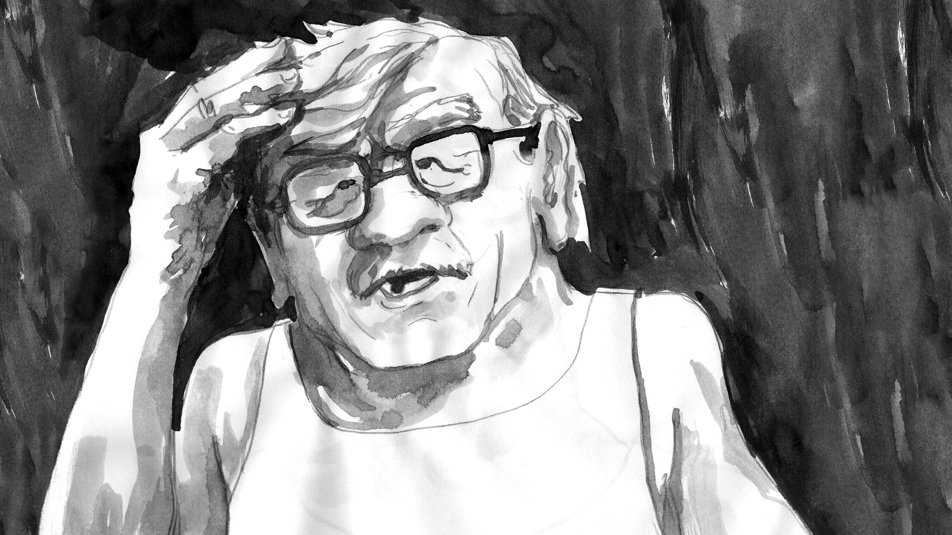
Our central character, Coy, was our first priority; his design would be the glue between all the different visual styles. Jerusha had a very specific character in mind and found reference photography for Daniel Bruson, who gave us a ton of sketches and, finally, this first finished concept. All of our other five animation teams used Daniel’s final design to craft their own takes on him.
Once Upon a Studio
Directors: Dan Abraham, Trent Correy
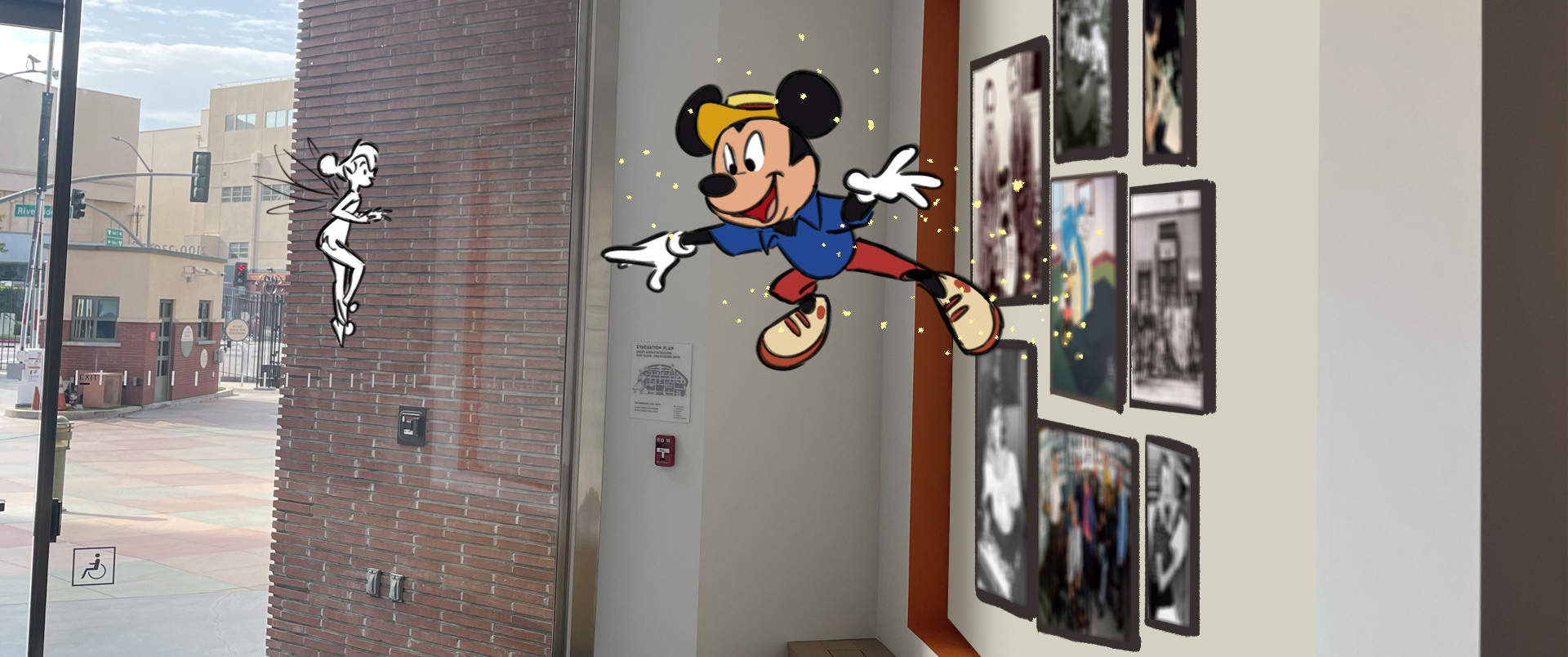
The inspiration for Once Upon a Studio was films like Mary Poppins, Bedknobs and Broomsticks, and Who Framed Roger Rabbit. Having the animated characters living within the halls of our studio felt like a fun, magical way to celebrate the centennial, the artists, and the art of animation itself.
Our Uniform
Director: Yegane Moghaddam
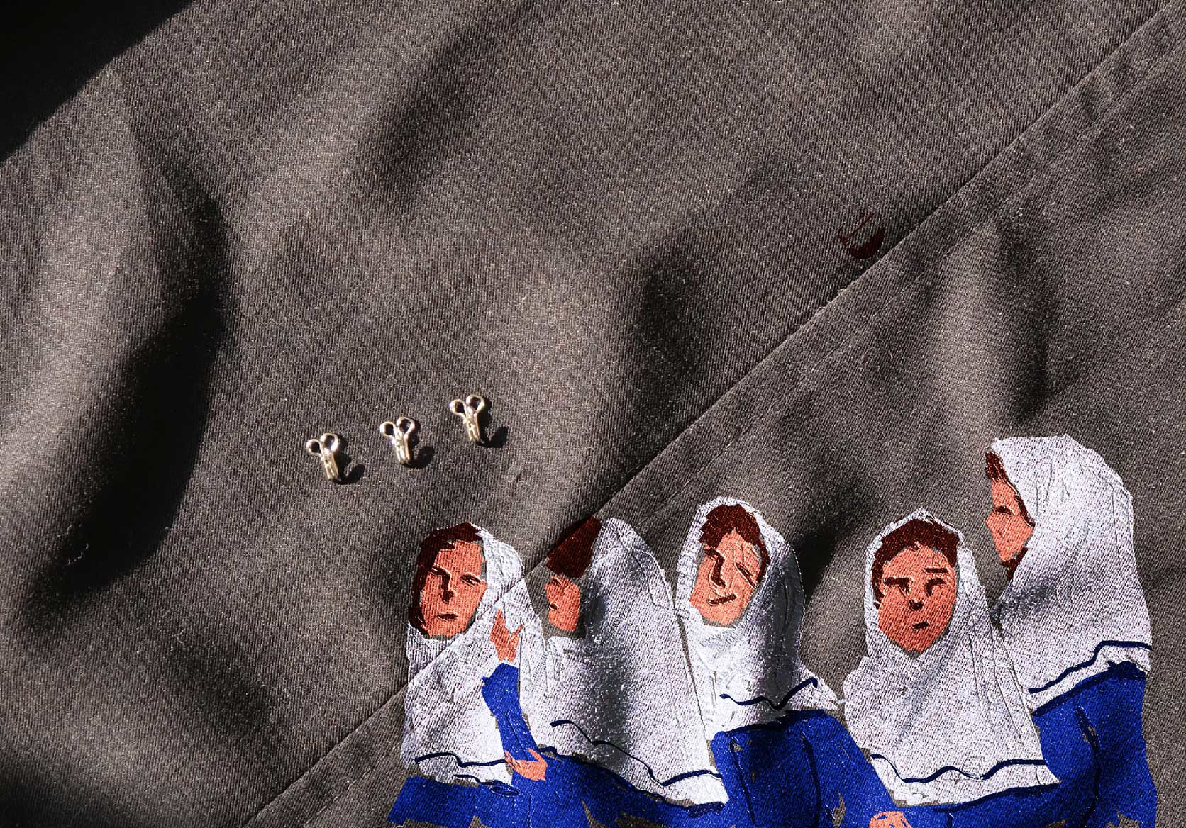
The main visual inspiration for my early concepts came from the real-life photographs I took from some young schoolerchildren. When they were standing next to each other, I couldn’t help but notice how they all blended into a big mass of monochrome colors. So, I tried to represent the characters with some blocks of paint without giving them much detail.
Pachyderme
Director: Stéphanie Clément
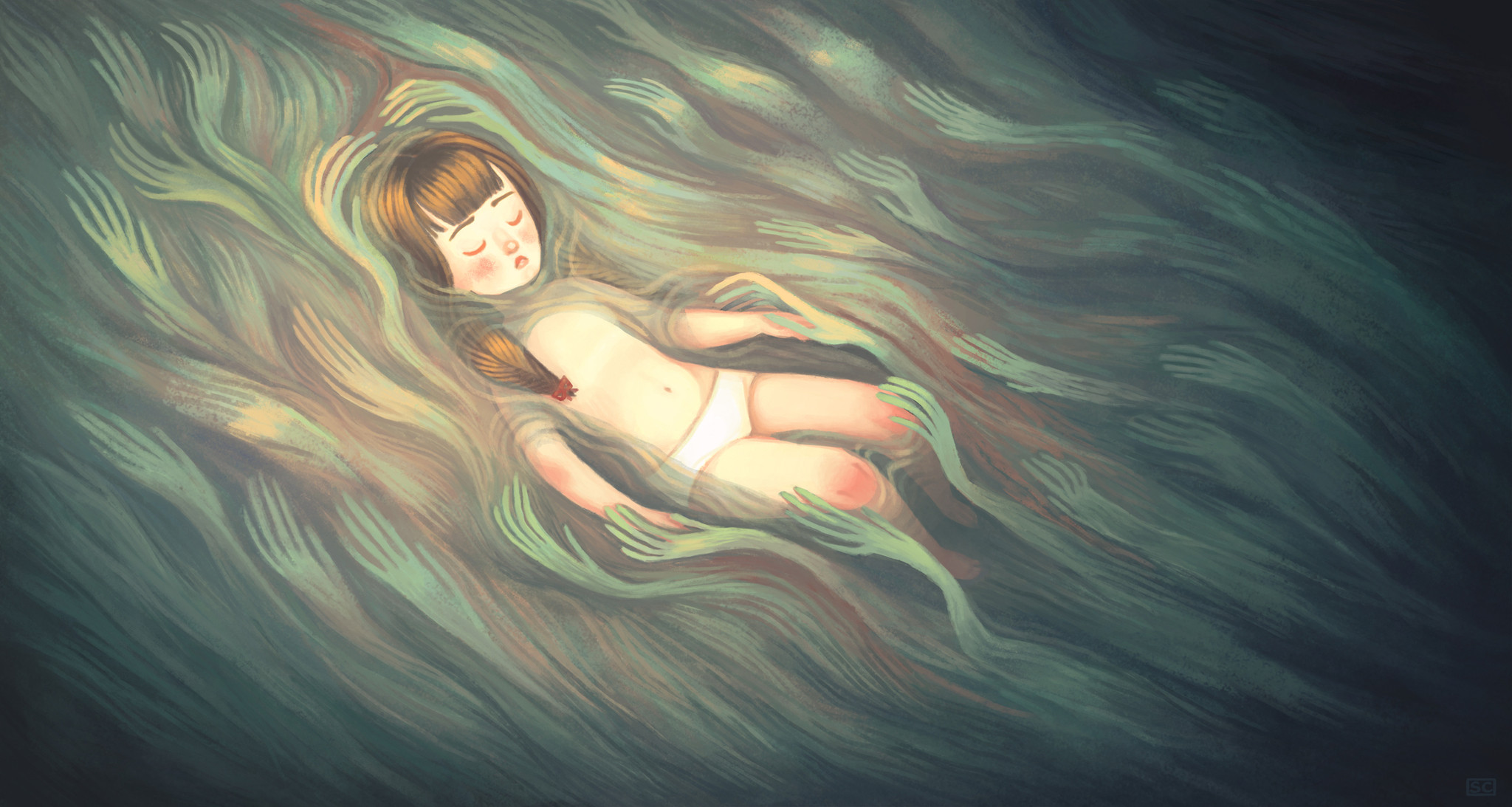
I created this first concept for the film instinctively, starting with watercolor chalk and colored pencil sketches. I was looking for a dream-like image that was both melancholy and soothing. We can see the influence of the Impressionist movement and its aftermath, the sinuous lines of Van Gogh, the palette of Monet’s Nympheas [water lilies].
Pete
Director: Bret Parker
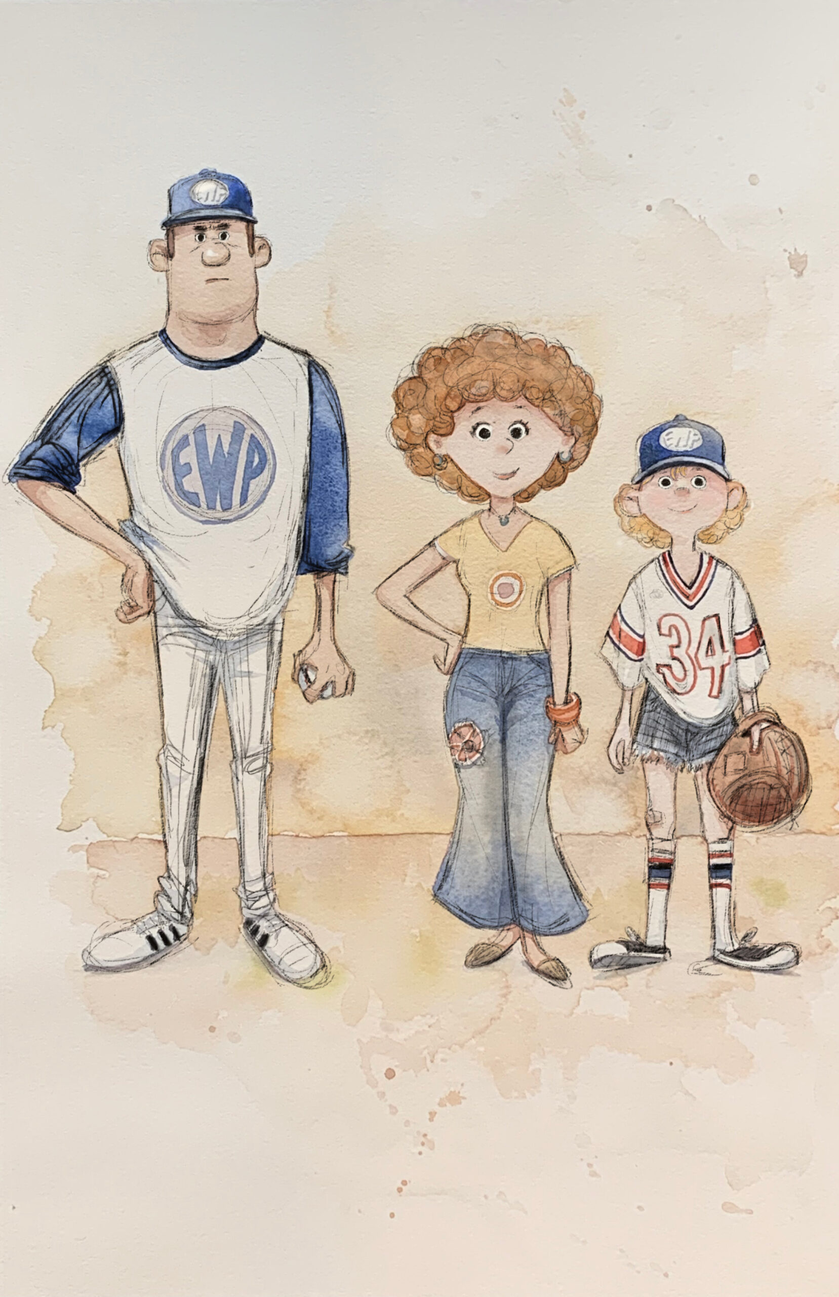
This is an early exploration done by Tia Kratter, translating our characters into ink and watercolor. My inspiration for the look of the film drew from Winnie the Pooh illustrations by E.H. Shepard, as well as the later watercolor prints of Calvin and Hobbes by Bill Watterson.
27
Director: Flóra Anna Buda
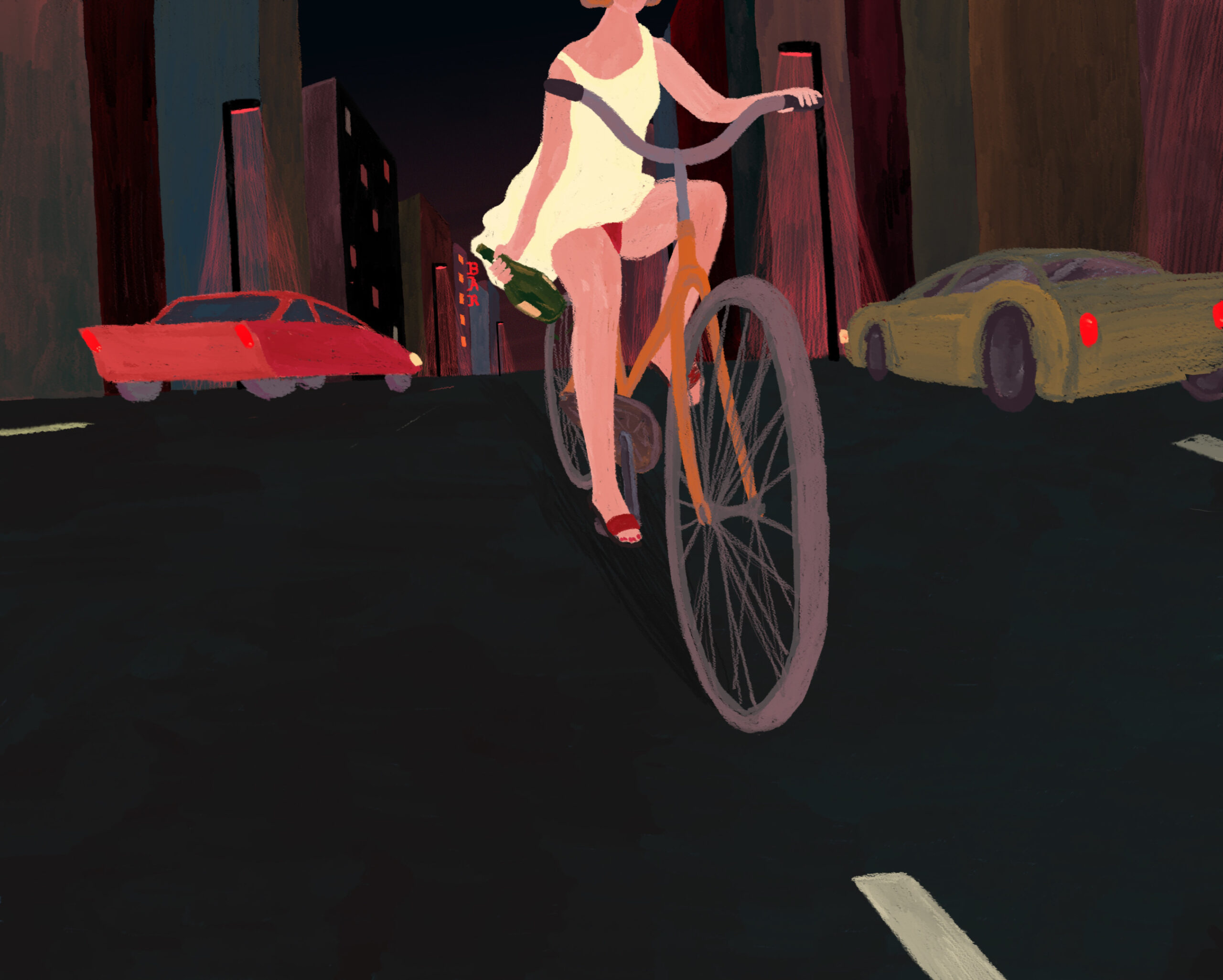
This is Alice on the bike right before she falls. During the drawing process, I was thinking if I didn’t include the full body of the character in the composition, it would create the sort of cinematographic experience when the viewer would be invited into the scene, being surrounded by the tilted horizon of the city. I wanted this steady image to tell a story that was dynamic, that almost moved on its own. I felt true catharsis while drawing, and it inspired the whole story of 27.
War is Over! Inspired by the Music of John & Yoko
Director: Dave Mullins
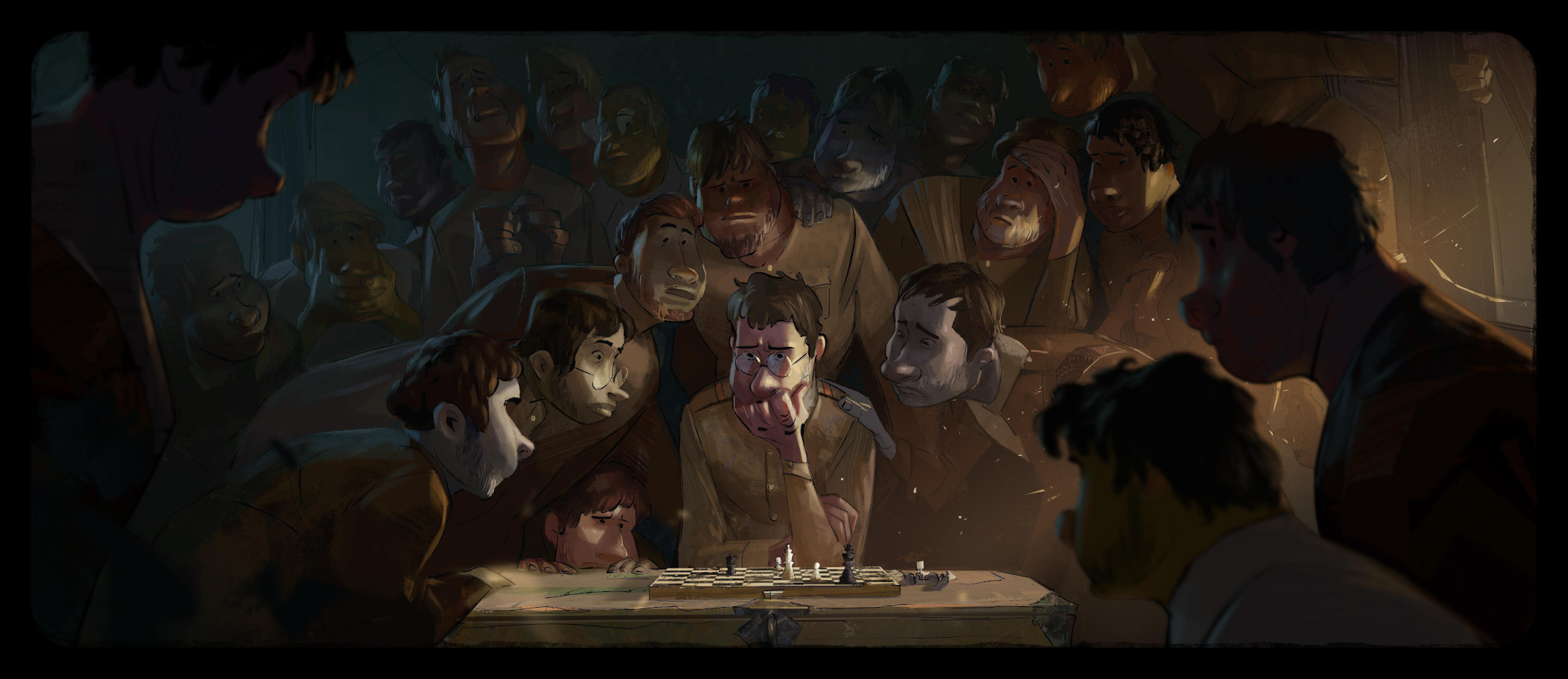
We landed the look of the film with a combination of Max Narciso’s character designs and Zac Retz’s color styling. I wanted Max’s caricature and composition to be inspired by Norman Rockwell’s WWII paintings while having Zac look closely at J.C. Leyendecker’s color palettes as a springboard for our production design. We thought a lot about John and Yoko’s song and its message and wanted to depict that in everything from casting to costume. This isn’t a film about a single war; this film is about every war, and the designs had to reflect a war that looked familiar but wasn’t a specific conflict.
Wild Summon
Directors: Karni Arieli, Saul Freed
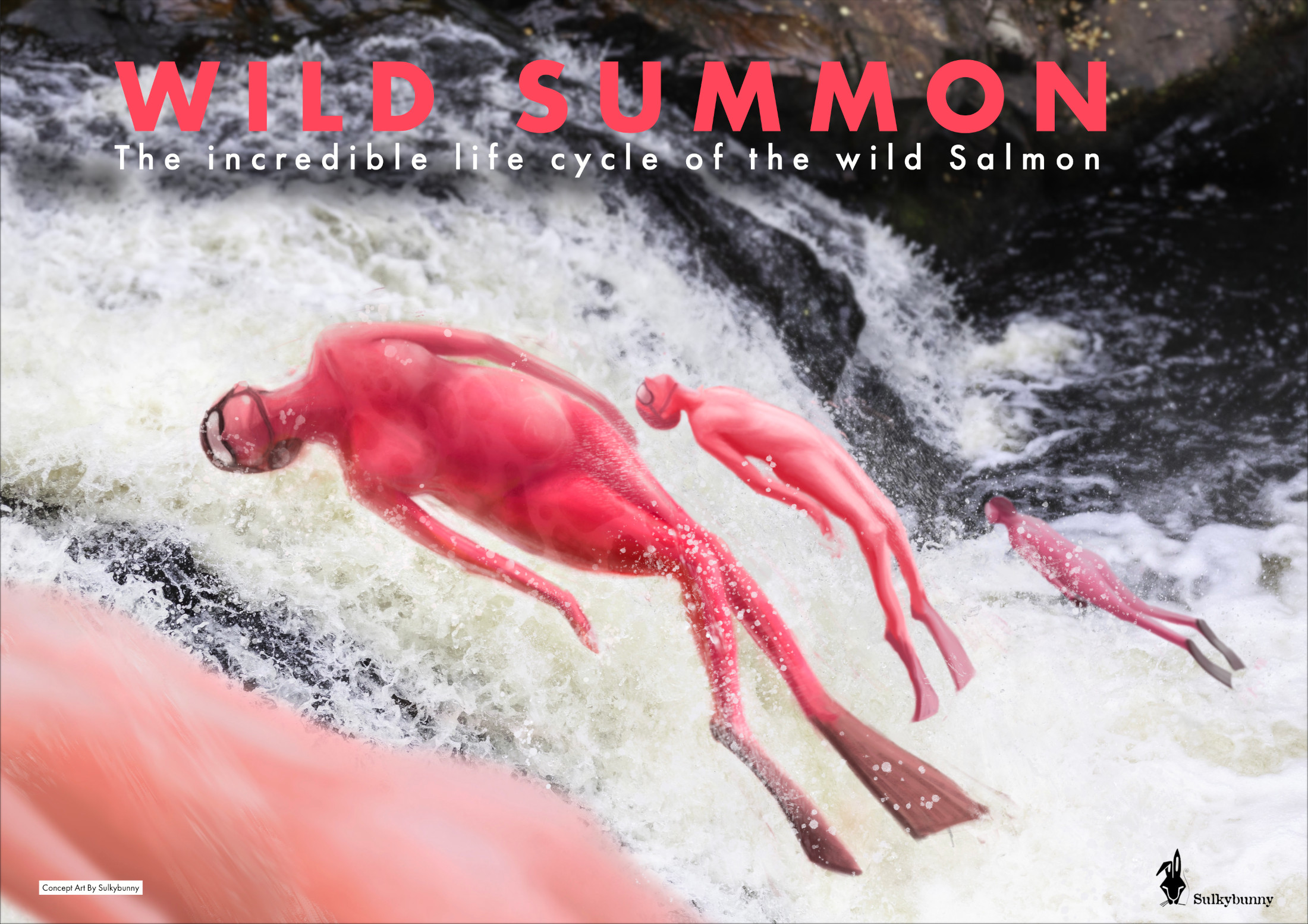
In Wild Summon, the original concept of portraying the salmon as humans came as a eureka moment. Creating a fish in a human form reminds us that we humans are one with nature, but it raises complex design questions: Would they be naked? Would they have scales? Are they red? Breathe through gills? A strong inspiration was the fantastic female pearl divers of South Korea and Japan and free divers. The wetsuit, goggles, and flippers gave us the post-modern, complex look we were after, nearly like a female superhero. It aligns nicely with our style of “casual fantasy.”

