Designing An Annie-Nominated Series: This Year’s TV/Media Production Design Nominees Share The Tricks Of Their Trade
Many festivals and awards shows honor animation projects, but only a small handful, like ASIFA-Hollywood’s Annie Awards, honor the individual achievements of the artists creating the animation.
This year’s voting window opens today, and we’re celebrating the occasion by taking a closer look at the Production Design – TV/Media category. We asked the nominees to send in the artwork they submitted to the Annies and to discuss their role in designing these visually striking shows.
The nominees include Toby Wilson, Jason Scheier, James Wilson, and Emil Mitev for Blue Eye Samurai; Carlos Salgado for Star Wars: Visions; and Charles Huettner, Jonathan Djob Nkondo, Pauline Mauvière, Hugo Moreno, adn Jon Juarez of Scavengers Reign. Marvel Studios’ What If…? was also nominated, but didn’t submit assets for this article.
Blue Eye Samurai (Nominated twice)
Episodes: “Hammerscale,” “The Great Fire of 1657”
Nominees: Toby Wilson, Jason Scheier, James Wilson, Emil Mitev
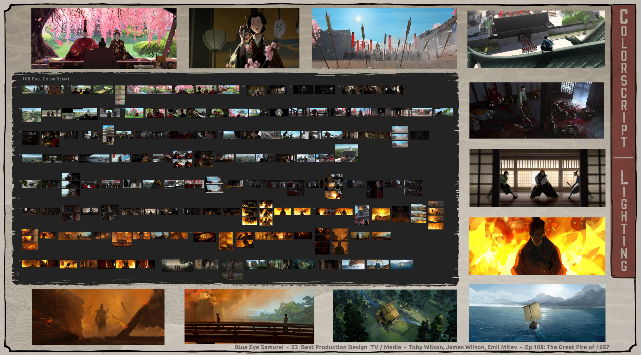
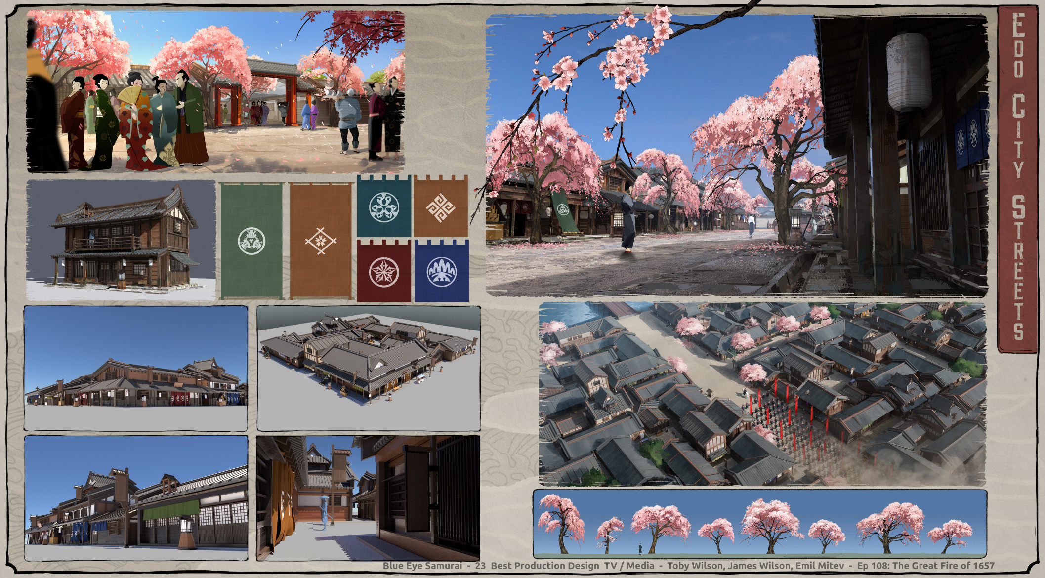
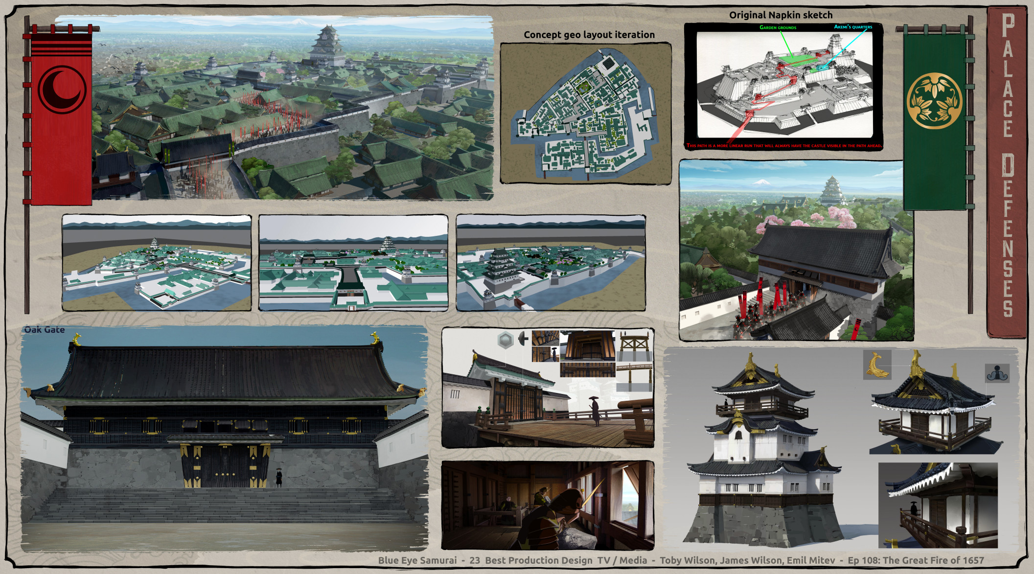
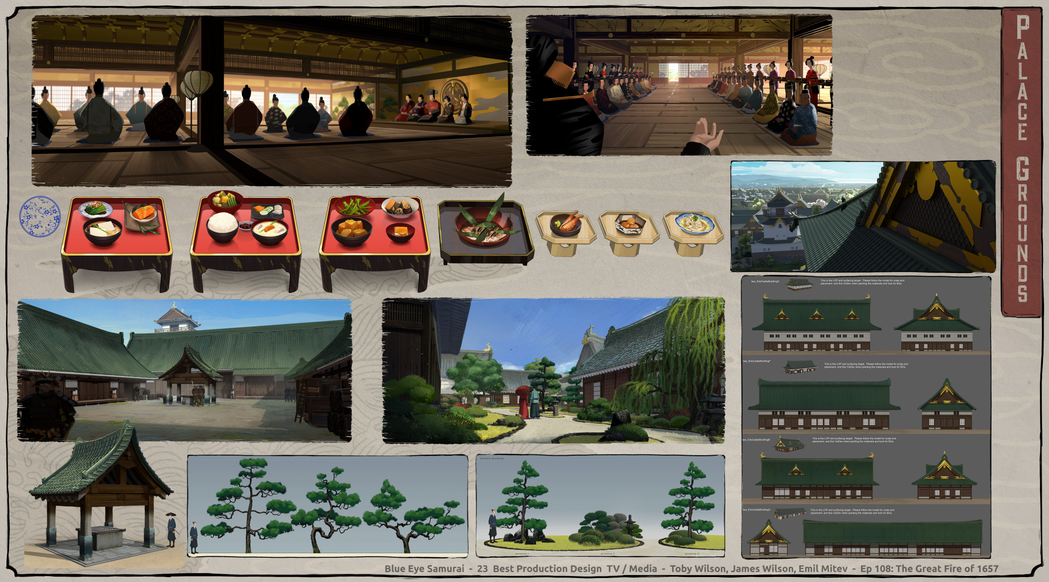
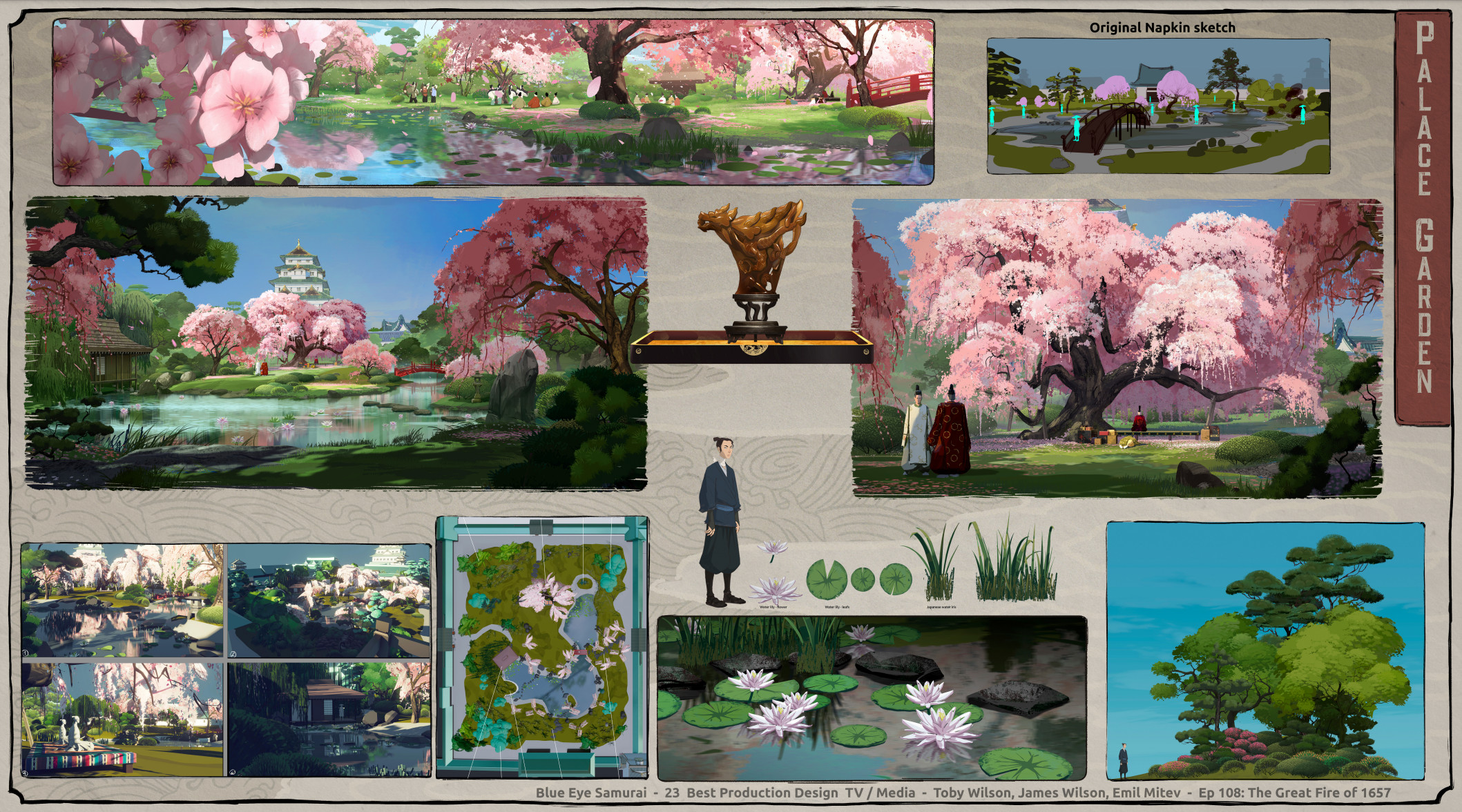
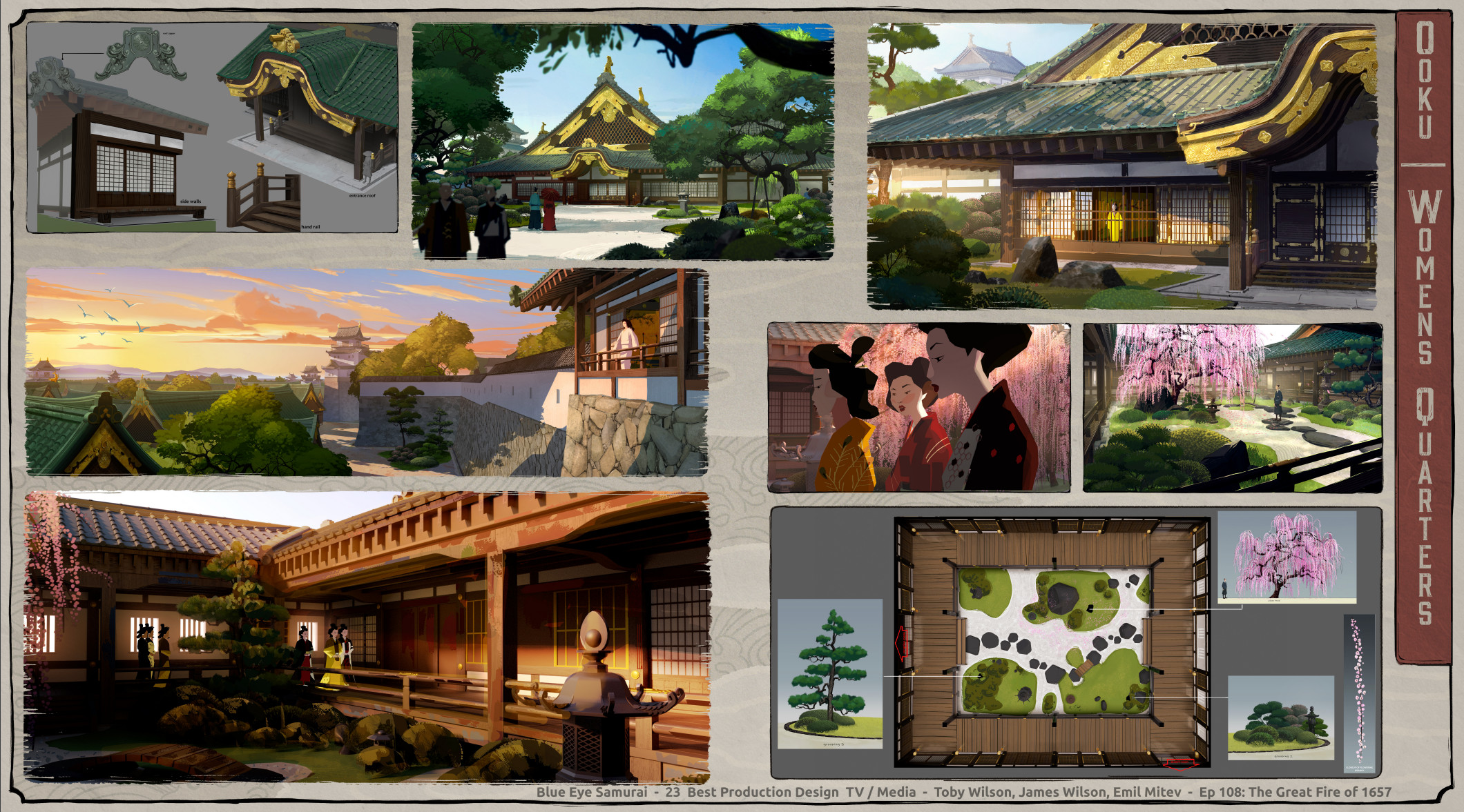
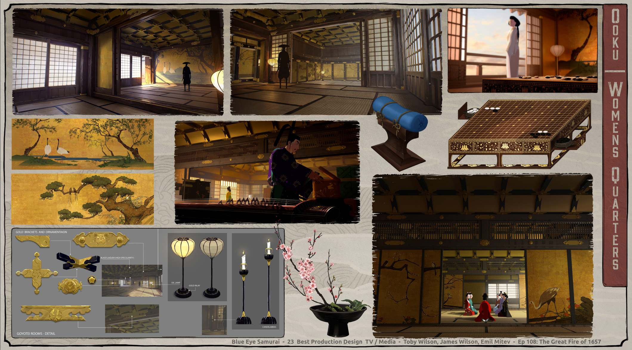
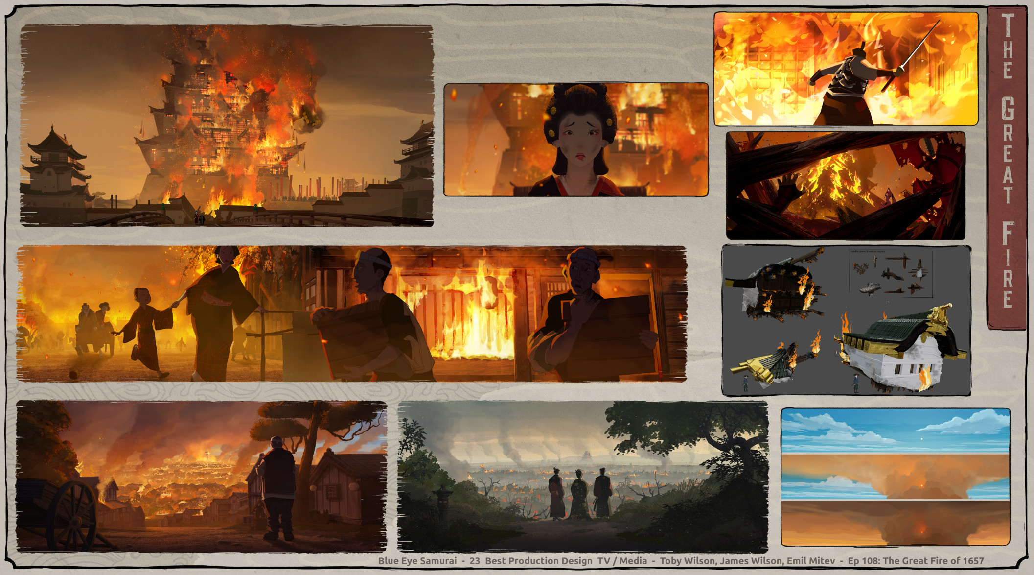
Production designer Toby Wilson: First and foremost, it takes place within the beauty of the native culture and setting of 17th-century Japan. Everything began with in-depth historical research. Our goal was to be true to the Japanese culture of the time and craft a visual painting of the era. Secondly, to do that, we needed an artistic representation of Japan, ukiyo-e woodblock prints. Specifically, we referenced the artwork of Hiroshi Yoshida, with his eastern art form incorporating Western art sensibilities. It was the perfect blend of East and West, just like Mizu. Third, we wanted a live-action cinematic feel to how we composed and lit our shots.
This meant designing and building historically believable sets, shooting our story as you would with a film camera, using a naturalistic approach to lighting and color choices, and applying a stylistic ukiyo-e treatment to how we paint the scene and light the characters.
As we began to look/dev the show, we knew we wanted to maintain a 2d look for our characters so they had the ukiyo-e feel. This meant minimizing the amount of form lighting and stylizing light effects such as reflections and highlights. For the backgrounds, we wanted to see the brush strokes of the artist in the images but also utilized the Japanese design principles of notan to design our light and dark values, focus contrast and textures within specific shapes, and intentionally design them around areas of focus within shots.
Star Wars: Visions
Episode: “Sith”
Nominee: Carlos Salgado
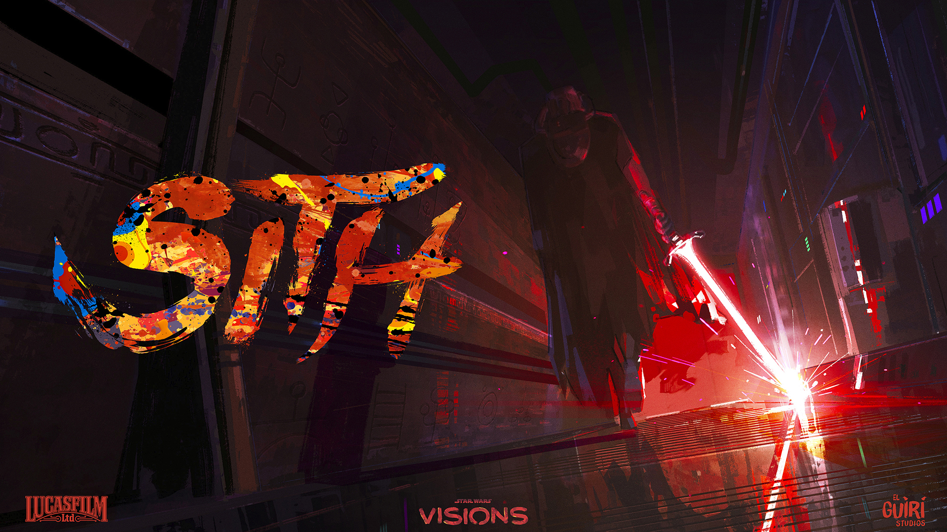
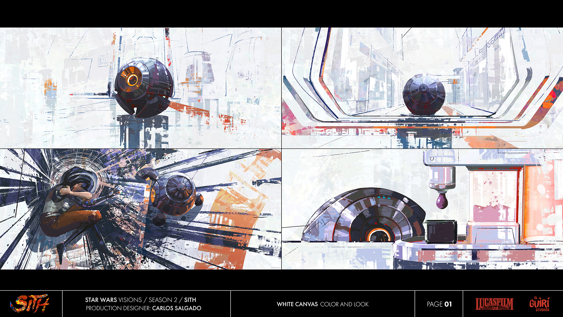
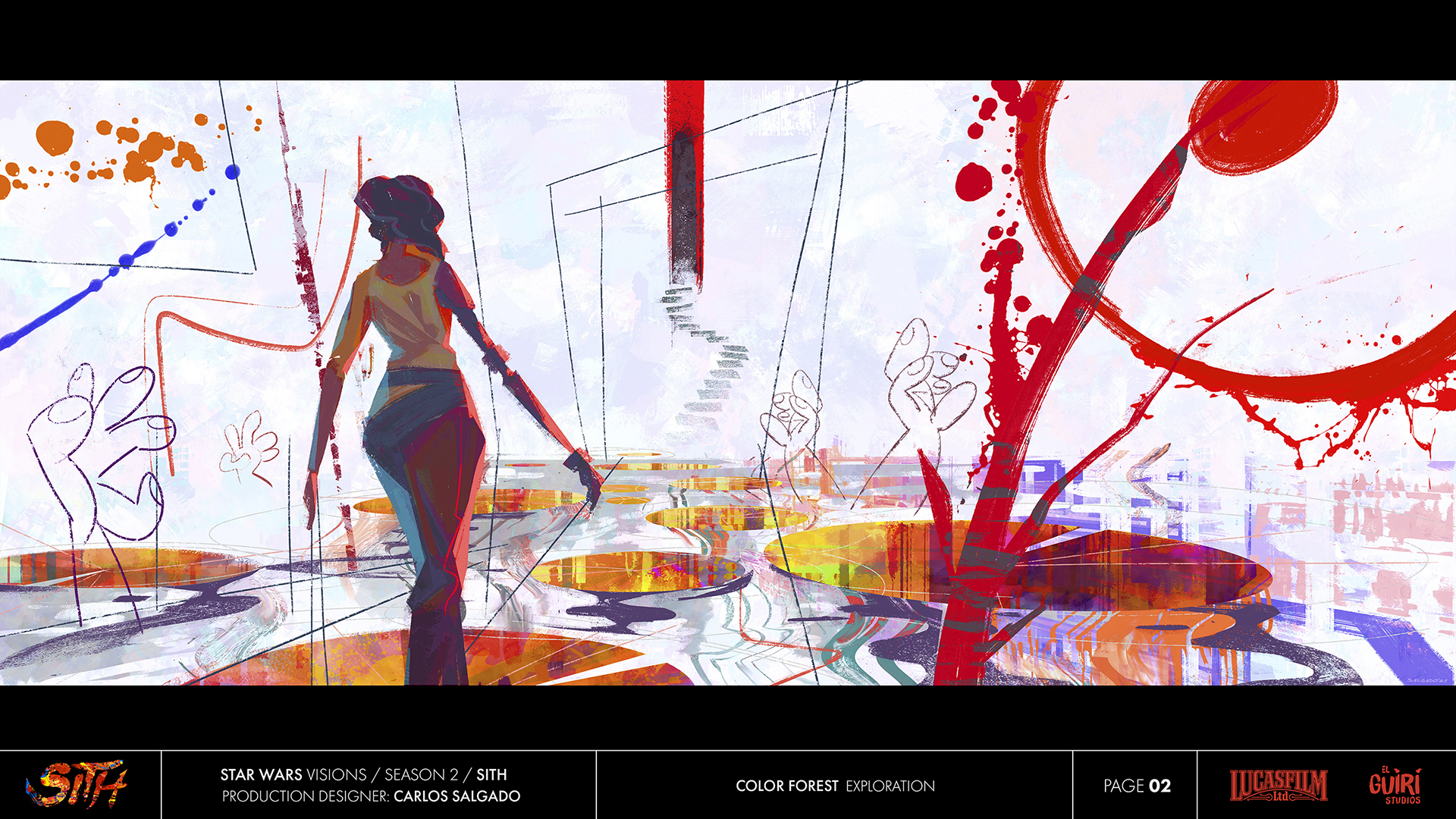
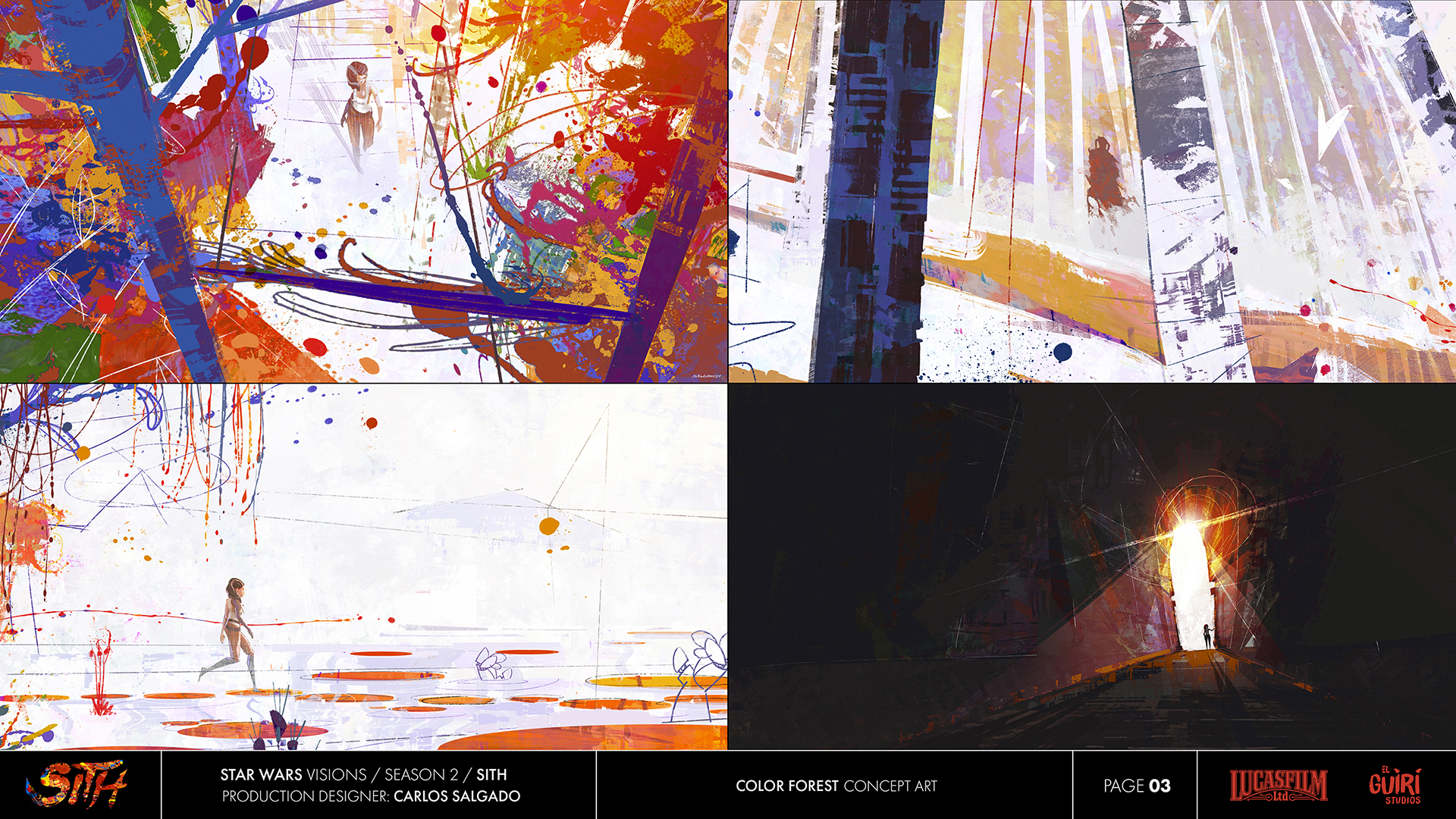
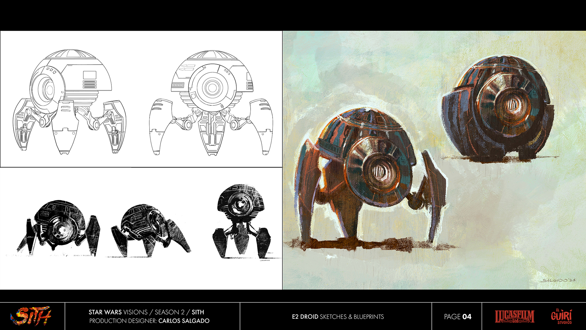
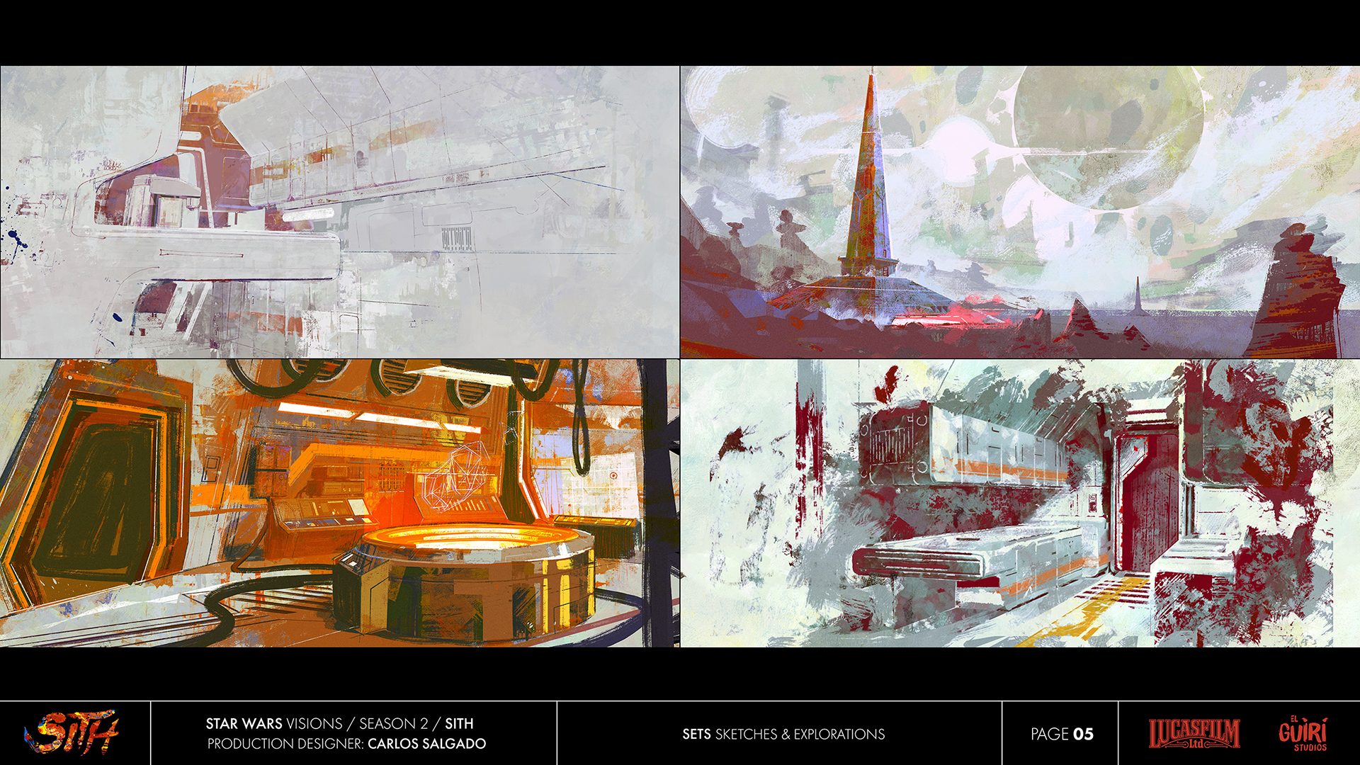
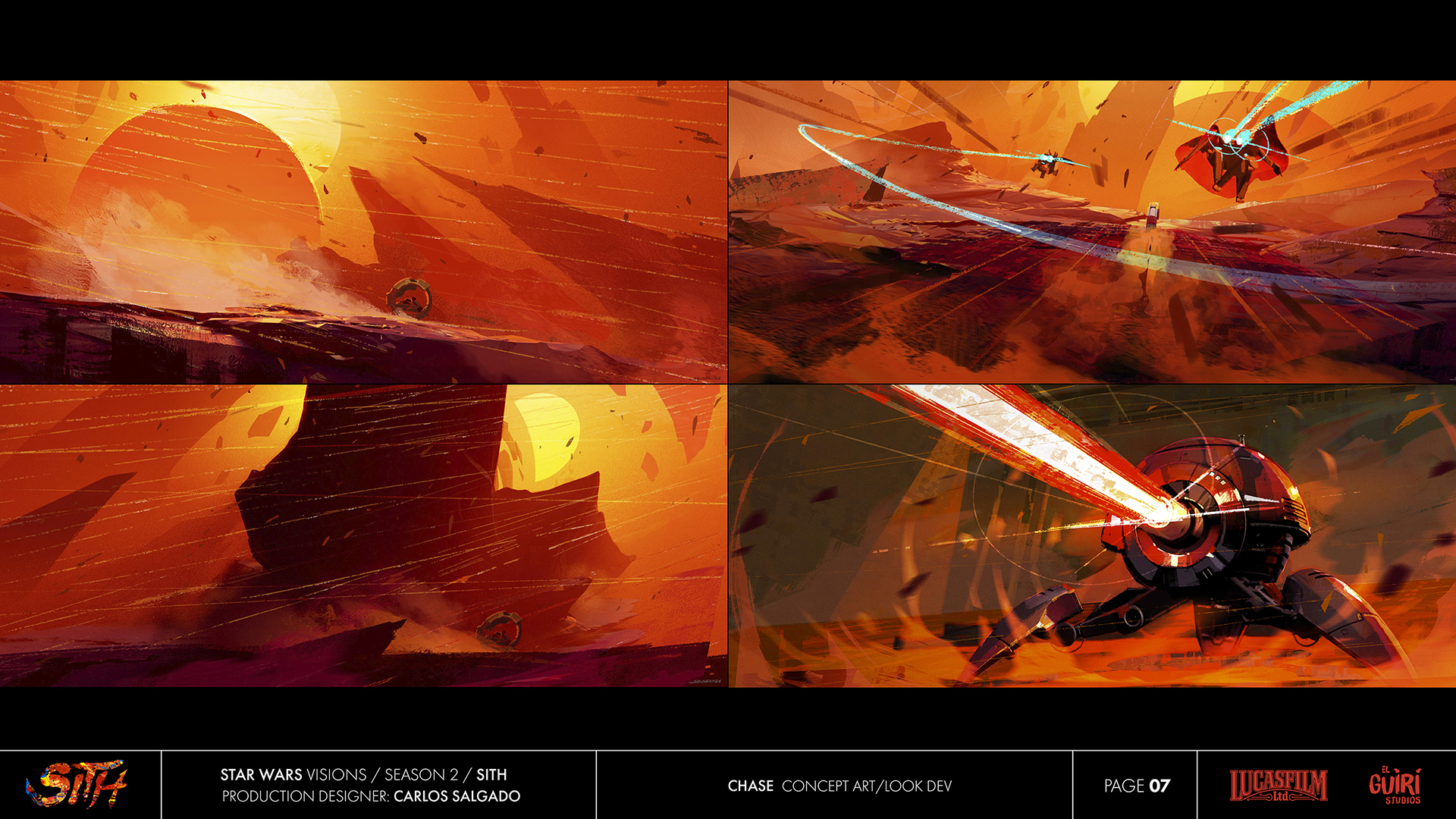
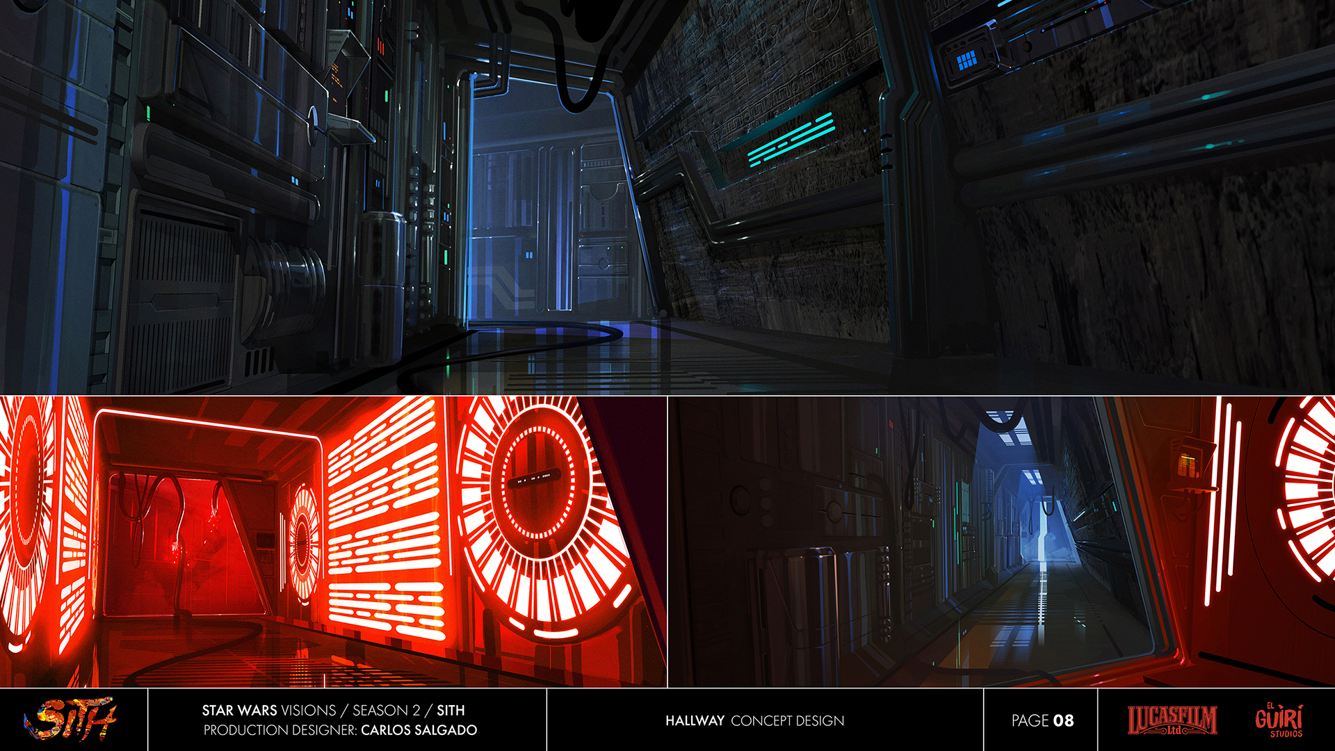
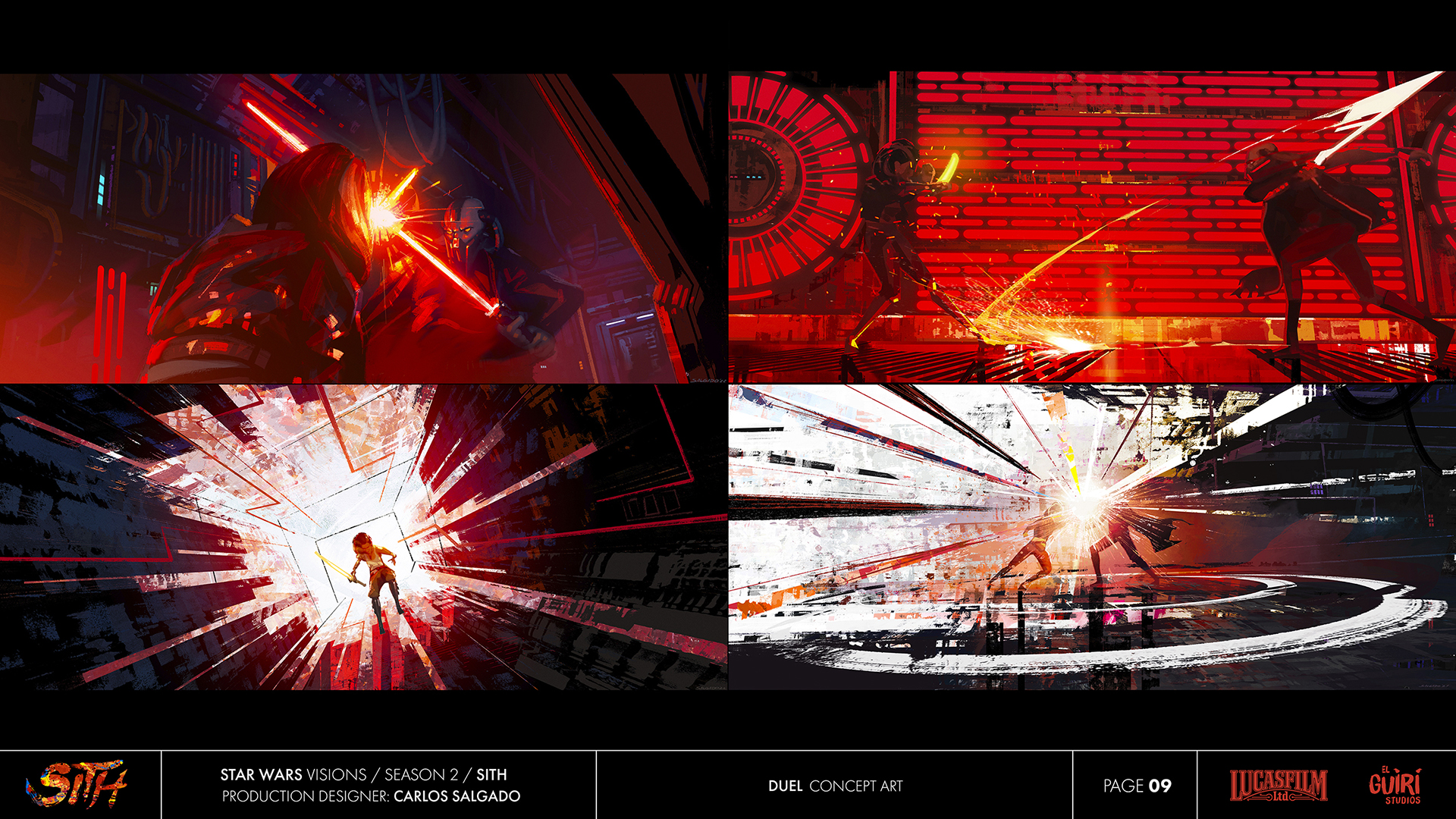
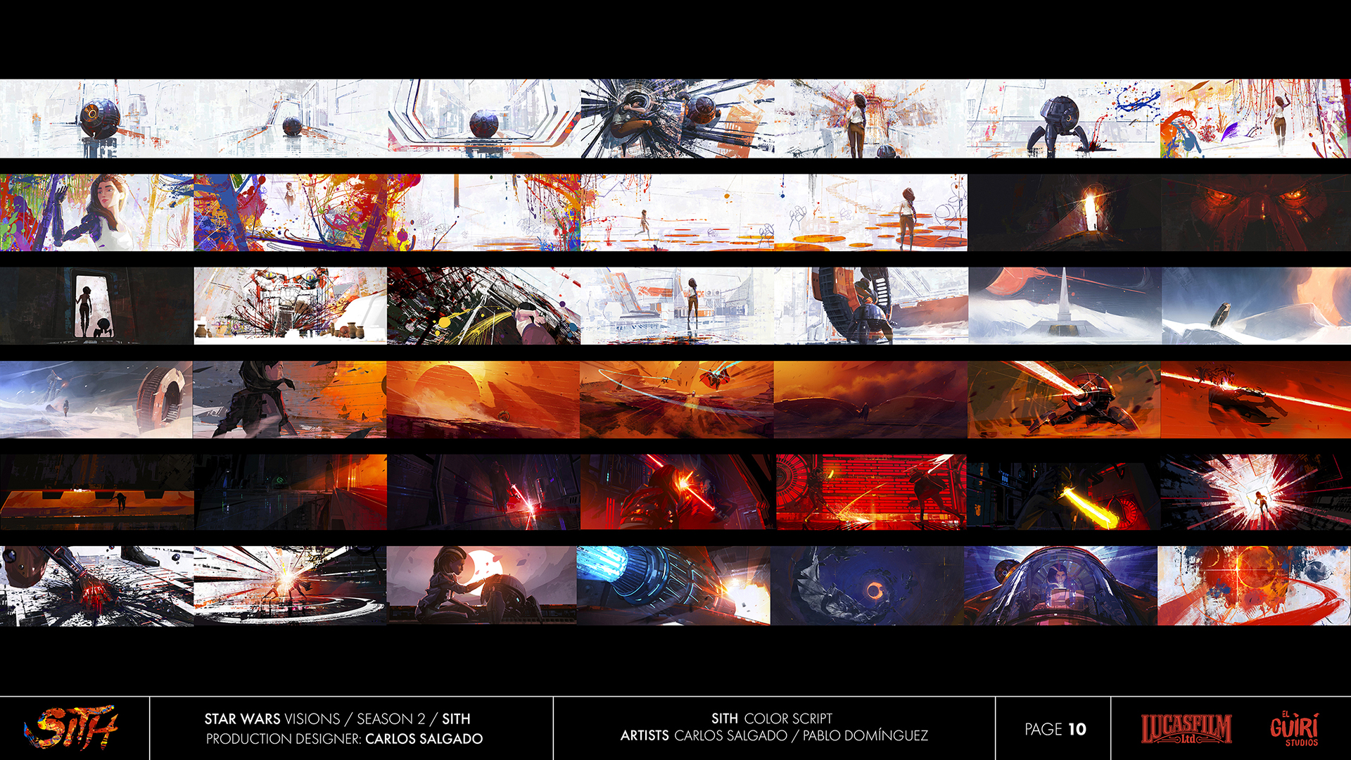
Carlos Salgado: The primary challenge for “Sith” was conveying the abstract force of imagination in a cohesive and unified manner, supporting the characters’ journey. Our inspiration drew from elements of abstract painting, incorporating the vibrant use of color from iconic artists such as Picasso, Miro, and Sam Francis. Embracing a bold and inventive pictorial approach, we humbly aimed to echo the way UPA redefined graphic style in their modernist cartoons.
Under the clear direction and vision of Rodrigo Blaas (director, writer), the script granted us the freedom to take risks and experiment, allowing us to discover our own visual language. On the technical side, the collaboration with Jonatan Catalan (DP, lookdev) and his team proved essential in seamlessly translating these diverse aesthetics into our final animated story.
Being part of a project with such creative freedom was incredible, especially when attempting to bring something unique to the vast Star Wars galaxy. I take great pride in the work accomplished and in collaborating with a small yet exceptionally talented art team, including Linda Chen (character design) and Pablo Domínguez (concept design).
Scavengers Reign
Episode: “The Storm”
Nominees: Charles Huettner, Jonathan Djob Nkondo, Pauline Mauvière, Hugo Moreno, Jon Juarez
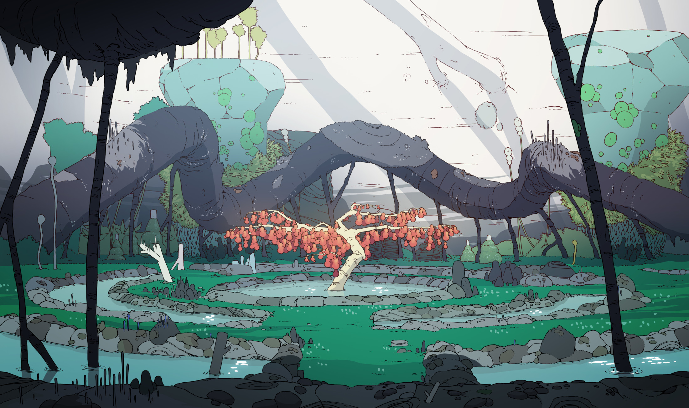
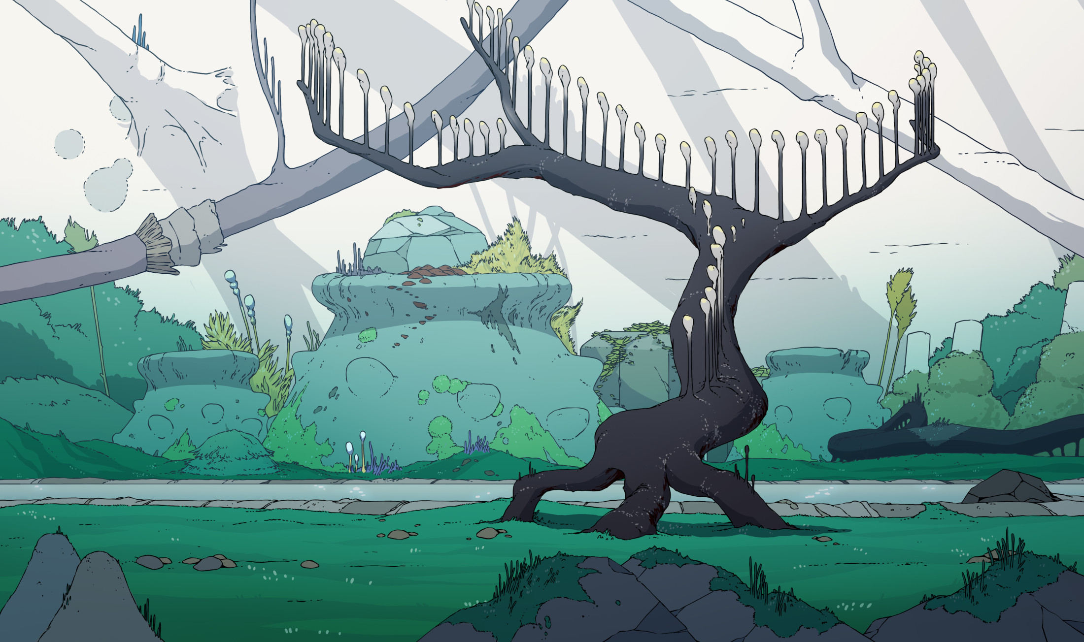
Charles Huettner: Visual design on Scavengers Reign was inspired by many sources. There are some obvious things like Nausicaa of the Valley of the Wind, Moebius, and older anime like Magnetic Rose. We also looked at a lot of microphotography. We had a large image folder full of animals doing strange things and electron microscope pictures. Ultimately, nothing is more surreal-looking and interesting than nature.
We were also mindful not to overwhelm the viewer.
Alien landscapes can be a lot to take in at first. So, it was more about finding a balance between showing bizarre structures versus something that you can understand. To accomplish this, we often used the language of earth’s nature but twisted it in unique ways to serve what the characters or story needed. On top of that, our designs were often created with some kind of internal logic on how they exist in the environment. Concept art would often come in with brief descriptions of life cycle and purpose. I believe that approach really helped glue the world together. I think about that whenever people comment that the world of Scavengers Reign feels alive. I’m very proud of our entire design team; they did an amazing job!
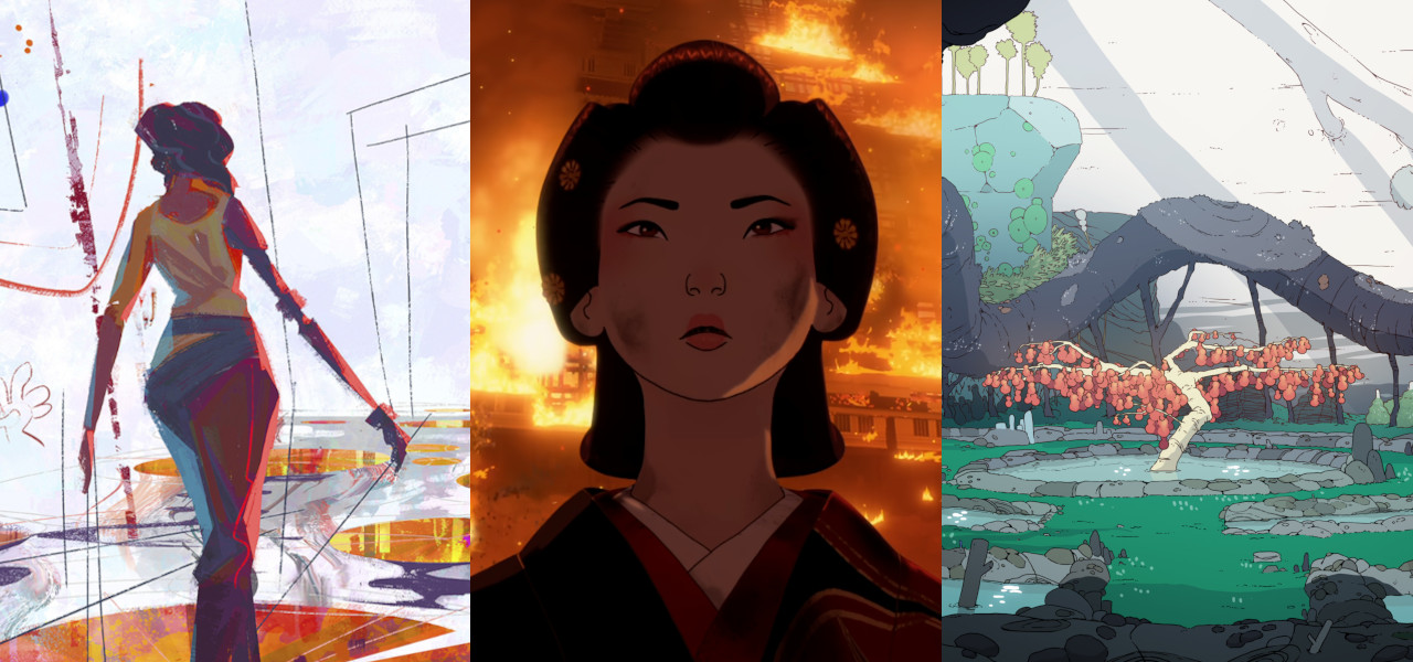
Pictured at top: Star Wars: Visions, Blue Eye Samurai, Scavengers Reign

