
The Making of ‘The Bigger Picture’ with Animator Chris Wilder
This year’s Academy Award shortlist for animated shorts comprises ten distinguished films that use an array of animation techniques, narrative structures, and stylistic approaches. We’ll be taking a look at these films over the next few weeks, beginning today with The Bigger Picture by Daisy Jacobs.
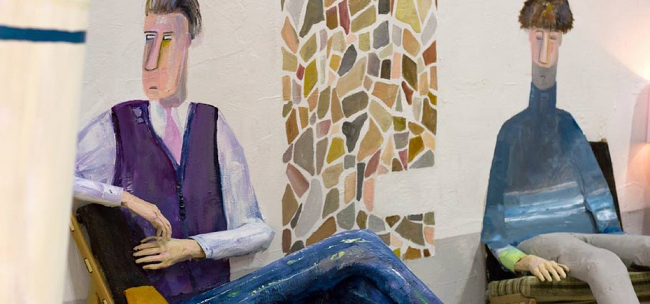
Technique-wise, perhaps no film takes a bigger risk than The Bigger Picture, which ingeniously blends life-size painted 2D animation and stop motion of hand-made objects. The physicality of the materials and setting give a sense of both intimacy and immediacy to the story of brothers who are looking after their ailing mother. Jacobs made the film as a graduation project at the U.K.’s National Film and Television School, and the film has been a major hit on the festival circuit, picking up awards at Cannes, Annecy, Hiroshima Fantoche, and DOK Leipzig, to name just a few.
We asked The Bigger Picture’s stop motion animator Chris Wilder to speak with us about the film’s unique production process and some of the challenges involved in its creation. Here’s what he had to say, accompanied by a visual essay of behind-the-scenes production photos:

Chris Wilder: Very early in the storyboarding process it was decided that 3D items should be pulled into the wall by the characters and become a 2D painting, however during the initial tests for the film we quickly realized that most of the props we had chosen for this to happen to (mostly kitchen items such as kettles, teapots and plates) were extremely heavy.

Most couldn’t be attached to the wall long enough for us to dive out of frame and take the shot; they would fall with a crash taking the characters’ arms with them and sometimes a large chunk of plaster from the wall itself. We at this point decided to build replica versions of these props out of paper mache, making them light enough to attach to the wall or suspend in mid air, this also meant we could cut them down easily as they disappeared into the wall incrementally.


Our technique involved Daisy painting the straight-ahead 2D character animation on a flat wall whilst I animated the 3D elements of the scene (such as arms, teacups and kettles) alongside her.

The main difference between animating drawings on paper and life-size painting is probably the level of physical endurance required of the animator. Daisy had made two small experimental films using this painting on wall technique and knew that having to work this way for six months straight was going to be a very arduous challenge.

Daisy did all the painting in the film herself. One week she was so exhausted she sat down on a swivel chair to examine how the frame was looking only to immediately fall asleep. I had to then gloomily poke her with the end of a paintbrush. When she jolted awake, I handed her a paint palette and she returned to the wall. No matter how tired she was she just kept painting. The deadline for completion was so tight we just kept pushing forward. Tears, tantrums, and the occasional screaming fit were all perfectly fine as long as we kept working.


One of the main difficulties we encountered during the production was the combination of using straight ahead animation and lip-syncing the characters’ dialogue. The film centers around several important conversations and whenever it came to animating speech this always applied pressure to any other elements of the animation as every element of the scene had to be accurately timed (the lip-sync, the painted animation movement, the stop-motion movement etc,) and we were very often not able to retrace our steps.

However, the knowledge that everything could quickly fall apart if we lost concentration is probably how we maintained the level of focus needed to complete the film in the time we had been given. Fear drove this film and it became our friend.

As we were in some ways inventing and shaping this technique as we made the film many of the creative results were often surprising. We had done tests before the production which involved the ideas of the 3D and the 2D world combining, but nothing on the scale of the film’s actual set pieces.

Often the film’s biggest moments, such as the vacuum sucking up the living room, the room filling with cling-film water, and Nick growing giant on the living room wall, had to be completed in the shortest spaces of time. In which case, we gritted our teeth and started animating with the mindset that we would just have to make it work even if we were unsure exactly as to how. If it wasn’t working, we would keep trying until it did. The hours were long, the work was hard, and we were often angry, but we kept at it.

Watch a behind-the-scenes video below:

