
‘Mr. Hublot’: The Art of the Oscar-Nominated Shorts

In this special Cartoon Brew series, we asked the five nominees of the 2013 Best Animated Short Academy Award to discuss the artwork of their films. Today we continue this exclusive look at the short contenders with Mr. Hublot, a Luxembourg/France co-production directed by Laurent Witz and co-directed by Alexandre Espigares.
(Click on any of the images for a closer view. All images in this post are copyright ZEILT Productions. See the artwork of the other short nominees: Possessions, Feral, Get A Horse! and Room on the Broom.)


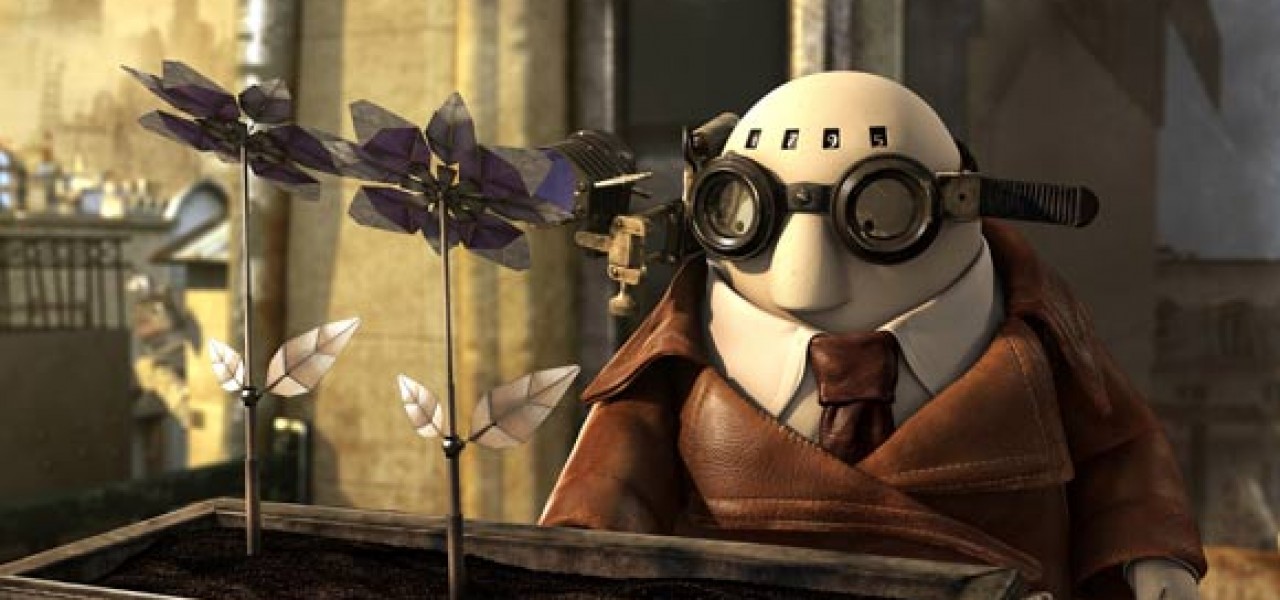
Laurent Witz: Stéphane Halleux’ characters were the basis for the short. We had two main characters, Mr. Hublot and Robot Pet, but we had to alter them for animation purposes. We adapted the characters so we could animate them and convey more emotions and poetry through them.
We worked a lot on the characters’ eyes, because that’s where the emotions come from. Mr. Hublot doesn’t have a mouth or eyebrows, his eyes were barely noticeable. That is why we had to adapt what would help us create this emotion (like the eyes and the glasses)… It was a real challenge for the animators.

Laurent Witz: Working on the ambiance of the film was important, both to underline the emotions—the poetry of it—and to find the identity of the film. We worked one year on the preproduction of Mr. Hublot. It is an important stage of reflection into which we put a lot of work.


Laurent Witz: Color research was a key stage in making Mr. Hublot. We knew we had a very small budget for the amount of work on the film. We couldn’t test things in rendering or in compositing. It’s so much less expensive to do tests in 2D rather than in 3D. So we took the time to do the research, at the risk of losing time. Several artists worked on this crucial stage, bringing varied suggestions that we then had to refine.
I remember the first suggestions, they were more in the bluish colors, less in the spirit of the film in its present version. But it’s part of the paths we have to explore before finding the direction we want to take. You can always be pleasantly surprised by ideas you hadn’t thought of when you began the film.


Laurent Witz: For the designs of Mr. Hublot, it was important to research the steampunk culture and Stéphane Halleux’ sculptures before coming up with the sets and props of Mr. Hublot’s universe. We needed to find the authenticity of the materials as well as the ingenuity of the mechanisms. We also wanted the interiors to feel comfortable, familiar, like a grandparents’ house, interiors that could contrast with the more menacing, oppressing exterior designs.


Laurent Witz: We didn’t want Mr. Hublot to just be a steampunk film, but rather a particular and original piece. The steampunk trend was a source of inspiration, not of copying. The work on designs, by Pascal Thiébaux among others, was crucial to create a coherent world for the characters to live in, a world that would support the scenario. We had to find the balance between the coldness of the industrial world and the warmth of stone, leather, and the Haussmann architecture.


