
Polish Animator Michal Socha Creates The Most Creative ‘Simpsons’ Opening Yet
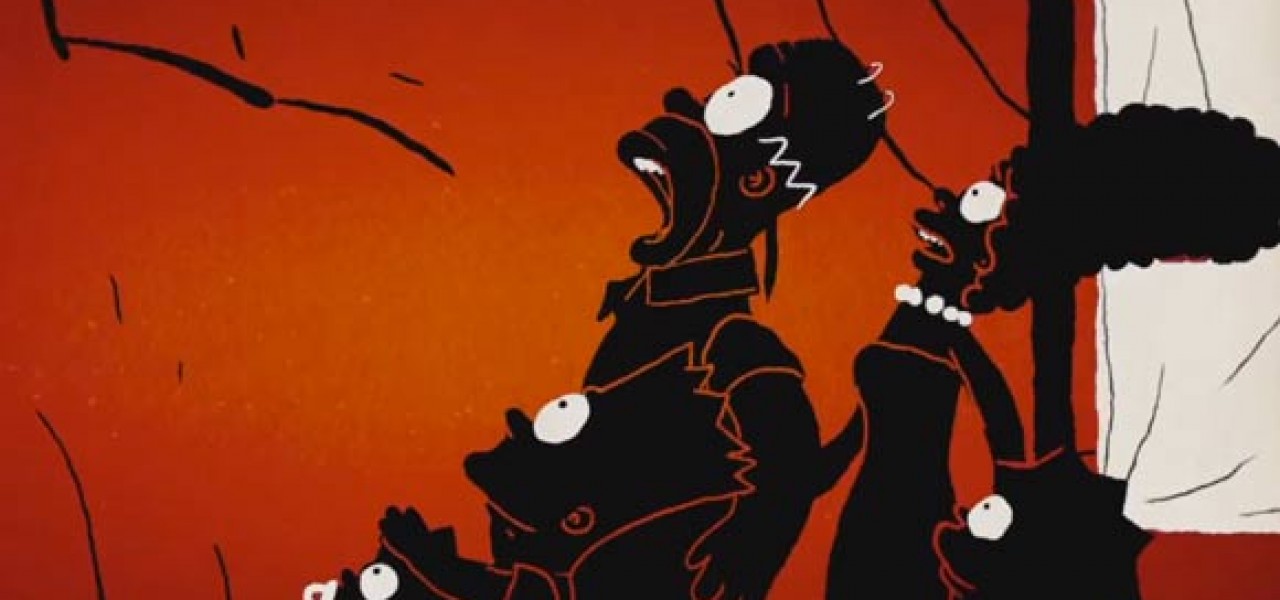
Following Sylvain Chomet’s first-class Simpsons opening, I didn’t expect any animator to top it creatively—and certainly not so soon after. I’ve never been happier to be wrong. This week’s Simpsons opening by Polish filmmaker Michal Socha is a mind-blowingly gorgeous and creative journey into Homer’s brain:
The stark red-and-black palette and 2D/CG mix is based on Socha’s 2008 student short Chick, which was a big hit on the festival circuit. Socha is an unexpected choice for directing a Simpsons opening, especially since he’s not a known name like the other artists who have created openings. The gamble paid off though, and audiences have been rewarded with one of the loosest, most fun pieces of Simpsons animation ever produced.
And just in case you’re wondering, the Simpsons characters are CGI. Socha explained a little bit of the process to Animation World Network:
At the beginning, we thought that we could animate the Simpsons Family with classic frame-by-frame technique. After couple of tests, we have found that we are not as good 2D animators as we thought! Our tests tended to lose character and proportions, [and] that was not acceptable. In this case it was very important that each black silhouette reminds you of Homer, Bart or Lisa. Classic frame-by-frame technique could take much longer to finish couch gag. We wanted to keep this animation in 2D style, [which] is why we mixed those two technique to achieve a better result…One of the challenging issues from[a] technical point of view was to reach [the] non-3D look of the characters. We tested a lot of different renderings that give us cartoon look, but none of them were sustaining us enough. That is why we decided to [manually] repaint all the frames frame-by-frame and add extra secondary animation. There was a lot of fun work to do, but finally it give us desired effect.

.png)