Max Headroom And The Strange World Of Pseudo-CGI
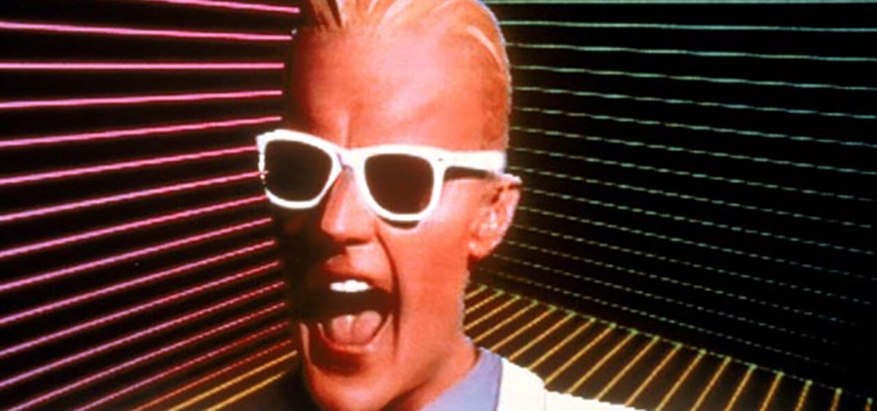
I’ve come across people who believe that Max Headroom, the Channel 4 character from the Eighties (pictured at top), was a genuine piece of computer animation. But although he was conceived by the animators Rocky Morton and Annabel Jankel (of Cucumber Films fame) Max himself was portrayed by actor Matt Frewer, placed into latex makeup and a shiny costume and set amidst a range of technological tricks.
Half of the frames from the footage used in Max Headroom were removed in production, resulting in a juddery look to suggest animation shot on twos, and Frewer was bluescreened in front of a basic digital backdrop. The crew even added deliberate faults to the “animation” – such as the stammer which became Max’s trademark – to complete the effect.
This process seems somewhat surreal today, in our brave new world of Maya, Xtranormal and Blender. Max Headroom was created at a time when 3D CGI animation was desirable, but not always affordable; if the budget did not allow it, then the crew had to fake computer animation in front of the camera.
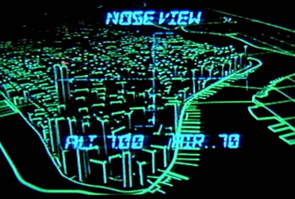
Another good example of this can be found in the 1981 film Escape from New York. Early on in the movie we see what appears to be a wireframe model of Manhattan; in actual fact, a physical model was built for this sequence, with reflective tape placed along the edges of the buildings. Shot under ultraviolet light, this recreated the luminescent green-on-black effect of primitive CGI.
There has even been an incident in which a budget imitation of CGI itself received a budget imitation. In 1987 an unidentified signal hacker managed to replace two television broadcasts with a mildly disturbing video of a home-made Max Headroom show. In this improvised effort Max was portrayed by a man in a shop-bought mask, while the moving backdrops – in the original series, an example of genuine digital animation amongst the pseudo-CGI – were replaced with somebody offscreen wiggling a bit of corrugated metal about.
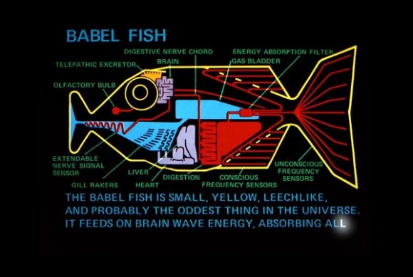
These are all extreme examples; during this period, it was more common for digital animation to be emulated using hand-drawn techniques. Often used as a visual motif in kids’ science fiction-themed cartoons (witness the cel animated wireframes in the opening sequence to Transformers) this approach was put to good use by Rod Lord’s animation work on the Hitchhiker’s Guide to the Galaxy television series from 1981. Created using litho film and coloured gels, these sequences suggested digital graphics simply by combining glowing primarily-coloured images with a black background. An added plus was that the animation could get away with being a little bit jerky…
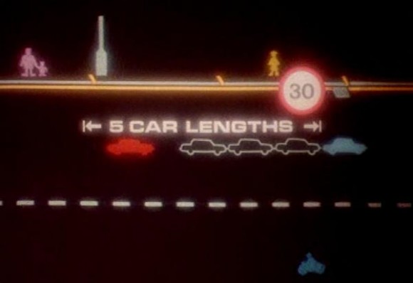
One sequence in Hitchhiker’s Guide portrayed an intergalactic war as an early video game, a theme drawn upon by other animators: for example, in 1982 a British public information film used Space Invaders-like imagery to advise audiences on safe driving [see image below]. The biggest example of this, however, came when Disney produced an entire feature film based around the look of eighties arcade games: Tron.
Tron contained genuine CGI animation backed up with large amounts of compositing tricks based around matte effects and backlighting; this made the live action footage look as though it had been digitally processed. As a result, the film stands as arguably the premiere example of pseudo-CGI.
In her book British Animation: The Channel 4 Factor Clare Kitson remarked on the fact that Max Headroom, Channel 4’s biggest animated hit, was not actually animated. But as she went on to argue, perhaps it is time for a reappraisal:
I wonder if we might indeed classify those sequences as animation nowadays. With the plethora of different technologies now employed, the previous narrow definition (which insisted that the movement itself must be created by the animator) seems a bit old-fashioned. These days anything that appears on a screen and moves but is not a record of real life – including creatures moved by motion capture – tends to fall under the animation umbrella… The current popular synonym for animation, ‘manipulated moving image’, seems to be made for Max.
Of course, if Max had been made using actual CGI he would have ended up as a creaky old relic, rather like the “Money for Nothing” video which came out the year after his debut. Instead, Jankel, Morton and Frewer came up with a genuinely iconic creation that has aged surprisingly well.
Today, it is all too easy for animators to fall back on the tricks of their software and lose track of the wider aesthetic potential of their work. What Max Headroom—and, to an extent, some of the other pieces mentioned here—show is the opposite effect: digital animation spurring creativity in analogue work. They have an ingenuity and hand-made charm which is missing from so much modern computer animation.
Primitive digital imagery has had something of a resurgence across the past decade or so, to the point where pastiches of 8-bit pixel graphics have found their way into mainstream productions such as Wreck-It Ralph. Perhaps it is time that the animators and digital artists of today rediscovered the lesser-known cousin of this aesthetic: the strange world of pseudo-CGI.
NEIL EMMETT is the editor of The Lost Continent, a fantastic resource devoted to British animation, past and present. This piece is an expanded version of a post that originally appeared on his site.
